h1

Everything’s Going My Way!

January 13th, 2010 Posted by | Tags: , ,

What had me singing “Oh, What a Beautiful Morning,” today?  Sure, my week brightens around Wednesdays.  And sure, I was still riding high on the leftover Batmanderthal vapors.  But this is what really kick-started my morning:

The Birds of Prey are back!  And they’re being written by Gail Simone!

Of course scans_daily is all over this, including the mysterious blacked-out figures in the background.  Creote is the front-runner, as far as speculation goes, for the big figure.

There are more contenders for the flying figure.  They include

1.  Misfit – Charlie Gage-Radcliffe  (Yeah, yeah.  “Dark Vengeance.”  Not my favorite.)

2.  Batwoman – Kate Kane (I’d think she’d be up front in the picture, though.)

3.  Batgirl – Bette Kane (That could be interesting.  And I’m pretty sure she’d be pissed to see how many people have stolen her moniker.)

4.  Manhunter – Kate Spencer (Very unlikely.)

5.  Spoiler/Robin/Batgirl – Stephanie Brown  (I don’t think Gail Simone has ever written her before.  That could be cool.)

Simone states that the two new characters are a pair, which cuts down on a lot of possibilities.  I suppose they could be Creote and a very interestingly posed/surgically altered Savant.  The ruling theory, though, is that they are Hawk and Dove  in some new iteration of the pair.  We’ll know in spring.  Until then, I’m humming the rest of Oklahoma!, and keeping hope alive.

Post to Twitter Post to Facebook Post to Reddit Post to StumbleUpon

h1

Ganges #2: Unexpected and Good

January 13th, 2010 Posted by | Tags: , ,

I picked up Ganges #2, my introduction to Kevin Huizenga, on Tucker Stone‘s recommendation, so it’s only fitting that I bite Nina’s Virgin Read gimmick, right?

I’d heard of Huizenga before, of course. He made several Best Of 2008 lists, but I’d never really bothered to check him out. I dunno what it was–maybe being a little wary of trying new things, hopping onto a book I knew next to nothing about, maybe just being a little dumb–but I didn’t get around to it until I ended up at APE ’09 with a list of books from Tucker to keep an eye out for. I was short on money, long on time, so all I got was Ganges #2. I mean, I didn’t even know that it was about a guy who can’t sleep. I found that out weeks later. I came into this colder than cold.

My first reaction when I started reading Ganges was a mixture of confusion and surprise. The first panel is clearly a menu from a video game, and the next few panels hit all of the video game staples. I saw a select screen, some platforming, some exciting zooms, and a little fighting before it all went weird. The next ten pages are a blur of bizarre shapes and experiments in symmetry, all filtered through the language of fighting games. There are health bars and charge meters, and there’s even a bit where the black figure (player one) checks his upgrades and moves in a pause menu.

Huizenga uses the large-sized page to great effect here, as he moves from relatively normal-sized panels to one- and two-page spreads. The level of detail and complexity of the figures in the image expands drastically as they warp from form to form. There are no words, save a few text boxes in Japanese, so the art stands on its own.

It’s weird and it’s different and it immediately showed me that Ganges #2 is not what I thought it was. I was expecting mopey autobio, a distant cousin of Blankets with better artwork, and instead got something that was well worth the hype.

The game is something that Glenn Ganges is playing while his wife sleeps in bed. After a sequence where he restarts the game and gets back to it, a caption informs us that Glenn used to play a game called Pulverize when he worked for an internet startup. From that point on, I was instantly hooked. I got my first job when I was 14, doing web design (I think in Front Page and Notepad.exe) for a local non-profit. We left work at around 630. The boss left an hour earlier. Someone on staff had a copy of Quake II, and soon that last 45 minutes of work (just in case the boss came back) was game time. We had custom skins and everything.

Ganges #2 is about how people come together. While everyone in the book has their own problems and worries, Pulverize becomes an equalizer. In the game, they’re their avatars. Nothing more, nothing less. Playing together gives them a common ground to stand on, strengthening bonds and turning people from coworkers into something akin to friends. But not exactly- at the end of the day, the camaraderie is fleeting. Pulverize brought them together, but in a very specific way. The friendship was like watching a movie through a piece of glass, a little foggy, a little distant, and not quite real.

But even still, Huizenga shows how these kinds of relationships can be important. When layoffs begin at Ganges’s company, they send off one employee in grand fashion. Their bond may not be the thickest there is, but it is a bond, nonetheless, and valuable simply because it brings people together. The connection existing in that moment is what counts, not how long-lasting it is.

By the end of the book, the story is nothing more than an anecdote, something you could tell in ten minutes over drinks. In the book, it’s framed as just that. We see Ganges playing the game, the caption tells us about the time he was really into another game, and then the story ends.

Despite that, Ganges #2 is never boring. The video game that serves as the glue for the story is interesting, basically GeneriQuake, but what’s important is that the game puts the people on a level playing ground, allowing Huizenga to illustrate differences of personality by how they approach the game. It’s an obsession for Glenn, and something he hides from his wife, behaving a lot like a cheating husband when he works late and lies about it. His boss plays it because he thinks it’d be good to bond with the team, but soon quits. It’s a calculated decision, not one he did for fun, and as authentic as his relaxed posture when asking his employees about whatever small detail he’s latched onto as being the best way to relate to them. He’s fake.

Ganges isn’t at all what i expected. Taken on its own, #2 is a comic about nothing. A guy plays a game, we read a brief story about his past, then he gets some water from the sink and plays again. That’s it. But, the story is deeper and more entertaining than that summary suggests. It’s a comic about people and how they interact, held high by shockingly good art. The first ten pages show that Huizenga can do some amazing things with storytelling and the rest of the book shows his strong grasp of body language and how to make talking heads interesting.

I’m going to try to pick up the rest of Ganges (numbers one and two, which are in stock at Fantagraphics.com) and do another review, this time knowing exactly what it’s about going in. I think it’ll be interesting to see how my assessment of the series and Huizenga’s work changes. Based off Ganges #2, though, I expect to enjoy both.

Post to Twitter Post to Facebook Post to Reddit Post to StumbleUpon

h1

What is the word I’m thinking of?

January 12th, 2010 Posted by | Tags: ,

Oh, yeah.

GOOOOOOOOOOOOOOOOOOOOOOOOOOOOOOOOOOOOOOAAAAAAAAAAAAAAAAAAAL!!!!!!!!!!!!

Life is beautiful.

Post to Twitter Post to Facebook Post to Reddit Post to StumbleUpon

h1

Prelude to Latest Night: Rage of the Red-Haired Host

January 12th, 2010 Posted by |

Which is my way of saying:

Post to Twitter Post to Facebook Post to Reddit Post to StumbleUpon

h1

Hulk is the Funnest One There Is

January 12th, 2010 Posted by | Tags: , , , , , ,

Over the last year or so, I’ve really grown to appreciate Jeph Loeb. I don’t think that he’s a particularly good writer, and he’s been justifiably parodied in Gavin’s Ultimate Edit series, but I do think that he fills a niche that I’ve come to enjoy. He writes very simple, completely un-self conscious stories about superheroes. If you want a dumb comic about dumb dudes wearing dumb tights fighting each other… Loeb’s Hulk is very entertaining.

I’ve liked a few Loeb books before. Spider-Man: Blue and Daredevil: Yellow were entertaining and very pretty, thanks to quality artwork from Tim Sale. While they tended to be fairly emotionally manipulative, they also really got at what makes Peter Parker or Matt Murdock work. A sheepish Peter Parker being tended by Gwen Stacy and Mary Jane, looking they best they’ve looked since John Romita Sr. last drew them, is dead on.

Loeb’s Hulk, though, is his All-Star Batman & Robin the Boy Wonder. ASBAR is distilled Frank Miller, all of his idiosyncrasies and interests packed into a bullet and fired directly at your brain. Hulk is Loeb jettisoning any semblance of emotional connection or nostalgia-as-crutch, instead choosing to focus on the purely superheroic aspects of the superhero genre. There are no secret identities, no real subplots, no supporting cast, none of that. Everything is about Red Hulk. Everything in the book ties back to him, or was caused by him, or is about him.

Hulk is distilled superheroics. While Captain America, Daredevil, New Avengers, and even books like Batman & Robin feature overt influences from other genres and mediums, Hulk really only has two influences: comics about the Hulk and other Jeph Loeb comics. There is no noir, spy, soap opera, manga, or exploitation influence to be found here. Every single twist and turn and plot can be traced back to comic books, whether it is the unstoppable new creation beating up All Your Favorites or a group of women teaming up seemingly because they are women.

Large and in charge.


This is a book where Moon Knight, the Sentry, and Ms Marvel team up because they kinda resemble Batman, Superman, and Wonder Woman– DC’s Trinity. They not only team up as a replacement Trinity, but Loeb’s dialogue for them is exactly the same as it would be if they were the real thing.

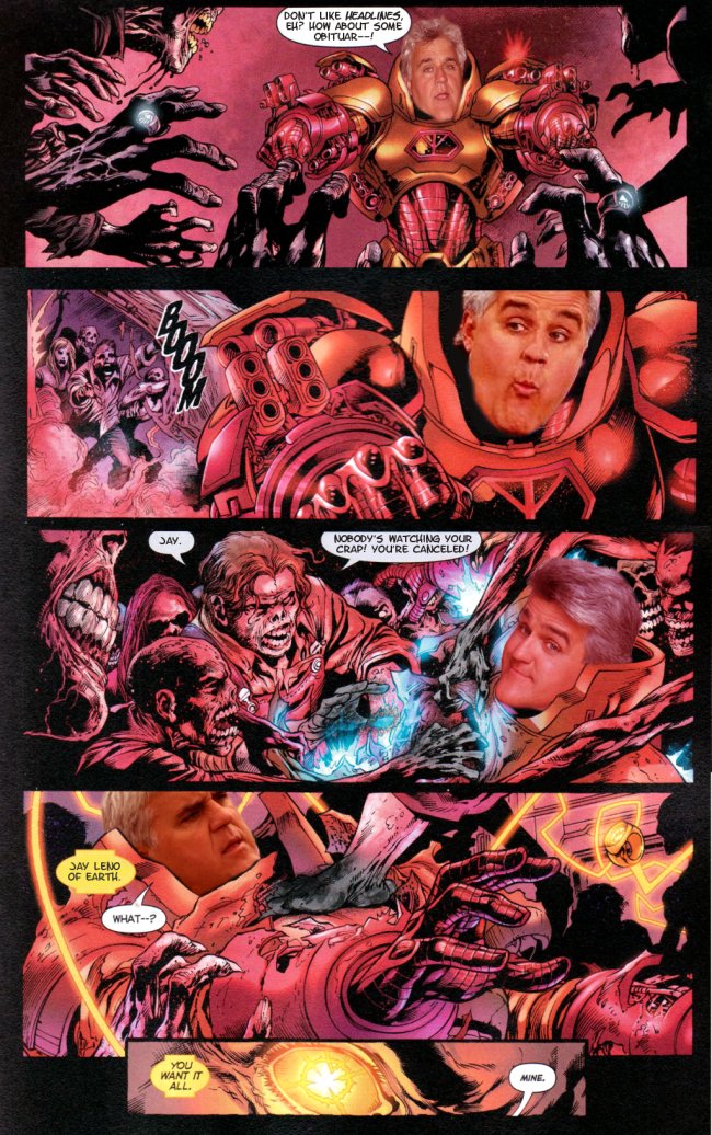
The introduction of Red Hulk is equal parts appealing and off-putting. He beats, outsmarts, embarrasses, and harasses everyone he goes up against, coming out on top each time. He’s the unstoppable force and immovable object all rolled up into one being. We’ve seen this before, where an author’s pet character is put over by beating up a recognizable character, but Loeb ups the ante to an absurd degree. Red Hulk punches out the Watcher in a beautiful spread. He beats Thor with his own hammer through the kind of plot maneuvering little kids routinely practice.

It is loud and it is dumb and it is on a scale that is extremely entertaining. It’s like being in a speeding car on the highway, doing 90 in the fast lane, during a pouring rainstorm. You know how things should work, and generally they perform as expected, but there’s that moment when you pull the wheel left and the car’s momentum shifts and suddenly you’re spinning and completely out of control. Then you stop spinning and you laugh and shake and laugh some more. It’s stupid, and it isn’t a good thing, but you get a weird rush off it.

Basically, what I’m saying here is that, when it comes to Hulk, the best possible comparison is Big Boi and Gucci Mane’s Shine Blockas. Jeph Loeb is the Gucci Mane of comics. He’s not great, but he’s catchy and doing something familiar in a slightly different way. He’s passable, just there to provide a little background noise (‘s gucci) and provide a way for the artists to put some drawings on the page. A little lowest common denominator, not very clever, but gets the job done. At the same time, the artists are the Big Boi in this extraordinarily tortured metaphor, banging out art that’s intended to impress you and drawing the kind of things they’ve apparently always wanted to draw. You check for it, and you feel a little bad over it, but you still seek it out to see what’s next.

You can look at the plot and work out the mystery yourself (Glenn Talbot is pretty clearly Red Hulk, Red She-Hulk is probably Betty Ross, Thunderbolt almost definitely isn’t dead), but all of that is beside the point.


The mystery is just a storytelling engine, something to throw Red Hulk into fight scenes with other characters. Loeb builds it up and ignores it in equal amounts. Domino sees Red Hulk transform, which sets off a story arc about Red Hulk trying to protect his secret identity. During the course of the story, there are no hints about who he is or what she saw, besides a guy in a hat turning into a monster.

Hulk is a book where the plot is secondary, at best, to the action. This is due in no small part to just how Jeph Loeb writes comics. From an interview on CBR a couple years ago:

Hulk fans will surely agree Ed McGuinness’ exaggerated and highly expressive style is uniquely suited for depicting the adventures of Marvel’s green goliath. Appropriately, the artist is himself one of professional comics’ most zealous Hulk devotees. “Ed has wanted to draw the character since he was a kid (and if you know Ed that was like two years ago) – so it’s just a pleasure giving him cool stuff to smash!” Loeb remarked. “And there’s a lot of that!”

“The Hulk is the type character that has affected me on the genetic level, ” Ed McGuinness told CBR News. “There’s just something so cool about this guy who has all the power in the world and can’t do anything to control it. I love the misunderstood monster idea, too. I want the Hulk to be a force of nature! I want the Hulk to wreck stuff! Who doesn’t?”

Writers always talk about “tailoring their scripts” to their artists. Sometimes it means adjusting the number of panels, adding or removing wiggle room, or something like that. When Loeb does it, though, I get the feeling that he’s just writing what his artist wants to draw first, and then fitting his story around that. Grant Morrison’s Seven Soldiers was tailored to all of its artists, but it was still primarily Morrison’s story. Hulk, though, gives Ed McGuinness a chance to draw almost every major Marvel hero doing what they do best: battling each other. And it continues on for all the other artists, too. Frank Cho gets to draw the lady-centric arc. Art Adams draws monsters. Ian Churchill gets to work some new artistic muscles. John Romita Jr gets to take a tour through the Marvel U and draw an amazing Kirby-style spread of the Fantastic Four versus the Hulk.


Comics, for me, are a 50/50 affair. Half of the appeal is in the writing, the other half is in the art. Hulk is a book where more than half of the appeal is in the art. Loeb gives these guys a chance to go wild, often leaving the plot or common sense in the dust, and the book is better for it. I wouldn’t want every book to be like this one, but Hulk? I like it a lot.

There are three, technically four, collections out right now. The hardcovers are annoyingly priced (25 or 20 a pop), but the first volume is available in softcover. Personally though, Hulk: Green Hulk/Red Hulk is the way to go. It’s in Marvel’s oversized hardcover format, which is honestly the absolute best way to read Marvel books, and collects the first couple arcs. Ed McGuinness, Frank Cho, and Arthur Adams’s art looks great at the size. If you’re in the mood for something loud and dumb, give it a try.

Post to Twitter Post to Facebook Post to Reddit Post to StumbleUpon

h1

Fourcast! 28: Squadron Supreme Power

January 11th, 2010 Posted by | Tags: , , ,

John provides a brief intro
-Theme music: 6th Sense’s 4a.m. Instrumental
-Gavin gave Esther Mark Gruenwald’s Squadron Supreme for Christmas. She gave him a scathing review in exchange.
-Psyche.
-We talk about Squadron Supreme, its place in history, and a few things Esther liked about it.
-David didn’t like Supreme Power much at all, seems like.
-CEOutro

Subscribe to the Fourcast! via:
Podcast Alley feed!
RSS feed via Feedburner
iTunes Store

Post to Twitter Post to Facebook Post to Reddit Post to StumbleUpon

h1

This Week in Panels: Week 16

January 10th, 2010 Posted by | Tags: , , , , , , , , , , , , ,

More meat than last week. Also features Deadpool’s new black glove fingernails. hermanos pointed them out to me and I can’t not notice them throughout that issue. Why does Deadpool now have black glove fingernails? Why?

Blackest Night: Wonder Woman #2
Greg Rucka, Nicola Scott and Eduardo Pansica

Deadpool Team-Up #897
Adam Glass and Chris Staggs

Read the rest of this entry »

Post to Twitter Post to Facebook Post to Reddit Post to StumbleUpon

h1

The Captain N Comic: I’m Gonna Take You Back to the Past…

January 9th, 2010 Posted by | Tags: , , , , , , ,

Me reading a Captain N comic didn’t happen because someone suggested it to me. Nobody told me that there was a Captain N comic. I didn’t stumble upon it or come across an issue in a bin anywhere. It’s just that one day I randomly reminisced about the cartoon and thought to myself, “Was there a Captain N comic book? I bet there was.”

Lo and behold, my instincts were correct. You know I had to get my mitts on this one. The five-issue series came out over the course of 1990, released by Valiant Comics. They released the Game Boy comic around that time, which I’ve reviewed months back.

To fully understand the comic and what makes it worth talking about, you have to understand the TV show. Captain N: The Game Master is a cartoon about a teenager named Kevin Keene who is so good at playing his NES that he and his dog Duke are pulled into his Nintendo by “the Ultimate Warpzone”. It’s there that he exists in a multiverse of videogame franchises, even if they weren’t Nintendo-owned. Armed with a controller belt buckle and a zapper gun, Captain N fights for the original character Princess Lana along with existing videogame heroes Kid Icarus (aka Pit), Mega Man and Simon Belmont. Those three are probably banded together due to their shared success in having awesome theme music. The main villain is Mother Brain from Metroid, commanding over the Eggplant Wizard, King Hippo, Dr. Wily and the Count (they couldn’t call him “Dracula” for whatever reason). Donkey Kong’s there too, but he’s more of a wildcard villain, like the crocodile from Peter Pan.

In concept, it’s a videogame fanboy wet dream. Unfortunately, there were some snags to the show, such as the character designs for the preexisting heroes. Kid Icarus is a midget who won’t stop adding “icus” to the end of his sentences, yet he’s the least problematic. Mega Man is also a midget, only pudgy and more annoying. They saw how dynamic and cool his 8-bit sprite was and came up with that? Then there’s Simon Belmont. Jeeeesus. Instead of a badass vampire hunter, he’s a doofy narcissist with pilot goggles. I get that these guys are all based on early 8-bit designs that lacked characterization, but as a marketing ploy, I can’t imagine any kid was thinking, “I want to play as that annoying, scratchy-voiced toddler in the green tights!” It got even worse in the third season when they introduced Alucard, re-imagined as a totally radical skater dude.

It’s like if Poochy wanted your blood.

Read the rest of this entry »

Post to Twitter Post to Facebook Post to Reddit Post to StumbleUpon

h1

Ian Churchill: Remixed, Relapsed

January 8th, 2010 Posted by | Tags: , , ,

I was never an Ian Churchill fan, even as a kid. I have some friends who really dig his stuff on the various X-books in the ’90s, but I never got into him. And when I came back to comics, his art was of a style that I definitely wasn’t into. It was a little too derivative of Jim Lee, but even more stereotypically Image Comics– unlikely breasts, boobsocks, stick legs, super long torsos, poor acting, etc. He was, in essence, what I didn’t like about superhero books.

supergirl-001supergirl-002supergirl-003

Back in October, I read interview on CBR with Churchill about him doing an arc on Jeph Loeb’s Hulk. The stuff about him adjusting his style in the ’90s to be more like Jim Lee in order to get more work was interesting. I’ve heard about Herb Trimpe trying a similar tactic and not meeting with much success. I read the interview, found it a little interesting, but still decided to skip the issues. How different could the style be? It’d still look more or less like his work on Supergirl, right?
supergirl-004supergirl-005

I skipped the first couple issues and didn’t think twice. I saw the cover to the second issue on a wall at the comic shop and was kinda surprised. It really, really didn’t look like Churchill’s style. Lots of spot blacks, no crosshatching, the hair wasn’t plasticky… weird. So I picked it up. That ended up being a good decision.

I really dig Churchill’s new style. He’s jettisoned a lot of what I disliked about his work and come up with something really interesting and neat. You can look at it and see some of Churchill’s flourishes. The chins are undeniably Churchill’s work, but overall, his style is something like Dan DeCarlo meets Ed McGuinness, with a small dose of Humberto Ramos in terms of character anatomy and structure. It looks good on the page, and is appealingly “superheroic” in terms of style.

hulk-001hulk-002hulk-003

I’m enjoying Churchill’s storytelling a lot more now, too. He’s still using around the same number of panels as in his prior work, but the cleaner style gives him room to make the faces more cartoonishly expressive. The figure work is better, too. There are still muscles stacked on muscles, but the lack of excessive detail makes it look cleaner, less cluttered, and more attractive.

A few artists I like have gone through serious changes to get where they are now. Chris Bachalo reinvented himself as as a monster of an artist, a guy who can make anything look good even as he weirds it up to the max. Travis Charest used to be a crappy Jim Lee knockoff before he was a master of hyperrealism. Patrick Zircher went from doing okay middle of the road stuff on Cable/Deadpool to knocking Terror, Inc. all the way out of the park with a fresh new style. (Ask Carla about his work on BLOOD COLOSSUS sometime.) With able assistance from Mark Farmer on inks and Peter Stiegerwald on colors, Churchill has managed to reinvent himself for the better.

hulk-004hulk-005

Post to Twitter Post to Facebook Post to Reddit Post to StumbleUpon

h1

New Hope for Red Robin?

January 8th, 2010 Posted by | Tags: ,

Alert reader Nathan Valle sent me an email.  A cunning gentleman, Valle opened the email with a link to this entry, knowing that I can’t resist reading my own work.  In the linked piece (on the off chance that you, the reader, don’t want to read my opinion all over again), I bemoan the fact that Tim has become grim, gritty, boring, and completely unrecognizable to long-time fans. 

It seems, though, that a change has come over Tim Drake.  There’s a new love interest, who both knows that Tim Drake is Robin and seems to be okay with it.  That cuts out a lot of the usual superhero love story cliches, in which a superhero keeps trying to make the relationship work while keeping the dominant facet of his or her life under wraps and therefore failing at both crime-fighting and love.

Tim also seems to be more cerebral.  The exact quote was, “he’s stopped acting like a crazy man and actually using his head.”  Good news, indeed.

And so Valle concludes, “So essentially this is my “there are no more sharks in the beach” “all clear” message, not a two fisted urging that you come back since Yost did decide to go this route in the first place and that may be enough for most to stay away, but I personally have hope for the future now.”

We shall see, sir.  We shall see.  I’m picking up Red Robin next week, and if it’s still all grim, I am calling you a liar to your face!  On the internet!

Any readers who wish to side with this gentleman can comment below.

Post to Twitter Post to Facebook Post to Reddit Post to StumbleUpon