Archive for the 'art' Category

h1

The 10 Most Awesomely Terrible Art Moments from WWE Superstars #6

July 21st, 2014 Posted by Gavok

The nice thing about being a blogger is that it’s like a tax write-off on buying terrible shit. It’s great when you read a great comic, see an awesome movie, or something like that, but if you pay for something lame, you can always twist it into an article. It’s really one of the best perks.

I can’t not read WWE comics and I’ve filled up big chunks of this site proving that. The latest attempt at a WWE series is WWE Superstars by Papercutz. It’s been written by wrestling legend Mick Foley and Shane Riches. I imagine Shane Riches wrote most of it. Anyway, the first four issues were just released in a trade under the name Money in the Bank. I reviewed it here. The arc was about reimagining WWE wrestlers as characters in an overly-casted crime noir story. A cool idea that wore out its welcome.

The art was mostly done by Alitha Martinez, who did an all right job. Most of the time, wrestlers looked like who they were supposed to and some pieces looked really nice. Other times, the pencils were rushed, as was the need to get through the story, meaning fight scenes all had an unnatural flow to them. Then in the fourth issue, Martinez was replaced for four pages by an artist named Puste and oh boy was it noticeable. Lifeless, awkward, incoherent and ripe with inconsistency, it was a complete trip.

For some reason, Papercutz decided to have Puste be the main artist on the current arc, which has the wrestlers actually being wrestlers. It’s a weird storyline called Haze of Glory that features Daniel Bryan, CM Punk, Rey Mysterio and Hornswoggle with a wicked hangover due to some spiked punch. The backstage area is in ruins, everyone blames them and they don’t know what in the hell happened. All they know is that they’ve been set up.

And yes, CM Punk is still a main character despite having been gone from the company since January.

I really can’t judge the wacky story on its own merits because the art is so distracting. Issue #6 alone has so many moments that make me shake my head that I’m able to make an actual top ten list out of it.

Let’s get started!

10) THE ATTEMPTED F5

Well. Lot of stuff going on here. Brock Lesnar is trying to F5 CM Punk and Goldust saves Punk with a kick to the nuts. Looks awkward, but okay.

Hornswoggle is bald here and that might make sense at first glance. After all, he recently lost a mask vs. hair match and for the past couple months he’s been bald in real life. Except in every single other panel he shows up in, he’s got a full head of hair. Remember, this comic is out of date enough that Jack Swagger calls Cesaro “Antonio” and CM Punk is there.

Puste seems to have a thing against drawing backgrounds most of the time, so for some reason the 4th of July is going off behind them. I don’t know.

9) CM PUNK CHOKES OUT MARK HENRY

A zombie CM Punk goes for Mark Henry’s brains and Henry seems almost happy about it.

He took out Cena too! You’ll… You’ll just have to take his word for it, okay? Punk certainly applies the sleeper an awful lot like the Anaconda Vise. Hm.

Read the rest of this entry �

Post to Twitter Post to Facebook Post to Reddit Post to StumbleUpon

h1

Check out this spread from Young Avengers 04

April 26th, 2013 Posted by david brothers

I made a joke on Twitter the other day that went something like “The trick to getting me to write about comics is to either make me mad, discover great art, or for me to come up with a dumb idea I think is funny.” The third one is why I wrote three thousand words about Quitely & Millar’s Jupiter’s Legacy (“I wonder if I could write about every page of this comic…”) and the first one is pretty much the only reason I write about industry-related things or news, as opposed to the actually interesting part of comics: the comics themselves. The middle one is why I clicked on a random link on Tumblr and saw this:

tumblr_inline_mlv1xdzATN1qz4rgp

Drawn by Jamie McKelvie, background inks by Mike Norton, script by Kieron Gillen, colors by Matt Wilson, and letters by Clayton Cowles. McKelvie talks it out here.

It’s good, right? I like this a whole lot. Bleeding Cool has a bigger version, but I think the small is good enough to wow.

Here’s a secret: whenever I write about comics, I’m not trying to show you why something is good so much as figure out how to express why it clicks for me. I don’t draw comics. I don’t write them. I read them. I don’t know from pens and quills, but I do know my taste. And I’m drawn to things that are either immediately understandable — a Frank Miller or Masamune Shirow action scene, some Katsuhiro Otomo rubble, a pretty girl drawn by Inio Asano, an Amanda Conner face — or so striking that it makes me look twice.

Let’s be real: you don’t study every panel in a comic, even in the good ones. I love several dozen panels in Frank Miller & Lynn Varley’s Dark Knight Strikes Again, but I’ve never looked at the panel of the weird mutant orphans escaping from jail and rubbed my chin, you know? It’s not that it’s not important. It’s just that it’s normal. Sometimes you just take things in stride until something appears that forces you to pause.

That pause is one of the reasons why I love comics. I want to be challenged and surprised when I read, and the best way to do that is to throw something at me that I either haven’t seen before (Masamune Shirow cranking up the panel count in Appleseed) or that’s familiar, but perfected or done in a new way (Frank Quitely’s work on We3 is a new spin on the same tactics Shirow was working with).

(I get the same thing out of rap, here and there. I want to hear bars that make me go “unh!” by accident like I was an old black lady in church and the preacher just said something wild profound.)

This McKelvie spread puts me in mind of Bill Keane’s Family Circus more than anything else, and it’s exactly what I want out of comics. There’s also this from McKelvie’s explanation:

Kieron mentions in the AR segment for the book that when you make comics as a team you’re really trying to pretend to be one person making the whole thing. That’s why we believe the best comics come out of close collaboration, and not just a production line.

You can tell when an artist and writer are in sync, I think. Or at least, I’d like to think. Who knows if I’m right, But either way, we need more stuff like this.

Post to Twitter Post to Facebook Post to Reddit Post to StumbleUpon

h1

The “Macho Man” Randy Savage Plus Prop Challenge

October 15th, 2012 Posted by Gavok

It’s become a recent tradition for me to do the Plus Prop challenge every time I make a visit to New York Comic Con. First time it was with Venom and that was fun. Then I used Juggernaut and that worked out well too. This year I wasn’t sure who to use. With so many choices and some reader support, I settled on using the late, great Randall Poffo, known by many names: Bonesaw McGraw, Rasslor, Leonard Ghostal and most famously, “Macho Man” Randy Savage.

And so, I spent much of Comic Con’s four days badgering various comic artists for commissions at Artists’ Alley. The challenge is to draw Randy Savage plus another object. Any object. What that object is is up to the artist and not me. This one ended up being a ton of fun and most of the artists were incredibly into it. Before he even drew anything, Chris Giarrusso and I spent like a half hour talking about how great Savage’s promos were. So sit back and snap into the fruits of their labor.

YEAH! DIG IT!

Randy Savage with Skull
by Jacob Chabot

Randy Savage with Mjolnir
by Chris Giarrusso

Read the rest of this entry �

Post to Twitter Post to Facebook Post to Reddit Post to StumbleUpon

h1

Steve Lieber & Rachelle Rosenberg on Alabaster: Wolves

March 28th, 2012 Posted by david brothers

I like Steve Lieber’s work, though I’ve been crap at saying so. I spoke briefly about Underground, his book with Jammin’ Jeff Parker, and even did a podcast about it. He’s done other stuff I liked. I remember some Batman-related work, a 52 spinoff… stuff here and there.

I was surprised to trip over his work in Dark Horse Presents 9, in a story called “Alabaster: Wolves.” I didn’t know he had comics work coming up to begin wtih, but the real bombshell was how good it looked. I like when good artists suddenly show up better than they were before. It’s like–what changed in this person’s life? What did they change about their approach? Did they happen upon some new technique by accident? If you look at Daredevil Frank Miller and Ronin Frank Miller, something is different. Quantifiably different, yeah? It isn’t incredibly different, but it is different.

Same thing here with Lieber. I can’t really put my finger on it, but his story in DHP 9, featuring a script by Caitlín R Kiernan and colors by Rachelle Rosenberg, popped. Some of it is Rosenberg’s great palette. Flammarion, the albino girl, stands out in the grungy watercolor-y surroundings, and the splash of red across the werewolf’s cheeks is so good. But Lieber’s faces feel like they shot up another level, or maybe to a sideways level, or something. His body language is great. Lieber even drops the backgrounds out of a few panels, including one in this post, and it just looks great.

I dunno. I don’t really have anything to say but “look how nice a job Lieber and Rosenberg did on this comic.” I liked Kiernan’s script, too. I liked all the parts, so much so that I’m on the hook for Alabaster: Wolves 1 in April despite not knowing nothing about the series. That’s a good feeling. It’s like finding something new in the middle of something familiar. “I like this guy’s work, so let me take a–WHOA, what is this? This looks great!”

You can check out DHP 9 for like four bucks. There’s some Kristian Donaldson, Richard Corben, and Geof Darrow in there, too, so I can’t really see you being disappointed with it, art-wise. Great Mignola cover, too.

edit: Turns out Dark Horse released this eight-page story for free this week.

Post to Twitter Post to Facebook Post to Reddit Post to StumbleUpon

h1

Frank Miller: Best In Flight

March 23rd, 2012 Posted by david brothers

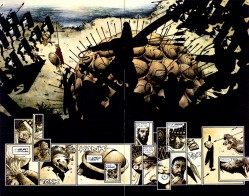
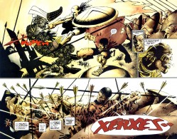
One thing I’ve long enjoyed about Frank Miller’s work is how he draws a body in flight. Not in motion, though he’s good at that too, but in flight. Leaping, falling, swinging, jumping, or flying. He has this way of suggesting bodies flashing past at high speeds and spinning through the air that’s… elegant, is the closest word I can think of for it. Especially mid- to late-era Miller. The big splash in Dark Knight Returns — you know the one, if not, guess and you’ll probably be right — is obviously cool, but it’s not as raw and frantic as his Sin City and 300 work. I actually have a selfish wish that he’d gotten to do a real Spider-Man job at some point over the years, just because he’s so good at this and he’s fond of lean, scrawny heroes. Would’ve been the best leap forward in Spider-stylings since Todd McFarlane.

I like this page from the end of 300, color by Lynn Varley:

I love the claustrophobic stillness on that first page. Everything is on hold, like a pregnant pause. Every panel is one still moment, fraught with tension. I actually love the little zoom from “You there, Ephialtes.” to “May you live forever.” And then, at the peak of the stillness, “Stelios.” And then:

Stelios coming out of formation and into the air. This is Stelios on the way down, long after his leap. He’s all muscle, whether leg or arm, and his cape is all the way Batmanned out. There’s such a shift between these two pages, from claustrophobia to freedom, maybe. Anyway.

I can’t decide which page of Holy Terror is my favorite. Here’s one of them, though.

Miller does some of his best work yet in the service of a story that doesn’t even deserve it. He also does some of his worst work, so I guess it evens out. But this page of Fixer chasing Natalie Stack is like a shot across the bow of cape comics, most particularly the ones that sit in Miller’s lane: Spider-Man, Daredevil, Punisher, all those books that feature dudes running across rooftops and through alleys in New York.

There isn’t even a lot to this page. The building is a raggedy amalgamation of every building ever. Look how thin it is, how many pipes and antennas sit on top of it, and that useless pipe going down the side. The night sky is just a splash of white with a smudge of black clouds providing flavor. But look at Natalie Stack flipping up and over that pipe. Feet together, arms in the process of flexing, and body nearly horizontal. There’s a sense of momentum in her body language. She looks like people do when they jump over fences at high speeds. She’s not just climbing or running. She’s moving.

And then there’s that fist. The staging here is great. You’ll occasionally get a story where Batman lurks in the shadows for part of an issue (most recently in David Lapham & Ramon Bachs’s City of Crime, I think), but by and large, if there’s a hero on the page, he takes precedence over everything. Not here. Here you just have a fist and a taut rope. You don’t even have to see the Fixer to know that he’s moving fast. All you have to do is let the image sink in a little. Think about that taut rope, the angle of his arm and where his body is likely positioned.

I also love the punctuation-less word balloon, something that too few comics creators utilize these days. “Oof.” has a different impact on your brain than “oof” does. Exclamation points are excitement. Periods are flat. A lack of punctuation has a sound and import all its own. It should be a tool in the toolbox, rather than an exception.

Another favorite:

The rope, the loops, the soles of the Fixer and Natalie’s feet… I just love how this looks. People talk a lot about flying representing freedom. The freedom to go anywhere and do anything at will. Freedom in its purest form. Nobody can tell you “No” or hold you back. But nobody ever talks about swinging. You don’t remember being a kid and that vicious thrill you got when you could swing on a rope or slap your way down the monkey bars at recess? Of sitting in a swing, getting up as high as you can, kicking your shoes off even higher, and then launching yourself into the air to risk either death or glory?

I don’t want to over-sell the feeling, but I grew up in and around areas where monkey bars were everywhere and chain link and wooden fences were even easier to find. But there’s definitely a thrill, every single time, when you don’t climb a fence so much as leap over it, pushing yourself up and over. It’s different from flying and falling, but equally dangerous. It’s like the bastard child of both of them. You could screw around and catch your hand on the sharp part of the fence instead of the round pole, or misjudge your jump and land on the fence or worse. But if you hit it just right, that combination of momentum and weightlessness kicks in and you feel real good. It’s a thrill.

That’s what that page feels like.

Post to Twitter Post to Facebook Post to Reddit Post to StumbleUpon

h1

a quick look at comedic comics

December 8th, 2011 Posted by david brothers

I was listening to The Roots’s undun on the way home. On the song “One Time,” Dice Raw ends his verse with “to make it to the bottom, such a high climb.” It’s one of those lines that kicks your feet out from under you. It’s not just something intensely sad. It’s something where the implications are horrible. It’s despair that sticks to your ribs. It got me thinking about other things in media that are sad like that, and I think there’s a post in it. I have to work through it a bit more before it’s go-time, though.

It’s a huge downer of a subject. (“Why didn’t they stop my mum and dad fighting?”) That got me thinking about the funny parts of comics, the gags that are the polar opposite of the things that kick your guts out. They make you pause in place to collect yourself, you show them to your friends, and you do a really poor job of retelling the joke at your earliest convenience. The good jokes are ones that break the flow of the comic, but not necessarily in a bad way. I mean, on a certain level, anything that takes you out of the book is bad, but I don’t think that enjoying something so much that you get pulled out of the work is bad by any reasonable standard. I bought a couple books this week with good ones.

I started writing this and realized I was just explaining jokes. That’s dumb. Here’s a list of stuff I thought was pretty funny, and hopefully I’m not ruining the jokes with my words.

Zeb Wells, Joe Madureira, Ferran Daniel, and Joe Caramagna create Avenging Spider-Man, and it’s definitely a worthy book. Wells writes the best Spider-Man in the business right now, and the series plays to Joe Mad’s strengths. He actually draws a pretty great Spidey, but it’s J Jonah Jameson that he really goes to town on. Wells, too. The second issue dropped this week (four dollars, ugh), and I really liked this exchange:

Eiichiro Oda’s One Piece is still basically the best comic. I read volume 60 and it was pretty great. One thing Oda excels at is smart dumb humor. Monkey D Luffy is an idiot, at best, and a lot of the jokes come from that. The best jokes come when Oda plays up the Looney Tunes absurdity that’s lurking beneath his art. He does a great job with people pulling faces, but his comic timing is pretty great, too. He likes to throw in a beat before the joke starts. You aren’t quite sure what’s gonna happen, maybe he’ll play it straight, and then bam, there’s that punchline. First bit, read it right to left:

It reminds me of another, similar joke earlier in the series. In volume 53, Boa Hancock, the most beautiful woman in the world is taking a bath. Luffy drops in out of the sky, sees her nude, and she attacks him with her attack that uses the dirty thoughts in men’s minds to turn them to stone. Luffy mistakes it for something else, another attack that slows you down. He gets caught in the blast, slows down, and then pauses. Nothing happened. Hancock looks at him in shock, does it again, and Luffy stands there awkwardly before trying to get away. He’s too stupid for dirty thoughts. (Later, Hancock falls in love with him. He remains oblivious.)

One more:

That three panel sequence of the monkey trying to use spit to fix his wound kills me. It’s so dumb.

One more one more, because I like this, too:

The puns on Luffy’s shirts are great. It’s not fall out of your chair funny, but I appreciate the fact that Oda puts that much effort into things that are really hard to see.

Next week: sad songs.

Post to Twitter Post to Facebook Post to Reddit Post to StumbleUpon

h1

The Juggernaut Plus Prop Challenge

October 17th, 2011 Posted by Gavok

Last year, I went to NY Comic Con, stared Artist Alley in the eye and laid down the gauntlet for the Venom Plus Prop Challenge. The bounty was wonderful. Naturally, I’d have to think of a new subject for my sketchbook during this year’s Comic Con trip. Venom is out and Juggernaut is in.

The theme is simple: Juggernaut and another object. Any object. It’s not for me to suggest what it is, but for the artist to come up with the idea. Luckily, nobody gave him a hammer because look where that put him. Depowered and off Marvel’s best book. And nobody drew Colossus in a Juggernaut helmet because that’s lame and smelly. You know it’s true.

Let’s see what we got.

Juggernaut with Umbrella
by Chris Giarusso

Juggernaut with Cell Phone
by Jacob Chabot

Read the rest of this entry �

Post to Twitter Post to Facebook Post to Reddit Post to StumbleUpon

h1

I like the sex scene in Catwoman #1. It’s the rest of it that’s the problem.

September 30th, 2011 Posted by Esther Inglis-Arkell

This is a response to the overwhelming talk about Catwoman #1 on the internet.  It started, of course, with Laura Hudson’s post on Comics Alliance, which I have mentioned before and which is now up to over 2100 comments.  (If we could match that on this post, I would be pleased.)  Next I heard about Catwoman on the Wait, What? Podcast with Jeff Lester and Graeme McMillan.  They mentioned that Judd Winick made a statement about Catwoman, which he wrote.  The statement goes like this:

This is a Catwoman for 2011, and my approach to her character and actions reflect someone who lives in our times. And wears a cat suit. And steals. It’s a tale that is part crime story, part mystery and part romance. In that, you will find action, suspense and passion. Each of those qualities, at times, play to their extremes. Catwoman is a character with a rich comic book history, and my hope is that readers will continue to join us as the adventure continues.

A quibble or two: Catwoman has almost always been a person who lives in our times, wears a cat suit, and steals, right up to the last issue of her last run, which I believe was in 2011 or 2010.  None of that is new.  The only new thing that you’re bringing to the book is the explicit sex scene at the end between Batman and Catwoman.  Because the cover of Catwoman let me know it wasn’t for me, I didn’t pick it up at the store, so the only scene I saw from the comic, when reading about this, was the sex scene.
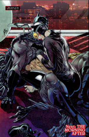
I thought it was great.

The art was not my cup of tea, but I thought the sex scene was a good innovation in continuity.  First, I liked the idea for the relationship.  I like superhero romance in general.  I think it can be fun and interesting and sexy,  and it necessarily turns the focus on the characters.  Batman and Catwoman have been mutually involved before, but not, to my knowledge, when she was still a thief.  I think it brings up all kinds of really uncomfortable dimensions to both characters that would be interesting to explore.  What does it say about Catwoman that she either cozies up to a guy who is out there solely to put her in jail or has sex with him in the belief that he won’t take her to jail?  And what about Batman?  He knows she’s a thief and knows where her apartment is and knows that she’s putting innocent people in danger with her illegal activities.  And yet I didn’t see him bring out the cuffs.  What does it say that if Batman is attracted to you, and you have sex with him, he’ll let you get away with a crime?  Suddenly both characters have serious feet of clay, and they’re in a situation that cannot last.  It’s interesting.

What’s more, I was fine with the explicitness of the scene.  I think the fact that it made clear, through art and story, that both of them are angry with themselves for doing any of this, and the last panel, with them collapsed together, not looking at each other, just before all hell will probably break loose was a good cliffhanger, in my opinion.

Ah – but then I borrowed and read the rest of the book.  And learned that all of that ‘romance’ and ‘passion’ and woman ‘of our times’ stuff was ridiculous.

To see why, let’s work back from the end.  Here we have Batman and Catwoman, two people who are deliberately are in a bad relationship, but are so passionate that they just can’t help themselves.  You can make a case for this being a sexual woman, who makes a romantic choice that will pose problems for her later.  Fine.  Interesting, even.

Just before that, Selina is at a party, trying to pick up tips for where to find high-value items that she can steal.  She’s in a red wig and posing as a bartender.  Suddenly she sees a man, who she says is ‘supposed to be locked up.’  She flashes back to a scene from her adolescence.  She huddles against a wall, terrified and crying, as the man uses a gun to kill a woman right in front of her.  Back at the party, the man goes to the bathroom.  Selina follows him.  She finds him with his back to the door, over the toilet, obviously about to pee.  She gets his attention, and the first panel we see of her in this scene is this:
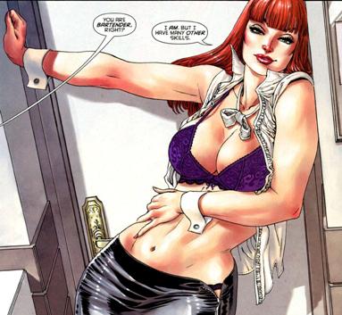
He makes some comment, she moves to embrace him, and then beats the hell out of him.  She smashes his face against the sink, and then claws and hits him as blood splatters everywhere.  Then she changes into her Catwoman suit and flies out of the party, knocking down everyone in front of her and getting down the hall before anyone at the party can even make it out the door.  She’s hurt and sad, and ‘just wants to go home.’

Here’s the big stumbling point.  Why did she open her shirt just then?  I’m serious.  Consider why she would do that.

Well, maybe she was trying to distract him?

No.

The panel before she spoke to him, he was completely relaxed, facing away from her, his pants undone, and unaware that she was even in the room.  Not to mention this is a woman who is a good enough fighter to fight her way through a mobbed-up party, tackle and pin Batman, and leap out into the air to escape a group of guys with guns.  She doesn’t need a distraction to beat up a white-haired man who needed a gun to intimidate an unarmed woman ten years ago.

Maybe she wanted him to see her coming?

No.

There’s no indication that he ever knows her name,  or she wants him to know who she is.  If she wanted it to be real payback she would have taken off the wig, not the shirt.

The lack of a concrete reason for her to do this indicates that this is a gratuitous and inappropriate shot of Catwoman with her shirt off.  That’s not necessarily true.  There is a character-appropriate reason for doing this, but it changes things.

Remember, this is a guy who stopped her cold a panel earlier.  He literally made her flash back to what had to be one of the most terrifying and helpless moments of her life.  And her immediate reaction was to display herself sexually to him.  This display isn’t the same as sexual power.  She’s not grabbing his crotch, or making him sexually afraid, or even sexually intimidated.  She’s trying to please him in order to make herself feel more powerful and in control, even though it’s clear that she can beat him through strength alone.  This is how she reacts to fear, disgust, and helplessness; being sexy.

Go back to the Batman and Catwoman tryst at the end.  Batman is a guy who knows where she lives, who she thinks might know her name, and who she knows ‘should’ be hauling her to prison.  Kind of puts another perspective on it, doesn’t it?  It’s not ‘passion’ or ‘romance’ anymore.  It’s not Selina being sexual.  It’s a response to fear and powerlessness – a need to use sex to win over a man and make herself feel in control.  This makes it pretty sad when she tackles the guy who broke into the apartment she was using as a safehouse and proceeds to have conflicted, angry sex with him.  If we take these two incidents together, this sex scene is not empowered female sexuality, it’s a panic response.

And then what does that say about Batman?  Before, he was a man who ruthlessly hunted down criminals and brought them to justice – but who let it slide when it came to the woman he was attracted to and who had sex with him.  Now we see that sex is Selina’s response to stress and trauma.  In essence, she has a compulsion that makes her try to bargain her way out of difficult situations with sex, and Batman, knowingly or not, is going along with it.  That’s really awful.  It’s a demonstration of how morally bankrupt it is for Batman to have sex with her in the first place, and how deadened she is.  This book is looking pretty dark.  It’s about a woman who’s clearly been abused and whose first, instinctive response to danger is to try to appeal to people through sex.   It still can make sense, though.  It can still be a good character portrait.

Now let’s go farther back.  The first page has her fleeing her apartment as a gang is pounding down her door.
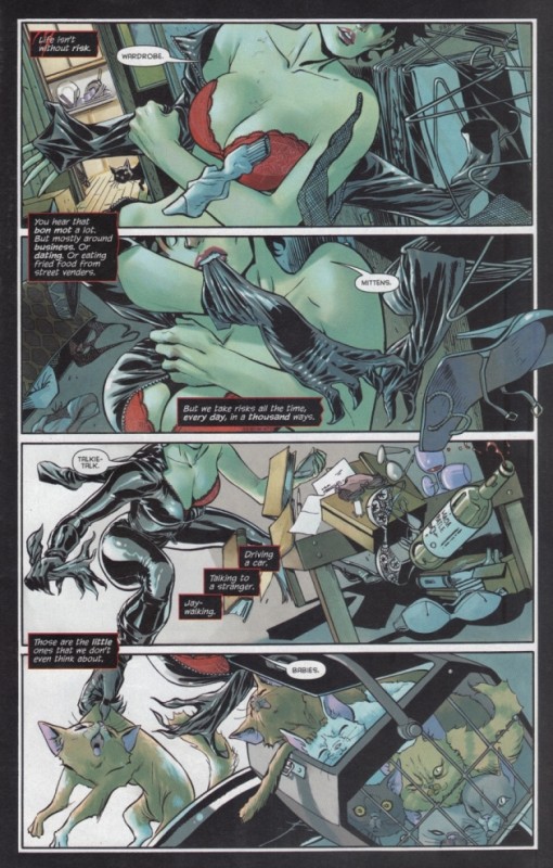
The more astute reader will notice that the voice is flippant, the boobs are front and center, and she has no head.  Given the intensity and bleak sexiness that we see in the last half of the book, this doesn’t really fit in well, but maybe her introductory panel will show us more of her fear –
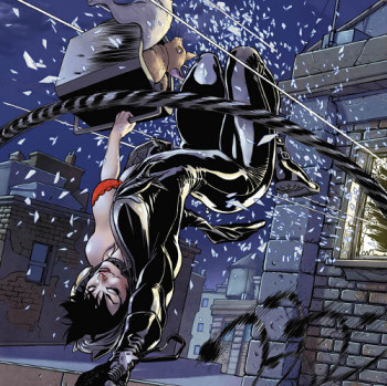
 

This panel can be summed up as, “Wheee!  Mortal danger is fun and my shirt is just coincidentally open!”

And what about the cover to this issue.  Does it expose the fun she has running free through the night ahead of her attackers?  Does it show her desperation and dark past?  Does it emphasize the romance and passion?
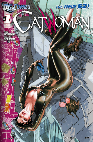
I think we can all agree it shows none of them.

And the reason it shows none of them is none of them exist in this book.  This isn’t a book about a dark, desperate character who clings to sexuality as a way of trying to deal with a crazy world filled with mystery and action and violence.  This isn’t a book about a fun-loving, sexy thief.  This isn’t a book about a star-crossed romantic thief in a relationship with her adversary.  This is a book about boobs, and Selina Kyle will be whatever kind of character she needs to be in order for her breasts to be exposed as much as possible.  When people talk about mindless sex dolls, ciphers, or degrading portrayals of women, this is what they mean.  There’s no character there – no story and no mystery and no adventure and no romance and no passion.  There’s whatever will put the character in a suggestive pose.  So let me change the statement.

This is a Catwoman for 2011, and my approach to her character and actions is tits.  There are tits on the cover and there are tits on the front page and the last page cliffhanger is meant to show the promise of more tits in future issues.  In these, you will find action and suspense and passion, and each of those qualities will go to extremes that cause Catwoman to get her tits out all the time, because that’s the way she responded to everything in this book.  Let’s face it, the only reason that we didn’t call this Catwoman #Tits is because we made a line-wide stylistic choice to start all new books at #1, and we’re not going to change that for a flimsy, inconsequential tittybook like this issue of Catwoman.


Post to Twitter Post to Facebook Post to Reddit Post to StumbleUpon

h1

Why I put back the Red Lanterns book.

September 25th, 2011 Posted by Esther Inglis-Arkell

To start off, I’d like to link to Laura Hudson’s excellent post at Comics Alliance.  She hits the nail on the head exactly when talking about male and female characters and their sexuality.  It’s worth a read, but for those of you with limited time, it can be summarized in three points.

1.  The ‘sexuality’ expressed by female comic book characters is not female sexuality but male sexual fantasy.

2.  In several important books male characters are shown as heroes first while female characters are shown as expressions of sexual fantasy first.

3.  That is really sexist, and makes her want to turn away from comics despite the medium being both her primary interest and her job.

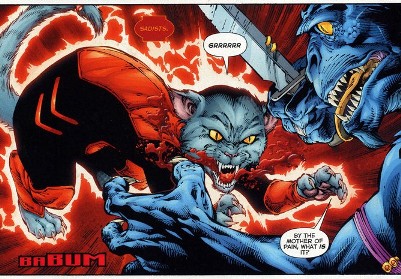
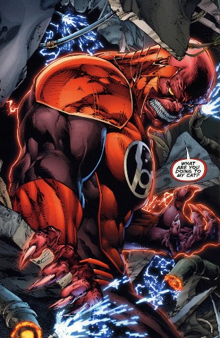
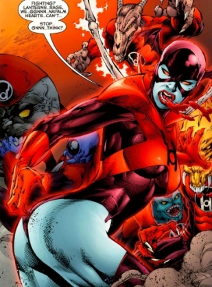
The post focuses on Catwoman #1 and Red Hood and the Outlaws #1.  Catwoman I knew was not for me the moment I saw the cover.  Red Hood, though, had two characters in it I was interested in and one character in it I was unfamiliar with – but the  images that Laura shows of the male heroes juxtaposed with the female heroes are why I put it back on the shelf, feeling exactly as depressed and turned away from comics as she did.  I thought I’d add one more example.  Two weeks ago Red Lanterns #1 came out.  I thought the rainbow of lanterns corps was a stupid idea when I first heard of it, but seeing what DC did with it, I realized I was wrong.  I grew to love the idea, the wacky joy that it brought to comics, and the many different stories and characters it spawned.  I was excited to pick up the book.  Then I looked through it.

This is the introduction of Red Lantern 1

This is the introduction of Red Lantern 2

This is the introduction of Red Lantern 3

And I put the book back on the shelf.

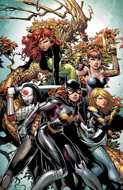
On the plus side, I will have more money for Batgirl and Batwoman, since I’ve seen the upcoming Birds of Prey #4.

What is this, a Bratz doll catalog?  Even the Teen Titans cover looks more badass.  Why are they all twelve?  Why do they all have the same face?  Why is Barbara knock-kneed?

Post to Twitter Post to Facebook Post to Reddit Post to StumbleUpon

h1

WWF Krozor: The World Champion of Bad Comics

September 17th, 2011 Posted by Gavok

I’ve read and reviewed every WWE comic book under the sun. From WWF Battlemania to World Championship Wrestling to the Chaos Comics stuff to WWE Heroes. As it is, the only thing I haven’t talked about yet is the 2-issue Undertaker/Rey Mysterio team-up sequel to WWE Heroes because I’ve been waiting for the seemingly canceled follow-up where John Cena is a gladiator trapped in the past. Yes, I just typed that.

Anyway, I figured I had seen it all. I had seen the worst that World Wrestling Entertainment’s checkered past could show me. Then one day, a guy by the name of Tato changed all of that. He had some old WWF Magazine issues and had been looking through them for laugh fodder. He ended up striking oil when he got to early 1997.

Now, first let’s take a quick look at what WWF was like during that time. They were setting up for Wrestlemania 13, the Wrestlemania with the worst PPV ratings in the company’s history. Shawn Michaels was so much of a backstage dick that rather than lose the title against Bret Hart, he milked an injury, claimed to have “lost his smile” and put us in a situation where Sycho Sid was the champ set to defend the belt against the Undertaker. Also, “Stone Cold” Steve Austin had been gaining a lot of momentum as a popular antagonist, constantly badgering honorable good guy Bret “The Hitman” Hart. Wrestlemania 13 would be the show to switch Austin into the company’s most popular good guy.

Of course, the company couldn’t know that Austin would catch on so strongly and help bring forth a new, lucrative era to the WWF. As it was, they were moving closer and closer to bankruptcy at the hands of World Championship Wrestling and their hit storyline with the New World Order. WWF was desperate and desperation can lead to some really unfortunate ideas.

In some issues of WWF Magazine, they’d show an ad for… something. Here are the two released.

Yep. They’re coming. I don’t know what they are, but they seem to have distracted Mankind from his psychedelic surroundings and what appears to be a melting ice cream bar in his hand. It looks like Steve Austin’s on Mars and while he has no trouble breathing, he’s bundling up due to lack of shirt. The more I look at the second one, the more I’m focused on whatever that is behind Austin. Is it a drill? A monster? A tree of some sort?

Of course, you can always tell quality when they use three exclamation points. That’s pretty freaking loud.

Who is coming? Who better than KROZOR?! Once you’ve gotten over the art of the above images, you might be wondering what the hell a Krozor is. Look no further than this snippet of an essay former WWE employee Kevin Kelly wrote up about WWE focusing on young viewers.

As bizarre as the concept of wrestling targeting kids, it’s been tried before. After the New Generation nearly bankrupted the company and then turned into the Attitude Era, the company tried to go back and target kids again. It was a laughable disaster. To anyone inside the Walls of Titan reading this, go to someone who’s been with the company more that ten years and ask if they remember “Krozor”? Let’s take you back to early 1997 and the Company Meeting held at a non-distinguished hotel in downtown Stamford, which is the worst town I have ever been in.

Jim Cornette and I sat in the back of the room as some old guy, who was an outsider hired for large coin, got up and began a video presentation. The audio on the tape was unmistakable. It was the theme from 2001-A Space Odyssey. Yes, Ric Flair’s theme! And right as WCW was stomping us in the ratings! So, of course, Corney and me both let out a “Whoooo!” at the right point of the song. 400 people in a room and two assholes gotta ruin it! Goddamn that was funny!

Jimmy and I are practically pissing our pants we are laughing so hard as the preview of “Krozor” rolls along. Apparently the Undertaker is going to be in space and fight monsters or some nonsense in this comic book. There was more but it’s hard to focus on the screen when you are crying from laughter. The preview ends… stunned silence followed by polite applause. It was awkward, like if your babysitter asked you and your wife to review her newest porn movie. You feel obligated to like it but it was wrong on so many levels.

Wow. Okay, let’s dive into this.

Read the rest of this entry �

Post to Twitter Post to Facebook Post to Reddit Post to StumbleUpon