h1

Genius: Renegades, Never Slaves

July 11th, 2014 Posted by | Tags: , ,


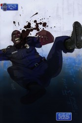
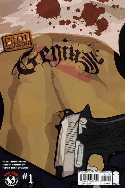
Way back in the bad old days of 2008, I read a comic called Genius. It was part of Top Cow’s Pilot Season program, an initiative meant to bring new blood into the industry and to the company, and it was created by Marc Bernardin, Adam Freeman, and Afua Richardson. Now, it’s 2014, I work at Image Comics, and Genius is on the way back this August as a weekly miniseries.

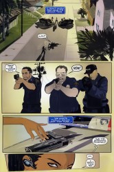
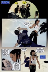
The concept of Genius struck me first. There have been several incredible military leaders throughout the years, and the latest is Destiny Ajaye, a young woman from South Central. Rather than becoming a kingpin or joining the military, she takes another route: armed insurrection. She unites the gangs and goes to war against the LAPD.

I’m an ’80s baby whose life was changed by Spike Lee’s Malcolm X and has spent a lot of time writing about the intersection of black culture and comics. The concept alone spoke to me, it reminded me of conversations and boasts that felt familiar and real. Bernardin and Freeman’s dialogue was on point and natural, authentically “black” without tipping over into parody or offensiveness. Richardson’s art was the bomb, inventive and kinetic and off-beat in all the right ways.

Genius hit me in my heart. There aren’t a lot of comics coming out of mainstream houses aimed at people like me, much less specifically me, but this one? It’s a comic that’s tailor-made for me, it feels like. The concept, the art, the focus on a majority-black and brown cast…there is something about Genius that other mainstream comics are lacking. It’s something different, something outside of the usual Direct Market experience.

It’s a familiar story, a Hero versus the enemy with an army at her back, but the twist is in the character work and the artwork. The characters feel familiar and honest, and Richardson’s artwork ranges from staging natural moments in a surreal manner to perfectly-emotive conversations. The creative team clicks for me.

A side effect of my job at Image is that I got issues 1-4 early as part of the production process. It’s work, but I read them while I was on vacation instead of waiting until I got back. I read them because I believe in Genius and Bernardin and Richardson and Freeman and I’m excited for this comic.

Final Order Cut-off for the comic is Monday. It’s shipping weekly in August, with two issues hitting on the last Wednesday of the month. If you shop at comic shops, tell them you want it. The Diamond Code for #1 is JUN140478, if you need it. Pre-ordering helps comics a lot, and for a book like this that’s sitting left-of-center with what’s prevalent, you’re going to need a little extra legwork to get what you need. You don’t have to pre-order it, it’ll presumably be available in a digital edition, but if you’re the pre-ordering type and you trust my taste, please call your shop and hook it up. I’m a fan, and I hope you will be, too.

I wrote about Afua Richardson for Black History Month 2011 and about Genius for ComicsAlliance in 2010.

Post to Twitter Post to Facebook Post to Reddit Post to StumbleUpon

h1

This Week in Panels: Week 250

July 6th, 2014 Posted by | Tags: , , , , , , ,

It’s time for This Week in Panels! The weekly segment where my wonderful contributors and I all take the comics we’ve read over the course of this week and cut them down into one panel. One representative panel that tries to explain the issue. We’ve only been doing this for… oh shit, 250?! Christ.

Yes, it’s Week 250. For nearly five years I’ve been doing this series. I started this back when Old Man Logan and Blackest Night were still going on. I originally got the idea during the short time I was writing at Pop Culture Shock. I did a bunch of one-paragraph comic reviews every week and I hated it. How many times can you write the same review of Ed Brubaker’s Captain America?

A few years before that, one comic site I can’t remember (probably Newsarama) had a preview of an upcoming issue of Civil War. Rather than show several pages, it just showed a handful of panels without context. I found the whole thing more intriguing than if we got the regular style of preview and I guess that just stayed with me. Another thing that stuck with me was when people would talk about the first Agents of Atlas series. One thing I’ve read once or twice was that it didn’t matter what you had to say about the comic in terms of opinion. Just show the panel of a 1950’s robot running down a hallway carrying a talking gorilla while said gorilla shoots four guns via both hand and both feet. That says everything.

I figured that I read a bunch of comics on a weekly basis, but nobody really had any interest in my opinions. Why would they? I’m just some guy on the internet. Worse than that, I’m a guy whose favorite character is an alien-wearing journalist-turned-hobo with delusions of grandeur recognized for being one of the poster boys of everything wrong with the 90’s. My opinions should be taken with a grain of salt. Why talk about what I read when I could just show you in its purest form and let you decide for yourself? I suggested the This Week in Panels idea to David and he put a cigar out on my face. I took that to mean, “Yes, go ahead.”

ThWiP has been very good to me and I was happy to see that it got enough regular readers and regular contributors. Gaijin Dan and Space Jawa especially, who never missed a beat when it came to sending me their stuff. I’m glad to see my idea was vindicated and it kept enough people interested.

With a heavy heart, I’m announcing that after 250 wonderful weeks, I’m stepping down from This Week in Panels. It sucks, but I need to move on. One of the things about starting ThWiP was that I wanted to do a weekly series for the sake of proving to myself that I could hit a regular deadline. And I did. Unless there was a hurricane or some kind of power-destroying storm, I hit the update every Sunday. Then I got my position at Den of Geek US, which has responsibilities beyond just writing articles. Plus my main job has been keeping me busier and busier. ThWiP updates went from regularly happening over the course of Sunday night to late Monday night or even early Tuesday morning. Simply put, I actually have real deal deadlines to deal with now.

Hell, I haven’t written a non-ThWiP update for 4thletter! since WrestleMania happened. I kind of need to rectify that and I have only so many hours in the day.

ThWiP isn’t done-done, at least. Space Jawa, otherwise known as Michael Stangeland (or as I keep accidentally typing, “Strangeland”) will be taking up the mantle. Personally, I can’t wait to see what he’s capable of.

Anyway, I still have this 250th update to do. We got me, Gaijin Dan, Matlock, Space Jawa, Was Taters, AnarChris and Dickeye. Let’s go down the road one more time.

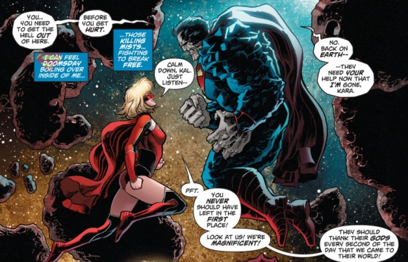
Action Comics #33
Greg Pak and Aaron Kuder

Avatar: The Last Airbender: The Rift, Pt 2
Gene Luen Yang and Gurihiru

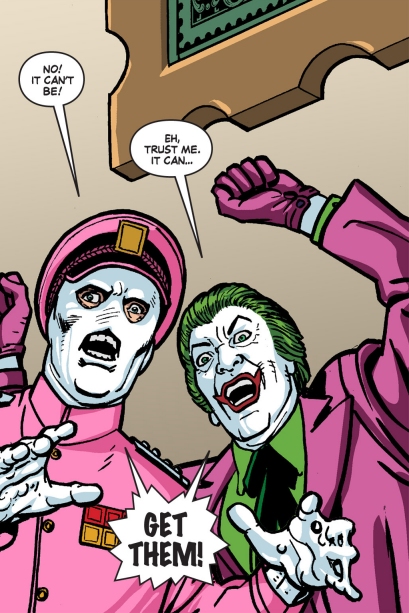
Batman ’66 Meets the Green Hornet #4
Kevin Smith, Ralph Garman and Ty Templeton

Read the rest of this entry »

Post to Twitter Post to Facebook Post to Reddit Post to StumbleUpon

h1

Fort of Apocalypse: violence comix

July 2nd, 2014 Posted by |

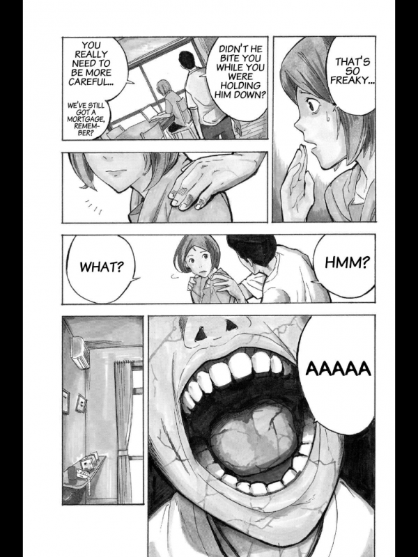
Fort of Apocalypse - Kazu Inabe - 03

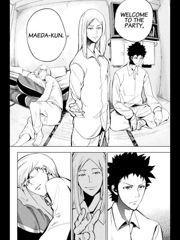
Fort of Apocalypse, written by Yuu Kuraishi and drawn by Kazu Inabe, isn’t that great. It’s serialized on Crunchyroll, and the hook is that it’s a horror manga with a zombie twist, mostly set in and around a Japanese juvenile detention center. It stars a group of boys who have to fight to survive in the school before being forced to fight for their lives as the world goes to hell. The problem is that it jettisons the most interesting aspects of that concept in favor of…bland twists, basically. It opens with a Nietzsche quote about gazing into the abyss, a painfully obvious move, and most characters are either borderline psychopathic, deranged, or totally cool with people doing deranged things on a regular basis. “You must be new here,” Fort of Apocalypse says. “Let’s start from the beginning.”

It’s endlessly derivative—or, being generous and disingenuous, “reminiscent”—of other, better, more popular works. Deadman Wonderland and The Walking Dead are the two most obvious touchstones for me, but there’s a bit of Highschool of the Dead and Lord of the Flies peeking in around the edges, too. Fort of Apocalypse lacks the ultra-fetishized hyper-sexuality of HotD, which has a weirdo carnival appeal/anti-appeal of its own, and instead goes for broke in another direction.

Fort of Apocalypse - Kazu Inabe - 04

The art’s weird. It’s similar to a less stylish and stylized Dogs: Bullets & Carnage. It’s usually passable—not great, but good enough for a good panel here and there, and some good monster monster design and composition overall. Paired with the tone of the writing, Fort of Apocalypse feels seedy-but-familiar, a feel-bad comic that doesn’t actually make you feel bad at all but makes a big production out of going through the motions.

It’s not great, but it is lurid. One short scene:

Fort of Apocalypse - Kazu Inabe - 06

Fort of Apocalypse - Kazu Inabe - 07

Immediately before this moment in time, a different man in an irrelevant location sits up on his autopsy table, his back arched and general body language definitively inhuman. It’s an old trick—show the thing, then cut away to build tension or emphasize the spread of a sickness. The apocalypse is not coming. It is here.

These characters are blanks, almost. Generic Husband and Generic Wife, unnamed and un-missed. They’re there to die, and while that isn’t remarkable (even the shot of the room to suggest unseen horrible violence is old and busted this time around), the next spread was:

Fort of Apocalypse - Kazu Inabe - 08

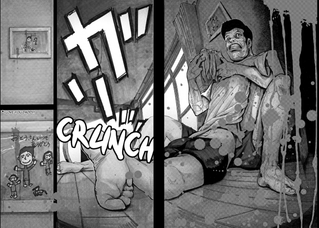
I was expecting a bunch of cuts away from the action to show the apocalypse rising, but I wasn’t being mean enough. A spread of the husband eating his probably-dismembered wife is bad enough, but what killed and grabbed me was the way the scene ends with a close-up of a family photo drawn by their kid, complete with an “I love you daddy!” inscription.

It’s one of those hilariously manipulative moves people pull sometimes, stacking up sad concepts like cordwood without putting in any work to make you believe in those concepts enough to feel bad about it. In better hands, this scene would be the ultimate betrayal. But Kuraishi and Inabe lean edgy, not poignant. I was struck by the meanness of that choice, the way it puts the idea in your head and then immediately moves on to the next one after your imagination fills in what happens next.

While the comic isn’t great, it’s got a mean edge that I enjoy. It’s sorta like the first season of The Following, the Kevin Bacon/James Purefoy serial killer cult thriller on FOX. That show is frequently trashy and incredibly poorly written. But it has a habit of going there that makes for good tv. Spearguns in diners, stabbings on subways, Edgar Allen Poe fetishists, and a conclave of serial killing English majors. A little “Can you believe this?” goes a long way. (Not that long, actually—season two doubled down on sad boring stubble dudes and I raced for the door before it was half-over.) It got me through a dozen volumes of Gantz, maybe even more. This isn’t Gantz on account of being nowhere near misanthropic and evil as that series, but it gets by.

Fort of Apocalypse is lurid, but doesn’t feel cruel, even when a zombie grabs a teen’s upper and lower jaws and yanks them in opposite directions. Mitsuhisa Kuji’s Wolfsmund is real. She wants you to feel it, and it feels cruel. Fort of Apocalypse isn’t that. They want to show you outrageous things so you can go “yo, gross!” and then turn the page for more, and it turns out the best way to do that is to fill your comic with damaged and broken people who adjust to the end of the world by losing their minds.

Fort of Apocalypse - Kazu Inabe - 05

I’m not sure how long I’ll last with Fort of Apocalypse, but it seems like once a volume, something outrageous enough to keep me interested happens. It goes there.

Post to Twitter Post to Facebook Post to Reddit Post to StumbleUpon

h1

This Week in Panels: Week 249

June 30th, 2014 Posted by | Tags: , , , , , , ,

Once again we find ourselves looking at the stuff we’ve read over the past week, reduced to one representative image. It’s This Week in Panels. “We” includes myself, Matlock, Space Jawa, Gaijin Dan and AnarChris. We’re like the Planeteers, only we’re all heart.

Elsewhere, I wrote this big piece on the history of Mortal Kombat comics. Years ago, I went over the Malibu series in detail here, but in this article, I go more in-depth on the many comics that acted as official preludes to the games. I was also asked by my editor to write a quick thing about John Cena being on the cover of WWE 2K15, and so I did.

Now, then. It’s paneling time! Seriously, it’s a big one this week.

All-New Ghost Rider #4 (Gavin’s pick)
Felipe Smith and Tradd Moore

All-New Ghost Rider #4 (Matlock’s pick)
Felipe Smith and Tradd Moore

All-New Ultimates #4
Michel Fiffe and Amilcar Pinna

Read the rest of this entry »

Post to Twitter Post to Facebook Post to Reddit Post to StumbleUpon

h1

Sample Sunday: Silly, wasn’t I?

June 29th, 2014 Posted by | Tags: , , , ,

Murs put out this song “Silly Girl,” featuring Joe Scudda, on his Murray’s Revenge album with 9th Wonder. It’s about relationships, specifically stupid dudes chasing silly girls. It’s funny, I think, especially when Murs goes “Wait, that’s not the point.” Murs is good at walking this line of dead-serious earnestness and goofy self-consciousness, and even the hook of this song is on that level. Breakup songs are always interesting to me, because they’re a long-form insult, almost. They can be funny or rugged, relatable or fake, or even about murder. Norah Jones’s “Miriam” is a stand-out break-up song. This one’s good.

C-Rayz Walz’s “86” is a song I’ve liked for ages. He’s one of the few musicians I’ve seen live, on Aesop Rock’s Bazooka Tooth tour, and he tore it down. “86” is from his Ravipops album, which is just straight spitting for 17 tracks. “The Lineup” is the posse cut, and it’s got Wordsworth, J-Treds, Thirstin Howl, Vast Aire, Breeze Brewin, and MF Doom, if you’re wondering where this sits in rap history. “86” is dope, it’s another “rap is dope, it’s forever in my heart” joints, like Tupac’s “Old School.” It’s also about how rap is soft now, like “your rap was critical, or the crowd got rid of you.” This one sounds smoother than a lot of those throwback tracks, though. It’s less standoffish and more cool. You could vibe to this. It sounds like summertime music.

I found myself listening to old Madlib Medicine Show records the other day and tripped over this one from Madlib Medicine Show # 1: Before The Verdict. It’s “I Must Love You (OJ Simpson Remix)” and that’s Guilty Simpson on the feature. The Medicine Show albums are Madlib chopping up and reinterpreting older songs, forcing vocals and beats and melodies into new shapes. I’m into it, it’s pretty definitively My Thing, and this one’s off the first one, Before the Verdict. It’s got Guilty kicking break-up raps, and Madlib flipping the beat makes it sound like a perfect—lyrically, thematically—guest spot for “Silly Girl.” I like the contrast between the original J Dilla beat and the Madlib one. The Dilla beat is church-y, hymnal with a rap twist.

All three songs have Valerie Simpson’s “Silly, Wasn’t I” at their foundation. It’s about getting cheated on and leaving your man, which actually makes it a pretty great counterpoint to the Murs and Madlib/Guilty joints. “86” moves away from the original meaning of “Silly, Wasn’t I,” instead just using a hot melody to make a hot track, but I always dig when songs with a sample actually play off the original.

Hearing “Silly, Wasn’t I” spin up makes me immediately flash to C-Rayz chanting “eighty-six, eighty-six.” I’ve probably heard that version more than any of the others, ’cause I got heavy into Ravipops when that came out.

I like the laugh on Simpson’s version the best. I like how it’s this rueful thing, a pointedly fake laugh to show that she’s so over him and can’t really believe she was ever into him. It’s remorseful, pinning blame to his chest and hers. It’s good writing, is what it is. She’s so personable that you’re totally on her side in the song, while Murs, Joe Scudda, and Guilty Simpson could kinda go either way, even when you laugh at their jokes.

Post to Twitter Post to Facebook Post to Reddit Post to StumbleUpon

h1

Q Hayashida’s Dorohedoro: violence comix

June 25th, 2014 Posted by | Tags:

q hayashida - dorohedoro - chapter break

This chapter break from Q Hayashida’s Dorohedoro (print, digital, but buy it on iBooks or Android if you want it mobile) sums up a lot of what I like about her style. She works in this kinda gritty, grimy occult comics style, and while the surface-level stuff is great—the skulls, the snakes, the black smoke—what really makes it go is how grounded it is. It’s a comic about wizards and demons that wear street clothes, Nike Dunks, and custom masks.

Block out this guy’s arms and skulls; focus on his body and head. The stuff I’m noticing are the way the belt fits around his waist, the rumpled clothes, and his jacket flaring out. The hood over the eyes is a look I’ve chased several times over the course of my life. The HR Giger-esque rib-piece is pretty out there, but by and large, this guy is wearing clothes you’d see people rocking in the street. It’s a “cool” look. The snakes and skulls add to it, giving it that occult feeling.

q hayashida - dorohedoro - spread 01

Here’s a spread from Dorohedoro, volume 12. Hayashida’s great at making regular buildings look like they’re on the wrong side of the tracks in Hell. It’s very different from Mike Mignola’s more ornate and classic approach, where Hell is Movie Prague, full of long long hallways, classic buildings, and traditional environments. Hell-as-University. Hayashida’s Hell has food trucks and everything’s a slum covered in a thick coating of grime, like smog after it settles.

I like the implied menace in the bottom tier, too. The fisheye effect heightens the X vs Y aspect of things, but Hayashida’s style is great at maintaing a consistent level of background menace, too. It makes it look like the crew on the left got caught in the act by the crew on the right, which is literally true. But the hallway they’re in is great. There’s dust clouds, filthy walls, an alarm box or something on the far left, and you just know that if this were animated, the bare bulb on the right would flicker so that the hallway was more dim than lit. The smudges make me think of water damage, like the building is as run-down as it gets without being marked for destruction.

The fisheye effect makes me feel like this is a moment to breathe in just before the curtain comes down and the violence starts. Luckily, this comes a few pages later:

q hayashida - dorohedoro - ha ha ha ha

T-shirts, jeans, polos, and intense action. The violence is obvious and extreme, with the claw end of a hammer and pure brute force getting the job done. I like the storytelling when the swordsman gets grabbed a whole lot. It got me thinking about which panels we’re seeing are specific POV panels and which are meant to be our standard third-person view. The man with the sword gets grabbed, and the following panel is his view: we see a blurry, blacked-out vision of a face. Then, in the next panel, we’re tracking his reaction. His instinct is to draw his sword, but Noi, the masked arm-puller, is ahead of him. And the potential energy in that panel, when he realizes he’s stuck and you realize he’s stuck and what’s coming next is going to be bad—yes. This is Q Hayashida.

On the facing page, that laugh is everything. Dorohedoro is a great comic because Hayashida blends great jokes with explicit violence and grim mood-building. There are sentient gyoza creatures, rotted husks of men, and capricious demons in the same world. Some of the demons even like gyoza. Noi’s laugh manages to combine all of that. It’s dark humor, and the blood spray is extreme, but it’s also a perfect demonstration of how much and what kind of trouble these guys are in.

Covered in the blood of their friend, whose arm she just successfully yanked off, and taking time for a hearty, gleeful laugh: Noi gives pause.

Post to Twitter Post to Facebook Post to Reddit Post to StumbleUpon

h1

This Week in Panels: Week 248

June 24th, 2014 Posted by | Tags: , , , , , ,

Hey, ThWiPsters. We’re getting closer and closer to the big 250th week landmark with panels from myself, Matlock, Gaijin Dan, Space Jawa and AnarChris. Original Sin continues to be Marvel’s more entertaining and less rapey version of Identity Crisis and I’ve been very happy with that. The two TMNT comics were also fantastic this week.

Helluva lot of Frank Castle stuff this week.

Elsewhere, I’ve written a review of the first arc of the WWE Superstars comic, as well as a look at various storyline aspects I expect to see in the next Mortal Kombat game.

Avengers #31 (Matlock’s pick)
Jonathan Hickman and Leinil Francis Yu

Avengers #31 (Gavin’s pick)
Jonathan Hickman and Leinil Francis Yu

Avengers World #8 (Gavin’s pick)
Nick Spencer and Marco Checchetto

Read the rest of this entry »

Post to Twitter Post to Facebook Post to Reddit Post to StumbleUpon

h1

Ajin: Demi-Human: violence comix

June 20th, 2014 Posted by | Tags: ,

I like fight comics, violence-as-genre comics. I like comics where one of the most significant thrills come from the fights. There’s something about a well-done fight scene that turns a solid book into a good one. My true love as far as comics action scenes go is largely choreography. Does A flow into B into C into something incredibly painful-looking but well-drawn? If you give me a fight scene where I can follow every block and punch and shot to its logical conclusion, I’m in heaven. It extends to non-fight scenes, too. Takehiko Inoue’s Slam Dunk is great at depicting basketball in such a way that it feels like real basketball. There’s an implication of motion in well-done action scenes that I really enjoy.

Isolated instances of punches and kicks don’t really move the needle. It’s sort of the default mode of the comics I grew up on, where the action is generally secondary to the plot, so you can’t blow eighteen pages on a fight between two warriors. Loving action is probably part of why I’m drawn to manga. The storytelling standards are different, and if you want to do a six hundred page fight scene, you can. (Takehiko Inoue did in Vagabond.) But at the same time, a little spectacle goes a long way. If the isolated instances are striking or exciting in their own way, that’s about as good as the highly choreographed stuff. Mostly, I just want to be impressed.

I’ve been reading Tsuina Miura and Gamon Sakurai’s Ajin: Demi-Human as it comes out, a manga by currently being serialized on Crunchyroll and seeing print later this year from all-star manga publisher Vertical, Inc.

Here’s a summary of the series:

Seventeen years ago, an utterly immortal human was discovered on an African battlefield. Since then, more of these new and unknown life forms began to appear among mankind. These undying beings start to be known as “demi-humans.” One day, just before summer break, a Japanese boy leaving his high school is involved in a traffic accident that kills him on the spot. Then, he comes back to life. A huge bounty is placed on his capture. Now the boy’s attempt to evade all of mankind begins.

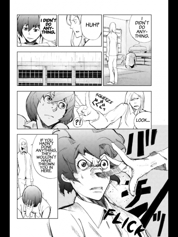
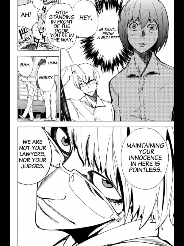
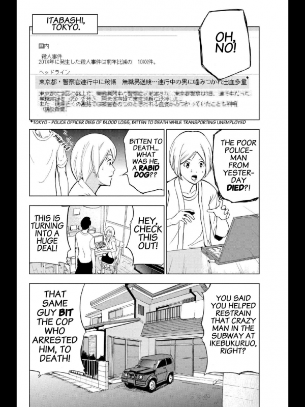
It’s just interesting enough to keep my attention, and sort of pleasingly grim, too. It’s like a turned down action comic, a little slow but plenty mean. Demi-humans can instantly come back fully healed from any wound if they die. This makes them great for human experimentation, but it also has led toward a pretty good “assault on base” scene. Here’s a couple pages from a recent chapter that really got me good:

sakurai - demi-human 01

sakurai - demi-human 02

The men are shooting tranquilizer dots at the man with the rifle in order to capture him. He’s a demi-human, which means he’s functionally immortal, and his gun has real bullets.

I like Sakurai’s style. It’s pleasingly realistic in terms of approach, and even the monsters (not pictured) have a nice weight to them. The characters aren’t very stylized, and there aren’t a lot of wild camera angles unless you count close-ups. It’s cool, it makes Demi-Human interesting to look at.

The little dodge in page one, panel three—that’s a cool thing to put into a comic book gun fight, and the casing being ejected right behind it is something that I really keyed on when I read this the first time. You know how something can seem significant? You notice it and it feels bigger than it seems? This felt like that, and I thought about it until I realized that he must have dodged so fast that he returned fire before the dart probably even got to him. You can almost see the motion, and I like how the panel leads your eye up (the whiffing dart), down (the gunfire), left (the casing), and right (the dodge) basically simultaneously.

Page two, panel 1: his nonchalant face, the detail on his gun and vest, the belt, the motion, and the act itself…what a great idea for a panel. I mean, it’s horrible or whatever, it’s nasty, but it’s something I haven’t seen before and surprising—not shocking—enough to raise an eyebrow and half a smile. The anonymous close-up after is great, like a visual gasp, and then panel three is another new thing. This is Hawkeye in Ultimates 2 cool, Frank Miller discovering ninjas cool. All those speedlines on just one side, too, weighing the panel down.

The next bit implies suicide, and in so doing ups the ante considerably:


sakurai - demi-human 03

sakurai - demi-human 04

Sakurai’s use of reaction shots are well-placed, I realizing. The timing on them in general is great. The way the “huh” comes after the shot but before we see the ooze is crucial for setting the pace for how quickly all this is happening. The man is launched into the air (somehow) and we see them noticing something we can’t see before the ooze reveal. We know something’s about to go down, just not what. Here’s what:

sakurai - demi-human 05

If I saw this in a movie, I would freak out on the spot.

It’s just two panels, but the sense of motion and implied movement are so good. He’s falling more down than back, so his legs kick up in panel two. The lines on the floor tell you how far backward he fell. I’d already been impressed enough to want to write about this before this page, but this was like manna from heaven.

I like watching martial arts-oriented action movies, especially non-American ones, more than just about anything else because the choreography really impresses me. I get to see people do incredibly difficult things at a high level and higher speeds, and watching them set up a punch for a kick for a toss through a window is totally my bag. Great choreo has kept me watching movies that you’d be better off fast-forwarding through, and great choreo combined with a great story is my bread and butter. It’s something I cannot do, but am consistently impressed by and jealous of. It’s not the violence so much as the configuration of the violence, the beauty of bodies in motion. A bunch of my favorite films are borderline bloodless, even.

It’s different in comics, because motion is this whole other animal. It’s implied, because sequential art is composed of single images instead of twenty-four frames a second. I like being able to track action from panel to panel, the perfect moments in time chosen to heighten the impact. I don’t think Sakurai excels at that kind of thing, his approach to continuity isn’t that great, but I do think he has an amazing talent for drawing cool things well. And this scene was a very cool thing. This is the most inventive and immediately impressive by far, but bits like this are littered throughout Ajin: Demi-Human.

It’s a good action comic. The story’s taken some surprising turns after a pretty basic opener, and the action is getting better the more I read. It feels like Black Lagoon without the sleaze, but with a heavy faux-Tarantino accent and magical sci-fi elements. I like that even though it feels so familiar, I can still be surprised by what’s going to happen. It’s like a skillful rendition of an old standard in tone—not super impressive, but still enough to make you feel good. As long as they keep coming with the action, I’m hooked.

Post to Twitter Post to Facebook Post to Reddit Post to StumbleUpon

h1

Growing up with Metal Gear Solid

June 18th, 2014 Posted by | Tags:

I remember being a kid and tripping over ads for the Ultra Games Metal Gear, the one with Snake’s whole inventory on a white background? I never played the game as a kid, not to my memory, but I saw that ad on dozens of comics, which means I saw it thousands of times as a kid. It caught my imagination. In Mario you had a fire flower, a tanooki suit, and a cape. But this guy had all types of weapons and gear, like a video game Rambo.

Nowadays, when I want to play a game, I just play it. I download it or trek to Best Buy or buy it on Amazon. It’s nearly instant gratification at this point, limited only by my bandwidth at home. But as a kid? I couldn’t talk my mom into buying anything, especially not if it was about something violent. Star Fox was one thing, but Mortal Kombat? Nah, son. Too realistic.

So I spent a lot of time thinking about video games. I pored over game magazines when I could get them. I still remember having an EGM with a big blow-out on a Samurai Shodown and some info on how to make Mai Shiranui’s boobs bounce in King of Fighters. I read it ’til it came apart, and then I kept reading it because it was the only way I’d experience KoF until years later when I got a Dreamcast.

Metal Gear came out a little early for me to be able to read about it, so the ad had to be enough. I don’t know what I thought the game was like. All I knew was that I wanted to play it because it sounded amazing.

I didn’t play a Metal Gear until Metal Gear Solid on PlayStation. I decimated my SNES collection to get a chance to buy a PlayStation for cheaper from Funcoland or Toys-r-Us or somewhere, and I survived on Madden, Suikoden II, whatever Working Designs put out, Colony Wars, a bunch of demo discs, and Final Fantasy VII for ages.

But MGS tho. I don’t remember what made me go for it, but I assume I saw news of it in the mags and then found a demo somewhere and then wheedled my way into the full disc.

It’s hard to under-sell how I felt experiencing the thing that begins to happen around 7:15 into this clip:

It looks like garbage now, all low-resolution textures and chunky polygons, but there’s a difference between watching it and playing it. In this moment, you were Snake, and that moment when your controller starts vibrating…it captured me. It got me. I loved FF7 but they didn’t ever talk and the game looked like a cartoon. MGS was next-level, ultra-realistic and grim but still incredibly fun and well-designed. Video games weren’t even really using force feedback yet, it was still new. But MGS gave me extensive, high-quality voice acting and scripted sequences, in addition to using the controller itself as a storytelling device, among other features. It was mind-blowing. MGS was the future. Static-y “Horryoukid” vocal clips were dead and gone. It raised the bar.

I’d experienced nothing like it at the time, and MGS is my favorite franchise to this day. I bought a PS3 of my own for MGS4, and beating that game gave me a feeling that hadn’t been beaten since the first time I beat Ninja Gaiden Black. It felt like an accomplishment, instead of something I did at 1 in the morning on a work night.

I can’t claim twenty-seven years of fandom. I was busy being a toddler in 1987. But MGS has been with me since 1998. I started playing it before I really knew what a pacifist or fascist really was, and as I’ve grown, I’ve found a wide variety of things to appreciate. Kojima has his hooks in me, and even though I’m mostly not into most games nowadays, I’m finding that I’m always up for Metal Gear. Nobody does it better.

Here’s what Metal Gear Solid looks like now:

La-li-lu-le-lo, forever and ever. Amen.

Post to Twitter Post to Facebook Post to Reddit Post to StumbleUpon

h1

This Week in Panels: Week 247

June 16th, 2014 Posted by | Tags: , , , ,

Hello, party people. It’s time for ThWiP starring myself, Matlock, Gaijin Dan, Space Jawa and AnarChris. Yes, a new person for once. Crazy.

The true highlight of this week is New Avengers, which is awesome mostly because of Namor. The dude absolutely owns every single panel he’s in, so it makes sense that he gets the spotlight in both choices this week.

She-Hulk and WWE Superstars both nosedive when it comes to the art this week. The stuff in She-Hulk is especially disappointing and the panel I chose is one of the better looking moments. Seriously, there’s a part where Tigra is talking about how sexy she looks while actually appearing as Lion-O in drag after a bender. It’s just not my bag.

All-New Invaders #6 (Matlock’s pick)
James Robinson and Mark Laming

All-New Invaders #6 (Gavin’s pick)
James Robinson and Mark Laming

All-New Ultimates #3
Michel Fiffe and Amilcar Pinna

Read the rest of this entry »

Post to Twitter Post to Facebook Post to Reddit Post to StumbleUpon