September 14th, 2011 Posted by Esther Inglis-Arkell
This was Amanda Waller.
And this is Amanda Waller.
Because why have a reboot if you have to draw even one female character heavyset, over forty, plain, or with her shirt completely buttoned up.
Seriously, though, a gorgeous supermodel with huge boobs that she is prominently displaying! What fantastic character innovation this is! What a change from other female characters in the DC universe!
I guess there’s a chance that this could be an impostor.
It wasn’t Chris Claremont that made me an X-Men fan. The Dark Phoenix Saga ended and John Byrne left the series well before I was born. Scott Summers and Madelyne Pryor married in a comic cover dated for the month I was born. By the time I was old enough to read, Maddie was long gone. By the time I hit the series, Claremont was past his prime and on his way out. I didn’t read but maybe two parts of the Muir Island Saga, and that was just enough to learn the word “pyrrhic” and the phrase “Bang, you dead.”
No, it was never about Claremont. It was about Jim Lee, whether he was assisted by Scott Williams or Art Thibert. It was about this:
and this:
It’s Jubilee flexing with Colossus, Iceman and Opal cracking jokes, Gambit getting his card pulled, Cyclops with a smile, and Archangel with the razor wings.
X-Men #1 wasn’t my first comic. That was Amazing Spider-Man #316, which I got from my uncle. X-Men #1 was probably one of the first ones I bought with my own money, or money begged off my mom, though. I’ve managed to hang onto it all these years, too. It’s well worn, which makes sense considering the fact I probably know it by heart, but not tattered, which is basically a miracle. Spider-Man was my entry drug, but Jim Lee’s X-Men hooked me. Last week on the internet, I said this:
Lee’s issues of X-Men are great comics. They’re pure spectacle, a series of really quick bursts of action and characterization. Some of Wolverine’s best moments ever are here, Gambit gets in a “gotta be da shoes” moment or two, and Bishop hits Rogue in the face with a boysenberry pie. Maybe you had to be there, but as an eight or nine-year old kid, these comics were the absolute apotheosis of comics as an art form or entertainment medium. “Jim Lee’s X-Men: David Brothers Likes It More Than He Likes Watchmen.”
The last line was a throwaway at first, something half meant to rile up the usual suspects and half sincere. The more I thought about it, though, the more sincere it became. I really do prize those comics more than Watchmen. In Watchmen, Alan Moore, Dave Gibbons, and John Higgins showed the world that cape comics were more than just entertainment for kids and shut-ins. They took the form and elevated it, charting new ground and changing the face of cape comics forever.
Jim Lee’s X-Men showed me that comics could be incredible, and crawled all the way up into my lizard brain to do it. I’m not even sure if I have the vocab to explain how or why. When someone says the word “superhero,” I think of Jim Lee’s art. He defined superheroes for me, and probably redefined them for the genre, too.
I know now, as an adult, that the visual language of cape comics comes from Jack Kirby. I can spot the influences in Lee’s art, too, the Art Adams business and John Byrne jawlines and Neal Adams physiques. I can break him down into his component parts if I put my mind to it, but Lee’s art is bigger than the sum of his parts. His characters look like superheroes should look: toothy grins, babyface or stubbled chins, physiques like Greek gods, and they positively bleed sexiness–granted, a very specific type of sexiness, aimed at pubescent boys, but it’s so easy to see his appeal.
I devoured those comics as a kid. I had a nearly uninterrupted run of Lee’s X-Men–that was probably a first, too–and I read most of them until the staples came out. Everything about comic books clicked for me and I had to have more.
His style defined the X-Men for years, to the point where the next big seismic shift in their visual style was when Joe Madureira mixed Lee’s costuming with a big sack full of manga tropes. The X-Men in X-Men: Children of the Atom up through to Marvel vs Capcom 2 are Lee’s X-Men, whether in design or in spirit.
Lee, even to this day, is probably the purest example of pop comics art. He doesn’t go in for Frank Quitely-style storytelling, David Aja-style body language, or Alan Davis-style realism. That’s not his thing. Instead, he has a keen eye for the cool. He knows what works on the page, and he gets that sometimes spectacle is more important than substance. Sometimes, substance is secondary to entertainment.
Grifter’s mask, Rogue’s bomber jacket and extra-long hair, Colossus being like eight feet tall, and Zealot are all things that shouldn’t quite work. If you think too hard at them, they fall apart. But when you’re swept up in the comic and watching these characters move across the page, none of that matters. It’s a cool visual, and it’s the type of cool that sticks with you. There are some scenes from X-Men that I first read twenty years ago and still hold in higher esteem than a lot of recent stuff. This “gotta be da shoes” reference right here:
I love this. It was topical back then, and probably passed through a corny phase a few years after that, but now, twenty years removed from its source? It’s fantastic. It’s just a guy having fun showing characters having fun. It’s not gripping reading, but it is compelling. There’s so much character and excitement packed into this dumb old basketball game.
I definitely imprinted on this stuff as a kid. I’ve never even seen a boysenberry pie in real life, so every time I hear the phrase, I think of this scene. I get and enjoy dozens of artists, Kirby included, and have a pretty good handle on the evolution of how cape comics are drawn. Paolo Rivera or David Aja may draw cape comics that are technically better, and Frazer Irving or Travis Charest may draw ones that are prettier, but nobody ever gets me hype off superheroes like Lee does. It flips some switch in my head and I just gotta check it out.
I’ve seen Lee draw the WildC.A.T.s, Batman, Superman, and the X-Men. Flash, too, I think–maybe a cover or three during Geoff Johns’s first run on the series. I sorta wish he’d done something substantial on Spider-Man. Spidey’s still the perfect superhero, and probably the one major gap in Lee’s body of work.
this was going to run elsewhere, but didn’t, so now it’s here instead. i’d have done it different if i wanted it up here, almost definitely (this reads stilted to me), but hey, i wrote it, so it’s probably worth reading.
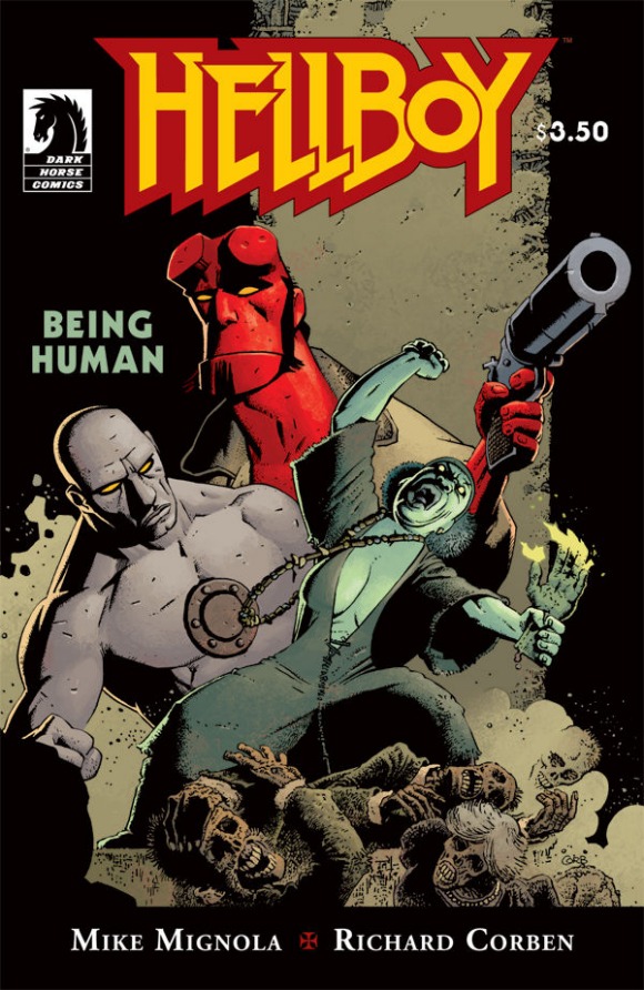
The assembly line nature of mainstream comics has allowed for a few alchemical relationships between members of a comic’s creative team. Stan Lee and Jack Kirby turned Fantastic Four into one of the best loved franchises in comics, Frank Miller and Lynn Varley revolutionized how comics were printed in Ronin, and Grant Morrison, Frank Quitely, and Jamie Grant made All-Star Superman and We3 among the most beautiful comics out. I’d like to add another team to that list: Mike Mignola, Richard Corben, and Dave Stewart, creators of today’s Hellboy: Being Human.
Pick your poison: Mignola, Corben, or Stewart. Stewart is one of the best colorists in the business, an Eisner winner, and a guy you can count on to make any comic book better just by showing up. Mike Mignola is one of the best success stories in comics, having spun off a silly idea he had once into two of the best series in comics and a couple of solid movies. And Richard Corben… he’s been in the game for over forty years, knocking out classic comic after classic comic. Together, you’ve got a powerhouse team that can do anything. "Anything," in this case, is "some of the best Hellboy stories ever."
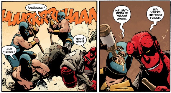
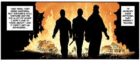
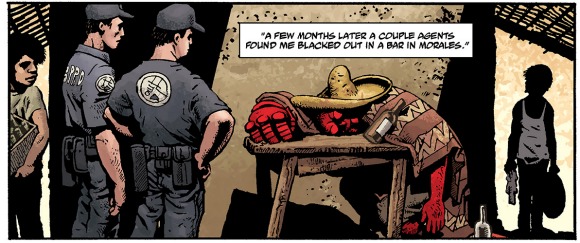
The team has collaborated on Hellboy on five, six with the release of Being Human, separate occasions. The first time was 2006’s Hellboy: Makoma, or, A Tale Told by a Mummy in the New York City Explorers’ Club on August 16, 1993. This story took Hellboy to Africa and, in the cultural tourism that has made Hellboy such a fascinating series, through African folklore. In The Crooked Man, Hellboy takes a trip to West Virginia for a taste of good old fashioned Appalachian horror. The Bride of Hell sent Hellboy to France, and the flawless Hellboy In Mexico (Or, a Drunken Blur) sent Hellboy to (wait for it) Mexico (read our previous coverage of that classic here). Finally, Double Feature of Evil sent Hellboy to haunted houses and murky museums.
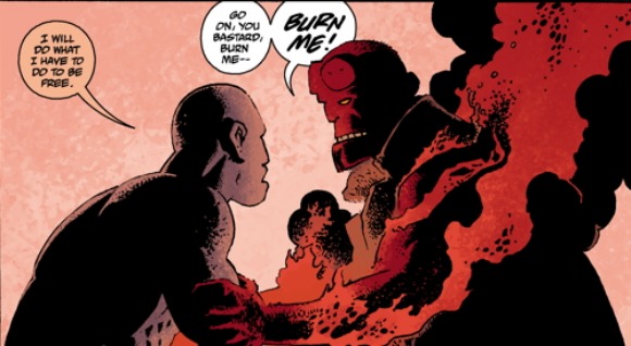
The easiest way to show why Mignola, Corben, and Stewart are so special is to spotlight their best work: Hellboy in Mexico. As far as I’m concerned, this was the best single issue of any comic released in 2010. It is, in essence, every Hellboy story. Hellboy‘s casual sense of humor, big action, folkloric inspiration, intense attention paid to atmosphere, and heartbreaking sadness are all in effect here. Mignola structured the tale as something Hellboy was telling his partner Abe Sapien, giving it a very personal and conversational feel. This isn’t someone recounting a happy time in their life. This is a bad memory and a source of emotional trauma for Hellboy.
Corben and Stewart (and letterer Clem Robins) handle the art chores, and the results are predictably fantastic. Corben’s Hellboy is straight out of Jim Henson’s Creature Shop, with a bobbly, goofy looking head and jaw and a brawny physique. His monsters are even creepier, with their desiccated skin, disgusting claws, and missing chunks. The thick, doughy figures have real weight, and are pleasingly exaggerated.
Dave Stewart gets a chance to do some interesting rendering, thanks to Corben’s detailed pencils. Hellboy gains definition that he doesn’t have under Mignola or Duncan Fegredo’s pen, making for an entirely different reading experience. Mignola and Fegredo created a world littered with shadows and gloom for Hellboy to stride through. Stewart and Corben pull Hellboy into the realm of pop comics, thanks to Hellboy’s bright red skin tone contrasting with the muted, dusty palette of Hellboy in Mexico.
In short, Hellboy in Mexico is what comics are supposed to look like: a peek into another incredible world. It’s incredible, and this week, the team is back together for another shot.
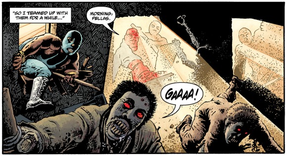
Hellboy: Being Human features Roger, the homunculus Hellboy met fairly early in the run of Hellboy stories, on his first field mission. Here’s the solicit text, courtesy of Dark Horse:
A horrible witch and her zombie servant host a dinner party for a family of corpses, and Hellboy and Roger turn up to blast them all back to hell in this team-up story from Roger’s early days at the B.P.R.D.
This one’s a simple, personal tale of horror, showing us an early glimpse at how Roger and Hellboy grew to become friends and how hate can twist a life into an ugly mess. Being Human refers to Hellboy, Roger, and the witch who menaces them. What’s it mean to be human? Do you have to be homo sapiens, or is it something more?
I thought this fight scene from Batman Incorporated 5 was pretty straight. Art by Yanick Paquette, inks by Michel Lacombe, colors by Nathan Fairbain, words by Grant Morrison, letters by Pat Brosseau:
It’s not really as elegant as some of the stuff Quitely did in his run on Batman & Robin (digital, trade), or as visceral as Cameron Stewart (digital, trade) got when Batman and Robin visited London. Taken as a series of discrete moments, it works, and it’s pretty easy to animate this in your head. I only have trouble on page 2, panel 5 leading into panel 6, but it’s clear more time passed between those panels than it did between, say, panel 2 into panel 3. I do like how those twin rocks in 2.3 serve as reference points for how the fight moves around in space. That’s a great idea.
The money panel is page 3, panel 5. It’s the only real moment of pain in the entire fight scene, I think. The other panels were very give-and-take, this sort of playfighting kinda thing. 3.5 is crucial, though. Paquette captured that moment in time perfectly, with a painful looking awkwardness in Scorpiana’s posture and surprise in the body language of El Gaucho and The Hood. Even the shock lines–what are they actually called?–are dead-on, and Scorpiana’s helmet coming off is the icing on the cake. While the fight isn’t all the way there for me, that bit? 3.5? It makes the scene for me. The only thing I would do is swap the “Ouch” for a balloon coming from Scorpiana that’s either empty, filled with squiggles, or a breath mark. I always liked how that looked, and it’d sell the interruption of the action even more.
Okay. Here’s the thing.
I’m not an artist. Well, not any more–I spent some time in high school putting together a portfolio so I could go to art school, but then I discovered I could write, blah blah blah who cares. I’ve got no training beyond binging on books and art theory online. I don’t know near enough about comics art.
Here’s the proof.
Over on his Twitter, Adam Warren posted a link to an old DeviantArt post about how he draws Empowered (digital, trade). This is the sort of thing I eat up, because it’s the real nuts and bolts of comics art. It’s behind the behind the scenes. I was really interested for the first few paragraphs, because it’s all about format and readability. This is basic, basic stuff, but it’s the building blocks of comics. “You have a blank page. What is your first step? How does that step affect your work?”
(I think about format a lot, both in other people’s work and my own. Especially my own; I struggle with the way I use images. Ask me how pleased I am with that (digital, trade) stuff up there. No, don’t, because the answer is “it sucks and is ugly but I don’t know how else to massage that data into the post, barring an even uglier list at the end of the post.”)
It’s the fourth paragraph that blew off the top of my skull, though. Here’s the relevant bit:
Note that there’s one more step I could take to make EMPOWERED even more readable… Namely, I could use “manga gutters” on its pages. In manga, the vertical gutters between panels are very thin and the horizontal gutters are VERY thick (usually in a 1:3 vertical: horizontal ratio), in order to ensure that the reader’s eyetrack stays on a particular (horizontal) tier of panels and doesn’t stray down to an out-of-sequence panel below.
Got any manga nearby? Pick it up, flip to a random page, and look at it. That’s what I did immediately, and since I live in a fire trap, I did it a couple more times, too. If you can, find one of those pages that has three panels that take up the top half of the page–two squat panels stacked on top of each other and one tall panel beside them. Or here, look at these images I pulled from Katsuhiro Otomo’s Akira ages ago:
Do you see this? Isn’t it unbelievably obvious? It’s the kind of obvious that makes you feel dumb. I own a ton of manga. I almost don’t want to move because it probably weighs an actual ton, and I never noticed this. Look how huge those horizontal gutters are. The panels are swimming. It’s such a little thing, the sort of thing you’d never spot unless you were looking for it (or good at your job), and it means so much.
It got me thinking. I grabbed Barbucci and Canepa’s Skydoll: Spaceship, a collection of short stories, and flipped through. It was a mix of manga gutters, regular gutters, and gutters that were irregularly applied. Some gutters were pencil thin, while others were super chunky. I opened up one of George Herriman’s Krazy Kat volumes (specifically Krazy and Ignatz 1916-1918). The gutters there weren’t as clearly defined as in more modern work, but still obvious. Some panels were boxed off, while others were separated by an inch or so of whitespace. Vertically, it looks packed, but horizontally, it had room to breathe.
This is part of why I like writing and reading about comics. There’s so much that goes into the page, and it’s easy to miss if you aren’t paying attention. I used to have (maybe still do?) this slim Italian volume of Hirohiko Araki’s Jojo’s Bizarre Adventure. My mom got it for me after she went overseas for a bit. This was forever ago–1997? 1998? I don’t remember, but it wasn’t the Jojo series that eventually made it over here. I couldn’t read it, so instead, I just looked at it, trying to discern the story just from the art. I didn’t really know what I was doing at the time, but I remember liking it.
Now, I do the same thing, but on purpose. Reading a book in a language that you don’t understand can be really eye-opening sometimes. I own an armful of untranslated manga that I just pull out and look at sometimes. I want to know how things are put together and what makes them tick. Analyzing makes good things better and mediocre things worse, and I’m 100% okay with that. I’m thankful every time I learn something new. It turns out that the new thing this time was something that I’ve seen thousands of times before, but never recognized. I was too busy looking at what was in the panels, instead of what was between them.
I keep kicking around this idea of doing a comparison on how we read digital comics versus print (or standard) comics. It’s a very different experience, especially if you use a guided view. There’s a zoom in Dark Horse’s digital version of Kazuo Koike and Goseki Kojima’s Lone Wolf & Cub that cracked me up. It’s straight out of a ’70s-era kung fu movie, and so appropriate to the story it’s telling. I can’t replicate it, but here are the two relevant images. Imagine a sudden and jagged zoom from the first panel to the next. If your taste in movies is at all like mine, you’ll understand.
Here, fast forward to about 0:30 and pay attention to the camera. It’s the same effect.
That type of transition doesn’t, and cannot, happen in comics. It requires real motion, and it raises a lot of questions about where digital comics are going to go from here. Are they gonna be just simple transplants, or is someone gonna take advantage of this way of reading comics to the fullest extent? That transition is something new and entirely accidental. It was inconceivable when Koike and Kojima created that page, and I doubt Dark Horse went through and set up the zooms for dramatic effect. One day somebody ill is going to dig into digital comics and leave everybody else behind in the dust. Real, raw comics with next-level storytelling, no gimmicks.
As much as I’d love to explain why the different between digital and print is interesting, I don’t have the vocabulary for it yet. I’m not Frank Santoro. Not even close. I’m just a guy who reads and likes to talk about what he read. Sometimes my reach exceeds my grasp. Sometimes I miss things.
But it’s nice to think that I could one day learn enough to be on that level. There’s so much to learn. It’s exciting, like putting together a puzzle. There’s unlimited potential. Being better than some wack writer on another site isn’t enough. I need to be better than I am right now.
From Osborn 3, words by Kelly Sue DeConnick, art by Emma Rios, color art by José Villarubia:
There’s a lot to like here. Rios’s art is looser, messier than it was on Hexed and Strange. Villarubia’s colors really work, too, with that orange and purple putting me in mind of Frazer Irving and early ’90s X-Men comics simultaneously.
What’s crucial for me is how she’s showing speed and, to a lesser extent maybe, impacts. Those thick, chunky lines are nice, but I like how she’s restricting the speed lines to certain parts of the body–blondie’s arms and body are a blur of lines and motion, while his face is fairly still in comparison. His tattoos are distinct, but look at his waist. All blur.
And again on page 2, where Norman Osborn delivers what’s basically a 2011-era Kirby Punch. Blondie’s gone flying, dominating the panel, but he’s still in motion. Osborn’s the one with the blur now.
I spent this weekend at Wondercon, and more specifically, I spent Saturday night hand-selling Frank Quitely’s original art to attendees at Isotope’s smashing Saturday party. I was in the room from around 2100-0330, talking to people about the art, pointing out his insane perspectives, astonishing blue line work, and pencils. I never got bored, only repeated myself a few times (I really liked his blue line work, shut up) and generally had a lot of fun putting on an impromptu art school. (Which will pay off here on this blog once I get a chance to sit down with my favorite X-Men story ever, believe you me.)
So I’m high on comics right now. You know how it goes. Here’s two recent things in comics that I liked and just sorta want to present to you so that you can like it, too. There’s also one thing which is a total downer but beautiful and amazing and the saddest thing ever. Figure out which is which! I was going to do these with no commentary, but blah blah whatever. I’ll keep it brief.
She’s brown. Do you see that? And she’s cute, and her necklaces are neat.
From Stan Sakai’s Usagi Yojimbo 136,
in honor of the Dark Horse’s 25th anniversary.
I love Usagi, and I love this image. I mean, dang, look at it already.
Bonus round: X-Men To Serve and Protect, which was otherwise completely forgettable (or, no, strike that–the Immonen Gambit/Hellcat jawn was pretty good) comes this treat from Jed McKay and Sheldon Vella:
Two things:
1. “DEATH! SQUAD!” is ill
2. “White chicks, am I right?” Colleen is so down. She’s great.
I wrote about Warren Ellis and Kaare Andrews’s Astonishing X-Men: Xenogenesis for ComicsAlliance, and how much I liked Andrews’s art. I think this is probably the best looking X-book in a good while, even above Ron Garney’s work with Jason Aaron on Wolverine: Weapon X: The Adamantium Men. Just ugly and grimey and awesome. Also notable: someone gets stabbed through the chest with no sound effect covering the exit wound (which is something Marvel has done something like 99% of the time since Elektra died) and Wolverine holds his own guts in his hands.
So this, then, is a sidebar to the CA post. This right here? Best Wolverine sequence in years. For real. Neat use of his powers, good way to sell the threat of the Furies, and good way to show that Wolverine is down, down… but not out, no… not out.
(colors by Frank D’Armata)
Pick that series up if you find the trade or back issues or whatever. It’s got Furies in it, and as a lapsed Ellis fan… best thing he’s done in years. Probably since Ultimate Fantastic Four.
Posted in art by david brothers | | Comments Off on “Not gonna be as easy as that.” [Astonishing X-Men: Xenogenesis]
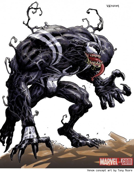
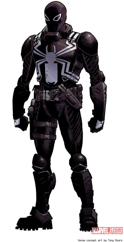
It’s been announced today that Rick Remender and Tony Moore — the guys who game us Fear Agent and Frankencastle — are joining forces once again for another ongoing.
Yes, Venom #1 will be released this coming March. Although the host is a secret (from what I hear, it’s totally John Jameson), the alien/human hybrid will be off trying to save the world under the government’s watch. Sure, this is the third time Venom’s worked as a government lackey, but I don’t stop eating pizza because I’ve had it twice before. Here’s a look at Venom-Wolf’s not-slobbering-and-crazy-for-human-flesh appearance.
So, yeah. I’m completely on board.
The real question is what do I have to do to become the guy who writes the “Venom Saga” backup in the first issue?