
7 Artists: Chris Bachalo
July 5th, 2010 by david brothers | Tags: 4321, chris bachalo, spider-man, x-men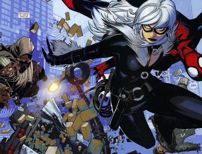
Nobody in comics draws quite like Chris Bachalo.
I’ve seen people complain that his work is too confusing, hard to follow, or too jumbled. There may be a point there, but not one that I ever really agreed with. Bachalo’s art is dense. He draws in a way that fills panels with details. He doesn’t do the Bryan Hitch thing, where every jet has several realistic parts. He’s not Moebius or Katsuhiro Otomo, so he’s not throwing in every detail there is to throw in. No, Bachalo has more in common with Geof Darrow than any of those guys.
Darrow and Bachalo have a style that can be described as “obsessive.” In Shaolin Cowboy, Darrow drew every rock and lizard and butt crack he could get away with. His figures look like real people, but as you look at his work, you see more extraneous information than you would with the average comics artist. There are too many details, too many little touches, for them to be realistic.
Bachalo’s work is similar, though for different reasons. Bachalo doesn’t even try to replicate reality in his work. He’s more concerned with replicating the experience of life, rather than the appearance. In essence, where Hitch or Otomo try to make their drawings as close to real life as possible, Bachalo wants to replicate the feel of real life via caricature. Bachalo’s approach is fascinating, and makes for exciting, and beautiful, comics. The closest person to his drawing style in American comics is Humberto Ramos, but that is more due to the fact that they have complementary styles, rather than styles that resemble each other (i.e., Alan Davis & Bryan Hitch).
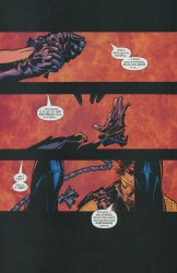
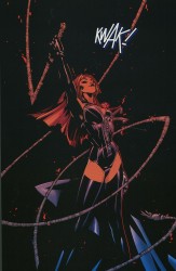
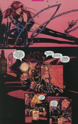
Bachalo draws these smooth, Play-Doh-type people. They have smooth skin, prominent noses, gelled-up hair, and wide mouths. Bachalo doesn’t go in for the muscles-upon-muscles style of superheroic art. Instead, he shows how powerful someone is by simply drawing them bigger and broader than everyone else. His Spider-Man is tiny and fairly muscleless, but he’s also lithe and practically a contortionist.
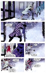
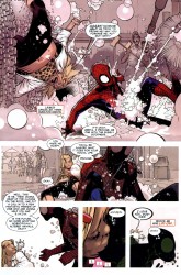
One of my favorite visual gags that Bachalo has drawn came early in Amazing Spider-Man: Brand New Day. J Jonah Jameson, after suffering a heart attack, is in the hospital, crankier than ever before and ready to go. He sneaks outside into the snow, barely making any headway against the wind. Panel five has the money shot–James with his leg thrown out far, bound and determined to take another step while a nurse drags him back inside.
That one panel is a perfect look at how Chris Bachalo uses caricature to create believable body language. It’s not realistic by any means. The snow is a big ball of blurred white, Jameson’s gown is just a little wrinkly, and his neck is way too long. This is practically a Three Stooges or Buster Keaton shot in comic book form. Jameson’s exaggerated motion, along with his stick-thin legs, enormous chin, and long neck, all work in concert here to tell you everything you need to know, clear as day.
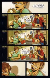
Bachalo is a master of acting. In this page from Amazing Spider-Man: Shed, Carlie and Peter are having an impromptu lunch. Bachalo uses close-ups to frame the page and three wide panels to show the actual action. Peter has a Ralph Dibny nose when he goes “Cheers” with his cup, Carlie’s carefully dabbing at her mouth after a messy bite, and her relaxed lean in panel four is killer. The quiet laugh in panel five is pretty great, too. Peter and Carlie come across as comfortable and friendly, and you don’t need dialogue to figure that out. It’s a little goofy, a little funny, but it’s great work.
What’s interesting about this page is the way that both people are drawn. Peter and Carlie both have Ralph Dibny or Mr. Magoo noses, strangely round jaws, and there’s a bit of Colin Mochrie in Peter’s face. Carlie’s mouth is unnaturally huge in panels five and six, especially in six. It’s kind of weird that she’s clearly taking little bitty baby bites out of that sandwich with her big ol’ mouth, but that doesn’t matter any more than the big noses and Peter’s weird hair does. Bachalo warped them in tiny ways, but uses that to his advantage.
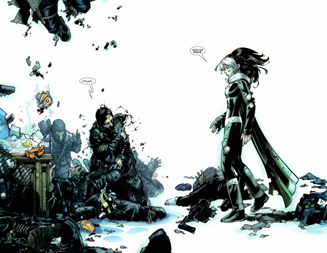
Bachalo uses unrealistic proportions well, but what he’s best at is playing with space. His mostly-white two-page spread from X-Men: Supernovas is beautiful, with the left-hand side being stacked with the aftermath of an attack, including some adorable flopping fish, while the right side is left largely empty. The composition is impeccable, perfectly displaying the chaos of half a second previous and the quiet moment just after.
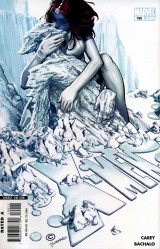
I’m really fond of the cover to X-Men 190, too. Again, it’s very busy, overflowing with information in the form of clumps of ice, puddles of water, and the mountains in the background. The best part of the cover is the embrace between Mystique and Iceman. She has long arms and fairly thin shins, but she’s all round angles and smooth. Iceman is the opposite, with hard-edged ice, broken limbs, and a pointy face. I can’t quite put my finger on it, but something about this cover stuck with me. Maybe it’s the way the blue and greys blend together (which I think is due to Antonio Fabela, Bachalo’s usual colorist) or the splash of color that is Mystique’s hair. It’s a striking image, and positively claustrophobic.
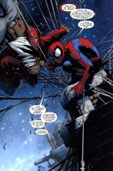
In this page, where Spider-Man has a guy strung up and is trying to scare him straight, the panel is tilted to the left and comparatively filled with information. The chimney stacks, water towers, and brickwork all work to show you exactly where this is taking place, but the real meat and potatoes are Spider-Man and his webs. Bachalo draws the best webs since Todd McFarlane left the Spider-books, and he’s just showing off here. Bachalo’s Spider-Man is crunched down into a tiny ball, ready to spring, and has huge and expressive eyes. There’s a lot to look at here.
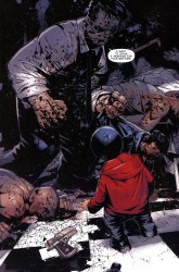
Look at the image of Hammerhead, from Amazing Spider-Man: Crime and Punisher. This is how Bachalo shows power. Hammerhead is huge. Hulk huge. The scale would have you think that the kid in the foreground is barely a toddler, but no. He’s in his pre-teens. Hammerhead is just that big, and he’s half-crouched. One of his fists is as big as the kid’s head. The page is weighted toward the background, making the kid look even smaller. This is an effective choice, in part because it instantly gets across how dangerous Hammerhead is, even without the piles of beaten and brutalized bodies behind him.
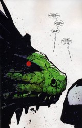
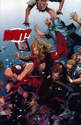
Space and scale again. The Lizard dominates this page from Shed. He’s enormous and right in Spider-Man’s face. All of the details on the page go to the Lizard, leaving Spider-Man featureless, save for his wide eyes. A later page features Spider-Man swarmed with civilians, buried under a mass of them and drowning in the chaos.
Bachalo alternates between flooding a page with information and leaving them wide open. This is the way storytelling in comics should work. Every element of his work is done in service of the story, whether the characters are warped and compressed under the pressure of all the debris on the page or given room to breathe. He’s killer, and extraordinarily suitable to drawing Spider-Man comics. His take on the character gives you a short, fairly skinny version of Spidey, a take that works really well and makes everything a little more interesting.

Not to irk anyone but, it really is a shame that he wastes his talent drawing mediocre stories.
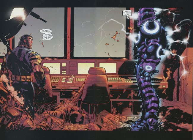
I first saw Bachalo’s work in Ultimate War and loved it immediately.
(pressed the submit button too early) I think he draws a perfect Black Cat, and I love how he draws women in general – they’re attractive but it’s not like their entire bodies poke out of whatever clothes they’re wearing, which is the reason I really dislike J. Scott Campbell and artists like him. Even though those New X-Men pages are sexual, they’re not skeevy.
I never noticed that about his body language, though, until I read Shed – When Harry Osborn is around, he’s all hands. It’s great.
This is some great stuff. I’ve loved Bachalo pretty much since I became a regular comics reader back in 1993. I actually have the first issue of Ghost Rider 2099 sitting at my desk right now and it’s a thing of pure beauty for me.
Great article!
Bachalo is the reason I got into comic books with Generation X back in the 90’s. I thank him for that!
I loved Ghost Rider 2099! (Well, most of it anyway. The whole 2099 took some serious dips in quality at times.) That book first introduced me to Bachalo, Mark Buckingham, and Ashley Wood. Pretty top-notch artists for a fairly obscure book. The writing, by Len Kaminski, was great too.
Shed, the recent ASM arc, showed Bachalo at the peak of his prowess. Especially the second issue, with Spidey trying to save Connors and his son, and the end result of that. (Trying to avoid spoilers.) That whole sequence shook me as much as anything I’ve seen in comics, and it wouldn’t have been the same with any other artist (even a good one).
@steve: I agree he doesn’t get paired with writers of his caliber nearly often enough, but I think Zeb Wells is a good match for him on Spider-Man.
Good write-up. Bachalo’s been one of my favorites since Generation X.
I’ve been eager to catch up on my Bachalo. He was one of my top favorites when I was a teenager (Generation X, Shade the Changing Man) but I do contend that he became swept away in the STEAMPUNK and WITCHING HOUR era of his work. That stuff WAS too dense to read. But his newer Marvel work, those Spider-Man and X-Men pages look fantastic. Looks like my shopping list just expanded a great deal.
Loved his work on Shade the Changing Man but I kind of feel like when a band starts playing different stuff from the early tunes you liked with Bachalo. While I think he’s certainly gotten better, and the examples prove it, I don’t know that I like his art being scrunched down, with so many tiny panels. An artist that good, you kind of want to see more of their art. The murky coloring of modern superhero comics doesn’t help. Neither do the lame soap-operatic stories that make little or no sense unless you’re a reader of that title for the past 10 years. Love to see his art in an over-sized book where it has room to stretch out and be appreciated more.
Bachalo’s Sinister Spider-Man was to die for. Bagley drew the definitive Venom when I was a kid (and probably the last one before the character was drawn like some sort of Jello Puddin’ Hulk), but Bachalo’s blows him out of the water – check the panels where Gargan is swinging through town with a couple honeys in tow.
It actually makes me want to read a Venom book, and I’m not twelve anymore. Damn.
And barring that terrible new costume 3/4 of the way in, which Bachalo obviously wasn’t responsible for, his Marvel Boy from the Dark Avengers Annual is fantastic.
Honestly, I think that’s what we needed from a Marvel Captain Marvel: a guy in shades and a coat with subtle powers and a lot of cool gadgets that shoot messy fireballs and spherical shock waves, and Bachalo’s the guy to draw him. Too bad we’re getting another fin-head.
I always have felt that Bachalo is in the same school as Howard Chaykin and Walt Simonson in the way all three use the full page as a complete composition. You almost have to learn how to read their pages.
I’m a little disappointed that there was no discussion of Bachalo’s work on Shade the Changing Man or Death. I think his work back (and that includes his early Marvel work, like GR 2099 and the GR annual) blows the doors off anything he’s done since then.
Excellent written piece. My favourite artist and you have outlined every reason why.
Bachalo is one of the few artist that I read everything that he draws.
Kelley Jones and Sienkiewizc are others.
You didnt mention he is a master designer of costumes and characters, they are always great.