
7 Artists: Doug Mahnke
July 10th, 2010 by david brothers | Tags: 4321, doug mahnke, geoff johns, green lantern, wonder woman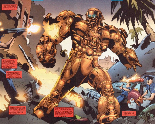
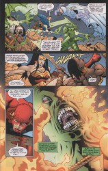
Doug Mahnke does one thing better than everyone else, and that’s draw Wonder Woman.
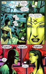
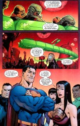
The biggest reason why he draws the best Wonder Woman is easy: the hair. It’s this very straight, wet, flat look that looks so good it should’ve become part of her official look.
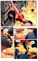
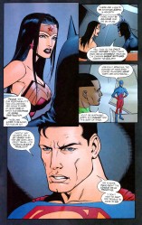
He does another thing better than most people, and that’s depict action.
Violence in comics is weird. When it’s wrong, it’s wrong, and it just looks stupid. This is particularly true of the post-Lee artists, guys who draw in the remnants of one of your typical early Image Comics styles. That sort of overly built, action figure style really doesn’t lend itself to a proper portrayal of violence. It looks like action figures moving across a page while an unseen child goes “Pow! Pow!”
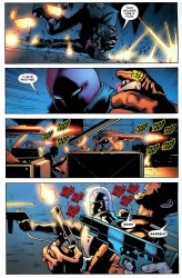
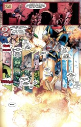
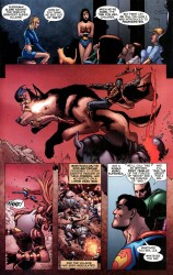
Comics art tends toward clean. Bryan Hitch, Stuart Immonen, John Romita Jr, Dan Jurgens, Mark Bagley, whoever whatever, they tend to draw these really neat scenes, clean lines, so on and so on. The action follows. It’s pretty clean and simple, and when people get bloody, it’s a very reserved kind of bloody. It’s not really that brutal. Mahnke, though. Everything this guy draws looks like it’s had a belt sander taken to it not five seconds before, and when he draws an impact, he draws it like it’s the only thing that matters on the page. You don’t even really need the sound effects at all.
Mahnke’s work isn’t interesting because of any particular attention to detail, I don’t think. It’s interesting because of how he approaches his subject matter. Some artists go for detailed draftsmanship and scale (Bryan Hitch), some for body language and realism (Frank Quitely), and some for photorealism (any artist with Photoshop and a host of garish filters). Mahnke… I think the key to his work is restraint.
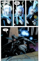
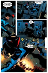
He draws his characters very muscular, just on the far side of ripped, but not the usual steroid case you expect to see in comics. They tend toward the slim, but filled out. They’re just big enough to be superhuman, but not so big that they look overdone. It’s clear that they aren’t normal, but they aren’t so abnormal that they look ridiculous. They’re just right in that sweet spot between human and super. They work so well on the page because they’re believable.
But that’s all beside the point. When Mahnke draws people fighting, it looks good. The gritty way his lines end up, the slim but powerful figures (with real weight), and his ability to capture the perfect mid-action panel are just a few reasons why. David Aja does choreography, Jack Kirby did bombast, and Mahnke is good at finding just the right moment to freeze the frame.
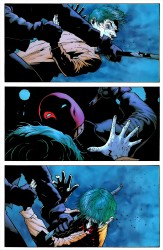
It’s all about that right moment in time. Aja captures it fluidly and about as close to “in motion” as you can get on a comics page. Mahnke doesn’t have the same style or approach to comics as Aja does, but I don’t think that his is any less effective. There’s a page from Batman: Under the Hood where Jason Todd is beating the Joker with a crowbar. The final panel on that page, where the crowbar is in direct and intimate contact with the Joker’s face, hurts. It’s that moment after the impact, after the Joker’s head has started to turn, but before Jason’s completed his swing. It’s ugly, and that specific moment might be the ugliest.
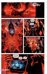
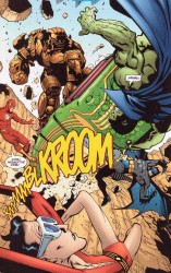
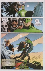
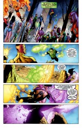
You can see it in other books, too. Kyle’s limp form as Manitou Raven stabs him in the chest in JLA: The Obsidian Age. The part in Green Lantern where Carol Ferris has Sinestro’s arm blocked and is working her way around his throat. In Final Crisis, Frankenstein taking the head off a dog while his giant wolf thing chews through Wonder Woman.
Panels are always specific moments in time. That moment has to convey whatever feelings or actions are required to create a fully realized story. Creating the perfect panel is probably pretty tough, considering that you’ve not only got to draw well, but capture a specific moment in a scene.
If you’re too late, there’s no impact, no juice. If you’re too early, it’s all still just potential energy. Getting it right… that’s something to be respected. Some artists manage to miss that killer moment almost every time. Their art is just passable, just short of acceptable, but it gets a book on a shelf so I guess it has some value to someone. With Mahnke, though… I’ve never felt like that. His gunfights (as in Team Zero), his superhero battles (Justice League Elite
), his brutal hand-to-hand (Batman), and even this sci-fi magic wishing ring stuff he’s doing over in Green Lantern
… all of it looks right. It looks like it hurts.
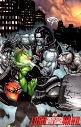
(And honestly, if Doug Mahnke were the only person allowed to draw Wonder Woman and Lobo, I’d be a very happy camper.)
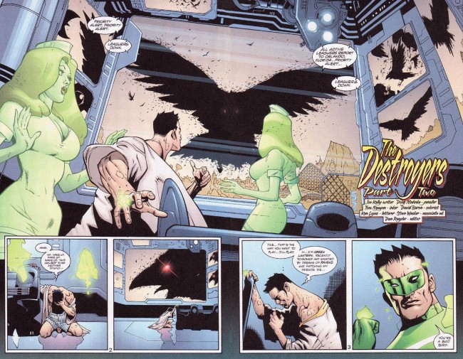

He’s really killing over on GL, there’s a solicited cover for a future issue that has Hector Hammond that I think is probably one of his best non Frankenstein covers
Pure awesome — thanks, this has been a really great series.
I’m going to have to disagree with you on his Wonder Woman. I hate that wet hair look he gives her. Hate it, hate it, hate it. The rest is spot on. I especially liked Mahnke on Frankenstein. The art in that book is visceral and grisly. I love it.
These posts are really interesting.
But I have to say, you’re picking one Lobo artist and it isn’t Bisley? That’s.. that’s wacky, man.
Mahnke’s Wonder Woman is my absolute favorite version. He was the first person in ages to try something just a little different with her, i.e. the “flat, wet” hair, and it grabbed my eye right away. More important was that he also tweaked her facial features, moving away from the Peter/Andru/Perez “All-American Girl” look, replacing it with a more ethnic appearance, and gave her a more regal, almost haughty, air. It knocked me for a loop, and was a big part of why I decided to come back to the book after Morrison left just to see where he and Kelly went with it. What with all the recent histrionics involving the character, i kept meaning to post some Mahnke WW pages…you beat me to it!
Then again, I was already a fan of Mahnke’s via his previous stint on the sadly-missed Major Bummer. if you haven’t read that one, do yourself a favor and find the back issues.
I think Mahnke’s just a tad more interesting when he inks himself; while certain inkers look really good on his pencils, most notably the underrated Tom Nguyen, his solo work has a rougher, more “dirty” line that looks really compelling. A good example of this is the Hitman/Lobo one-shot from several years ago- if you haven’t read that one, again, seek it out. If I recall correctly, he inked himself on that Seven Soldiers: Frankenstein mini, too.
For my money, Mahnke is one of the best, and pretty much my favorite, artist doing mainstream superheroes these days. Great to see this well-done spotlight.
I agree with Mr. Bacardi about Major Bummer (and I’m about to post something about it and Mahnke’s work on it). It’s interesting that you write about Mahnke’s lack of attention to detail, because Major Bummer is extremely detailed, full of weird stuff ringing the main action in a panel (unless that’s not what you meant). As he’s also satirizing superheroes, he goes the ‘roided-out look to the x-treeeeeemmmm, but it’s part of the joke. His work has gotten smoother over the years, but Major Bummer is really a highlight of his work.
I still hold the belief that Final Crisis would have been even better than it was if Doug was drawing #1-6.
My favorite art of his is in Superman Beyond, it combines everything you mentioned into my favorite Superman story to read and it is just MAGIC.
I agree that this series has been great. You have done an awesome job of picking talented artists and showing why they are awesome.
Rick is totally right that Mahnke should have drawn the entirety of Final Crisis.
Is there any chance you could put together a “recommended reading” list for these artists? I’ve always wanted to see more of Aja and Mahnke, but haven’t found much beyond Iron Fist for Aja and Final Crisis and his early JLA stuff for Mahnke.
I HATE the way he drew Wonder Woman’s hair. Thank god they didn’t actually make it permanent.
@claire: “Nobody Beats the Biz” and all, but Bisley has done like four or five issues in recent memory (all on the quite excellent Peter Milligan Hellblazer, and he has a brawny take on John that shouldn’t work but absolutely does)! Mahnke comes closest to having that Bisley take on Lobo these days.
@Johnny Bacardi: Mahnke inking himself is a sight to behold. It’s like–okay, you thought THAT was gritty? Here, let me show you gritty. He’s working with a team of inkers on Green Lantern (Tom Nguyen, of course, Keith Champagne, maybe one other guy, and then himself) and it works surprisingly well. Some of Final Crisis looked kind of rough due to the inker army (bits of the “TIME IS BREAKING!” page hardly look like Mahnke at all, for example), but still good.
And the wet hair–it’s flawless. It’s so counter to normal superhero/superheroine hair (“the bigger the better,” the rule seems to be there, like the ’80s come back to haunt us) and the wet look made her look like a different character. Changed the shape of her face, made her look slimmer/less Generic Superheroine, I don’t know. It just looks good.
@Greg Burgas: Attention to detail… I should have phrased that better. Kind of like how Bachalo approaches detail differently from really noodly detail oriented artists, Mahnke does the same thing. Hitch draws every rivet and fold and buckle. Mahnke does some of that (his work on Team Zero [I think with Sandra Hope?] in particular), but his real skill isn’t in that attention to detail. Does that make more sense? He’s good at it, but it’s not why I love his work.
@CasinoGrande: That is a fantastic idea, though a few of those lists would be pretty short. I’ll give it some thought and see what I can do.
I thought for sure you’d have some Black Adam miniseries art here. That was my favourite of everything Mahnke has done so far and a marked improvement over his earlier work in my eyes. Still, great choice on Mahnke. Definitely one of the best artists working today and one that is actually able to maintain a monthly schedule.
it makes her look like someone who isn’t Wonder Woman.
Me, I don’t get the attachment to the big bushy 80s curly perm look, but I learned long ago that it takes all kinds to make up a world.
And heaven help me, I’m debating Wonder Woman’s appearance again. It’s like a curse or something.
@Jason: so the Wonder Woman outfit isn’t a giveaway?
I think Mahnke himself described his art best
(paraphrased)
“I draw beautiful UGLY”
Lobo’s got the straight hair too — maybe that’s the winning point with both of them.
Mahnke’s later MASK stuff was genius as well.
KS
I think the key point to be made about Mahnke’s Wonder Woman is that she looks like she will absolutely and without hesitation fuck you up, bad, like it is not even a thing.
Hey, man, nice article
I`m a big Mahnke fan and I got a question-request. Can you tell me from which comics are the screepncaps from? (title and issue) I would really appreciate that and don`t think I didn`t try to find out. Apparently i suck at looking things up so If that`s not too much trouble give me a hand with this one.
thx in advance
cheers