h1

We Care a Lot Part 22: We Care Again

January 25th, 2011 Posted by Gavok

It’s been quite a while since my last We Care a Lot article and even longer since I had a Venom article that was about actual Marvel canon. Over a year, in fact. Even longer when it comes to a canon article about Eddie Brock! For forever, I seem to have been sitting on the potential Anti-Venom entry. Why haven’t I written it? Honestly, it comes down to needing a good ending. I’ve been waiting for that perfect ending to finish off the article. And, well, you’ll see how that went…

We all remember the infamous One More Day/Brand New Day status quo change. Devils and Harry Osborn and whatever. The whole thing’s been beaten into the ground to the point that I might as well skip it. The short of it is that I decided I was done with Spider-Man in general and despite all the claims of how great the series has become, I would simply put it at the bottom of my list of great things I should be reading. I wasn’t going to fast on it completely, since I agreed to myself that I would still check out any issue that included one of my favorite characters. In this case, those would be Eddie Brock, Deadpool and Juggernaut. The first one matters the most here, though I suppose Deadpool’s issue plays a role too.

The story New Ways to Die begins eight months after the new status quo of three issues per month. It starts off at Amazing Spider-Man #568 and ends at Amazing Spider-Man #573. It’s got Dan Slott on words and John Romita Jr. on art.

Of all the various plots going around, the two of importance for me are that of the Thunderbolts and Mr. Negative. The Thunderbolts is in its Norman Osborn phase, where the team is made up of Songbird, Moonstone, Swordsman, Bullseye, Penance, Radioactive Man and Mac Gargan as Venom. For one reason or another, Swordsman, Moonstone and Penance get the story off. They’ve been training by attacking motionless dummies for the sake of going after those who are unregistered. Venom goes nuts and starts tearing into all of them. Before Songbird can chastise him for it, they’re given orders to head to New York.

Read the rest of this entry �

Post to Twitter Post to Facebook Post to Reddit Post to StumbleUpon

h1

7 Artists: Chris Bachalo

July 5th, 2010 Posted by david brothers

Nobody in comics draws quite like Chris Bachalo.

I’ve seen people complain that his work is too confusing, hard to follow, or too jumbled. There may be a point there, but not one that I ever really agreed with. Bachalo’s art is dense. He draws in a way that fills panels with details. He doesn’t do the Bryan Hitch thing, where every jet has several realistic parts. He’s not Moebius or Katsuhiro Otomo, so he’s not throwing in every detail there is to throw in. No, Bachalo has more in common with Geof Darrow than any of those guys.

Darrow and Bachalo have a style that can be described as “obsessive.” In Shaolin Cowboy, Darrow drew every rock and lizard and butt crack he could get away with. His figures look like real people, but as you look at his work, you see more extraneous information than you would with the average comics artist. There are too many details, too many little touches, for them to be realistic.

Bachalo’s work is similar, though for different reasons. Bachalo doesn’t even try to replicate reality in his work. He’s more concerned with replicating the experience of life, rather than the appearance. In essence, where Hitch or Otomo try to make their drawings as close to real life as possible, Bachalo wants to replicate the feel of real life via caricature. Bachalo’s approach is fascinating, and makes for exciting, and beautiful, comics. The closest person to his drawing style in American comics is Humberto Ramos, but that is more due to the fact that they have complementary styles, rather than styles that resemble each other (i.e., Alan Davis & Bryan Hitch).

Bachalo draws these smooth, Play-Doh-type people. They have smooth skin, prominent noses, gelled-up hair, and wide mouths. Bachalo doesn’t go in for the muscles-upon-muscles style of superheroic art. Instead, he shows how powerful someone is by simply drawing them bigger and broader than everyone else. His Spider-Man is tiny and fairly muscleless, but he’s also lithe and practically a contortionist.

One of my favorite visual gags that Bachalo has drawn came early in Amazing Spider-Man: Brand New Day. J Jonah Jameson, after suffering a heart attack, is in the hospital, crankier than ever before and ready to go. He sneaks outside into the snow, barely making any headway against the wind. Panel five has the money shot–James with his leg thrown out far, bound and determined to take another step while a nurse drags him back inside.

That one panel is a perfect look at how Chris Bachalo uses caricature to create believable body language. It’s not realistic by any means. The snow is a big ball of blurred white, Jameson’s gown is just a little wrinkly, and his neck is way too long. This is practically a Three Stooges or Buster Keaton shot in comic book form. Jameson’s exaggerated motion, along with his stick-thin legs, enormous chin, and long neck, all work in concert here to tell you everything you need to know, clear as day.

Bachalo is a master of acting. In this page from Amazing Spider-Man: Shed, Carlie and Peter are having an impromptu lunch. Bachalo uses close-ups to frame the page and three wide panels to show the actual action. Peter has a Ralph Dibny nose when he goes “Cheers” with his cup, Carlie’s carefully dabbing at her mouth after a messy bite, and her relaxed lean in panel four is killer. The quiet laugh in panel five is pretty great, too. Peter and Carlie come across as comfortable and friendly, and you don’t need dialogue to figure that out. It’s a little goofy, a little funny, but it’s great work.

What’s interesting about this page is the way that both people are drawn. Peter and Carlie both have Ralph Dibny or Mr. Magoo noses, strangely round jaws, and there’s a bit of Colin Mochrie in Peter’s face. Carlie’s mouth is unnaturally huge in panels five and six, especially in six. It’s kind of weird that she’s clearly taking little bitty baby bites out of that sandwich with her big ol’ mouth, but that doesn’t matter any more than the big noses and Peter’s weird hair does. Bachalo warped them in tiny ways, but uses that to his advantage.

Bachalo uses unrealistic proportions well, but what he’s best at is playing with space. His mostly-white two-page spread from X-Men: Supernovas is beautiful, with the left-hand side being stacked with the aftermath of an attack, including some adorable flopping fish, while the right side is left largely empty. The composition is impeccable, perfectly displaying the chaos of half a second previous and the quiet moment just after.

I’m really fond of the cover to X-Men 190, too. Again, it’s very busy, overflowing with information in the form of clumps of ice, puddles of water, and the mountains in the background. The best part of the cover is the embrace between Mystique and Iceman. She has long arms and fairly thin shins, but she’s all round angles and smooth. Iceman is the opposite, with hard-edged ice, broken limbs, and a pointy face. I can’t quite put my finger on it, but something about this cover stuck with me. Maybe it’s the way the blue and greys blend together (which I think is due to Antonio Fabela, Bachalo’s usual colorist) or the splash of color that is Mystique’s hair. It’s a striking image, and positively claustrophobic.

In this page, where Spider-Man has a guy strung up and is trying to scare him straight, the panel is tilted to the left and comparatively filled with information. The chimney stacks, water towers, and brickwork all work to show you exactly where this is taking place, but the real meat and potatoes are Spider-Man and his webs. Bachalo draws the best webs since Todd McFarlane left the Spider-books, and he’s just showing off here. Bachalo’s Spider-Man is crunched down into a tiny ball, ready to spring, and has huge and expressive eyes. There’s a lot to look at here.

Look at the image of Hammerhead, from Amazing Spider-Man: Crime and Punisher. This is how Bachalo shows power. Hammerhead is huge. Hulk huge. The scale would have you think that the kid in the foreground is barely a toddler, but no. He’s in his pre-teens. Hammerhead is just that big, and he’s half-crouched. One of his fists is as big as the kid’s head. The page is weighted toward the background, making the kid look even smaller. This is an effective choice, in part because it instantly gets across how dangerous Hammerhead is, even without the piles of beaten and brutalized bodies behind him.

Space and scale again. The Lizard dominates this page from Shed. He’s enormous and right in Spider-Man’s face. All of the details on the page go to the Lizard, leaving Spider-Man featureless, save for his wide eyes. A later page features Spider-Man swarmed with civilians, buried under a mass of them and drowning in the chaos.

Bachalo alternates between flooding a page with information and leaving them wide open. This is the way storytelling in comics should work. Every element of his work is done in service of the story, whether the characters are warped and compressed under the pressure of all the debris on the page or given room to breathe. He’s killer, and extraordinarily suitable to drawing Spider-Man comics. His take on the character gives you a short, fairly skinny version of Spidey, a take that works really well and makes everything a little more interesting.

Post to Twitter Post to Facebook Post to Reddit Post to StumbleUpon

h1

We Care a Lot Part 18: The Sammy Hagar of Cannibalism

October 13th, 2009 Posted by Gavok

“Oh, no. No no no. That’s—that’s Venom. That’s Venom as me. That’s—and it’s not even the good one. It’s Mac Gargan.”

— Spider-Man, New Avengers #50

Due to popular demand, I guess I have to dedicate one of these installments towards Mac Gargan, the current Venom. First, a quick refresher on who Mac Gargan is and what he was up to before donning the hungry goo spandex.

Mac Gargan used to be a greedy private investigator, doing just about any job as long as the price was right. Jonah Jameson hired him to figure out the link between Spider-Man and Peter Parker. Mac wasn’t getting anywhere due to Peter’s spider-sense indicating when to slip away, so Jameson pulled out the big bucks for more desperate measures. Using an experimental serum and a cybernetic suit, he transformed Mac into the Scorpion. On the plus side, he was granted strength and agility to counter Spider-Man, along with a cool tail that shoots stuff. On the minus side, it drove him completely mad.

I think we need more villains who are only evil because whatever gave them powers also made them fucking crazy. A lot of the early Spider-Man villains had that going for them.

Scorpion existed for decades as a B-list Spider-Man villain. He was one of the many, many villains who in some way existed as the dark shadow of Spider-Man. Due to his insanity and his insatiable hatred for Jameson, Gargan tended to fail as a team player. Also, some of his insanity came from his inability to remove his costume.

Mark Millar reinvented Gargan for the better during his run in Marvel Knights Spider-Man, which I covered earlier in this series. At some point, Gargan had become a top henchman for Norman Osborn. His armor was gone, though with many operational scars left behind, and his sanity had been more or less restored. Sure, he was still a bad guy, but he was a coherent bad guy. Under Osborn’s orders, he orchestrated the kidnapping of Aunt May as a way to mess with Spider-Man and get Osborn out of prison.

As we know, the Venom symbiote – having skipped on its latest host – decided that Gargan was ideal. Perhaps it was how Gargan’s Scorpion powers are notably comparable to Spider-Man’s. Perhaps it was Gargan’s hatred of Spider-Man, spiked with his lack of Eddie Brock’s morals. But by the end of the day, Mac Gargan had become Venom.

Read the rest of this entry �

Post to Twitter Post to Facebook Post to Reddit Post to StumbleUpon

h1

Who Cares About Comics, Anyway?

August 5th, 2008 Posted by david brothers

Comics are a bastard medium.

It isn’t fine art. Even the commercial art doesn’t quite stick– it’s for sale, yeah, but it’s still somewhere between the two.

Comics are for children. They feature men in tights re-enacting the same simple good versus evil fights they’ve been doing for decades. How deep do you think Batman vs the Joker really goes? Don’t even try to play the “graphic novel” card– graphic novels are just comics with a spine.

The time of comics being worth a grip of money is over, too. It kind of blows my mind when I see people buying variant books for twenty bucks. I have trouble paying more than ten cents a page– why would you go for a dollar a page? Do you really expect that much of a return on your investment? That comic is worthless, son, and it isn’t going to make you money. The ’90s are dead and gone.

Comics are the red-headed stepchild of Hollywood. How many IP farms are out there now? How many people write comics that are obviously movie pictures or storyboards in sequential art form? How many Hollywood writers drop in, dabble a bit, and drop back out, sometimes mid-series? Hollywood options are big news these days– why? Easy: Hollywood is where the money is, friends. Money talks.

Comics are a bastard medium. Not quite fine art, not quite commercial art. Disrespected, not respected, and used as a stepping stone. What do comics have to lose? Nothing at all.

Why not take greater advantage of that?

I love Gotham Central. It’s a great little police procedural. Everything from the writing down to the art clicks. But, take a look at it. It looks like it could have been The Wire or The Shield. It’s staged and laid out like a TV show. It’s got realistic angles, establishing shots, and pretty realistic looking characters. This could’ve easily been a TV show. I’m not dissing or anything. The realism is a point of pride for the series, I’m sure.

Comics can do Hollywood. Hollywood is easy. However, can Hollywood do this?


Look at that. Hyper-compressed information dump gives way to a wonderfully wide open two page spread. The eighteen panel grid is positively claustrophobic. The lack of words and panel size forces you to take your time and pore over each panel. The panels even reflect the reality of the situation. They’re inside an oppressive military facility, and when they escape? A wide open breath of fresh air.

What about the insane style switches in Seven Soldiers #1?

Comics can do so much that movies cannot. However, the general style at the Big Two, and even beyond, tend to stick to realism. Chris Bachalo and Humberto Ramos are a nice look, but work by them, and those like them, is fairly rare.

David Aja made wonderful use of the comics page in his work on Immortal Iron Fist. He kept the straight-forward, realistic storytelling and flipped it. Each strike gets its own panel. Iron Fist dances around the comics page in a scene that would take a split second of action in a movie. He makes the page part of the story.

I loved We3. There are a ton of little narrative tricks and details that force you to read the book slowly and take it all in. The spread above, of the animals attacking the soldiers, is more exciting than bullettime was when the Matrix hit. Every single action gets its place in time. If you look at the panels in order, it’s like looking at a film strip.

No one cares about comics, so comics can get away with a lot. Grant Morrison’s Flex Mentallo is one of my favorite comics. It tells the tale of a forgotten superhero and how you can make fiction a reality. It’s a love letter to comics and it flits from era to era over the course of the series. It’s brave.

We need more Flex Mentallos. Tell a story that might not sell, but is worth the time. Marvel’s started moving in this direction with their revamped Marvel Knights series. Who’d have thought that a story about Daredevil’s Dad would be an excellent comic?

There’s a lot of attention paid to continuity, as well. Things have to line up just so or else the story is ruined.

Screw that.

Keep the stories internally consistent, but go wild. I may not like Marvel Zombies very much, but I can respect what it represents. Take advantage of the fact that most of these characters are unbreakable. Toss Captain America into 1602, sure. Pop Spider-Man into feudal Japan. What if Luke Cage was in his ’20s in 1930s Harlem? What did the Black Panther cult do to fight colonization in Africa?

Take your characters and bend them. If they break, guess what– you can just dial it back to what it was before. You don’t need Continuity Patch Comix. Fans aren’t stupid. If you say “That was then, this is now,” they will assuredly grumble. They’ll grumble regardless, to be honest. But, they’ll get over it. They always do.

Spider-Man made it through the Clone Saga. Batman made it through the ’90s. Luke Cage, Ms. Marvel, Emma Frost, and a host of other d-list characters are headlining now. You can’t break these characters, so don’t treat them like fine china. Throw them against the wall. They’ll bounce back.

Comics need to start acting like comics. No one expects anything out of them but a story that goes from A to B to (sometimes) C. If no one expects anything out of you, you’re free to do what you like.

We need more Seth Fishers.

Post to Twitter Post to Facebook Post to Reddit Post to StumbleUpon

h1

Lobo’s back’s back.

August 30th, 2006 Posted by david brothers

Just a few quick bullets on what I’m thinking about in the world of comics right about now.

– This week’s 52 was good. Lobo’s reintroduction was great, and his origin, completely with pompadour, was a good look, too.

– I have a new issue of Kabuki to read. I’m positively giddy. I may wait until tomorrow to read the latest issue of the best non-monthly series ever.

– All-Star Superman, by The King of All-Comics and Frank Quitely, delivered. Lex Luthor’s eyebrow and sheer arrogance come through perfectly and hilariously.

– Mike Carey’s first issue of Ultimate Fantastic Four? Way better than Millar’s entire year, of which I read approximately the first three months. It’s that good.

– Black Panther’s World Tour has started up, and it’s going to be a doozy. Doom gets what’s coming two different ways. Next month is the Inhumans, I cannot wait for that.

– The Boys 02 is the second issue in a row to feature, er, doggy-style. Pun possibly intended. This is one of the most mean-spirited books I’ve read, but we get some good character insights in Billy Butcher and friends. I’m definitely interested, and Robertson’s art? It’s great.

x-men 190 Have you guys seen Chris Bachalo’s cover to X-Men 190? It’s incredible. The scene it depicts happens a little different in the comics, but that’s water under the bridge. There’s precious little Rogue in this book, but her old costume is lovely and her new assertiveness fits a character who’s been a mainline X-Man for years now. She isn’t just “Sugah sugah mope mope mope.” She’s a fighter. Carey is doing a bang-up job on this series. This guy is remarkably good in the Marvel U. His Hellblazer was good, but Lucifer never grabbed me. His Marvel stuff, though… too good. Loving it.
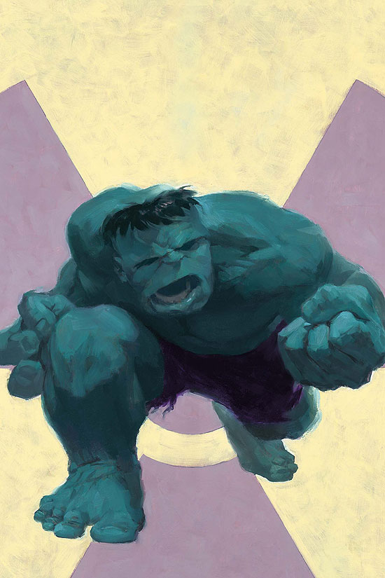
Mythos HulkMythos: Hulk by Paul Jenkins and Paolo Rivera is a four dollar bundle of joy. The Mythos series (right now just Hulk and X-Men) is a retelling of Marvel origins. They are updated for the modern era and boiled down to their essences. Rick Jones isn’t dared by friends to go onto the testing site, he’s an intern who isn’t paying attention. That sort of thing. They’re good stuff, and Rivera’s art is a treat. Highly recommended, and I hope they collect all of them into a handsome hardcover down the line.

– I read Wonder Woman 02. I’m done with the series. I realized that the moment I saw Wonder Woman start to do that stupid spinning thing from the TV show. No sir I do not like it. The Dodson’s art is great, as always, but Heinberg leaves me flat. Not quite Young Avengers flat, but flat. It wasn’t just the spinning what done it, either. It’s a book that seems to be trying very hard to get me to care, but does a poor job of closing the deal. Giganta is smart and tall… okay? Donna Troy is Wonder Woman and sucks at her job… okay? Wonder Woman is sneaking around and hiding… why bother? It’s weird. My favorite portrayals of Wonder Woman have been in the Morrison/Waid/Kelly JLA era. Doug Mahnke drew the absolute best WW ever. The wet hair look was way better than the usual comic book poofy hair. He drew her lean, but powerful, and his Angry Wonder Woman was something to behold. So, uh, now that I own the first 90 or so issues of JLA in trade form, I guess I’ll go read those when I want to read about Wondy.

Titans 
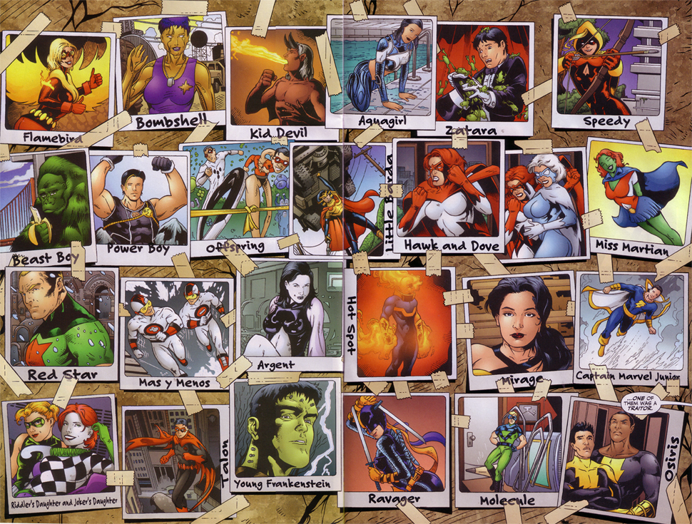
– Someone explain this image to me. Is this from the new issue of Teen Titans? I found it linked off SomethingAwful’s BSS forum and it… bleh. Johns, what are you doing, man? That first row, save for Aquagirl and Speedy is worthless, and I like Speedy despite Judd Winick’s handling of her. The second row has Beast Boy and Offspring and they’re cool, but the rest of that row is worthless, too. I realize I’m prejudging here, but Little Barda is too much. DC just needs to leave the Fourth World alone. Give it to Morrison and a good artist and just keep it out of anyone else’s hands. It’s cool to see Mas y Menos and Captain Marvel Jr, but again, the rest of the characters? Bleh. On the bottom row, I think that the two Daughters are interesting ideas, if pushing the gimmick a bit, and I like Ravager, and that leaves Osiris. If Osiris turns out to be Isis’s brother, he’s got the most poorly thought-out code name ever. It takes a lot for me to read Titans. Introducing a bunch of no-names and go-nowheres isn’t really drawing me in. The series hasn’t really grabbed me since Titans Tomorrow, to be quite honest. Maybe it’ll pick up, but I basically have read Teen Titans for two years of my life. I can do without it. It’s turned into the JSA, in that it’s a book about a team full of characters who should be guest-stars at best.

– To be quite fair, Whedon’s Astonishing X-Men is boring me, too. Ha ha, Wolverine, yes, but the rest of the book is cute references up the wazoo and SHOCK REVEALS. It’s very pretty, but I’m not even remotely interested in the story. It feels like it’s treading water, with Neat Callback Scene (Kitty Pryde in the sewer last issue made me roll my eyes hard) to Neat Action scene with no meat inbetween.

– Just to complete the custom combo, I found Serenity boring and Firefly decent to middling at best.

– Cameron Stewart is awesome. You all know this, yes? His upcoming book about Vietnam looks like the bee’s knees. However! He and his Royal Academy of Illustration and Design cronies are having a draw-off, and Harley Quinn was the pick for today. Harl is probably my favorite bat-villain, so go check it out. I kind of like Cam’s, since it’s classic Bruce Timm style, but all of them are good. Go look!

– Oh man, I’m totally going to pitch DC Joker Loves Harley Quinn and do it in the Spider-Man Loves Mary Jane style, but with more mayhem. Yes.

– Here’s an interview with Georges Jeanty, artist of The American Way. He’s a great talent, and TAW is totally a sleeper hit. It gets better and better. It’s telling a great tale of superheroics in the 1960s and actually deals realistically with race. I’m loving it, and 4l member Thomas Wilde likes it, too. He doesn’t like anything but Barb Wire, Vampirella, and other bad comics, so him liking a good book is astonishing. I’m kidding! He doesn’t actually like any of those books. However, if he doesn’t write for the blog, I’ll tell everyone that he does and then kill him while he sits in shame.

– I’ve gotten a buttload of trades over the past couple weeks. X-Men: The Coming of Bishop, Birds of Prey: Sensei & Student, Starman: Sins of the Father, X-Men: Golgotha, some JLA v3 trades, Ghost Rider/Wolverine/Punisher: Hearts of Darkness, Spider-Man: The Assasin Nation Plot, The Punisher/Wolverine: African Saga (Carl Potts and Jim Lee! Whatever happened to Carl Potts?), and Monster volumes 3 and 4. Also Absolute Kingdom Come, though I don’t like Alex Ross’s art very much at all, but I love extra content in hardcover comics. I sometimes fear that I have bad taste in comics, but I love them too much to quit.

– So, summing up: Comics are great right now, Wonder Woman’s series is blah, Teen Titans is blah, but comics are still great, the internet is awesome, and I’ve got bad taste in comics. This ended up a lot longer than expected. It was supposed to be a short post!

– Peace!

Post to Twitter Post to Facebook Post to Reddit Post to StumbleUpon