h1

This Week in Panels: Week 51

September 12th, 2010 Posted by Gavok

It’s a nice mix this week from me, David and regular/guest contributor Was Taters. Almost an equal amount of panels all around. Naturally, I had to choose a New Avengers panel with Iron Fist’s flashy new duds on it. Note to Marvel: keep this a thing. Relaunch his book and make that his new status quo costume. Or just relaunch his book.

Taters and I disagreed on which Batgirl panel to go with, but I went with her idea. Can’t believe someone turns down the image of Bela Lugosi riding a segway.

Amazing Spider-Man #641
Joe Quesada, Paolo Rivera, Stan Lee and Marcos Martin

Amazing Spider-Man #642
Mark Waid, Paul Azaceta, Stan Lee and Marcos Martin

Read the rest of this entry �

Post to Twitter Post to Facebook Post to Reddit Post to StumbleUpon

h1

4×4 Elements: Kraven’s Last Hunt

July 31st, 2010 Posted by david brothers

Spider-Man: Kraven’s Last Hunt. Words by JM DeMatteis, pencils by Mike Zeck, inks by Bob McLeod, letters by Rick Parker, colors mostly by Janet Jackson.

I picked up a couple issues of Kraven’s Last Hunt when I was a kid and relatively fresh. It was pretty scary at the time, being that most of the Spider-Man stories I read were pretty middle of the road with regards to violence and horror. KLH is still one of my favorite Spidey stories, and one of the relatively few that stand alone, like Batman: Year One or Dark Knight Returns. Here’s four reasons why it’s great.

Mick Zeck and Bob McLeod get Spider-Man. Zeck’s really good at drawing people, and this gives him a chance to put that into action. Spidey’s a little shorter than Kraven, and a little slimmer. Spider-Man isn’t as buff as other heroes. He’s acrobatic and fast, which suggests a thin, but muscular, build. Kraven is burly, built like a circus strongman or like Superman.

There’s a surprising number of completely silent panels in Kraven’s Last Hunt, and Kraven’s face is the focus of many of them. Zeck and McLeod render him with a deep sadness. When it comes time to draw figures in action, they acquit themselves very well. The ghost of Ned Leeds looks genuinely confused after being told that he’s dead. Mary Jane’s body language when she goes to see Robbie Robertson is tired and dejected. Kraven looks insane when he’s gobbling up spiders. Vermin is creepy crawly, as he should be.

Zeck and McLeod do a better than average job of making this story work, but still manage to keep it within the Spider-Man style. Zeck’s Mary Jane is undeniably a John Romita girl. Robbie sits around smoking a pipe and he doesn’t look out of place. They jettison Kraven’s costume for the majority of the book, but when it does appear, it’s rendered just as realistically as everything else. They did this back in 1987, but I wouldn’t be mad if I saw it on a book nowadays.

Kraven’s Last Hunt placed Spider-Man within something bigger than himself. Rather than just having a hero/villain relationship, Kraven’s mad rantings place Spider-Man under the umbrella of the Spider, the source of all of man’s pain and suffering. Kraven places all of the blame for his mother’s insanity, his father’s downfall, and his own weakness onto the Spider’s shoulders, creating a totem for him to tear down and conquer.

This is a little different than a criminal telling Batman that he’s a demon or a devil. The bat is never really charged with any meaning but fear in Batman, and I’m having trouble thinking of a time when that was examined in any depth. In this story, Kraven comes to realize that the Spider represents a concept, rather than anything literal. The Spider is your enemy, something that exists simply to oppose you. It isn’t necessarily evil.

Spider-Man represents all of the hate and doubt and evil that’s haunted Kraven’s life. Due to this, and his impending death, Kraven has one goal. Kraven must prove himself better than Spider-Man. It’s the only way he can conquer his fear, his feelings about his mother’s insanity, and his own shortcomings. He dons the costume and attempts to do everything the Spider did, only better. He fights crime, but kills the criminals. He takes on Vermin, who had previously fought Captain America and Spider-Man both, and demolishes him. He even rescues Mary Jane, unintentionally repeating another of Spider-Man’s past actions, but she reacts with terror.

Kraven’s entire arc in Kraven’s Last Hunt is about proving his supremacy over his fear, and his own fear is his last mountain to climb. There’s no get rich quick, no world domination… he doesn’t even do it to hurt Spider-Man. Spider-Man is a prop in the fight between Kraven and his Spider.

She only appears on a few pages in Kraven’s Last Hunt. Despite that, Mary Jane plays the role of the average reader’s point of view. At the end of the first chapter, Spider-Man is killed and buried. For the next few chapters, we see Kraven going wild and have no idea what’s going on. She echoes all of our fears and thoughts, and when she encounters Kraven, she has the same reaction we have had: “Stop.”

Kraven perverted the idea of Spider-Man, but he also perverted the Spider-Man comics. Kraven took over the books entirely, and Spider-Man simply doesn’t appear again until the fourth chapter. I can see how this would be a little unsettling, and when viewed through Mary Jane’s eyes, it makes perfect sense. This is Kraven wearing Spider-Man’s skin, and it’s absolutely not right.

And the first thing Spider-Man does when he digs his way out? He goes directly to his wife.

Post to Twitter Post to Facebook Post to Reddit Post to StumbleUpon

h1

This Week in Panels: Week 44

July 25th, 2010 Posted by Gavok

I’m flying solo this week, since David’s off in San Diego, hanging out with his friends with the paper Goku hair. There’s still a shitload of comics featured this time around, mostly featuring Avengers stuff, Deadpool stuff and comics simply ending. The final issue of Marvel Zombies 5 simply confuses me in the sense of, “Seriously? That? That’s how you’re going to end the miniseries? Okay, if that’s how you feel.”

Age of Heroes #3
Fred Van Lente, Jefte Palo and various others

Atlas #3
Jeff Parker, Gabriel Hardman and Ramon Rosanas

Read the rest of this entry �

Post to Twitter Post to Facebook Post to Reddit Post to StumbleUpon

h1

This Week in Panels: Week 43

July 18th, 2010 Posted by Gavok

It’s the special Awesome Motorcycle Shots Edition of ThWiP. Yeah, go read Gorilla Man if you haven’t already. With Astonishing Spider-Man & Wolverine, I could have used a panel involving the big surprise villain (and he is both big AND a surprise), but I think it’s better for you to see that reveal yourself.

Amazing Spider-Man #637
Joe Kelly and Michael Lark among others

Astonishing Spider-Man & Wolverine #2
Jason Aaron and Adam Kubert

Read the rest of this entry �

Post to Twitter Post to Facebook Post to Reddit Post to StumbleUpon

h1

This Week in Panels: Week 42

July 11th, 2010 Posted by Gavok

Another week of panels is upon us. David only tosses in one panel this time around. I remembered to remind him that one of the guidelines for This Week in Panels is not to put anything from the last page. After all, we don’t want to spoil the entire book for you, nor do I want it to be like one of those comic covers that depicts the very last page. Let’s see what he chose.

Amazing Spider-Man #636
Joe Kelly, Zeb Wells and Michael Lark

GODDAMN IT, MAN! WHAT THE HELL?!

Avengers: The Children’s Crusade #1
Allan Heinberg and Jim Cheung

Read the rest of this entry �

Post to Twitter Post to Facebook Post to Reddit Post to StumbleUpon

h1

7 Artists: Paolo Rivera

July 9th, 2010 Posted by david brothers

Covers sell comics. I mean, obviously, right? Back when you could buy comics in public, covers had to be exciting and interesting as a general rule. Severed heads, gorillas, and frankly stupid ideas were commonplace, and it was all calculated to catch your attention. As the comics industry became more insular, the covers did the same. They stopped trying to attract civilians and started trying to trick comics fans into buying the issue because “nothing will be the same!” If you look at early ’00s Marvel, and actually several covers recently, it’s clear that they weren’t even trying to reach even comics fans. “Get Adi Granov to draw She-Hulk standing on a gunmetal-y background! That’ll move units! Get Greg Horn to throw some D’s on that joint!” In a word: lazy. Another word: boring. Those are two of the worst things a comic book can be.

Paolo Rivera, though. This guy did a series of fully-painted Marvel books with Paul Jenkins that I liked well enough. They were origin stories, slimmed down and tightened up. Fun, but not particularly interesting, you know? They were stories I’ve read dozens of time before. The art was good, and the writing was okay, but it wasn’t groundbreaking. But his cover work… that’s where he shines. This guy actually makes interesting covers, something that was in short supply for a long time.

I don’t really have any science for this one. I don’t really know cover theory beyond realizing that some cool type, clever copy, and great art makes for a good cover. I have several cover artists I like (Dave Johnson, Rafael Albuquerque, Frank Miller, Walt Simonson, Jordi Bernet, others), but I couldn’t genuinely tell you why I like them. Not beyond “It looks good.” I’m not equipped.

If I strained, I could point out reasons why Rivera is a great cover artist. It could be the little details he puts on his covers, like Spidey’s tiny (but expressive!) eyes, the glow of Cyclops’s visor on the snow, or the awkward mid-motion poses of Punisher and Spider-Man (and his web). Maybe it’s the draftsmanship/craftsmanship in his work. His characters tend to have real weight and are believable in context. Spider-Man is kinda thin, Cap a little tall, and Punisher looks a little like a creepy child molester. Maybe it’s the hand-lettered sound effects. Maybe it’s how he knows how to draw your eye to a specific point on the cover. Maybe it’s the look on Sandman’s faces while he pummels Spider-Man. Maybe it’s the incredible sneer on Black Widow’s face.

Who knows. Who cares. I’m a firm believer in examining what you enjoy. If it’s worthy of time, it’s worthy of examination. Why you like it, what’s good about it, what it says, what it means. Whatever. At the same time… sometimes you just have to sit back and like things. Sometimes that’s nice.

I like Paolo Rivera’s work.

And this cover down here, with the blue and the red? Cover of the year and instantly one of my favorite Spider-Man images. No contest. It doesn’t even need any copy. It knocked my socks off when I first saw it. Even if you didn’t know from covers, that’s a cover. Check the process here.

Post to Twitter Post to Facebook Post to Reddit Post to StumbleUpon

h1

7 Artists: Chris Bachalo

July 5th, 2010 Posted by david brothers

Nobody in comics draws quite like Chris Bachalo.

I’ve seen people complain that his work is too confusing, hard to follow, or too jumbled. There may be a point there, but not one that I ever really agreed with. Bachalo’s art is dense. He draws in a way that fills panels with details. He doesn’t do the Bryan Hitch thing, where every jet has several realistic parts. He’s not Moebius or Katsuhiro Otomo, so he’s not throwing in every detail there is to throw in. No, Bachalo has more in common with Geof Darrow than any of those guys.

Darrow and Bachalo have a style that can be described as “obsessive.” In Shaolin Cowboy, Darrow drew every rock and lizard and butt crack he could get away with. His figures look like real people, but as you look at his work, you see more extraneous information than you would with the average comics artist. There are too many details, too many little touches, for them to be realistic.

Bachalo’s work is similar, though for different reasons. Bachalo doesn’t even try to replicate reality in his work. He’s more concerned with replicating the experience of life, rather than the appearance. In essence, where Hitch or Otomo try to make their drawings as close to real life as possible, Bachalo wants to replicate the feel of real life via caricature. Bachalo’s approach is fascinating, and makes for exciting, and beautiful, comics. The closest person to his drawing style in American comics is Humberto Ramos, but that is more due to the fact that they have complementary styles, rather than styles that resemble each other (i.e., Alan Davis & Bryan Hitch).

Bachalo draws these smooth, Play-Doh-type people. They have smooth skin, prominent noses, gelled-up hair, and wide mouths. Bachalo doesn’t go in for the muscles-upon-muscles style of superheroic art. Instead, he shows how powerful someone is by simply drawing them bigger and broader than everyone else. His Spider-Man is tiny and fairly muscleless, but he’s also lithe and practically a contortionist.

One of my favorite visual gags that Bachalo has drawn came early in Amazing Spider-Man: Brand New Day. J Jonah Jameson, after suffering a heart attack, is in the hospital, crankier than ever before and ready to go. He sneaks outside into the snow, barely making any headway against the wind. Panel five has the money shot–James with his leg thrown out far, bound and determined to take another step while a nurse drags him back inside.

That one panel is a perfect look at how Chris Bachalo uses caricature to create believable body language. It’s not realistic by any means. The snow is a big ball of blurred white, Jameson’s gown is just a little wrinkly, and his neck is way too long. This is practically a Three Stooges or Buster Keaton shot in comic book form. Jameson’s exaggerated motion, along with his stick-thin legs, enormous chin, and long neck, all work in concert here to tell you everything you need to know, clear as day.

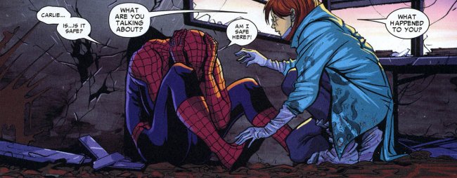
Bachalo is a master of acting. In this page from Amazing Spider-Man: Shed, Carlie and Peter are having an impromptu lunch. Bachalo uses close-ups to frame the page and three wide panels to show the actual action. Peter has a Ralph Dibny nose when he goes “Cheers” with his cup, Carlie’s carefully dabbing at her mouth after a messy bite, and her relaxed lean in panel four is killer. The quiet laugh in panel five is pretty great, too. Peter and Carlie come across as comfortable and friendly, and you don’t need dialogue to figure that out. It’s a little goofy, a little funny, but it’s great work.

What’s interesting about this page is the way that both people are drawn. Peter and Carlie both have Ralph Dibny or Mr. Magoo noses, strangely round jaws, and there’s a bit of Colin Mochrie in Peter’s face. Carlie’s mouth is unnaturally huge in panels five and six, especially in six. It’s kind of weird that she’s clearly taking little bitty baby bites out of that sandwich with her big ol’ mouth, but that doesn’t matter any more than the big noses and Peter’s weird hair does. Bachalo warped them in tiny ways, but uses that to his advantage.

Bachalo uses unrealistic proportions well, but what he’s best at is playing with space. His mostly-white two-page spread from X-Men: Supernovas is beautiful, with the left-hand side being stacked with the aftermath of an attack, including some adorable flopping fish, while the right side is left largely empty. The composition is impeccable, perfectly displaying the chaos of half a second previous and the quiet moment just after.

I’m really fond of the cover to X-Men 190, too. Again, it’s very busy, overflowing with information in the form of clumps of ice, puddles of water, and the mountains in the background. The best part of the cover is the embrace between Mystique and Iceman. She has long arms and fairly thin shins, but she’s all round angles and smooth. Iceman is the opposite, with hard-edged ice, broken limbs, and a pointy face. I can’t quite put my finger on it, but something about this cover stuck with me. Maybe it’s the way the blue and greys blend together (which I think is due to Antonio Fabela, Bachalo’s usual colorist) or the splash of color that is Mystique’s hair. It’s a striking image, and positively claustrophobic.

In this page, where Spider-Man has a guy strung up and is trying to scare him straight, the panel is tilted to the left and comparatively filled with information. The chimney stacks, water towers, and brickwork all work to show you exactly where this is taking place, but the real meat and potatoes are Spider-Man and his webs. Bachalo draws the best webs since Todd McFarlane left the Spider-books, and he’s just showing off here. Bachalo’s Spider-Man is crunched down into a tiny ball, ready to spring, and has huge and expressive eyes. There’s a lot to look at here.

Look at the image of Hammerhead, from Amazing Spider-Man: Crime and Punisher. This is how Bachalo shows power. Hammerhead is huge. Hulk huge. The scale would have you think that the kid in the foreground is barely a toddler, but no. He’s in his pre-teens. Hammerhead is just that big, and he’s half-crouched. One of his fists is as big as the kid’s head. The page is weighted toward the background, making the kid look even smaller. This is an effective choice, in part because it instantly gets across how dangerous Hammerhead is, even without the piles of beaten and brutalized bodies behind him.

Space and scale again. The Lizard dominates this page from Shed. He’s enormous and right in Spider-Man’s face. All of the details on the page go to the Lizard, leaving Spider-Man featureless, save for his wide eyes. A later page features Spider-Man swarmed with civilians, buried under a mass of them and drowning in the chaos.

Bachalo alternates between flooding a page with information and leaving them wide open. This is the way storytelling in comics should work. Every element of his work is done in service of the story, whether the characters are warped and compressed under the pressure of all the debris on the page or given room to breathe. He’s killer, and extraordinarily suitable to drawing Spider-Man comics. His take on the character gives you a short, fairly skinny version of Spidey, a take that works really well and makes everything a little more interesting.

Post to Twitter Post to Facebook Post to Reddit Post to StumbleUpon

h1

Fourcast! 52: Madvillain

July 5th, 2010 Posted by david brothers

-All villains, all the time in this extra-sized Fourcast!
-Esther liked last week’s Green Lantern 55 and Action Comics 890.
-Yes, even the sad/silly cat story.
-We smoothly segue into talking about Batman’s villains.
David is in love with the idea of apophenia.
-We discuss the workman-like qualities of Flash’s Rogues.
-David makes a case for Spider-Man’s villains.
-Esther ain’t having none of it.
-Esther was recovering from being sick.
-David was in the process of getting sick.
-David will be smarter next time or he’ll be fired.
-6th Sense’s 4a.m. Instrumental for the theme music.
-See you, space cowboy!

Subscribe to the Fourcast! via:
Podcast Alley feed!
RSS feed via Feedburner
iTunes Store

Post to Twitter Post to Facebook Post to Reddit Post to StumbleUpon

h1

The Cipher 06/16/10

June 16th, 2010 Posted by david brothers


amazing spider-man presents black cat #1: words by jen van meter, art by javier pulido, colors by matt hollingsworth, letters by joe caramanga, cover by amanda conner, and cover colors by christina strain.

North beach leathers, matching Gucci sweater… Gucci sneaks on to keep my outfit together, whatever, hundred for the diamond chain. Can’t you tell that I came from the dope game?

You know who I love? Felicia Hardy, the Black Cat. Up until her reintroduction in Amazing Spider-Man last year, courtesy of Joe Kelly and Mike McKone, she’d hadn’t had any substantive appearances in a Spider-book in a good long while. She’s been one of my favorite characters since I was a kid, but not for any particular story. She was in my first comic, ASM 316, but all she did there was get dissed by Venom. Not exactly a selling point. But no, I like her because she’s got a great visual, with the white hair, black costume, white gloves and shoes, and tufts of fur. I like her like I like Domino, I think. Her bad luck powers are neat and allow for some fun action, but the real key is that she’s a thief. Heist stories are some of the best stories, and hopefully Van Meter’s story in Black Cat is going to be a good one. I’m feeling optimistic. The team is pretty fantastic all around. Javier Pulido is an astonishingly good artist, Matt Hollingsworth a great colorist, and how crazy is that Amanda Conner cover? Check the preview here. Four bucks is less than optimal, but I’m curious. We’ll see how I feel at the shop.

Looking at the other stuff on my list… this is a surprisingly large week for me. Amazon-wise, Naoki Urasawa’s 20th Century Boys, Vol. 9 arrived yesterday, Ultimate Spider-Man, Vol. 11 is due in today. 20th Century Boys is kicking up now that Urasawa has gotten around to answering questions, but the last volume definitely had two scenes that featured someone going “Oh no! It’s YOU!” without actually showing us who it is. That was massively frustrating, but hopefully we’ll get to see who it is in this volume? Ult Spidey I preordered when it was cheap, and it completes the last run of Ultimate Spider-Man. After this… I think I’m out. The new stuff isn’t clicking like it should. It has its moments, but not so many that I want to keep buying it monthly. I might check out the first couple trades a few months down the line, see if my opinion changed.

Floppy-wise, I’m looking at Amazing Spider-Man 633 & 634, Atlas 2, Hellblazer 268, Heralds 3, and Unknown Soldier 21. That’s the end of “Shed,” the beginning of “Grim Hunt,” a Jeff Parker/Gabriel Hardman joint, a Shade the Changing Man guest spot, more from the Kathryn Immonen/Tonci Zonjic superstar team, and more from the sadly cancelled book about a lone soldier battling himself and others in Uganda. This is the best week I’ve seen in a good while. I’m juggling a few things, but I figure I’ll have a post on Unknown Soldier up soon. Whether it’ll be about this week’s issue (which is about the life and times of an AK-47) or the series as a whole, I’m not sure.

Other notables: Brightest Day 4 is the first appearance of the new Aqualad, Seven Soldiers of Victory, Book 1 is the first hardcover collection of the fantastic Grant Morrison-led megaseries, and friend of 4l! Ian Brill’s Darkwing Duck launches.

Oh yeah, I did a few movie reviews over at Tucker Stone’s spot. I watched four Akira Kurosawa films at New People here in San Francisco and you guys get to reap the whirlwind.

What’re you buying? What am I missing? What did you like? Check out this week’s books here. Anybody else have characters where they like the idea more than the actual execution on the page? I can’t think of a single great story with Domino, but I like her nonetheless.

Post to Twitter Post to Facebook Post to Reddit Post to StumbleUpon

h1

This Week in Panels: Week 36

May 30th, 2010 Posted by Gavok

Welcome back for another week. It’s been a pretty damn good week for comics, even with that Rise of Angst miniseries. A really full week, too. Reader Space Jawa sends in one for Ultimate Enemy, which I heard was a pretty big letdown. Sure, it’s going to lead into the next miniseries, but there’s apparently no closure.

Amazing Spider-Man #632
Zeb Wells, Chris Bachalo and Emma Rios

Batman: The Return of Bruce Wayne #2
Grant Morrison and Frazer Irving

Read the rest of this entry �

Post to Twitter Post to Facebook Post to Reddit Post to StumbleUpon