h1

The Prophet Exception: More On Artist Changes

February 26th, 2012 Posted by | Tags: , , , , , ,

I said that artist changes due to double-shipping mainstream comics devalues the artist. Not all art changes are evil, though. Sure, some of them are of the Final Crisis variety and result in terrible comics, but every once and a while, people get them right. Artist changes, guest artists, however you want to call them–they can be used tactically, as a way to showcase an artist or add a little extra punch to a storyline.

This may be weird, but follow along for a minute. One of the best examples of the way a guest artist can make something extra dope is a song. It relates to my point about unwanted art changes being like new actors showing up in old roles in a movie or a song changing direction mid-stream. It’s Big Boi’s “Fo Yo Sorrows,” off that Sir Lucious album:

It happens around 0:55. Too $hort, the legendary rapper out of Oakland, pops up to drop four bars and then bounce. That’s a quarter of a verse. It’s a cameo, but it goes deeper than that. At 0:47, Big Boi flips the word “bitch” just like $hort made famous, and then says that $hort was one of his favorite rappers. For Too $hort to pop up on this song for something that’s little more than a cameo is ill. It’s rappers playing around and having some fun. It’s not really a guest spot. It’s something you smile about, because you’re in on the joke.

That’s the feeling that art changes should give you. A little spike of glee, or a chance to explain to everyone you know exactly why what just happened is so good.

The Immortal Iron Fist did it well, for the most part. The flashbacks to adventures of other Iron Fists were drawn by a variety of dope artists, each one tackling a different Iron Fist. David Aja drew the modern pages, and his art served as connective tissue between the flashbacks. He set the tone and stage for the book, and then when the story required that the tone and stage change, Travel Foreman, John Severin, Russ Heath, and Sal Buscema tagged in to get it done. Aja is Big Boi, and John Severin is Too $hort. He brings with him a history and pedigree that people on the inside will get, while others will just go, “Yo, that looked pretty cool.”

Big Boi/Matt Fraction/Ed Brubaker had a good reason for their guests showing up, too. It’s not just a willy-nilly thing. There’s a point. It’s an enhancement, rather than someone just plugging another gear into the mix so that the machine goes faster. It turned Immortal Iron Fist into a jam comic. It provided variety.

There’s a really good example of what I’m talking about coming up later this year. Prophet started life as a Rob Liefeld/Dan Panosian joint. As part of the big Extreme relaunch, it’s currently in the hands of Brandon Graham, Simon Roy, Richard Ballermann, and Ed Brisson. It’s really good, actually, part of the continuously rising wave over at Image. Graham is writing, but working closely with Roy to make the story the best it can be. Sometimes that means layouts, other times it means Roy making sure that Graham’s on point or vice versa. It’s a collaboration. And there’s going to be guests popping in. From Graham’s blog:

So I’d written on here before that Prophet would come out 6 times a year but some cool shit has happened and now it’s going to be 12 issues a year monthly.

So here’s the schedule:

Starting Jan-

#21(number 1 in our hearts) -#23 art by Simon Roy (Jan’s Atomic heart), then #24 &25 are drawn by farel dalrymple (pop gun war) I’m drawing #26 and Giannis Milonogiannis (Old city blues)is doing # 27- 32. I think we’ve come up with a cool way to make this work storywize.

The situation isn’t too dissimilar from Marvel, and I’m sure a lot of people will say it isn’t different at all. There’s a comic, and the people making it want it to come out more frequently, so more artists are joining the team. The original draw of the series was the Graham/Roy/Ballermann/Brisson team, and that’s changing. I think that there’s a difference here, but a very, very fine one. I don’t think the difference is “I like these guys,” either. I like a lot of them dudes who are coming onto books I like, too.

Instead of just slipping new dudes into the rotation to boost the schedule, editor Eric Stephenson and writer Graham have found artists to work with and crafted the story around them. My understanding is that each artist will be working on a story tailored for them, rather than simply being used to keep the ship on track. All of the artists are doing covers, too, I suppose as a type of introduction. There’s a creative reason here, and I think that has more value than the purely economical reasons Marvel has to have artists playing musical chairs.

Here’s the covers for Prophet 22-24 and 26. The covers are by Simon Roy, Farel Dalrymple, Giannis Milonogiannis, and Brandon Graham, in that order.


They have absolutely distinct styles, right? Roy & Ballermann’s palette is dusty and soft, Dalrymple’s muted and night time-y, Milonogiannis’s is aged, and Graham’s is soft, but in a different way than Ballermann’s. Firmer, maybe. Roy & Ballermann’s art is rough and loose. Dalrymple is detailed and gloomy. Milonogiannis is… I don’t even know the right word for it right now. Majestic? Ominous? I get the feeling of mankind making contact with an entirely alien and apathetic intelligence, something that sees us as being beneath its notice. And Graham’s cover for 26 reminds me of nothing so much as the passage of a lot of time.

Things like this make art changes into events. It’s not just “Oh, we want to make people buy this book sixteen times a year instead of twelve.” It’s “We want this book to be the best it can be.”

I think it’ll work. I’m looking forward to finding out.

Post to Twitter Post to Facebook Post to Reddit Post to StumbleUpon

h1

This Week in Panels: Week 127

February 26th, 2012 Posted by |

Heyo! This week I’m joined by Was Taters, new fish Tobey Cook and Jody. This week introduces the badass redesign of Krang (or General Krang) in the TMNT comic as well as Hawkeye being a stupid, mean jerk.

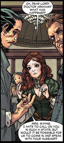
All-Star Western #6 (Taters’ pick)
Justin Gray, Jimmy Palmiotti, Moritat and Phil Winslade

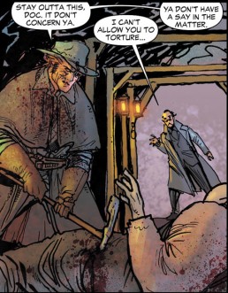
All-Star Western #6 (Gavin’s pick)
Justin Gray, Jimmy Palmiotti, Moritat and Phil Winslade

Aquaman #6 (Gavin’s pick)
Geoff Johns, Ivan Reis and Joe Prado

Read the rest of this entry »

Post to Twitter Post to Facebook Post to Reddit Post to StumbleUpon

h1

that’s a one hot team every ten issues average

February 24th, 2012 Posted by | Tags: , , , ,

Marvel’s been double-shipping comics lately, taking advantage of an increased shipping schedule to pull a little more money from their fanbase. As a result… the quality and consistency of their books has slipped over. Here’s a quick copy/paste from my buddy Ron Richards’s Marvel May solicitations post that does a pretty good job of explaining the situation:

To put it in perspective, here’s a rundown of several single issues coming out in May. Series that previously featured a “hot” artist who received critical and fan praise, and the artist replacing them:
Secret Avengers #27 – you loved Gabe Hardman on this book that JUST relaunched with a new creative team, so HERE’S RENATO GUEDES!
Ultimate Spider-Man #10 – you loved Sara Pichelli and her new take on Ultimate Spider-Man, so HERE’S DAVID MARQUEZ!
Ultimate Comics The Ultimates #10 and #11 – Esad Ribic blew your minds with the opening chapters of Hickman’s run, so HERE’S LUKE ROSS!
Scarlet Spider #5 – you loved Ryan Stegman after he launched this title, so HERE’S NEIL EDWARDS!
Fantastic Four #605.1 – you loved Steve Epting, so HERE’S MIKE CHOI (Speaks for itself after last week’s Green Lantern #6 atrocity)!
Defenders #6 – you loved Terry Dodson, so HERE’S VICTOR IBANEZ!
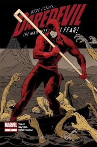
Daredevil #12 – you loved Paolo Rivera SO HERE’S CHRIS SAMNEE – oh wait, this is a good one…
EXCEPT, next issue…
Daredevil #13 – you loved Paolo Rivera and Chris Samnee, so HERE’S KHOI PHAM!
Don’t mind me, my head’s too busy spinning.

That’s a lot of changes. Most mainstream artists can just about keep a monthly schedule. Previously, you’d see two stable art teams alternating arcs on a book to keep the book on schedule and with something of a cohesive look. With the double-shipping, stable art teams are looking less and less likely.

Daredevil is a good example of what I’m talking about, and why these art changes are so frustrating. At launch, it was announced as a book that would feature Mark Waid writing with Paolo Rivera (and his pop Joe Rivera inking him!) and Marcos Martin alternating on art duties. Javier Rodriguez was going to color Rivera, Muntsa Vicente was going to color Martin, and Joe Caramagna was going to letter all of it. That’s a good team–an astounding one, honestly. Alone, Rivera and Martin are beasts. Putting them on the same book is like having putting on a concert with fifteen Michael Jacksons on stage at once, or going to a basketball game that’s Jordan on Jordan. (It’s a pretty good comic.)

By the time we hit issue 13, we’ll have seen Rivera, Martin, Kano, Chris Samnee, and Khoi Pham illustrating the book. That’s five artists over thirteen issues. Some will have done one issue, others just a few. And on a certain level, sure, all of these artists are pretty good. Daredevil is going to be a good looking comic regardless, and will presumably remain well-written. But on another level, good looking isn’t a binary proposition. Martin’s good looking is different from Rivera’s good looking. Samnee and Kano are two entirely different types of good looking. With alternating teams of two, you can maintain a real visual identity. That’s what a stable art team does–it gives the book a look. Bringing in five artists onto a book in just over a year is far from stability. It’s another hoop for your suspension of disbelief to jump through so you believe in the story.

I saw a Marvel editor going off on Twitter about how artist switch-ups aren’t a problem, because hey, you’re still buying the comic, aren’t you? What’s the deal? It’s not like they’re ugly. I disagree. Vehemently disagree, in fact.

Think of it like this. When you hopped on Daredevil, you hopped on for Waid, Rivera, and Martin. They set a specific mood with their first issue. For another artist to tag in, even a good one, muddies that mood. Samnee doesn’t draw like Kano, who doesn’t draw like Martin, who doesn’t draw like Rivera. Rivera and Martin are complementary (though perhaps not as complementary as Javier Pulido and Marcos Martin, another killer duo), and their mood (which is aided and abetted by Waid’s script, of course) is a very specific thing.

When you begin adding to that mood, Daredevil becomes a different comic. It’s like if the actors changed forty-five minutes into a film, or if the new hot single by your favorite artist changed BPM and singers halfway through, but kept the same subject matter. It’s not that strange a comparison, I don’t think. There’s a skipped beat there. Every artist is unique, and swapping an artist out of one story (and make no mistake, Waid is clearly scripting one story) and slotting another in changes that story fundamentally.

I’m actually having a hard time explaining why because it’s so obvious and basic to me. It looks different, and comics are a visual medium. You don’t just read comics–you look at them. The art matters, and when the art changes, the story changes. All-Star Batman and Robin the Boy Wonder is such a beautiful hot mess because Jim Lee is the quintessential superhero artist of our day and Frank Miller scripted a story that needed a more cartoony, flexible style. I talk about it here a little, but Lee is simultaneously the best and worst choice to illustrate what Miller was trying to do. If Miller drew ASBAR, it would have been received differently. It follows, then, that Lee’s ASBAR is not Miller’s, just like Rivera’s Daredevil is not Kano’s. It isn’t a value judgment. It’s an objective fact. Blue is not red, but they are both nice colors. Same thing.

These changes also have this unwanted effect of devaluing the artist, in a way. It sets the writer up as the prime mover on a comic book. The writer is the one constant in all these creative changes, and that changes the conversation from “Waid and Rivera are doing Daredevil!” to “Rivera is drawing Waid’s Daredevil next issue!” There is a difference there, and it affects how we think and talk about comics. It gives the writer ownership of the book, and makes the artist secondary, despite the artist being such a huge part of the success of the book.

(I realize that I’m giving short shrift to the inkers, colorists, and letterers here, but please believe that I love you guys, and do not wish to underestimate your influence. Pardon my shorthand.)

I don’t expect every creative team to stay together forever. But the constant musical chairs, right when things are getting good, is off-putting. We’re paying more money for less content, and we can’t even get consistent content. I understand why Marvel double ships comics, but am I really going to keep buying two issues a month when the creative team is compromised like it is on so many books in the latest round of solicits?

I buy cape comics because I like seeing what a small, dedicated team can do with these old characters I grew up on. Spider-Man has no value in and of himself. I might get curious about a series featuring Spider-Man and Hypno Hustler, but without a strong creative team, it’s nothing. It’s worse than nothing. Uncanny X-Force is a dumb idea on paper. It’s the team of X-Men that go out and murder people at night. But it came roaring out of the gates with Rick Remender, Jerome Opeña, and Dean White firing on all cylinders, including cylinders I didn’t even know Marvel had. That team made that series. By issue eight, Billy Tan was drawing the book, the quality took a nosedive, the magic was broken, and I bailed out. Why was Tan drawing it? Because Marvel shipped six issues of the series between the cover dates of May 2011 and July 2011, tossed out another two in October, and will consistently double-ship the book from February to April.

Uncanny X-Force 17-22 feature five different artists. That’s seven issues, including 19.1. There’s no in-story reason for the double-shipping. It just happens. That’s not a problem? It’s enough of a problem that I quit the series, and I’m absolutely positive that I’m not the only one. Maybe it’s just us elitist hipster douchebags dropping books over changes, but I doubt it.

Boiled down, though, my only request is this. If you want us to pay four bucks for 20 pages of comics, then at least let us trust that the reasons we’re reading the series are going to stick around. Let us get a story from a creative team that’s had time to grow together and get in sync. If you want us to pay more for less, at least do us the basic favor of giving us something approaching consistency.

Post to Twitter Post to Facebook Post to Reddit Post to StumbleUpon

h1

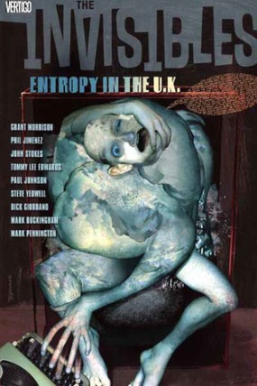
The Invisibles 2 (or 3): Entropy in the U.K.

February 22nd, 2012 Posted by |

I hit a slight snag in my Invisibles continued reading when I realized I went from the first volume to the third volume, only barely noticing.  It did seem strange that suddenly two characters were kidnapped and threatened by space beetles, but then again the entire thing started out with a sixties/seventies pastiche, that seemed to both come from and go to nowhere.  For those of you rolling your eyes, call it a lack of understanding in how Morrison works.  That’s fair.  But give me credit for my faith in the dude, continuing the story even though it seemed to jump.

That being said, I think that jumping ahead a book and then retracing my steps seems to be in the spirit of my decision to read them in the first place, so I’m going to go ahead and take a look at what I see.  For those who are struggling to place the book, it begins and ends with retro pulp teams whose stories brush against the main villain, revealed in this book to be a group of bug like aliens which are going to take over the Earth.  Agents of the aliens have kidnapped King Mob and Fanny, and are torturing King Mob who is talking about stories (the retro tales) as a way to cover up what he knows.

Since I’m no connoisseur of fictional torture and don’t have the stomach to become one, let me say that the torture scenes are creative and visceral, and turn my attention to the other parts of the book.

We get Boy’s back story, and how she seemed to be the middle ground between her angelic brother and her devilish brother – until it turns out we had the brothers switched around.  Artist Tommy Lee Edwards has a style that syncs up well with the bleak winter in New York that he’s depicting, and that’s the most visually arresting part of the book, even though other talented artists are given very flashy things to do.

But that’s a standard review of a comic book.  What about The Invisibles story?  Well, the story is still going, really, and that’s all you can say for it.  Although this volume can be summed up as a story – the rest of the Invisibles pull together to rescue the kidnapped Fanny and Mob, it doesn’t unfold in a way that actually lends itself to story telling, as opposed to telling about a bunch of things that happened in sequence.  The macro story, the one that’s being told over many volumes, feels good and relaxed.  Although it’s more pulled-together than the first volume, it still gives me the impression that story is what happens in between Grant Morrison saying what he wants to say.

Which is fine, since the things he wants to say are about adding shading and moderation to characters.  Moderation is not typically prized in comics, especially in a comic like this, but it’s a rare and wonderful thing, all the same.  Jack Frost (or Dane) begins to pull his character together instead of slaloming between endangered waif and bad seed.  King Mob is less of the unflappable, invincible icon he was in the first volume (I was about to say that being tortured will do that to you, but when does Batman look one bit more vulnerable when being tortured?  Never.  DC wouldn’t allow it.).  Boy, or Lucille, was one of the more even-keel characters from the start, so the backstory just adds a little depth to what otherwise might be a moderator.

The one place that the story falls is the same place that most stories fall – magic is magic.  When a hero has magic ability, it’s there whenever the situation is grave enough that it needs to be there.  That’s not necessarily bad.  You could say that about any facet of a story.  The cavalry will arrive when the author needs them to and if the author needs them to.  They’ll disarm the bomb if that’s how the story goes.  It’s just that magic needs a focal point, a switch that’s well established and yet not obvious to flip when the going gets tough.  When you use magic, you need to secure to an emotional solution instead of a practical one.  It didn’t feel like Dane, even with the famous vision of Jesus that he experiences in this volume, was up to doing battle with something that big, and then healing his dying friend.

Then again, if I wanted that emotional build-up to make sense, I should perhaps have read volume 2.  We’ll see if it all adds up when I do!

Post to Twitter Post to Facebook Post to Reddit Post to StumbleUpon

h1

“The dress code’s strictly white tee, Air Force 1s, and some Dickies.”

February 21st, 2012 Posted by | Tags: , ,

Yesterday, during a crisis of confidence and an expectedly foggy bad mood that had me surfing the internet in a grey haze, I decided that life is too short to not do things I like, so I’m going to make it a point to only ever wear Air Force 1s forever, or until I get bored of them (unlikely) or die or something. I remember being younger and telling jokes about how I’d like to own seven pairs of Air Forces, so I could wear a different pair each day of the week. I dunno how I didn’t realize it before now, but I make enough money for that to not be a totally irresponsible prospect, and on top of that, I’m a little under halfway there already.

My goal is, with a few exceptions, to be all Air Force 1 everything. I like the lows way more than the mids and highs. I have a pair of mids in white on white, and they’re nice and all, but I messed around and got them half a size too big and I don’t really like wearing high tops, anyway. Lows are just more comfortable overall, and I like how they look with my clothes. I’ve got lows in black on black, black on grey/elephant skin (one of my favorite patterns), and khaki (or was it tan?). I’m donating a lot of my shoes to a charity, though, so now’s the time to re-up in something interesting. I need to get up on some blues and reds and start color coordinating better. Purple’s definitely on the list, too. I’m in love with these Kobe Air Force 1 Supremes, but the online site is out of my size.

This isn’t going to be a hard and fast rule. A huge exception will be made if I can find a pair of red and black Jordan XII Retros, my holy grail and a recreation of my favorite Jordans. If I find those, I’m never wearing anything but them until they fall apart, and then I’m going to find someone who owns them in my size and jack theirs. I bought a pair of Chris Paul’s 2’Quicks today because they were on sale, looked nice, and had a splash of purple on ’em. I’ll definitely have to keep my brown Ace 83 beaters around for when I have to do work or something. I love those shoes. They’re crazy comfortable. But barring a few small exceptions (I’m going to say that I’ll hold myself to… less than five, including the ones I’ve mentioned here), I want a closet full of Air Forces, and also an apartment in San Francisco big enough to fit all of them.

Comfort is what it comes down to, really, with fashion and flexibility a close second and third. My Air Forces are the most comfortable shoes I own, and I love how they feel. Just the right amount of padding, just enough space to breathe but not so much that my feet are swimming in the shoes… I could probably roll laceless if I wanted to, which is always nice with the right outfit.

I’ve been thinking a lot about fashion. Your clothes are one of the first things people notice about you. You send a message with the clothes you wear, whether you want to or not. What message am I sending? I’ve been really drilling down and trying to figure that out lately, and culling clothes that aren’t on-message. I’m going to be writing about it more in the future (probably tomorrow, matter of fact), but I think starting with the shoes and working my way from there.

I want to branch out into more colors, patterns, and configurations as a whole, and having a foundation that I can look at and not get bored with, that also can be accessorized and color-coordinated with the rest of what I wear, seems like a good idea. I bought two pairs of shoes today thanks to an incredibly well-timed sale. I went out expecting to spend a certain dollar amount for a specific pair of shoes, but I threw an extra 10 bucks into the mix and walked out with two fantastic alternate choices. I like the Jordan brand CP 2’Quicks I got, which are black, white, and purple. The other pair of shoes were Air Force 1 ’07s in velvet brown & birch-khaki, and I like them, too. The Air Forces are different enough from my tan ones that I have more wardrobe options now, too. I’m not going to go all-out sneakerhead (I’m not that rich!), but I want a nice, respectable collection of fashionable choices.

I feel good about this. It’s nothing in the scheme of things, obviously, but I feel good about it. I think it’s important to do things you feel good about while you can.

Now I just gotta figure out how to keep these dumb shoes clean. I may have to go back to storing them in the box, just so they stay pristine.

(I feel good about other decisions made in yesterday’s ugly haze, too, especially ramping up how many different ab exercises I do a day [as part of a revamped workout regimen] and eating more vegetables [because… wait, why am I eating all this broccoli, anyway?], but this one will have an immediate and obvious effect on my life.)

Post to Twitter Post to Facebook Post to Reddit Post to StumbleUpon

h1

The Top 25 Twisted Metal Endings

February 21st, 2012 Posted by | Tags: ,

“Their emptiness makes me whole. Their weakness makes me strong. Their destruction is my creation.” – Calypso

Just recently, the company Eat. Sleep. Play. released the latest Twisted Metal game onto Playstation 3. I myself love the Twisted Metal games to death and wish I could get my hands on it. Sadly, I don’t own a Playstation 3 and as tempting as it would be, the game (as well as Box Art Mega Man as a console-exclusive character in Street Fighter X Tekken) isn’t enough for me to shell out all that money for the console. Still, I’m not completely bummed because I do have access to YouTube and while the gameplay is the centerpiece in the series, I’ll always have a soft spot for one of the things Twisted Metal does better than most video games: the endings.

For those who don’t know much about the series, the idea is that Twisted Metal is a reckless competition where people drive cars armed to the teeth with all sorts of weapons and have to fight it out until there’s only one car left. These extreme demolition derbies take place in all sorts of settings, especially in public places, where innocent bystanders are ripe for the picking. The whole thing is put together by Calypso, a mysterious and demonic man who is like a genie mixed with a rat bastard. Whoever comes out the winner is granted an audience with him and he’ll grant whatever wish they ask for. Sometimes he’ll give them what they want and they’re happy. Sometimes he gives them what they want and they end up in terrible shape. A lot of the time he openly messes with them by twisting their wishes for his own amusement. There are also those instances when the winner will challenge Calypso himself to varying success.

The story is filled with a million plotholes and to claim it has its own continuity is charitable at best. That said, it’s not meant to be taken seriously and it’s really just a hokey setup meant to be window dressing for the actual game. For the most part, they’re fun to watch and with 124 endings across eight games (released by four different companies), I can’t help but want to celebrate it with a list of my favorites.

Before I get into it, I should point out how different these cutscenes can be and the context of each game. The first Twisted Metal was simply about Calypso hosting the 10th annual competition in Los Angeles. Originally, they spent about $10,000 filming live-action segments for the game as directed by the game’s mastermind David Jaffe. These got canned by the higher ups, not for the hilariously bad acting and cheesy effects, but because they were deemed too violent and sexist. These didn’t see the light of day for years until Jaffe handed them out to a fansite and later put them in the Playstation 2 version of Twisted Metal: Head-On as an extra. The endings were redone for the actual release via scrolling text accompanied by the game’s rocking theme song, a glaring image of live-action Calypso and ending with a shot of the character’s car driving off.

The second game, Twisted Metal 2: World Tour, changed it up by giving us cutscenes done in the style of motion comics. A direct follow-up to the first game, this time Calypso’s realizes that he’s pretty much annihilated Los Angeles off the map and therefore needs to make his contest international. Jaffe’s company Singletrac lost the rights to Twisted Metal after this due to a dispute with Sony and 989 Studios picked it up. They had to start the engine completely from scratch and it ended up being a disaster. The endings were also a casualty, as the CGI segments were only seconds long and existed to have Calypso torture the winner with some kind of lame pun, usually based on a wish that made no sense. Like how the driver of the car Thumper wishes to “forever hang with his homies” and he’s transformed into a hood ornament. The weirdest one is how the police officers who drive Outlaw ask for a world without crime and doing so leads to them being jobless. That… that kind of seems like more than a fair trade. Why is that treated as a bad thing?

Read the rest of this entry »

Post to Twitter Post to Facebook Post to Reddit Post to StumbleUpon

h1

On Kanye, Regular Dudes, and Douchebags

February 21st, 2012 Posted by | Tags: ,

I asked Twitter what their favorite song on Kanye’s My Beautiful Dark Twisted Fantasy is the other day. I got a lot of answers, most of ’em good, but the one that caught me the most was from my friend EC. She said this:

Runaway. At the end of the day, when Kanye feels like a douchebag, he needs a hug from Donda, but she’s gone. 🙁

A close second, and I mean painfully close, was this from Ray:

AllOfTheLights. Peak of his maximalism, sonically. But ponders depths of being minmal in life. Take together w/Power which is flip

These two comments unlocked something in my head. It’s dangerous to try to psychoanalyze somebody through their music, but Kanye paints a really interesting picture. He’s a regular dude with new money pretensions. Success is a goal in and of itself, and I think that goes a long way toward explaining why his sound is so different on each of his albums.

Kanye’s the picture of the regular dude who is good at something but feel he isn’t recognized enough for that fact. It’s not arrogance or egomania so much as having the confidence you need to make it. It’s about not getting what you’re due, whether or not anybody else agrees. I bet most creative people, whether they’re gainfully employed or just scribble erotic fanfiction in their dorm rooms when their roomie isn’t around, feel the same. If you don’t feel like you’re any good, then nobody else will, either.

At the heart of that creative drive is a sense of inferiority. What if you aren’t as good as you think you are, what if people hate you, or what if you are that good, but no one notices. And Kanye thinks he’s very good. So good, in fact, that he’ll drop an album like 808s and Heartbreak, which I thought was punishingly average, or My Beautiful Dark Twisted Fantasy, a thirteen track album with six songs that approach or beat six minutes. That’s confidence, to me, because Kanye could’ve just made a bunch of College Dropouts and seen plenty of success instead. So I’d be willing to put cash money toward the idea that Kanye’s sense of inferiority is tremendous. He’s got to out-do himself every single time.

EC and Ray hit on what that regular dude style is so attractive, though. “Runaway” humanizes a champion when you realize what the song’s about. And Ray’s point about “All of the Lights” being the peak of his maximalism but being about mundane things is the perfect complement to that. It elevates the common man to where we think Kanye is, that point where life is majestic and exciting.

It’s such a subtle, unconscious thing, but it clicks so hard with me. My favorite Kanye song, or at least one of them, is “Mama’s Boyfriend,” which he has yet to officially release, and probably won’t since some scrub bootlegged it and threw a beat on top of it. It’s about growing up with a single mom and watching how men treat her, and then growing up to do the same thing to women even though he swore he’d do better. “I never liked you niggas,” goes the chorus, “who knew one day I’d be just like you niggas?” It’s about trying to protect your mother and then becoming the man you used to hate. There’s too much there for me to grab onto.

It’s kind of a sad song, in a way. It’s about cycles and inevitability and growing up black and poor with just your mom. It’s about a lot of things. I do like how it’s plain that it’s the man at fault in both instances, though. The kid is bitter and suspicious of newcomers to his family. The man loves a lady and wants his kid to like, or at least tolerate, him. The mother is immaculate in both verses.

I like that a lot. There’s a depth to Kanye that I feel like a lot of people miss because they don’t look past “I’ma let you finish” and “George W Bush doesn’t care about black people.” He knows about being the man of the house at a young age, heartbreak, confidence, perseverance, making the same mistakes over and over, and being a douchebag.

I forget what I said my favorite song off that album is. It’s changed by this point anyway. At the moment though, just after midnight on 03/21, it’s the 9-minute version of “Runaway.” No, wait–it’s that version of “Runaway” that he played on SNL, with the clusterbomb of live samples, painful snares, and Pusha mixed way too low for the track.

Post to Twitter Post to Facebook Post to Reddit Post to StumbleUpon

h1

This Week in Panels: Week 126

February 19th, 2012 Posted by | Tags: , ,

This week I’m helped out by Was Taters, Space Jawa and luis. Small week in total and I’m a little too out of it to come up with any pre-panel banter.

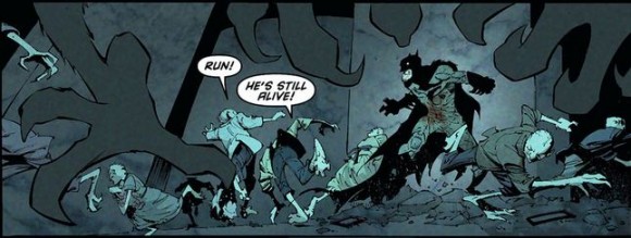
Batman #6
Scott Snyder and Greg Capullo

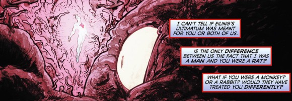
Captain Atom #6
J.T. Krul and Freddie Williams II

Read the rest of this entry »

Post to Twitter Post to Facebook Post to Reddit Post to StumbleUpon

h1

Screw Music: Cocaine Pentagrams and the Twerk Team at a Black Mass

February 17th, 2012 Posted by | Tags: , , , ,

The Damon Albarn Appreciation Society is an ongoing series of focused observations, conversations, and thoughts about music. This is the fifteenth. I realized I had a lot of screw music in the official rotation. It’s a type of music I like a lot, but find it hard to articulate why. There’s a good reason for that, I think. I keep going to a few key words, though–it sounds evil, it sounds wrong, it sounds off, it sounds abstract, it sounds sideways, it sounds like Hell… it sounds great. It’s just that whenever those monks get around to updating the Ars Goetia, they’ll have to add a footnote that King Paimon is the patron demon of screw music.

Minutes from previous meetings of the Society: The Beatles – “Eleanor Rigby”, Tupac – Makaveli, Blur – 13 (with Graeme McMillan), Blur – Think Tank (with Graeme McMillan), Black Thought x Rakim: “Hip-Hop, you the love of my life”, Wu-Tang Clan – Enter The Wu-Tang (36 Chambers), On why I buy vinyl sometimes, on songs about places, Mellowhype’s Blackendwhite, a general post on punk, a snapshot of what I’m listening to, on Black Thought blacking out on “75 Bars”, how I got into The Roots, on Betty Wright and strong songs


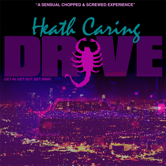
Drive by Xheathcaresx

Press play on this joint while you read.

I’ve been thinking about writing about chopped and screwed music for a while now. This cat named Heath Caring created a C&S version of the Drive soundtrack and it came on my radar a little bit ago. I’ve been regularly spinning it ever since. The problem is that the appeal of screw music is such a weird and specific thing. Screw music is post-modernism stacked on the already pomo origins of rap. I’ve been mulling it over for days, trying to find an angle of attack, but it’s a slippery subject.

My man Ray, a dude who has put me onto a lot of good screw, recently said this while spotlighting a new screw mix:

I’ve come to realize, trying to explain chopped and screwed music to people makes you sound like you’re fucking insane. The idea of slowing down music and making it skip on purpose isn’t the easiest thing for heads to imagine. That’s why instead of explaining what the music actually sounds like it’s best to describe the feeling screw gives you. Sometimes you feel like you’re being dragged through a black hole where time and space are being warped. Other times screw feels like you’re at a dope pool party but you spent the entire affair chillin’ out at the bottom of the pool listening to the DJ do work.

And that’s it right there. It’s about the music, but it’s not. It’s about how it feels. Listening to screw, whether you’re sober or high, is like listening to regular music, sure. There’s a beat, and you can bop to it. You might could even do a slowed down version of the wop to it if you had the right song, and I mean the wop that your parents used to do when they hit up house parties, not the wack dance that swept youtube a few years back. But screw music is… it’s like abstracted rap. Not abstract, like Q-Tip or Aes Rock. Abstracted. Taking a thing and making it different. It’s psychedelia for people who were raised on Three 6 Mafia and UGK instead of The Beatles.

But it’s real hard to explain what screw music sounds like to people who can’t parse the idea that DJ Mr. Rogers’s chopped and screwed version of Drake’s “Say What’s Real” sounds like the feeling you get when you walk into a black mass in the basement of the club by accident and realize that the chief anti-priest is your ex-girlfriend. The way the harmonious melody in the background is slowed down changes its sound from a generic triumphant rap orchestra into a funeral dirge, Drake’s voice goes lower and he’s enunciating clearly, but the track keeps skipping and hopping and stripping all the smooth charm out his voice. That feels different from “I like how John Lennon sings this song because you can hear the hurt in his heart” to me.

I’ve been describing that screwed version of the Drive soundtrack to other people as evil, like a house party in Hell in the ’80s where all the coke’s run out. Kavinsky’s “Nightcall” turns into something else entirely when the upbeat synth-pop gives way to a voice that moans and groans the words out and the synths are stretched to the breaking point. It sounds slow, is the thing. It sounds wrong, and I mean wrong in the sense of what it feels like to come into your house and realize something is out of place, but not being able to figure out what that out of place thing is or who could have been in there but you. “Nightcall” turns into the musical equivalent of a gross leer, and you can’t do anything but let it wash over you.

The wildest part of the mix to me is the point when Kendrick Lamar’s “ADHD” rolls in. I didn’t even realize that it had faded in on my first listen, because it’s slipped in there so smoothly and the song sounds so different. There’s a great thematic link between Drive and Lamar’s Section.80, but the screwed “ADHD” tripped me out. It fits so well, and the Clipse joint that comes after is tremendous.

It sounds so full, like it’s just overflowing out of your speakers. It sounds like something you want to bang so loud on your speakers that your neighbors spontaneously shatter into dust from the bass. Like a… like a sustained earthquake, or something. It rolls over you and makes you feel trapped. Claustrophobic. The lyrics twist and turn uglier than they might be at first glance when they’re this slow.

This specific example of screw music is like the most comfortable uncomfortable situation ever, like the tail end of what happens when you screw up and eat an entire hash brownie, not realizing you only needed half to get right. It feels like that last hour or so of being over-high for thirteen hours straight, when you’re done panicking and you know you’re way too high, but man the couch feels too good right now and you feel so relaxed and life is so nice that it’s all to the good.

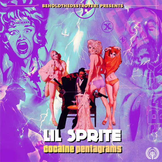
I like this Lil Sprite mix Ray hooked up, too. It’s called Cocaine Pentagrams, which makes it incredible from jump. Sean Witzke was on Twitter talking about how it made him think of David Bowie’s Station to Station, and I hadn’t made that connection, but it’s dead on. Station to Station is an incredibly funky album, and one of my favorite Bowie joints. He was so coked out while working on it that he doesn’t even remember doing it.

At the forefront of my mind was Andre 3000 beginning a verse “I came into this world high as a bird from second-hand cocaine powder” and ending another “They call it horny because it’s devilish, now see, we dead wrong.” on ATLiens. Bowie is just the icing (provided by Freeway Ricky Ross and the CIA) on the cake, the missing puzzle piece that pulls it all together. Just from the start, Cocaine Pentagrams is ill, and that’s without even hearing a single word. It’s evocative. It’s the precursor to an experience.

It’s not just about slowing down a song or getting high and turning on an mp3. It’s an experience that’s different from how I regularly listen to music. I try to really listen when I’m playing songs, but with screw music, I just go with it and see what happens. I do a lot of writing to screw music. It just sorta sits at the back of your head, infecting your subconscious until you’re through. It’s music that’s easy to absorb when you aren’t thinking too hard about it.

Post to Twitter Post to Facebook Post to Reddit Post to StumbleUpon

h1

Are they scanning Marvel’s comics from inside the House of Ideas?!

February 15th, 2012 Posted by | Tags:

When looking at scanned print comics, one thing usually sticks out. Unless the scanner takes great care, each page will differ in size just a little bit. Scanners use Fit Width to make sure all the pages are the same width, but unless your scan is perfect (or you go back through later to crop for consistency, though that has problems of its own), you’re looking at pages that may be sized 1280×1028, 1280×1020, or 1280×1030, as a few random examples. It’s not a huge deal for the reader, and really you’ll only notice if you’re paying close attention, which I imagine is why this is generally true of comics that were physically scanned. There are a few other things that are specific to print scans, too, like the occasional hair that got scanned in, artifacts, evidence of where someone joined a two-page spread, and moire.

The new hotness are digital scans. Common sense suggests that the scanners take the digital comics themselves, strip them out of the reader, and then package them up. They don’t just use the iPad screenshot function, either. The scans are higher quality than that, and aren’t subject to the brightness setting on the iPad. They’re also of a uniform resolution — a recent digital scan of Daredevil is 988×1500 throughout, save for a two-page spread and one other exception. The recap page is 995×1500. Ultimate X-Men #7 is 1280×1943. Avengers 22, which wasn’t even released digitally but was released as a digital scan, is 1280×1944.

It’s possible that these are just print scans, sure, but not likely. I’ve been talking through this conundrum with David Uzumeri for a couple of weeks now. We’re both interested in the technology behind how this works, if only for curiosity’s sake. We got our Nancy Drew on and found something interesting. We’re pretty sure that the digital scans of Marvel’s comics aren’t being scanned by who or how you’d think they are.

Print scans tend to be around 150dpi or higher, for the sake of image quality. The recent digital scans I’ve looked through have been 72dpi. Most of them have been created using Adobe Photoshop CS3 for Windows, though a couple scanners use CS5. There’s an aura of perfection around these scans that makes it unlikely that someone is just posting print comics with a digital tag for the sake of shenanigans.

Where do these they come from? They’re not iPad screenshots. I don’t think it’s someone taking screenshots off ComiXology, either. The images are too clean and too perfect for that, plus ComiXology’s web reader sucks. Good luck getting anything readable out of that thing. Edit: Several people have pointed out that it’s actually really easy to pull images from ComiXology using simple functions that are built into your web browser. I tried it out and yeah, man, I was totally wrong there. My bad.

A clue. Here’s the print cover to Daredevil 9 and the digital scan cover right after it.

They look fine, right? Both are totally reasonable covers, and the lack of UPC feels right for digital comics. The rub, though is that digital comics have a copyright notice on the cover, every single time. “©2012 Marvel Characters, Inc. All rights reserved. WWW.MARVEL.COM.” The digital scans don’t have that warning, and show no sign of it having been photoshopped out.

Here’s the raw cover from the solicitations:
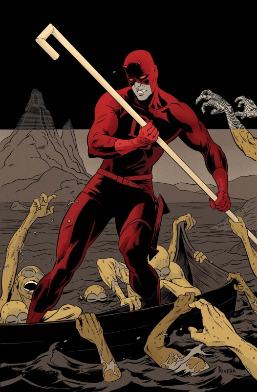
Now, unless the scanners are carefully photoshopping in the logo each time (they aren’t, don’t be ridiculous), then something’s up. The plot thickens when you realize that the font and placement of the credits on the cover on the legit digital version differ from the digital scan. It doesn’t differ a lot, usually, but the fonts are visually different and sometimes the credits are off by a few inches. In this case the credits are different.

There’s a chance the scanners could have figured out how to hack ComiXology to dump the pages, but would still require buying a whole lot of comics once they go live and processing them immediately. Considering how small the digital scan groups are, that’s pretty unlikely. All of the DC scans slowly trickle in after 2pm EST, their official release time. Scanners aren’t likely to obey idiotic online street dates, and they can’t scan books without buying them. That limits them to ComiXology’s release time.

All the Marvel books arrive at once, though, and in pristine condition. There’s something undeniably fishy there. My first thought was that people were scanning Marvel comics they got on Tuesday at their comic shops, but if that were true, we’d see DC and Image books following that pattern, too. My second thought, and one that seems more reasonable and likely, is that there’s a leak somewhere in the supply chain.

Taken all together: There are covers that differ from any legit cover. Pages that are pitch-perfect. DPI that matches across the board. Recap pages that occasionally vary in size, just like they do in official Marvel electronic review copies. Every Marvel comic is available early and all at once on the scan site du jour. DC comics appear in a trickle after 2pm EST. By 7pm EST on Wednesday, every big two comic is available for download, but well before that, Marvel’s entire line-up for the week is ready to go.

It’s pretty clear from this evidence that there’s a leak somewhere along the supply chain. Someone’s getting access to a PDF, or something, and dumping it to JPG before releasing it to the net. Converting a PDF to a series of JPGs is simple in Photoshop, and once you set up a good action to save the images, this is something that takes no more than five minutes to do, RAM and size of PDF depending.

The PDF thing is easy to prove, due mainly to the janky fonts on the covers and in the issue. Whatever tool the scanners use to dump the jpegs doesn’t actually have the fonts the comics require, so we get a next-best and unobtrusive replacement. They use InDesign to dump, is my guess, and then Photoshop to re-size. You can actually see this error at work in all of DC’s preview comics, because the price and issue number are incorrect. (quick edit: check the comments for something I screwed up on the PDF front, though it doesn’t really change the thrust of the post…)

Actually, quick sidebar: DC’s preview images are enormous in size, usually weighing in at a megabyte a page or more. DC’s doing no post-processing on their previews, basically, so the pages are too large to actually read in a web browser comfortably, too high-res to be worth saving, and clear enough to see all of the weird PDF signatures that books have before they go to print. Dear DC Comics: you gotta do better with that. It’s embarrassingly amateur. Drop it to like 1280 on the long side and maybe 350 or 500kb max per page. Or, y’know, look at how every comics site reformats your previews and format it like that.

Anyway, if the DC thing doesn’t convince you, Uzumeri found a smoking gun. The photo is from the issue of Uncanny X-Men he bought on Wednesday. The clean image is from the scan.
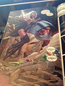
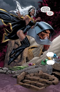
The scan is missing the musical notes, which are presumably some type of font that the scanners do not have access to, or maybe a layer that was missed out of the source of the scan.

We found another gun in Daredevil 9. The captions on this page are from the following page. Daredevil is underground and tracking the Mole Man. The captions have nothing to do with the Black Cat, though it is funny how they almost work with the scene, at least in terms of how they’re positioned on the page.
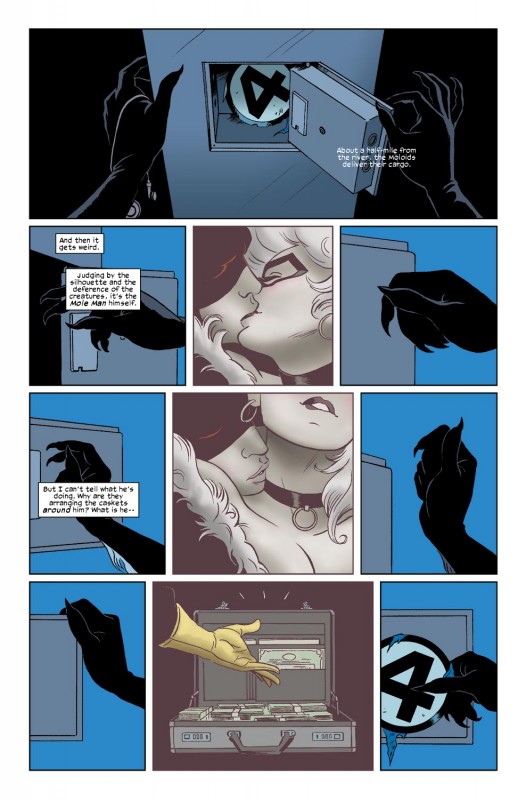
Or this other other gun, in Winter Soldier 1. There’s a scene that’s out of place in the digital scan. Pages 11 and 12 of the digital comic come before page 7 in the digital scan. It’s a mistake that’s easy to make, but there’s a subtle transition between pages 6 and 7 in the digital comic that show it as a definite mistake. This is curious, because if you’re dumping a PDF, all the pages come pre-numbered. Did someone have a bum PDF or InDesign file?

The clean covers begin to make sense now, too. If I had to guess, I would assume that the copyright, credits, and UPC are separate layers in one file. When they export to print or digital, they can tick a box and show the UPC or copyright, depending on the requirements of the situation. Cover elements like the credits can be maneuvered around pretty easily, but the scans always have them near where they are on the printed comic. Actually, looking at the Daredevil cover… the credits and Marvel logo are terribly placed. They’re high enough that something should go below them. What is THAT about?

So, who is it? Who’s got the PDFs?

Who it isn’t:
Fans: The fans who scan use printed comics, or have figured out how to dump ComiXology’s images (maybe dipping into wherever Flash stores its cache?). This is too perfect for that, and the little problems that crop up are unlikely in that situation.

Retailers: I asked around and spoke to a retailer. Retailers do get electronic preview copies on their retail resource site, but strictly at Marvel’s whim. The last one they got was was Chris Yost and Ryan Stegman’s Scarlet Spider #1 around a month before that came out. Right now, there are no previews on the page. No previews mean no scans. Nah son.

Press: Marvel doles out preview PDFs on Thursdays, but they just have eight pages. When Marvel wants to use you to pimp some new comic of theirs, they’ll shoot you a link to a full PDF. The sheer volume of books available, though, suggests that it ain’t the press. Marvel’s got no reason to flood the press with books when the press is more than happy to review every Marvel comic every week.

ComiXology: This was my first guess, actually. They’d have access to the files, and they messed around and released Justice League several hours early, enabling scanners to get it up before it even came out last year. But the files are different than the actual ComiXology files in very specific ways. ComiXology would probably have the fonts needed to convert Marvel books to whatever digital proprietary format they use, too, so the fonts would look how they should. Not to mention the recap pages, which are specific to the digital edition due to how the indicia is formatted.

It’s not the fans, retailers, press, or ComiXology, I’m pretty certain that at least three of those are 100% correct. Let’s go back to Daredevil 9’s busted page. It is impossible for a scanner to make that mistake. There’s no way for it to happen. There are four different page elements that have been transposed onto another page, leaving the next page silent save for its hand drawn sound effects. If the text is a single layer on its own, though… I could see how that could happen.

Who it is:
Marvel?: That means that either the scanners have access to Marvel’s pre-press files, which is amazing, or someone who works closely with Marvel, whether on the production side or at the printer, is slipping a scanner PDFs. There’s no way that the lettering could be transposed by a third party, and the font issue suggests that it’s someone fairly high up on the supply chain.

One last smoking gun. The Ultimate X-Men 7 digital scan includes a page advertising the digital edition of the comic. There’s a big blank space where the redemption code should go. I don’t have a digital comic version of this to check, but I’m willing to bet cash money that no digital comic version of this issue would include an access code for the digital comic. This is from a print comic.
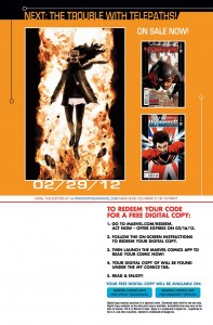
More proof: the indicia in the digital scans include the print indicia, included the date the comic was manufactured. In the case of Ultimate X-Men 7, it was between 01/20/2012 and 01/31/2012 by Quad/Graphics Jonesboro, in Jonesboro, AK. Every printed comic has this info in it. The digital ones have a seriously abridged version of the print indicia, and no info on the printer.

Messed up fonts, print indicia, missing digital comics redemption codes, the fact that Avengers 22 is available as a digital scan despite not being available on ComiXology (or on Marvel’s stupidly exclusive app), the standard DPI, the rigid resolution, the perfect scans… it’s obvious what this is. Someone’s got Marvel’s print-ready files before they’re finalized, and they’re slapping them up online as digital scans. Clever girl.

Marvel: your ship is leaking, whether it’s internal, an FTP hack, or on the way to the printer.

Edit: Thanks to Uzumeri’s dogged determination, we figured out what the hack is this morning. It isn’t a person, it’s a security leak, and we emailed Marvel about it.

one more edit: Marvel closed the hole we found, though I don’t think it’ll lessen how often or easily Marvel’s books can be pirated, except in a few very specific instances. This was one hole that was very easy to exploit. There are others that are completely unavoidable.

Post to Twitter Post to Facebook Post to Reddit Post to StumbleUpon