h1

Brave New World; Bold New Direction: Week 4

September 27th, 2011 Posted by Gavok

We’ve reached our fourth week and if you’ve been following the comic blogosphere (whoa, Microsoft Word accepts that as an actual word!), it’s one filled with two instances of controversy that are bundled together. Don’t let it distract you too much, as we still get a really solid week overall. Am I going to be keeping every book? Hell no. But in the end, it’s a strong set.

Now let’s get to the gratuitous boob—I mean, let’s get to the reviews.

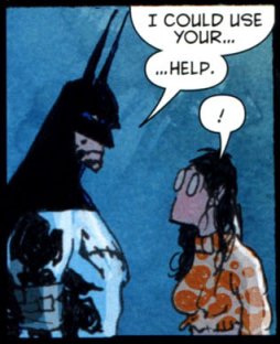
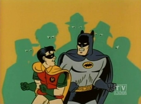
We get a sandwich of fantastic and the first slice of bread is Batman by Scott Snyder and Greg Capullo. A far stronger showing than the Detective Comics issue we got a couple weeks ago. Both comics used the same idea of trying to lure in new readers by showing what they know as an intro – in Detective‘s case, Batman vs. Joker mystery and in Batman‘s case, a fight against a bunch of known and lesser known villains – but this one simply gets it out of the way so it can move on to the real story. It’s a great scene that doesn’t so much show Batman as being able to beat a bunch of villains on his own, but able to beat a bunch of villains with a sneaky plan and teamwork. In fact, I just realized that with the reveal from a couple pages later that the opening scene of Batman #1 is a modern-day retelling of the Adam West show’s animated opening.

The opening scene is pretty awesome and does something that, to me, makes a good comic. That is, give us a cool sequence but have it make sense. Snyder decided to give us Batman and Joker vs. a bunch of rogues and goes out of his way to give us an explanation that makes total sense and even slightly hints towards the big cliffhanger. It’s opposite of Secret Avengers #13 where Nick Spencer had the kickass idea of having the ghost of George Washington lead a bunch of soldier ghosts and the Lincoln Monument against Nazi mechs, but when it came time to explain it, the entire issue imploded on its complete lack of logic and fell apart.

Capullo’s facial expressions rule the roost here, especially once Harvey Bullock enters the story. I genuinely enjoy it whenever Bullock and Batman get a scene together, mainly due to their mutual respect and Bullock’s inability to give into Batman’s bullshit. In only a few pages, Harvey becomes so expressive that it’s hard not to love the lug.

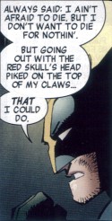
If there’s any complaint about this book, it’s that Riddler Mohawk. Hey, remember when Riddler was a detective on the level? Remember how promising that was? Well, nowadays he’s in Arkham with a Mohawk shaped like a green question mark. Goddamn it, DC.

Snyder’s Batman is not only better than the other Batman-starred books of the reboot so far, but it’s also better than his work on Swamp Thing. You better believe I’m sticking.

Then we have Birds of Prey by Duane Swierczynski and Jesus Saiz. This is a weird one because it’s a good comic that I quite enjoyed, but it’s the least memorable one of the week. I’ve never gotten into Birds of Prey before, but as an introduction and rebooting of Black Canary as a wanted criminal for accidental vigilante murder, it does its job well. There’s fun action, good art and some okay character interaction. Especially that of Keen and the new heroine Starling. It’s cute to see them play off each other and the ending hits us with a curveball in regards to what we expect to see out of their possibilities. The ending also hits us with a mystery and a major sense of doom in terms of what’s been going on with Black Canary in the last fourth of the issue. I’m interested enough to stick and see where this is going.

Read the rest of this entry �

Post to Twitter Post to Facebook Post to Reddit Post to StumbleUpon

h1

This Week in Panels: Week 105

September 25th, 2011 Posted by Gavok

Welcome to This Week in Panels: Wolverine Saying Awesome Shit Edition. This week I’m joined by David Brothers, Was Taters and Space Jawa. A good amount of overlap here with the DC New 52 and I had to give all three stories in Fear Itself: The Home Front their own spots because each one was just as enjoyable. There was also a one-page story in there about Dust that was funny because Howard Chaykin drew it. Chaykin drawing a character with a covered up face. That’s too perfect.

Avengers #17
Brian Michael Bendis and John Romita Jr.

Batman #1 (Was Taters’ pick)
Scott Snyder and Greg Capullo

Read the rest of this entry �

Post to Twitter Post to Facebook Post to Reddit Post to StumbleUpon

h1

This Week in Panels: Week 66

December 26th, 2010 Posted by Gavok

Welcome back to another week of panels. Again, I’m joined by my usual panel of panel panelists in David Brothers, Was Taters and Space Jawa. Pretty full week this time around so let’s get to it.

Azrael #15
David Hine and Cliff Richards

Batman, Inc. #2
Grant Morrison and Yanick Paquette

Read the rest of this entry �

Post to Twitter Post to Facebook Post to Reddit Post to StumbleUpon

h1

This Week in Panels: Week 55

October 10th, 2010 Posted by Gavok

Back from Comic Con. I’d tell you all about it, but I’m tired as hell. Still better off than David, who’s probably completely unconscious as I type this and will remain so for the next 36 hours. Or he might be dead of a heart attack, considering he ate 5 Guys Burgers and Fries no less than three times in two days. Unlike me, he did NOT go there because Norman Osborn told him to.

While David is out, Was Taters is in. She included a Wonder Woman panel, even though that was last week. I won’t tell her if you won’t.

Avengers Academy #5
Christos Gage and Jorge Molina

Chaos War #1
Greg Pak, Fred Van Lente, Khoi Pham and Reilly Brown

Read the rest of this entry �

Post to Twitter Post to Facebook Post to Reddit Post to StumbleUpon

h1

This Week in Panels: Weeks 48 and 49

August 29th, 2010 Posted by Gavok

Due to extenuating circumstances, I wasn’t able to do ThWiP last week, so it’s been accumulated into this week’s update. For last week’s picks, I’m disappointed in David for choosing that specific Avengers Academy panel when the true honors should have gone to Reptil asking a disgruntled Cain Marko if he can say, “Nothing can stop the Juggernaut!” for his amusement. Was Taters rejoins the show once again, unable to choose between panels for Superman/Batman, so we went with both.

Warning: there is something really fucked up going on with Hal Jordan’s hands in the Legacies image and you won’t be able to stop yourself from staring at it.

Action Comics #892
Paul Cornell, Pete Woods, Pere Perez, Jeff Lemire and Pier Gallo

Age of Heroes #4
Elliott Kalan, Brendan McCarthy and others

Read the rest of this entry �

Post to Twitter Post to Facebook Post to Reddit Post to StumbleUpon

h1

7 Artists: Doug Mahnke

July 10th, 2010 Posted by david brothers


Doug Mahnke does one thing better than everyone else, and that’s draw Wonder Woman.

The biggest reason why he draws the best Wonder Woman is easy: the hair. It’s this very straight, wet, flat look that looks so good it should’ve become part of her official look.

He does another thing better than most people, and that’s depict action.

Violence in comics is weird. When it’s wrong, it’s wrong, and it just looks stupid. This is particularly true of the post-Lee artists, guys who draw in the remnants of one of your typical early Image Comics styles. That sort of overly built, action figure style really doesn’t lend itself to a proper portrayal of violence. It looks like action figures moving across a page while an unseen child goes “Pow! Pow!”

Comics art tends toward clean. Bryan Hitch, Stuart Immonen, John Romita Jr, Dan Jurgens, Mark Bagley, whoever whatever, they tend to draw these really neat scenes, clean lines, so on and so on. The action follows. It’s pretty clean and simple, and when people get bloody, it’s a very reserved kind of bloody. It’s not really that brutal. Mahnke, though. Everything this guy draws looks like it’s had a belt sander taken to it not five seconds before, and when he draws an impact, he draws it like it’s the only thing that matters on the page. You don’t even really need the sound effects at all.

Mahnke’s work isn’t interesting because of any particular attention to detail, I don’t think. It’s interesting because of how he approaches his subject matter. Some artists go for detailed draftsmanship and scale (Bryan Hitch), some for body language and realism (Frank Quitely), and some for photorealism (any artist with Photoshop and a host of garish filters). Mahnke… I think the key to his work is restraint.

He draws his characters very muscular, just on the far side of ripped, but not the usual steroid case you expect to see in comics. They tend toward the slim, but filled out. They’re just big enough to be superhuman, but not so big that they look overdone. It’s clear that they aren’t normal, but they aren’t so abnormal that they look ridiculous. They’re just right in that sweet spot between human and super. They work so well on the page because they’re believable.

But that’s all beside the point. When Mahnke draws people fighting, it looks good. The gritty way his lines end up, the slim but powerful figures (with real weight), and his ability to capture the perfect mid-action panel are just a few reasons why. David Aja does choreography, Jack Kirby did bombast, and Mahnke is good at finding just the right moment to freeze the frame.

It’s all about that right moment in time. Aja captures it fluidly and about as close to “in motion” as you can get on a comics page. Mahnke doesn’t have the same style or approach to comics as Aja does, but I don’t think that his is any less effective. There’s a page from Batman: Under the Hood where Jason Todd is beating the Joker with a crowbar. The final panel on that page, where the crowbar is in direct and intimate contact with the Joker’s face, hurts. It’s that moment after the impact, after the Joker’s head has started to turn, but before Jason’s completed his swing. It’s ugly, and that specific moment might be the ugliest.

You can see it in other books, too. Kyle’s limp form as Manitou Raven stabs him in the chest in JLA: The Obsidian Age. The part in Green Lantern where Carol Ferris has Sinestro’s arm blocked and is working her way around his throat. In Final Crisis, Frankenstein taking the head off a dog while his giant wolf thing chews through Wonder Woman.

Panels are always specific moments in time. That moment has to convey whatever feelings or actions are required to create a fully realized story. Creating the perfect panel is probably pretty tough, considering that you’ve not only got to draw well, but capture a specific moment in a scene.

If you’re too late, there’s no impact, no juice. If you’re too early, it’s all still just potential energy. Getting it right… that’s something to be respected. Some artists manage to miss that killer moment almost every time. Their art is just passable, just short of acceptable, but it gets a book on a shelf so I guess it has some value to someone. With Mahnke, though… I’ve never felt like that. His gunfights (as in Team Zero), his superhero battles (Justice League Elite), his brutal hand-to-hand (Batman), and even this sci-fi magic wishing ring stuff he’s doing over in Green Lantern… all of it looks right. It looks like it hurts.

(And honestly, if Doug Mahnke were the only person allowed to draw Wonder Woman and Lobo, I’d be a very happy camper.)

Post to Twitter Post to Facebook Post to Reddit Post to StumbleUpon

h1

7 Artists: Ed McGuinness

July 4th, 2010 Posted by david brothers

JLA Classified 1-3 is the perfect superhero story. As far as stories about tights and fights go, it is top notch and one you can point to that has almost everything that makes superhero comics work. Grant Morrison supplies a script that’s packed with jet apes and killer robots, but Ed McGuinness, ably assisted by Dexter Vines and Dave McCaig, knocks the ball entirely out of the park with his art. Without McGuinness, this wouldn’t be half as good as it is.

For a long time, Jim Lee defined comics art for me. Todd McFarlane drew my first comic, but Lee did X-Men 1, which blew the roof off superheroes for me. His characters were tall, imposing, built, and attractive. They were the movie stars of comic book heroes. They aren’t as weird as McFarlane’s creepy take on Spider-Man, they were more realistic than Jack Kirby’s work, and they looked like they were chiseled, rather than drawn. They looked like the end point of the superheroic ideal, beautiful people doing powerful things.

After I came back to comics after a long time away, Ed McGuinness soon took over Lee’s spot. His take is even less likely to appear in real life than Lee’s, but something about his squat, muscular, and clean take makes superheroes look like they should. There are touches of CC Beck and Curt Swan in his work, but McGuinness never looks like a Silver Age throwback. There’s definitely some of the Image “muscles upon muscles” in his work, but it doesn’t ever look garish.

McGuinness’s superheroes look like cartoons, which is an astonishingly good take on the genre. Hyper-real superheroes look ridiculous, as a glance at any superhero movie you care to name will tell you. Superhero comics indulge in larger-than-life theatrics more than any other kind of book I can think of, and McGuinness’s art reflects that.

The most striking thing in these two pages are Wonder Woman’s eyes on page one, panel four. They’re made of very simple lines, free of wrinkles, and with the barest hint of a furrowed brow in the center. Instead, her eyebrows do all the talking. They’re unnaturally cocked high, aren’t they? Page two, panel two features Wonder Woman breaking the panel border as she flexes and pulls her lasso taut. Her back muscles are drawn in thick and large, but her hair is a solid mass of black. There’s no noodling or unnecessary details to gum up the works. He draws a lot of details, from pouches to cracks in armor to wrinkled cloth, but he always stops short of over-rendering. His characters are simple, with strong silhouettes and lantern jaws.


His storytelling is clear as a bright summer day, too. This story takes him from hyper-compressed sixteen panel grids to wide open two page spreads and he handles both of them with ease. McGuinness has never had a problem with readability, and his sense of panel to panel progression is impeccable. He repeatedly uses characters as part of the design of his pages in this story in particular, and it never stops being anything but good. When things go all sideways and his panels start twisting and turning, it’s to emulate a high-speed mid-air dogfight. At the end of the fight, when a laser goes straight through Squire’s arm, the panel is straighter than a ruler.

In the years since JLA Classified came out, McGuinness has been working mainly with Jeph Loeb on Hulk. He has introduced several new elements into his style, making his style less cartoony than it used to be, but still clearly his style. If JLA Classified was the Saturday morning cartoon, his work on Hulk and a few other comics since then is the big budget feature film.

On Hulk, he’s working more details into his art, embracing several techniques he didn’t employ previously, and upping the spectacle in his work by several orders of magnitude. Everything is bigger. The figures are more detailed and more traditionally expressive. What’s notable about these style changes is that McGuinness manages to do all of this without breaking what made his style so attractive in the first place. The figures are less simple than they were in JLA Classified, but no less recognizable and attractive.

Watching McGuinness on Hulk is kind of like watching Miller on Sin City. You can see where he’s pushing against his limits, bringing in outside influences or diverse styles, and still keeping it all within what you could call his style. He’s still doing interesting layouts, particularly in the Secret Warriors special he drew where Nick Fury and a friend engage in a midair dogfight as displayed on the sides of a few skyscrapers or when characters break the panel borders in Hulk.

McGuinness is definitely what pops into my mind when I think of a generic example of superhero art. Kevin Maguire’s strength is accurate facial expressions, and Frank Quitely is fantastic at body language, but McGuinness’s characters look like superheroes should look. Big, beefy, cartoony, and exciting. His strength lies in accomplishing that without sacrificing storytelling on the altar of pin-ups and so-called iconic shots. He knows how to tell a story, and often delivers work that completely out-classes the scripts he’s given to draw. As time goes on, he becomes more and more versatile and that’s what makes his work worth checking out.

You don’t get sub-par or uninteresting work out of this guy, and every time he takes a short break, he comes back with something new. Credit is also due to his inkers, usually Dexter Vines or Mark Farmer, and colorists, Dave McCaig, Dave Stewart, Jason Keith, and Morry Hollowell. They bring out a lot of the details McGuinness puts into his art, and you can tell that they’re a complementary team. Together, they do powerhouse work.

Post to Twitter Post to Facebook Post to Reddit Post to StumbleUpon

h1

The Sun Will Come Out. Tomorrow.

March 13th, 2010 Posted by Esther Inglis-Arkell

To wedge myself out of the pit of mild crankiness I’ve been in regarding comics, I have started looking ahead to things that I look forward to.

Thank you, The Brave and the Bold, for seemingly being an impossible title to bog down in misery, no matter what medium you are in.  Here we have a female team-up book, a happy-seeming story, and complete indifference to current continuity.  It has everything I’m looking for in a book.

Moreover, it has Barbara Gordon as  part of it all.  This is the kicker for me.  She’s a sentimental favorite, and while I think her role as Oracle is great character development, I can’t get over the fun she had as Batgirl.  I’m always willing to see more of that.  This and Wonder-Con, another reason to look forward to April.

Post to Twitter Post to Facebook Post to Reddit Post to StumbleUpon

h1

Here Comes the Sun?

February 24th, 2010 Posted by Esther Inglis-Arkell

This issue of Wonder Woman ends with something I had just about given up on seeing; sunny skies.

I’ve had to gnash my teeth over Wonder Woman for a long time, now.  She’s a character that I should like, but mostly I don’t.  She’s in a world I should like, but mostly I don’t.

When the book gained Gail Simone as a writer, I was absolutely sure I would like the book, and at the beginning I did.  Then came Genocide, and the Nemesis/Wonder Woman break-up and the slaughtering of pregnant women and the crows, and – I picked up some issues, but I kept putting them down.  It was well-written and well-drawn and the character was interesting, but (despite my last entry here) I couldn’t take any more misery.  I wanted Diana to win something; a fight, a game of chess, a church raffle, a free super-sizing of fries with her happy meal.  Anything. 

And now, for the first time, things are looking up for Diana and the rest of the characters of Wonder Woman.  It feels like a break with the past, and a new, more trimphant era beginning.

Post to Twitter Post to Facebook Post to Reddit Post to StumbleUpon

h1

This Week in Panels: Week 20

February 7th, 2010 Posted by Gavok

Well, it’s Sunday night and we’re ready to strike!
Our special forces are in for a fight!
With heroes in the air and zombies on the ground!
This Week in Panels is takin’ over the town!
We gotta get ready! We gotta get right!
There’s gonna be some comic art at 4th Letter tonight!

So get ready…
I MEAN, get ready…
ARE YOU READY FOR SOME PANELS?!
A COMIC BOOK INVASION!

This week I’m going against my rule of never using a final, or even last-page, panel for this. Why? Because that Deadpool Team-Up panel completely sums up the entirety of that issue and why Stuart Moore wrote it in the first place.

Batman Confidential #41
Sam Kieth

Blackest Night: Wonder Woman #3
Greg Rucka and Nicola Scott

Read the rest of this entry �

Post to Twitter Post to Facebook Post to Reddit Post to StumbleUpon