h1

Harley Quinn & Humor?

May 15th, 2009 Posted by | Tags: , , ,

MARCH OF GUILLEM’S DC SIRENS – COMICON.com Panels | Comic Book, Graphic Novel and Cartooning Discussions

GUILLEM MARCH: I like drawing females, but there were a risk of doing a silly series about boobs and butts jumping over the buildings. Once I knew Paul Dini was the writer, I couldn’t be happier. Also I was a little worried, because previous stories with Harley Quinn had a humorous tone that wouldn’t fit with what I’d like to draw, but Dini’s ideas for the story are great, the characters are treated very seriously, and I’m very excited working on this project.


Naw, son.

Post to Twitter Post to Facebook Post to Reddit Post to StumbleUpon

h1

Friendly Neighborhood Reminders

May 15th, 2009 Posted by |

We hit 1000 posts the day before yesterday, so I figure now is as good a time as any for some station identification.

Who we are: David, Esther, Gavok
What we do: write about comics from a variety of angles using analysis, criticism, comedy, and common sense
What we like: Gavok likes Venom, Esther likes Batman, David likes black people
What we don’t like: Racism, sexism, Howard Mackie
Pet peeves: Gavok

You can find us on RSS (comments feed here) and livejournal. Our posts come with a Related Posts feature at the bottom, which should link you to posts about similar subjects. We’ve got a search box off to the left, and if you click “+/-” under categories, you’ll find all of the categories we’ve written under lately.

If you want to get in touch with us for hate mail, fan letters, or review copies, our email addresses are over on the right under our names, along with a way to sort by name.

Any questions?

Post to Twitter Post to Facebook Post to Reddit Post to StumbleUpon

h1

Be Diverse and Be a Slob

May 14th, 2009 Posted by | Tags:

Let me tell you about James Howard. He’s a stand up gentlemen and one of my oldest internet friends. If I was Jigsaw, he’d be Loony Bin Jim, only instead of being held up in an asylum where a disgusting fat man steals his applesauce, he’s in Canada where… I’m sorry, I completely lost track of where I was going with this.

James is currently writing a blog called Gone East to Western. At first I was curious as to why we didn’t have a link to it until now, but then I realized, oh yeah, he only started updating it recently. Maybe he’s busy writing that guest article I commissioned him to do like two years ago.

Anyway, he did a recent update about a library mural that he’s forced to see day in and day out. Despite the butt-ugly painting that suggest that different cultures (which includes people without legs, judging from the people in the center) can enjoy library services together, the mural is ripe of things that would get your ass kicked out of any self-respecting library.

Give it a read. It’s funny stuff.

Post to Twitter Post to Facebook Post to Reddit Post to StumbleUpon

h1

Welcome to Essex County

May 14th, 2009 Posted by | Tags: , , ,

I get bombarded with Marvel‘s press releases on a daily basis. They vary from on-sale announcements (once a week), interview pimping (a few times a week), and sell-out notices (five in the past seven days). Generally, it’s three or four emails a day. Constant information updates, hype, and pimpery.

Some of it is interesting, I’ll admit– it’s nice to see links to interviews on Marvel.com, since I don’t usually check the main site. However, most of it? The sell-out notices for books that are made on something close to a print-to-order basis? I don’t care. It’s stupid. It isn’t news, because it isn’t even a retailer sell out. It’s at the distribution level, and whoops here comes a second printing next week. It’s a total smoke screen.

I work with a lot of PR in my day job, and I’d like to think that I’ve picked up some things over the past few years. Successful PR campaigns tend to be focused, rather than spread out. There’s a target and you have to hit that target the first time. A constant flood of information only serves to dilute your message and turn your news into anything but.

I got something very interesting in the mail today. Top Shelf Comix is re-releasing Jeff Lemire’s (excellent) Essex County trilogy in softcover and hardcover editions in August. Leigh at Top Shelf sent over a pre-release pamphlet, for lack of a better word. The back cover says that it’s a chapbook that was designed by Carlos Hernandez Fisher. So, chapbook it is.

A Reader's Introduction to Essex CountyA Reader's Introduction to Essex County

It’s a small booklet, about as tall as my hand, with a brown cover. The book is titled “A Reader’s Introduction to Essex County,” and the interiors are just that. There’s an introduction by Leigh Walton that introduces the trilogy, announces the Complete Essex County volumes, and explains the purpose of the booklet.

What follows are preview pages from each book in the trilogy, with praise from critics and creators alike scattered throughout. The previews give you a brief taste of each volume, just enough to give you an idea of the story and the art, but not enough to blow any reveals. It’s a teaser. After the previews are a couple pages of the extra bonus material from the collected edition. A brief bio of Lemire rounds out the book, with the inside back cover being dedicated to a picture by Lemire that says “Now Leaving Essex County.”

A Reader's Introduction to Essex CountyA Reader's Introduction to Essex County

This, to me, is successful PR. It doesn’t get lost in an avalanche of info of varying relevancy and quality. It’s focused on doing one specific thing: reminding you that Jeff Lemire’s award-winning and critically-acclaimed trilogy of Essex County books are getting a deluxe re-issue in three months. It provides order options, details on the format (6.5″x9″, 512 pages, hardcover and softcover), reiterates those details on the back cover, and pulls it all into a neat mini-comic style design.
A Reader's Introduction to Essex CountyA Reader's Introduction to Essex County

It’s attractive, memorable, and different. It’s the sort of thing that helps to build interest in a book, as well as delivering a good amount of info in a tiny package. Even better– I got to the page of one of the books just by clicking one link on the home page from a drop down box. No navigating to Universe/Series/Franchise. Easy.
A Reader's Introduction to Essex CountyA Reader's Introduction to Essex County

Post to Twitter Post to Facebook Post to Reddit Post to StumbleUpon

h1

Sexy is good, right? Sexy sells, right?

May 14th, 2009 Posted by | Tags: , , ,

Lately, there has been a lot of talk about how women are portrayed on the covers of various comic books.  I’m relieved to hear it because my frustration level, every week when I see the solicits, has been rising.  At least I know I’m not alone.  I’ve planned a longer post on this issue later on, but for now, I’ll keep it short.

I’ve seen many positive responses to the covers.  ‘Being sexy is good, not bad,’ and ”this is what sells’ seem to be the most popular.  Maybe they’re true.  But at the same time, they’re the ones that bother me the most.

Read the rest of this entry »

Post to Twitter Post to Facebook Post to Reddit Post to StumbleUpon

h1

Emotional Manipulation

May 13th, 2009 Posted by | Tags: ,

I was reading Secret Six #9, today.  In it three members of the six stop a kidnapping.  The kid in question is female, blonde, and in a pink dress, and who should end up holding her and taking her to her parents?  Bane.  Yes, the gigantic, awkward, spine-snapping collossus of the Secret Six ends up singing to the little girl and calming her down.  Looking at the issue made me think of all the other Big Gruff Guy, Cute Little Kid pair ups there are.  There’s Bane, in this comic, and to some extent Bane with Scandal Savage.  Cable got a baby girl a little while back.  Wolverine can’t pass a teenage girl without becoming a mentor to her for a little while.

And then there are countless movies, tv shows, and books that play off the same concept.  It’s cheap, obvious emotional manipulation.

I love it.

Of course I know that people are pandering to me.  So what?  What exactly is wrong with a story that is flat-out written for reader enjoyment?  Isn’t that what we pay for?  I realize that graphic novels can make subtle points and speak to our minds instead of our brain-stems, but at the same time, I think there’s an art to skillfully pushing people’s buttons and molding their emotions.  I also think there’s a certain integrity in deliberately giving readers the kind of stories that they enjoy most.  I don’t know if it’s customers service or consideration for one’s audience, but I like it.

The only real problem I have with accepting this kind of obvious maneuvering is it rips the self-righteousness right out from under me.  When certain authors set up one character as an incompetent, hateful buffoon so that their pet character can look cool by taking out an easy target, someone reading The Complete Works of Proust may be able to raise a scornful eyebrow and talk about cheap storytelling technique.  But I, gripping my copy of that Batman Adventures comic in which Batman has to spend a whole night crime-fighting while also taking care of a baby with nuclear codes imbedded in its DNA, don’t have a leg to stand on.

But at least I don’t have to spend my time reading The Complete Works of Proust.

Post to Twitter Post to Facebook Post to Reddit Post to StumbleUpon

h1

League of Extraordinary Gentlemen: Century #1 is out

May 13th, 2009 Posted by | Tags: , , ,

Officially out, I mean. It may have come out last week, but “Diamond” and “reliable shipping” don’t exactly go hand-in-hand sometimes. I reviewed it here. I checked out the final version, and Ben Dimagmaliw’s colors look great. Very nice and moody, and I like how he makes Janni stand out in the dry, drab grays of London. There are a lot of nice touches like that, where the coloring enhances the art and genuinely adds to the experience, rather than just being window dressing.

Post to Twitter Post to Facebook Post to Reddit Post to StumbleUpon

h1

Keeping It Real

May 13th, 2009 Posted by | Tags: , , ,

Yesterday, Justin suggested I pick up Aya from Drawn & Quarterly. I’ve got some spare Amazon credit, so I’m going to order it today I think.

I want a couple of other titles, too, though. Esther and Gav have superheroes pretty well locked down now, so I get to indulge myself with a bit of non-Big Two (or non-Big Four) fare. Sell me on a book that’s published by houses like Top Shelf, D&Q, First Second, Fantagraphics, and so on. No qualifiers or reservations or pickiness on my part– just tell me why you like it. I’ll pick it up if I like your pitch and review it when I finish.

Post to Twitter Post to Facebook Post to Reddit Post to StumbleUpon

h1

Trees Never Grown

May 12th, 2009 Posted by | Tags: , , ,

True story: I hated Kieron Gillen & Jamie McKelvie’s Phonogram. I read the first issue and found it impenetrable and kind of a hipster music snob’s version of DC’s incestuous continuity porn. I dug McKelvie’s art, and his name is now usually enough to get me to at least skim a new comic, but it wasn’t enough to keep me reading a book that I had absolutely no interest in. All of the references went whizzing right over my head, but they didn’t confuse me exactly. It was more like I recognized that the book wasn’t being written for me. I don’t think I’d even heard actual Britpop before, I dunno, Guitar Hero.

An off-hand comment by a friend about comic stories that she wants to be told led to me thinking about Phonogram. Phonogram is proof that comics can do basically anything. Phonogram is about, according to wikipedia, “a mage who uses the medium of Britpop music to interpret his magic.” Think Zatanna, but with Oasis instead of talking backwards. Alongside Phonogram stands superheroes, comics about depressed midwesterners, video game-inspired pop culture reference fests, and easily dozens of other stories.

So, where are the stories I want to see? I’ve got a wish list of things I’d like to read in comic form, and I think a few of these are interesting enough that people who aren’t me would be interested, too.

The Great Migration
Ever heard of this? The Great Migration altered the racial make-up of the populated of the United States forever. It’s my understanding that prior to the Great Migration, something like 90% of American blacks lived in the South. Racism, economic reasons, and a number of other issues led to the large-scale exodus. After it, blacks were spread all over the country, mainly in urban areas.

The jobs they found up north and to the west were largely industrial in nature, and in and around cities. This was a marked change from the rural life and farming to be found in the south. You couldn’t really leave to get a job and ship money back to your family at this point, either, so your whole brood had to come with you.

You have the makings of an interesting story there. An entire family, torn from everything they know, shipping off to somewhere new, where there are new dangers, but also new opportunities. Adults who’d only known one thing being forced to learn something new to provide for their children. In a way, it’s a classic american tale. The Great Migration was about pulling yourself up from less than nothing so that your kids could have a better future than you did.

Interestingly, I’m pretty sure the Great Migration is why so many city-based blacks have family down south nowadays. Not everyone could leave, and family ties are hard to break.

Music
Specifically, rap.
Read the rest of this entry »

Post to Twitter Post to Facebook Post to Reddit Post to StumbleUpon

h1

New Mutants #1

May 11th, 2009 Posted by | Tags: , , ,

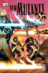
newmutv3001_dc11-1I don’t have history with the New Mutants. I never read their original book, and by the time I’d tried the satellite X-books, they were X-Force. I know a lot of X-Men fans hold the New Mutants in high esteem, but for my money, X-Force was way more interesting. I reread that old X-Force stuff a few months back and didn’t regret it, exactly, but it wasn’t very good, either. The idea of a second generation of X-Men who decided that Xavier’s way wasn’t perfect is a good one, and one that Grant Morrison revisited to great success in New X-Men: Riot at Xavier’s.

That was years ago at this point, though, and those times are long gone. The members of X-Force have given up, regressed, grown up again, and joined the actual X-Men. New Mutants #1 was written by Zeb Wells, pencilled by Diogenes Neves, inked by Cam Smith and Ed Tadeo, and colored by John Rauch. I checked it out mainly off the strength of Zeb Wells. He wrote the awesome New Warriors: Reality Check, starring Marvel’s other second generation of heroes, which was quickly thrown under the bus by Mark Millar’s Civil War. After reading it, the name New Mutants is basically a nostalgia grab. It stars Sam Guthrie, Roberto Da Costa, Amara Aquilla, Illyana Rasputin, Xi’an Coy Manh, and Dani Moonstar, and I found it a pretty solid first issue.

I’m really only familiar with Sam and Bobby as far as the cast goes, in addition to the surprise villain at the end. Even still, Wells does a pretty good job of selling me on the characters I don’t know, two of whom are blonde females of about the same height. I like that Illyana, who I’d previously seen when she died and maybe in some old X-Men reprints, is back and not exactly a good guy. She’s actually pretty sinister, and not in a “rough edge on a smooth team”-Wolverine sort of way.

The fact that the young students hate her is also a good touch, and a good example of something Wells does that I enjoy. He references a lot of backstory pretty seamlessly, but I never felt like I needed to know exactly what went down in, say, X-Infernus, which was a worthless story with solid art. The references are just used to build history, and to give Wells a bit of short-hand when sketching out the characters for new readers. I feel like Wells gets these characters. Sam and Bobby come across as best friends from jump, and Sam’s loyalty to his friends in particular is very clear. I also didn’t mind the suiting up scene, which usually comes across as corny.

I’m not as keen on the art. John Rauch’s coloring is working in that same style Pete Pantazis has been doing over on JLA– where each character is so brightly light that they look washed out and lightened. To be frank, it’s offputting and ugly. There’s not really any mood to the coloring, other than Outside, In A Basement, and Red Because She Might Be Evil. The color should enhance the art, rather than detract from it. It also sucks that Bobby Da Costa looks about as Brazilian as Bobby Drake.

At the same time, Neves’s art is solid, but unspectacular. He’s pretty solid at drawing kids, though his adults tend to skew a little too much toward the overmuscled superhero stereotype, rather than the early 20s mutants they should be, but that’s just comics as usual. Neves pulls some great facial expressions out of his hat, and though the issue doesn’t have a traditional fight scene, it seems like he’d be perfectly fine at choreographing and staging a solid fight scene.

New Mutants #1 was a solid, if a little unimpressive, read. I’ll give it another issue or so based on my past enjoyment of Zeb Wells and the fact that I like Bobby, Sam, and the surprise villain at the end. For it to be truly good, though, it’s going to need better coloring to even up the art. As-is, it’s a good start, enough to keep me interested, and a pretty decent mid-tier Marvel book. I like seeing these old characters turned into adults, and hopefully it’ll stick this time.

Post to Twitter Post to Facebook Post to Reddit Post to StumbleUpon