Archive for the 'comic books' Category


Pretty Girls Interlude: Dirty Pair
October 8th, 2010 Posted by david brothersBack in my day, which was the video rental era of anime in the mid to late ’90s, this was cutting edge animation:
Dirty Pair is about as ’80s as it gets, like Lily C.A.T., Demon City Shinjuku, and poorly thought out gratuitous shower scenes. Right Stuf is releasing the DVDs of the tv show as Dirty Pair: The Original TV Series, Pt. 1 DVD Collection
Adam Warren had a great run on the DP comics, but good luck finding them.

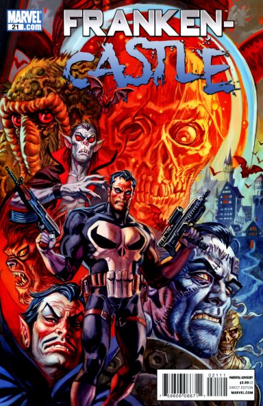
Franken-Castle: A Look Back at Rick Remender’s Graveyard Smash
October 7th, 2010 Posted by Gavok
Just last week, Rick Remender’s infamous Franken-Castle story arc had come to a close. Never have I seen a more divisive reaction to the character’s developments in all his history. At least with his whole Punishment Spectre-lite run, just about everyone hated it. I thought the whole Frankenstein concept was interesting and fun and I’ve seen many agree with me, but I’ve seen just as many hate it with the fury of a million Nick Furys. My local comic shop for months had a bulletin board with nothing up it other than Punisher #11 with a sign over it saying, “DISGRACE!” I kept forgetting to lovingly lick the covers of whatever Punisher issue I was buying while at the register.
Since Matt Fraction took up the character in Punisher: War Journal, Frank Castle has become more and more involved in the greater Marvel Universe. Outside of Jigsaw being killed off (and then being replaced with another guy taking up the mantle several issues later), not much carried over into Rick Remender’s Punisher run other than his latest injection into the superhero scene. The problem was that the Dark Reign banner put Frank’s writing in a corner. With Osborn and Hood in charge of things, he obviously had to be itching to take care of them, but even as the protagonist, he can’t. There’s far too much plot armor to work through. So how does one write a story about Frank Castle being completely impotent as an unstoppable vigilante?
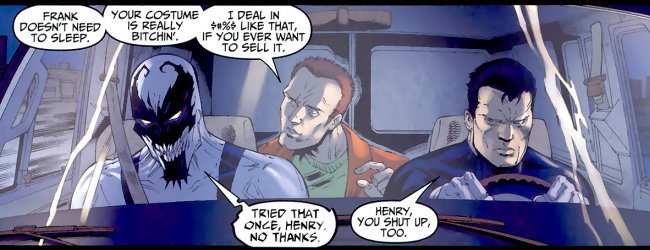
The first ten issues of Punisher and the one Annual take their time to get to something super-strong. Don’t get me wrong, it’s a fun bunch of issues, but the first five-issue arc is so closely melted into the second five-issue arc that there doesn’t appear to be much more than wheels spinning in place. There is one piece of interest in all this in the introduction of supporting character Henry Russo. Henry is a young hacker who tracks down Frank and makes himself the third man to take the role of Punisher’s tech-savvy sidekick. I really like Henry and want to see more from him. Thankfully, he’s gotten play in other stories like Deapdool: Suicide Kings and Anti-Venom: New Ways to Live.

Yes, yes. I’ll get to the next We Care a Lot soon. I promise.

Ha, Smarter Than The Average… [Genius #1]
October 7th, 2010 Posted by david brothersTop Cow First Look Volume 1 TP is a five dollar trade with six first issues of upcoming Top Cow series.
If you want some incentive to pick it up, here are some keywords:
-Afua Richardson
-Marc Bernardin
-Adam Freeman
–Genius #1
Pick it up or word is bond Cheryl Lynn is gonna come to your house while you sleep and punch you in the stomach.
Check out this preview, courtesy of Top Cow:
I wrote it up for CA a while back.

Pretty Girls: Inio Asano
October 1st, 2010 Posted by david brothers
Inio Asano: wiki, Anime News Network
Books: solanin, What a Wonderful World!, Vol. 1
, What a Wonderful World!, Vol. 2
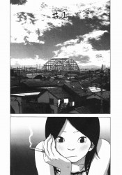
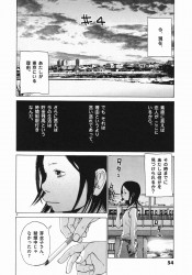
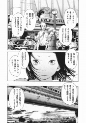
Why? Asano’s stories are my thing because he pretty much nails mid-20s ennui, but he also draws really, really cute girls. Fashion-wise, they’re kind of hipster girl cute. They have that carefully crafted off-kilter thing going on, a lot of scarves and patterns, sometimes tops and skirts that look a little like grandma clothes, lots of layers, and hair that’s either short or worn so as to appear short. A little quirky, but calculatedly quirky, right? Asano’s girls feel very contemporary.
They have really cute faces, too. They’re kind of doughy. More like, their faces bend under the weight of their emotions. Smiles go from one ear to the other, eyes squeeze shut, certain girls have duck lips, and your commonly accepted proportions for faces don’t matter at all. Expressiveness is what counts, and his brand of particularly cartoony, exaggerated expressiveness is what makes Asano fresh.
The freckles across Meiko’s nose in solanin help a lot, too.


Cripes on Infinite Earths Part 3: Two Faces
September 30th, 2010 Posted by guest articleGuest article by Fletcher “Syrg” Arnett.
Probably the biggest sin the Elseworlds line committed is that for every breakout hit or disaster the line produced, there were two or three bland piles of tripe released. Batman got the most Elseworlds, so he got the most dull stories- it’s simple probability. Today we’re going to start peering at those.

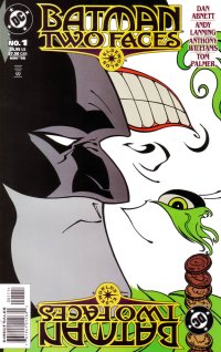
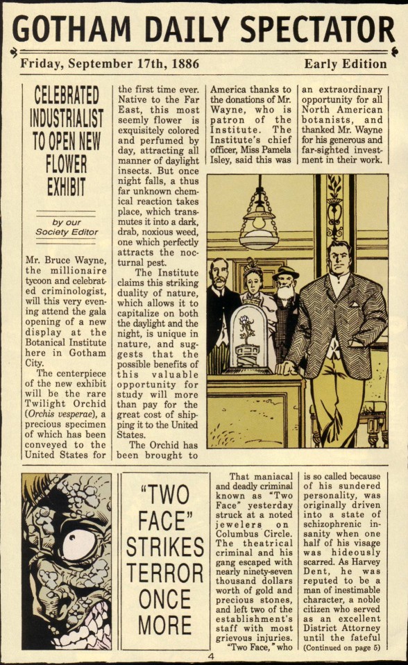
Batman: Two Faces
Written by: Dan Abnett & Andy Lanning
Art by: Anthony Williams & Tom Palmer
Focuses on: Batman
Self-contained/Multiple books: Self-contained
Published in: 1998
Central premise: Stretches the “duality of criminals/vigilantes” metaphor to its limit via the use of Two-Face, while Batman is also the Joker (oh like you couldn’t guess that from the cover)
Martian Manhunter Out of Fucking Nowhere? No
To be honest, I think the framing device for this story is a bit clever: inside the Iceberg Lounge, a gentleman’s club in late Victorian Era Gotham, Peregrine White and James Gordon swap tales of the bizarre and exciting from their lines of work, sworn to secrecy within the club’s walls. This evening, it’s Gordon’s turn to tell the tale, and he fills in the details on a case that was “the talk of every broadsheet in America” at the time.

There’s a recurring theme in a lot of Elseworlds of putting Batman a) in a Victorian-ish time period (fun note: this story takes place three years before the similarly-timed Gotham by Gaslight, the ur-Elseworld), and b) making him some sort of psychologist or similar skillset. Here he’s a criminologist “and amateur sleuth” of some renown. It doesn’t really have much to do with this story aside from his wanting to help cure the schizophrenia of Harvey Dent, but I just thought I’d point it out, being that this is the first we’re getting to that touches on those themes.

Gamble A Stamp 01: It’s Only Like Heaven
September 29th, 2010 Posted by david brothers
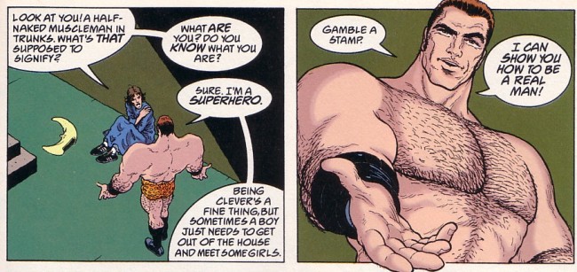
I think that if you are a fan of superhero comics, Grant Morrison and Frank Quitely’s Flex Mentallo should be your holy book. It caused a seismic shift in my enjoyment and understanding of superheroes after I read it, simultaneously deepening my enjoyment of the good stuff and my willingness to ignore the terrible. It’s a story, it’s comics journalism, it’s a history lesson, it’s evergreen, and it is auto-critique in pamphlet form. It’s about comics, you see, and if you haven’t read it, you should. This is part of a series of posts relating to the book.

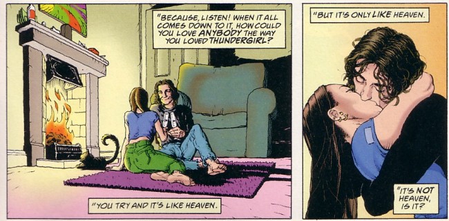
At one point in the book, Sage says, “Because listen! When it all comes down to it, how could you love ANYBODY the way you loved THUNDERGIRL? You try and it’s like Heaven. But it’s only LIKE Heaven. It’s NOT Heaven, is it?” It’s one of those points that stuck with me after reading, kind of like “Sometimes her cigarette smoke smells like flowers” from Brandon Graham’s King City carved out a space in my skull.
A teen in the throes of puberty and wishing for a Mary Jane Watson of his very own isn’t wishing for a real girlfriend. He’s looking for someone who resembles the stories and beliefs that he has built up around Mary Jane. Maybe she likes his favorite kind of music, has a certain cup size, or will do all those nasty things in bed that he’s been curious about.
What can compare to that? The only possible end point of that is disappointment. No matter how much you love someone, no matter how heads over heels they are–they’ll never be Mary Jane Watson, tiger. You can’t build a lover out of ideas. And yes, on the very next page: “What’s like Heaven? Shit. Oh shit. They fuck you up, those comics. They really fuck you up…”
Just like romance movies, fairy tales, sitcoms, and every other thing that tells us how life is before we get to experience it ourselves, superheroes sell us a reality that only works with archetypes. Every romance is an atom bomb of passion or strife. Lovers embrace against all odds and damn the consequences. No one gets to settle for someone they didn’t want or to be content with somebody who is just okay. Love triangles aren’t a ball of stress and drama so much as an entertaining diversion. No one comes home, hugs their wife, and goes to bed early. Everything is larger than life. Superheroes go hard or go home. There is no in-between.

At the same time, this is the strength of superheroes. Superheroes exist as archetypes that have been drawn from the same collective unconscious that has been creating stories about heroes for thousands of years. They represent abstract or unquantifiable values–responsibility, vengeance, altruism, guilt–and work out our insecurities and fears on the comics page. Spider-Man insists on a world where people take responsibility according to their ability, no matter how marginal. Batman is about emerging from darkness, away from your baser instincts, and into the light. Superman is a father figure, there to protect us from all possible harm and guide us on our way.
One of the points of Flex Mentallo is that superheroes exist to save us from ourselves. They provide an example for us to follow and embody the best aspects of human nature. They represent the hole that’s present in reality, the thing that’s missing that resulted in the world being in the shape it’s in. They’re the memory of a better time.
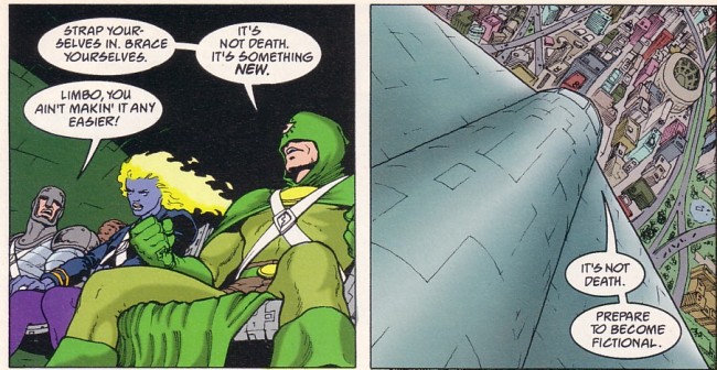
Flex provides a reason for comics to traffic in the stories that they do. The superheroes exist outside of the comic books, having escaped from their doomed reality by becoming fictional in ours, and live in our imagination. The comics are an attempt by the superheroes to show us what things could be like, if only we tried a little harder.

Sage’s feeling about Thundergirl and love–it’s not just about love. It’s deeper than that. It’s about archetypes, period. Your father may make you angry and let you down. Your friends may betray you. But, when you get down to it, Spider-Man will fight to the death to save you. Superman will always be there with a kind word when you need it. His stories and his reasons for being don’t change.
This is the power of superheroes. They touch on something deep inside us, whether as adults or children, and show us something we need to see. This is one of several messages in Flex Mentallo, and it’s one that places superheroes on a direct level with every other story. They represent something bigger than themselves and better than us.
How could you trust anybody the way you trust Superman?

The Commish
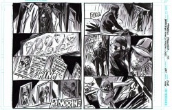
September 29th, 2010 Posted by Esther Inglis-ArkellSo Commissioner Gordon is getting a back-up in Detective Comics. I think the art, by Francesco Francovilla, looks great. And I’m excited to see the finished book.
One minor quibble with the picture, I really doubt that Gordon would have anything that reminds him of the Joker on the wall of his bedroom. We’re talking about the guy who tortured his daughter and killed his wife.
Commissioner Gordon is one of the characters I’ve always wanted to see more of. The trouble is, I don’t really know what that ‘more’ should consist of. Jim’s position involves management of a lot of intersecting cases, but at the same time he shouldn’t get involved in any of them. And it would be hard for his character to do stuff that didn’t involve getting sucked into some past traumatic memory. I think this would have been cooler if he were still a retiree and went around solving cases like Matlock.
Still, this is something that I think will really set Detective Comics apart from the . . . eleventy hundred (?) other Batman books out there. (Not that I’m opposed to that. I’m a Batperson. If anything there should be more books.) Any ideas for what kind of stories would work for Jim?

I Bought Thor 615 For John Workman
September 27th, 2010 Posted by david brothers
Not a joke! Not a snarky dismissal! I’m buying the Matt Fraction/Pasqual Ferry Thor because John Workman is lettering it.
That’s the pithy summary, anyway, but it’s no less true. Fraction is an okay writer who has done a few things I like (Casanova, Immortal Iron Fist) and a few things I don’t (Invincible Iron Man, Punisher War Journal) and Pasqual Ferry is a tremendous artist as far as I’m concerned, with great work done on everything from Superboy to Adam Strange to Ultimate Fantastic Four. Together, though, they aren’t quite enough to get me to read about Thor. I was going to give it a miss until I heard that Workman was lettering the book.
As far as I can tell, the only Thor you really have to read is Walt Simonson’s run on The Mighty Thor from the ’80s. The Kirby stuff never really clicked with me beyond the art, and the ’90s-era Thor was a tangled, knotted mess of a bunch of things I couldn’t have possibly cared about, no matter how hard I tried. Dan Jurgens and John Romita, Jr gave it a worthy try and told some good stories, but it never felt essential. J Michael Straczynski’s run on Thor
had pretty pictures from Olivier Coipel and the same brand of overwrought moralizing that has infected JMS’s amazingly awful DC Comics work. Michael Avon Oeming and Andrea DiVito came closest to making great Thor comics with Avengers Disassembled: Thor
, which wore its Simonson influence on both of its sleeves and down the seam of its pants.
No, if you want Thor, you gotta go to Walter Simonson. With the aid of letterer Workman and colorists Christie Scheele (who I think also colored the Miller/Romita Man Without Fear, maybe?) and George Roussos, Simonson crafted a genuinely epic story. He took Thor high and low, introduced new members of the cast, took the traditional cast in new directions, and turned Thor into his book the way Miller did with Daredevil.
I only had a few random issues of his run as a kid, being focused mainly on Spider and X-related titles. I liked what I had, though, and I remembered my uncle being a big fan of his work, so I sought out the trades once I grew up. One thing I learned from them is that lettering matters. It is undeniably an integral part of the art. If you’ve ever read a comic where word balloons overlap and crowd out the art, you know exactly what I mean. Placement, type, and yes, even spelling, matter. Marvel’s flirted with lettering experimentation lately, probably most notably in Incredible Herc, but the majority of their books are more or less lettered identically. You never look at an issue of Avengers and go, “Whoa, that lettering looks great!”, you know?
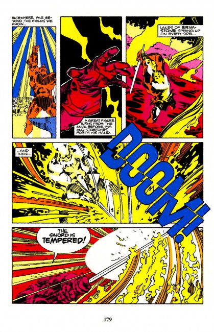
Workman is the guy who gives your book personality. His style is distinct and instantly recognizable. Brett Lewis and John Paul Leon’s Winter Men benefitted greatly from his work. He lettered Paul Pope’s Batman Year 100 (in concert with Pope and Jared K Fletcher) and 100%. His balloons have tons of white space, more than they probably need, and long, crooked tails. His sound effects fill entire panels, and are as much a part of the art as Simonson’s pencils or Scheele/Roussos’s colors. The style of Simonson’s Thor is inextricably linked to Workman’s letters.
I mean, seriously. The foreshadowing of Surtur wouldn’t have been half as awesome without Workman’s letters, and the bit where Surtur cuts a “DOOM!” in half with Twilight? Fantastic. Pencils, inks, colors, and letters all working in concert to tell one story. That’s how comics should be.
Everyone who comes onto Thor is sitting in Simonson’s shadow. He’s the guy to beat. Most people who end up working with Thor are honest about it in interviews (JMS, Fraction, Ferry, Simone Bianchi, for example) or it reflects in the work (Oeming). Fraction and Ferry have been very open about loving Simonson’s run, which is cool, but plenty of people have said that and then produced crap. How many people have talked about Grant Morrison when taking over one of his characters, ideas, or former series and then delivered nothing worth reading? Talk is cheap.
The presence of Workman on the book, though, is the difference. I hadn’t realized it, but Workman’s letters are how Thor is supposed to talk. The sound effects, the balloons, the letters, all of that is undeniably Thor to me. Similar to how Spawn needs Tom Orzechowski or seeing a realistically rendered Patsy “Hellcat” Walker looks wrong, Thor without Workman just isn’t Thor. Going off and getting Workman speaks to the kind of story that they’re trying to tell. It’s an effort that I can respect, and moved me enough to grab the first issue of the Fraction/Ferry run.
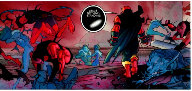
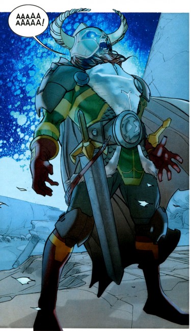
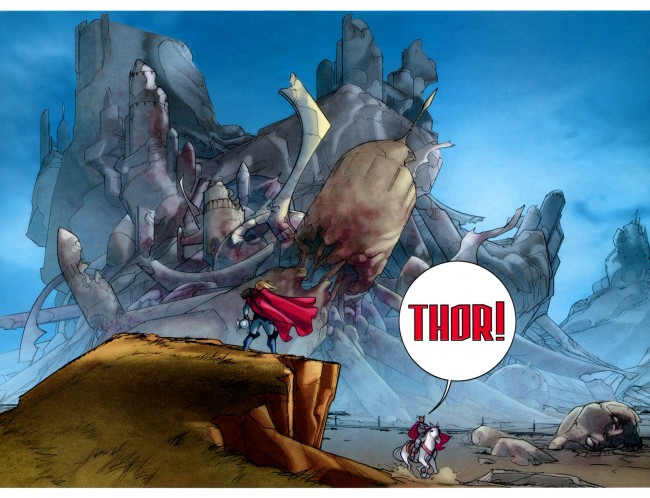
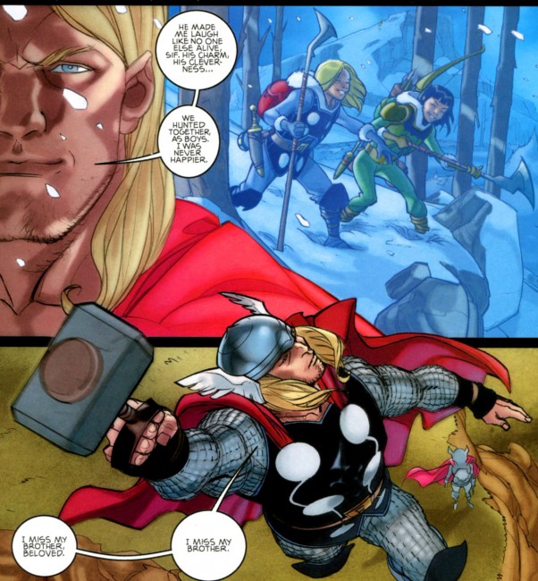
Verdict? Four dollars for a 22-page comic is entirely too high, but Ferry’s art is off the meter, Hollingsworth’s colors are real good, and Fraction’s got a great handle on everyone involved. The plot is looking good, just that sublime mix of sci-fi and magic that makes Marvel’s Thor what he is, and the enemies are appropriately fearsome. Workman absolutely kills on the lettering, particularly on the last balloon in the book, “I think I tasted blood,” the creepy black balloons, and Heimdall’s scream. The fact that there are ten double page spreads, all dedicated to non-Earth locales, is interesting. I think it’s too soon to call, but my best guess is that Fraction and Ferry are doing that to show the larger than life nature of the gods and the other of the nine worlds. There are three pages set in Asgard that aren’t spreads, and all the Earth pages are singles. I’m definitely going to be watching to see how that develops.
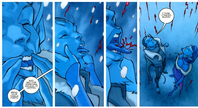
You should be reading it.

Pretty Girls: Barbara Canepa (and Alessandro Barbucci)
September 24th, 2010 Posted by david brothers
There’s boobs in this one, cap’n, so you get to see one of the rare times I ever use a cut. Read the rest of this entry �