Archive for July, 2010

h1

6 Writers: Stan Sakai

July 12th, 2010 Posted by david brothers
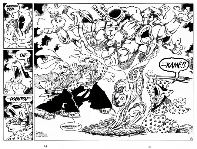
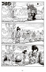
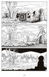
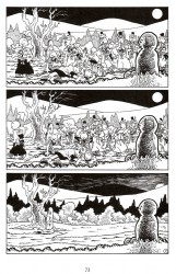
Stan Sakai’s Usagi Yojimbo is probably the most consistently good comic currently being published.
If I were on the outside looking in, I wouldn’t expect myself to like Usagi Yojimbo. There’s not a lot of space for casually brutal violence, curse words, and femmes fatale in funny talking animal comics, y’know? But, no– it turns out that this book is right up my alley. Sakai isn’t trying to tell some continuity-tangled epic or reinvent an old genre. He just wants to tell chambara tales, and he created a character and a world that’s flexible enough to support anything he wants to do. I don’t think I’ve ever read a volume of Usagi Yojimbo that I disliked.

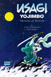
The first Sakai book I read, or at least read knowing it was Stan Sakai, was Usagi Yojimbo 8: Shades of Death. I picked it up on a whim maybe six or seven years ago off a vague inkling that I liked when Usagi Yojimbo showed up on the old Teenage Mutant Ninja Turtles cartoon. It turns out that blind luck got me the volume where the Ninja Turtles guest star for a story arc. The story is the kind that shouldn’t work–full of magic, time travel, and a crossover between two franchises, but it absolutely comes together in the end.

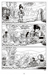
Shades of Death is actually a pretty good cross-section of what Sakai is capable of. Other than the TMNT story, he does a brief story about Usagi as a child, one where Usagi gets trapped in the intrigue of a small village (“Shi”), and a funny short about Usagi and some tokage lizards. There’s a mix of mysticism, samurai action, horror, and just plain old comedy, and none of it seems out of place.
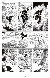
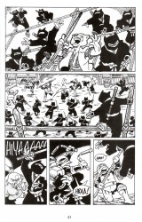
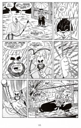
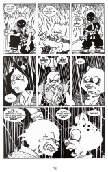
The Ninja Turtles story was good, but “Shi” is fantastic. In it, Usagi randomly wanders into a village after tossing a stick at a crossroads and letting the gods decide his fate (remember Yojimbo?). He ends up in the middle of a magistrate’s plot to steal a bunch of gold from a village. Usagi is forced to defend the village from four assassin’s collectively known as “Death,” or “Shi.”
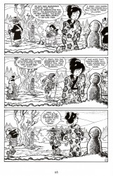
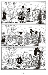
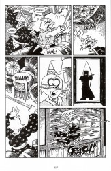
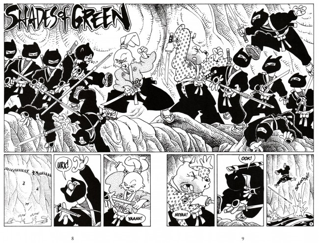
When the time comes to kill the assassins, Usagi and Sakai do not shy away from the violence. It’s shown without ever dipping into exploitation, but it remains exciting. Usagi dispatches the villains one-by-one, and Sakai’s clean linework and layouts keep the action interesting. After the battle, when confronted with a man from the village who wants to prove his worth, Usagi effectively puts him down with simple words. Sakai draws Usagi with an off-kilter stance and overly-shadowed face, ramping up the menace, and it’s as effective on the page as it is in the story. You get the feeling that Usagi’s blood is still running hot and that bothering him right then would definitely be a mistake.
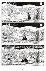
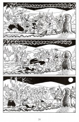
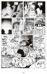
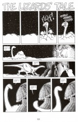
On the other end of the spectrum, and directly after “Shi,” is “The Lizard’s Tale.” This short story wouldn’t be out of place in a Looney Tunes short or goofy Saturday morning cartoon. Usagi wakes up to find himself surrounded by tokage lizards, who then proceed to imprint upon him and follow him around, defying his best efforts to get rid of them. This is a largely dialogue-less piece, unless you count the sounds of the lizards, but you don’t really need words to make this work. It uses Tom & Jerry storytelling to get the job done.

Sakai’s never had a problem with telling stories in Usagi Yojimbo. There are a couple of bits that he picked up from movies, such as Usagi’s leap out of a window to dodge an arrow or using a still camera for an entire story to great effect, but by and large, Usagi Yojimbo is just made up of solid cartooning. The stories draw their inspiration from a variety of films. The most notable references/homages are from Akira Kurosawa’s chambara pictures, as I can think of a couple of Yojimbo riffs off the top of my head, but Sakai’s done a pretty deft (but goofy) Godzilla strip, too.
Usagi is one of those books I binge on a few times a year. I’ll hit Amazon and pick up several volumes, tear through them in a few short days, and then wait. Usagi Yojimbo is Grab Bag Comics, the sort of series where you know you’ll get something you’ll enjoy, but have no idea which genre you’re going to get it in. Sakai’s interested in telling simple stories, tales you can drop in on whenever you like and get something good. Usagi Yojimbo is dependably good, and I’m having trouble thinking of a series that’s matched its run. That’s something to be respected in the modern comics industry, I think.
Of course, after writing this, I noticed that the volume I spent this entire essay praising is currently out of print. You can find it used for pretty cheap, or you can preorder the new edition for 01/2011. Honestly, though, if you want a taste of Usagi, you should start with last year’s Usagi Yojimbo: Yokai. It’s a short original graphic novel about the time Usagi wandered into a demon-infested forest. It’s maybe a little more serious than the average Usagi tale, but it’s nicely spooky and seeing full-color Sakai is pretty great. After that, jump around in the series. The reading order isn’t essential the way it is in a continuity-focused comic, and Sakai is great at getting you caught up without loading up on infodumps.
Post to Twitter Post to Facebook Post to Reddit Post to StumbleUpon

h1

Fourcast! 53: Predators

July 12th, 2010 Posted by david brothers

-We saw Predators!
-Now it’s time to ruin it for you.
-It may sound like we’re damning it with faint praise, but it’s honestly a pretty good movie.
-Well cast, well acted.
-It’s pretty dumb, and very outlandish, but in a good way.
-That’s about it, really.
-There is a conversation about Superman and Batman vs Aliens and Predator that got left on the cutting room floor, though.
-Sorry.
-(Psyche.)
-6th Sense’s 4a.m. Instrumental for the theme music.
-See you, space cowboy!

Subscribe to the Fourcast! via:
Podcast Alley feed!
RSS feed via Feedburner
iTunes Store

Post to Twitter Post to Facebook Post to Reddit Post to StumbleUpon

h1

This Week in Panels: Week 42

July 11th, 2010 Posted by Gavok

Another week of panels is upon us. David only tosses in one panel this time around. I remembered to remind him that one of the guidelines for This Week in Panels is not to put anything from the last page. After all, we don’t want to spoil the entire book for you, nor do I want it to be like one of those comic covers that depicts the very last page. Let’s see what he chose.

Amazing Spider-Man #636
Joe Kelly, Zeb Wells and Michael Lark

GODDAMN IT, MAN! WHAT THE HELL?!

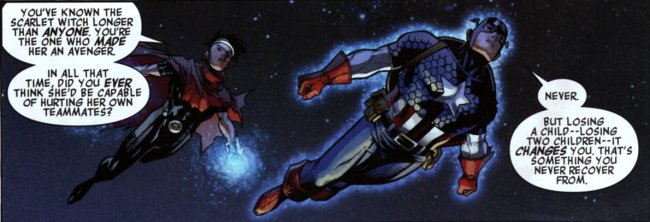
Avengers: The Children’s Crusade #1
Allan Heinberg and Jim Cheung

Read the rest of this entry �

Post to Twitter Post to Facebook Post to Reddit Post to StumbleUpon

h1

7 Artists: Doug Mahnke

July 10th, 2010 Posted by david brothers


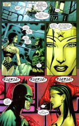
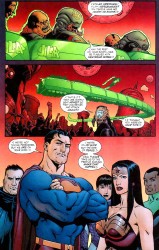
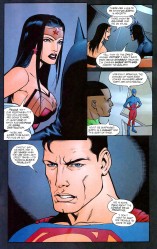
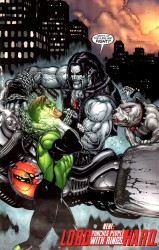
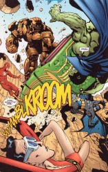
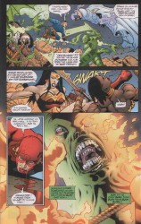
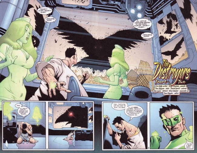
Doug Mahnke does one thing better than everyone else, and that’s draw Wonder Woman.

The biggest reason why he draws the best Wonder Woman is easy: the hair. It’s this very straight, wet, flat look that looks so good it should’ve become part of her official look.

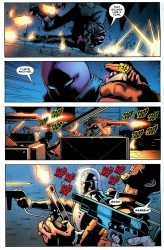
He does another thing better than most people, and that’s depict action.

Violence in comics is weird. When it’s wrong, it’s wrong, and it just looks stupid. This is particularly true of the post-Lee artists, guys who draw in the remnants of one of your typical early Image Comics styles. That sort of overly built, action figure style really doesn’t lend itself to a proper portrayal of violence. It looks like action figures moving across a page while an unseen child goes “Pow! Pow!”

Comics art tends toward clean. Bryan Hitch, Stuart Immonen, John Romita Jr, Dan Jurgens, Mark Bagley, whoever whatever, they tend to draw these really neat scenes, clean lines, so on and so on. The action follows. It’s pretty clean and simple, and when people get bloody, it’s a very reserved kind of bloody. It’s not really that brutal. Mahnke, though. Everything this guy draws looks like it’s had a belt sander taken to it not five seconds before, and when he draws an impact, he draws it like it’s the only thing that matters on the page. You don’t even really need the sound effects at all.

Mahnke’s work isn’t interesting because of any particular attention to detail, I don’t think. It’s interesting because of how he approaches his subject matter. Some artists go for detailed draftsmanship and scale (Bryan Hitch), some for body language and realism (Frank Quitely), and some for photorealism (any artist with Photoshop and a host of garish filters). Mahnke… I think the key to his work is restraint.

He draws his characters very muscular, just on the far side of ripped, but not the usual steroid case you expect to see in comics. They tend toward the slim, but filled out. They’re just big enough to be superhuman, but not so big that they look overdone. It’s clear that they aren’t normal, but they aren’t so abnormal that they look ridiculous. They’re just right in that sweet spot between human and super. They work so well on the page because they’re believable.

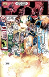
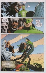
But that’s all beside the point. When Mahnke draws people fighting, it looks good. The gritty way his lines end up, the slim but powerful figures (with real weight), and his ability to capture the perfect mid-action panel are just a few reasons why. David Aja does choreography, Jack Kirby did bombast, and Mahnke is good at finding just the right moment to freeze the frame.

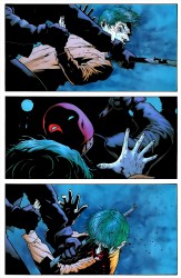
It’s all about that right moment in time. Aja captures it fluidly and about as close to “in motion” as you can get on a comics page. Mahnke doesn’t have the same style or approach to comics as Aja does, but I don’t think that his is any less effective. There’s a page from Batman: Under the Hood where Jason Todd is beating the Joker with a crowbar. The final panel on that page, where the crowbar is in direct and intimate contact with the Joker’s face, hurts. It’s that moment after the impact, after the Joker’s head has started to turn, but before Jason’s completed his swing. It’s ugly, and that specific moment might be the ugliest.

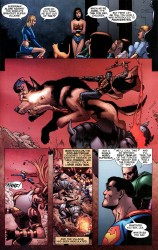
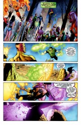
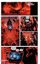
You can see it in other books, too. Kyle’s limp form as Manitou Raven stabs him in the chest in JLA: The Obsidian Age. The part in Green Lantern where Carol Ferris has Sinestro’s arm blocked and is working her way around his throat. In Final Crisis, Frankenstein taking the head off a dog while his giant wolf thing chews through Wonder Woman.

Panels are always specific moments in time. That moment has to convey whatever feelings or actions are required to create a fully realized story. Creating the perfect panel is probably pretty tough, considering that you’ve not only got to draw well, but capture a specific moment in a scene.

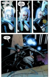
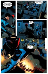
If you’re too late, there’s no impact, no juice. If you’re too early, it’s all still just potential energy. Getting it right… that’s something to be respected. Some artists manage to miss that killer moment almost every time. Their art is just passable, just short of acceptable, but it gets a book on a shelf so I guess it has some value to someone. With Mahnke, though… I’ve never felt like that. His gunfights (as in Team Zero), his superhero battles (Justice League Elite), his brutal hand-to-hand (Batman), and even this sci-fi magic wishing ring stuff he’s doing over in Green Lantern… all of it looks right. It looks like it hurts.

(And honestly, if Doug Mahnke were the only person allowed to draw Wonder Woman and Lobo, I’d be a very happy camper.)

Post to Twitter Post to Facebook Post to Reddit Post to StumbleUpon

h1

Mr. T Comic Book Jibba Jabba: Part Five

July 10th, 2010 Posted by Gavok

We move closer and closer into the present with the various Mr. T comics and upon hitting 2008, we get to my favorite of the bunch. Now, while Mr. T and the T-Force and the short-lived Mr. T from 2005 involved a couple of neat elements, there’s something rather underwhelming about going the lengths of getting the Mr. T license and not doing anything extra special with it. The A-Team comic wasn’t especially fantastic, but at least it knew that being outlandish couldn’t hurt. The stories made little sense, but we still had B.A. Barracus fighting a sumo, getting into bar fights and knocking out Russian soldiers.

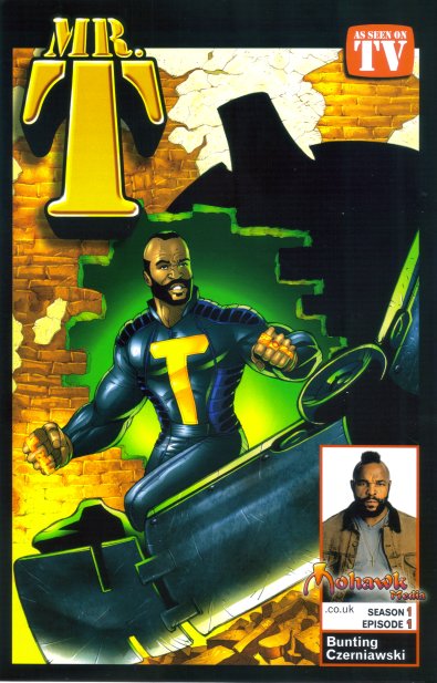
After the unfortunate cancellation of the 2005 Mr. T due to the company closing down, Christopher Bunting decided he would keep it going. He started up Mohawk Media and released yet another Mr. T comic. While the stories are basically split up into issues, including covers, they would not be released separately and by the month. Instead, Bunting would let them loose all at once with the new Mr. T graphic novel.

I don’t know how to feel about that “AS SEEN ON TV” logo.

There are five issues in the trade. The first four are its own story arc with JL Czerniawski on art. The bonus issue is done by artist Giovanni P. Timpano. While, yes, the comic does have a lot of Mr. T being preachy, it’s a lot less forced this time around. The reliance of having Mr. T yell at children for doing drugs is finally put to rest.

Also, between the issues are pages of Mr. T answering fan mail. If you’re wondering, Mr. T believes Clubber Lang would beat B.A. in a fight.

Read the rest of this entry �

Post to Twitter Post to Facebook Post to Reddit Post to StumbleUpon

h1

7 Artists: Paolo Rivera

July 9th, 2010 Posted by david brothers

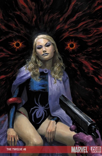
Covers sell comics. I mean, obviously, right? Back when you could buy comics in public, covers had to be exciting and interesting as a general rule. Severed heads, gorillas, and frankly stupid ideas were commonplace, and it was all calculated to catch your attention. As the comics industry became more insular, the covers did the same. They stopped trying to attract civilians and started trying to trick comics fans into buying the issue because “nothing will be the same!” If you look at early ’00s Marvel, and actually several covers recently, it’s clear that they weren’t even trying to reach even comics fans. “Get Adi Granov to draw She-Hulk standing on a gunmetal-y background! That’ll move units! Get Greg Horn to throw some D’s on that joint!” In a word: lazy. Another word: boring. Those are two of the worst things a comic book can be.

Paolo Rivera, though. This guy did a series of fully-painted Marvel books with Paul Jenkins that I liked well enough. They were origin stories, slimmed down and tightened up. Fun, but not particularly interesting, you know? They were stories I’ve read dozens of time before. The art was good, and the writing was okay, but it wasn’t groundbreaking. But his cover work… that’s where he shines. This guy actually makes interesting covers, something that was in short supply for a long time.

I don’t really have any science for this one. I don’t really know cover theory beyond realizing that some cool type, clever copy, and great art makes for a good cover. I have several cover artists I like (Dave Johnson, Rafael Albuquerque, Frank Miller, Walt Simonson, Jordi Bernet, others), but I couldn’t genuinely tell you why I like them. Not beyond “It looks good.” I’m not equipped.

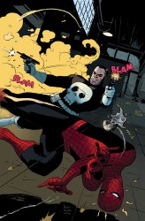
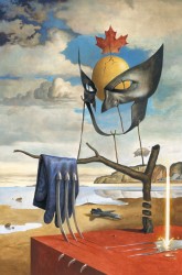
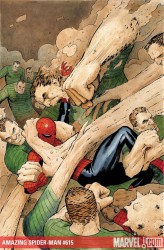
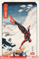
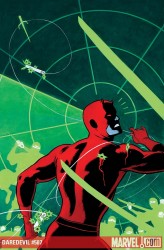
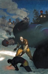
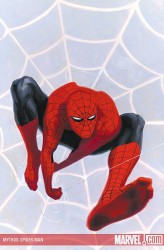
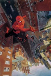
If I strained, I could point out reasons why Rivera is a great cover artist. It could be the little details he puts on his covers, like Spidey’s tiny (but expressive!) eyes, the glow of Cyclops’s visor on the snow, or the awkward mid-motion poses of Punisher and Spider-Man (and his web). Maybe it’s the draftsmanship/craftsmanship in his work. His characters tend to have real weight and are believable in context. Spider-Man is kinda thin, Cap a little tall, and Punisher looks a little like a creepy child molester. Maybe it’s the hand-lettered sound effects. Maybe it’s how he knows how to draw your eye to a specific point on the cover. Maybe it’s the look on Sandman’s faces while he pummels Spider-Man. Maybe it’s the incredible sneer on Black Widow’s face.

Who knows. Who cares. I’m a firm believer in examining what you enjoy. If it’s worthy of time, it’s worthy of examination. Why you like it, what’s good about it, what it says, what it means. Whatever. At the same time… sometimes you just have to sit back and like things. Sometimes that’s nice.

I like Paolo Rivera’s work.

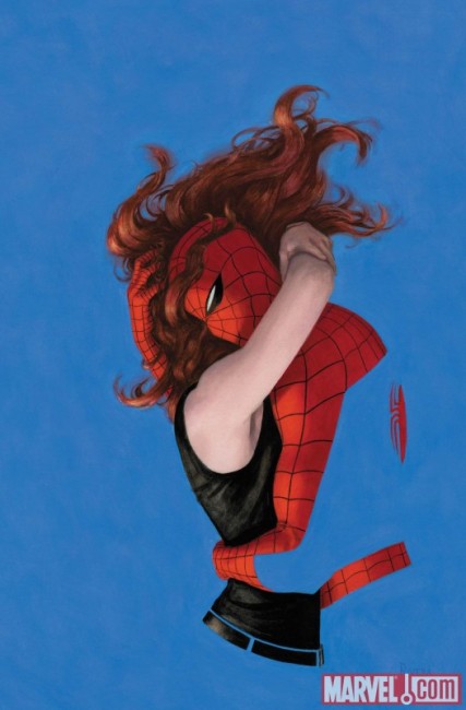
And this cover down here, with the blue and the red? Cover of the year and instantly one of my favorite Spider-Man images. No contest. It doesn’t even need any copy. It knocked my socks off when I first saw it. Even if you didn’t know from covers, that’s a cover. Check the process here.

Post to Twitter Post to Facebook Post to Reddit Post to StumbleUpon

h1

The Cipher 07/07/10

July 8th, 2010 Posted by david brothers


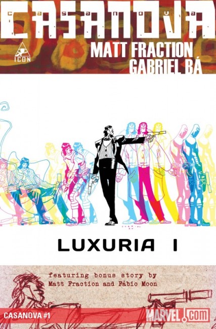
Casanova 01. words by Matt Fraction, art by Gabriel Ba and Fabio Moon, colors by Cris Peters, cover by Gabriel Ba. Preview.

I’m living in that 21st century, doing something mean to it–Do it better than anybody you’ve ever seen do it

I used to really love Casanova. It wasn’t my introduction to Matt Fraction (I think that was Last of the Independents?), but it was the first book of his that I really genuinely liked. Something about it–the superspy stuff, dimension hopping, interesting storytelling–clicked with me and I ended up buying every issue, plus the hardcover of the first series. This post is full of hyperbole and mistakes I wouldn’t make today, but it shows you how high I was on this comic at the time.

This year sees the return of Casanova, but maybe return should be in “douchebag quotes.” It’s being re-serialized from the very beginning, recolored and re-lettered, and the entire series is going to get the deluxe treatment out of Marvel. On the one hand-great! I loved reading these. On the other hand–it’s not 2007 any more. I buy comics differently. If I leap into this, which I have read and liked and appears to be improved, I’m looking at possibly quadruple dipping on this series. I bought the originals, bought the trade, and bought the originals for the second series. I could buy the new issues, but what I really want are the trades of the stuff I’ve already read (with the new colors and etc).

There’s a dilemma for you. Support in singles after having already supported in singles or be selfish and buy the trades several months down the line?

(I’m buying the trades because this really isn’t a dilemma at all, but if you haven’t read Casanova, give it a look.)

What’s 4l! buying?!
David: Amazing Spider-Man 636, King City 10
Esther: Batman and Robin 13, Secret Six 23, Batman Confidential 46, Red Robin 14
Gavin: Batman & Robin 13, Secret Six 23, Avengers: Children’s Crusade 1, Avengers: The Origin 4, Hawkeye & Mockingbird 2, Hit-Monkey 1, Steve Rogers: Super-Soldier 1, Irredeemable 15

Book-wise, I just got Shade the Changing Man: The American Scream, Human Target: Chance Meetings, Hellblazer: Hooked, Batwoman: Elegy, The Life and Times of Martha Washington in the Twenty-First Century, and One Piece 54. I didn’t own Human Target: Final Cut, so I went ahead and grabbed that trade. I haven’t read Shade before, or at least not to my memory, so I’m starting in on that. And HellblazerHellblazer is just good. Let Tucker convince you. He’s right. So yeah, it’s a heavy Milligan week for me, but I can’t complain. And I get King City and One Piece and a follow-up to one of the top three greatest Spider-Man stories of all time? Comics should always be this good.

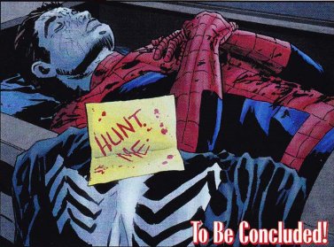
(If you’re not reading Amazing Spider-Man: Grim Hunt, you’re making a mistake. The last page this week is on bomb status.)

Tell me what you’re buying and how you liked it.

Post to Twitter Post to Facebook Post to Reddit Post to StumbleUpon

h1

7 Artists: David Aja

July 8th, 2010 Posted by david brothers

There’s this Grant Morrison quote I like a lot. It’s inflammatory, but I think there’s a lot of truth in it.

As for all this talk I keep hearing about how ‘ordinary people’ can’t handle the weird layouts in comics – well, time for another micro-rant, but that’s like your granddad saying he can’t handle all the scary, fast-moving information on Top of the Pops and there’s really only one answer. Fuck off, granddad. If you’re too stupid to read a comic page, you shouldn’t be trying to read comic books and probably don’t. As creative people, I feel we need to call time on the relentless watering down of comics design and storytelling possibilities in some misguided attempt to appeal to people who WILL NEVER BE INTERESTED in looking at or buying hand-drawn superhero comic books.

The emphasis is mine, and keep it in mind as you read.

How do you read a comics page?

Stupid question, right? But no, not really. The comics page is the most basic building block of a comic book. They haven’t changed too much since they were first invented. You can have words and pictures and you can have ink in CMYK or digital PSDs or AIs in RGB, but without a page to put it on, the tabula rasa of yore, you’re out of luck. It’s probably the one thing in comics that’s genuinely indispensable. (Well, that and ink.)

You could make cases for Jack Kirby, Steranko, and even the often-horrid art of the speculator boom of the ’90s for changing the way people read comics. This change has happened several times. The change came when people began treating the space between the panels, the passage of time that happens there, differently. Panels began to convey different kinds of action.

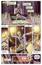
What’s nice about David Aja’s work is how he treats his layouts. Rather than simply being a tool to convey the story, which is generally how most artists treat their layouts, Aja often turns the layout into part of the story. It’s like if the television you use to watch movies ended up actually introducing new data into your viewing experience.

He’s done this in a variety of ways. David Uzumeri wrote a pretty fantastic appreciation of a single page from Daredevil 116 for Funnybook Babylon. It’s absolutely worth reading, if you have the time. The reason why this page is so crucial is simple. (Hopefully I can talk about it without plagiarizing David.) The Kingpin is a man defined by his relationships. The tommy gun and revolver represent his status in a very old-fashioned form of organized crime. Spider-Man was his introduction to the superhero community. Daredevil looms large in Kingpin’s mind, ready for violence, but bottled within Daredevil is a silhouette of Bullseye, Daredevil’s worst enemy and Kingpin’s former chief assassin. Separate from all of that is Vanessa, the Kingpin’s wife. He tried to keep her segregated from his less than savory pursuits, but those pursuits eventually destroyed her.
(When Ditko and Romita would draw Spider-Man with a half-Spidey mask over his face, it was meant to show how Spider-Man and Peter Parker coexisted, and how they cooperated and interfered with each other’s lives. They compete and battle each other, with Spider-Man taking the form of his responsibility and Peter Parker being his inner selfishness. The two halves need each other. They define each other by their existence, and sometimes even their absence. A simple technique–a face that is half Peter Parker and half Spider-Man–with fantastic depth. It’s storytelling quicksand, you don’t realize just how deep it goes til you’re knee deep in it. If that technique went off and had a baby with Steranko’s Agent of SHIELD, and that baby was raised by some of the more out there Frank Miller and David Mazzucchelli stuff on Daredevil, you’d end up with something like this, I think. This is also a technique that only works in comics. It’d look stupid in live action.)
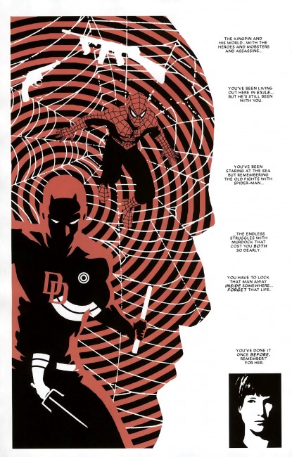
This is a comics page. It’s the same kind of comics page you’ve grown up reading, but it isn’t. The grid is gone, replaced with the outline of a man’s head, and stacked high with meaning. It’s part of the story, not the hanger the story is draped upon.

Next.


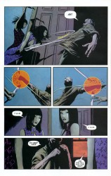
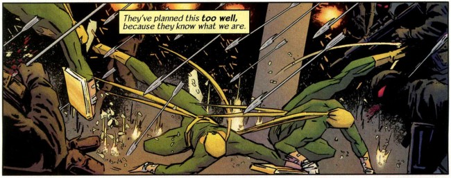
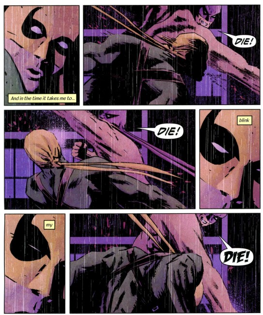
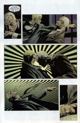
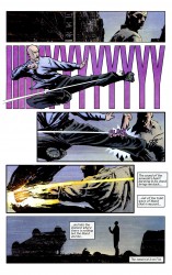
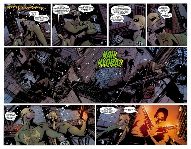
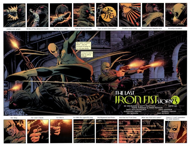
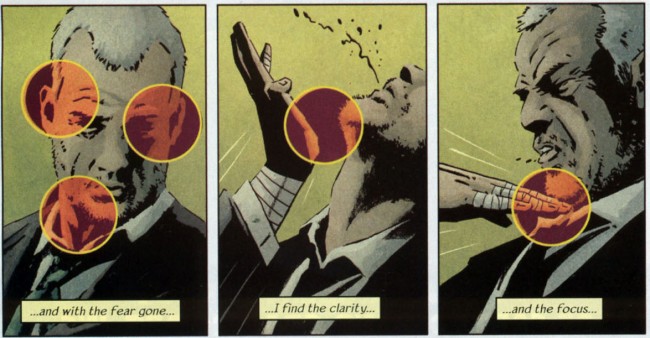
In Immortal Iron Fist, certain punches and strikes get a bit of extra oomph. Aja plays with your sense of time to accomplish this. Each panel on a page is a specific instant in time. When Spider-Man has several afterimages present on a page, doing a diverse array of actions (or just punching one guy 3-10 times), that is meant to take place in the same instant. It’s a show of speed. Aja, though, slams it into reverse and likes to pull your focus in to a specific point on the page you’re reading.

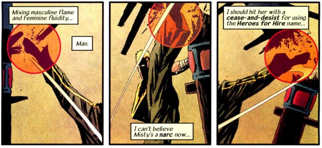
You see the punch in a panel of its own, but there’s a little more added into the mix. Small circles, like targeting reticles in video games, emphasize the point of impact, and by virtue of taking place at one specific moment in time, emphasize the impact itself. It changes the pace of your reading, so instead of going punch-kick-punch-uppercut, you’re seeing punch-jawbone-kick-kidney-punch-neck-uppercut-chin. Four beats become eight, and suddenly you’ve spent more time on the panels, more time focusing on the thing the layout wants you to focus on, than you normally would have. One breath becomes an infinite amount of time, captured like a slideshow.

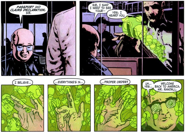
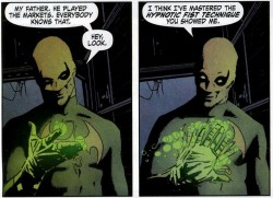
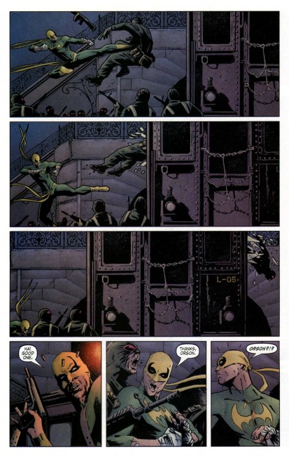
He does something else when Orson Randall arrives in the USA. He does a little jedi mind trick, something that would be a flick of the wrist and a blur of the fingers in real life, and each position of his hand gets a panel dedicated to it. This little bit of nothing, something that later in the book is a mere blur across two panels, gets a lot of page space.

This forces you to dwell on the trick itself, rather than the fact that a trick happened. Imagine if Spider-Man’s web-swinging was drawn differently. Spider-Man in mid-air-right arm curved in-right arm flung out-thwip position-web shooting out-hand pulling tight over the web-right arm pulling back and propelling Spider-Man forward. One action split into seven distinct segments. This is choreography at work.

These are all magic tricks that artists can use to control how you read comics. Aja does it better than most, particularly on Iron Fist. Two things made kung-fu movies exciting: speed and clarity. You want to see people moving quickly and doing impossible things, but you also want to be able to see exactly what Five Elements kung-fu is. If you can’t tell what it is, the action sucks (see also: The Dark Knight). Iron Fist is a kung-fu book, and while the cinematic stylings of kung-fu movies cannot be directly transplanted onto a comics page, Aja does the next best thing. He captures the look and the feel, if not the totality of the motion.

Do you get it?


A punch, for a particularly relevant example, is one smooth motion with a lot of moving parts. Your back muscles flex, your arm changes shape, and your body turns with the punch. Throwing repeated punches turns one motion into many, but since they’re taking place on the same body, they have to flow into each other. It’s not as easy as just drawing jab-jab-straight. Look at this Roy Jones Jr highlight reel. Jones is fantastically flashy, but watch how he moves. His legs move, his feet shift, his head bobs, and his body works. Have you ever seen Bruce Lee’s Green Hornet audition video? There’s a lot of similar things on display, and the theory holds true for all of it. Aja applies this sort of thing to comics very well, showing the myriad motions that people go through when they do simple or complex things and picking out the specific moments you need to show maximum action.

This is the opposite of the watering down that Morrison spoke out against. It’s aggressively pushing forward the standards of what to do with a comics page, how to tell a story, and expanding the language of comics.

And I haven’t even talked about his collaboration with Ann Nocenti, 3 Jacks. Tim O’Neil and Abhay already did that.

Pay attention to David Aja. Pay attention to how you read comic books. Everything matters. It’s all part of the story. And if you can’t handle it… maybe you should quit comics and start reading novels.

Post to Twitter Post to Facebook Post to Reddit Post to StumbleUpon

h1

7 Artists: Richard Corben

July 7th, 2010 Posted by david brothers


Richard Corben can draw anything. I’ve seen him do dark horror, mean crime comics, superhero books, prison drama, and post-apocalyptic ugliness with aplomb. He’s been creating stories since the late ’60s and has amassed a pretty imrpessive resume. For the past few years, he’s been working with mainstream publishers like Marvel, DC, and Dark Horse and pumping out must-read tale after must-read tale.

The thing about Corben is that he’s not a pretty artist. His work is grotesque in the traditional sense of the word–not ugly, but distorted and unnatural. His men are super-muscular, with prominent jaws (and, when nude, penises), while his women are buxom and bulky. No one is skinny in Corben’s comics unless they’re dying or dead. Everyone’s rounded and ripped, with long or round faces, brawny arms, sausage fingers, big noses, wide lips, and thick gums. Corben exists in that weird area where his art definitely has a touch of ugly about it, but ends up being aesthetically pleasing because of that.

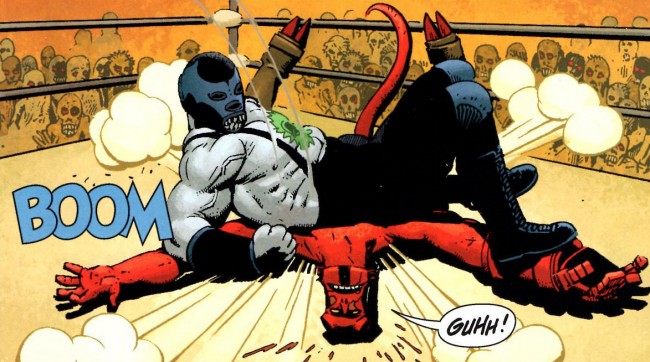
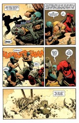
There are a few things I think of as Corben’s signature flourishes. His approach to violence is one of them. He draws this weird, cartoony violence, like slapstick Tex Avery shorts where people actually die. In your average Corben tale, lizardmen crush skulls, axes cleave skulls in two, people get burned alive, and swords poke out eyeballs. It’s very gory, but not in a realistic way. It’s more akin to cartoon violence, where the blood and acts are exaggerated just enough to be thrilling without being too disgusting.


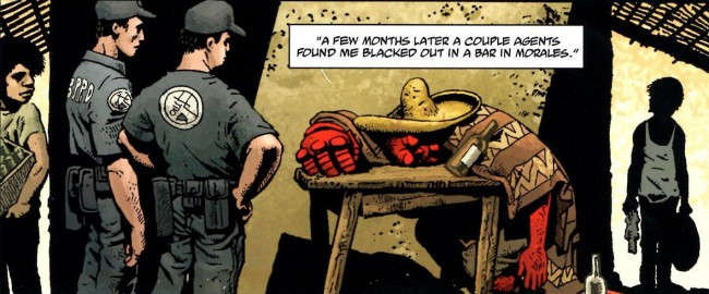
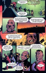
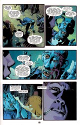
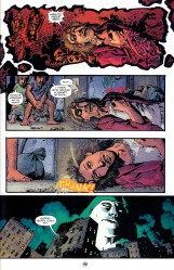
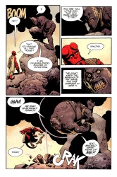
This carries on to his approach to corpses, too. They’re decayed and disgusting, with battle wounds, worms, and broken bones jutting out at odd angles, but they’re always drawn just gross enough to be interesting, rather than off-putting. His work on Hellboy, and various short stories recently, has led to Corben drawing a lot of dead people. A collaboration with John Arcudi in Solo featured Corben telling a story about the Spectre. A man is dismembered, disemboweled, and cut open, amongst other various punishments, on-panel. In the hands of a more realistic artist, say Hiroya (Gantz) Oku, you would have gotten an almost pornographically detailed vision of spewing guts and broken faces. In Corben’s hands, it’s cartoony and scary, to be sure, but you could never accuse Corben of being dependent on gore as a gross-out factor.

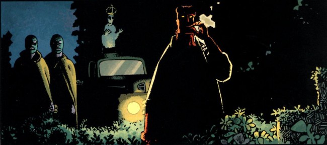
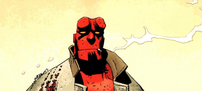
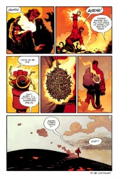
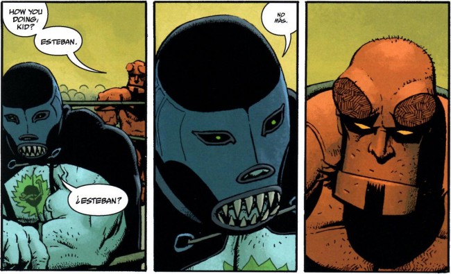
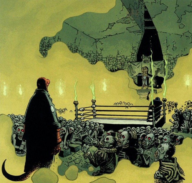
Another Corben high point is his take on Hellboy. Several artists have drawn Hellboy’s adventures, and each have had a very specific take on the character. Mike Mignola drew him as mostly monster, clearly inhuman and huge. Duncan Fegredo has a more human take on Hellboy, where he’s more of a brawny guy in a trenchcoat. Corben has the most interesting take on Hellboy for my money, though. The only way I can think to describe it is to say that it’s Hellboy by way of Sesame Street. Corben’s Hellboy looks like a muppet. He has this oddly-shaped, squared-off head, a flat jaw that’s connected to his head in a way you can’t quite figure out, and a stubby nose. If you look, really look, it looks like his jaw is connected to his head like a puppet’s jaw is connected, rather than anything that’s actually human.

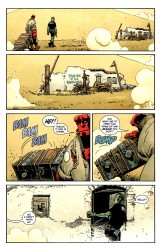
This take on Hellboy works. He looks pretty dopey in personality, but it actually adds a lot to the character. Hellboy has always been treated as a normal guy stuck in extraordinary circumstances. He doesn’t do Dr. Strange-style magic spells, and he’s just as likely to punch a monster as use a talisman to kill it. Corben’s muppet version adds a thick layer of cartooning onto Mignola’s blueprint and delivers a character that looks friendly, good-natured, and more than a little inhuman. When Hellboy is wrestling vampires or battling giant African spirits, he doesn’t feel out of place. He’s this bright spot of gritty, dirty red in the middle of a variety of browns, but it works.

It’s creepy. His face is expressionless, with just a thick black line for a mouth, but that lack of expression makes Hellboy look kinda sad at the same time. His body is Corben-beefy, with a healthy dose of chest hair, but his head is totally out of place. Hellboy’s red right hand feels more real than Hellboy’s head does. His trenchcoat is real, but his head isn’t. The contrast between real and unreal throughout Corben’s version of Hellboy creates a weird disconnect in my mind. It actually makes it easier to buy Hellboy as taking part in these stories and whatever weirdness that comes his way. It’s spooky from jump, and all you need to know that is clear by looking at Hellboy himself.

When Frank Miller and Jim Lee were doing All-Star Batman, there was a tonal disconnect between the art and the story. Miller was doing this really hard-edged take on Batman, abrasive and maybe a little honest, and Lee’s art was more or less traditional superhero art, shiny and exuberant. I enjoyed the clash between writing and art, but it made it tough to get into the story. You have expectations that don’t get filled in the way you expect, or at all.

This otherworldly aspect of Corben’s work is what makes his work so good, I think. You’re clearly reading a story, whether it’s about a British con-man turned convict or a barbarian lost in a strange land, but it’s easy to accept that world as real and lose yourself in the story because it’s weird from the start. Due in part to his style and in part to his body of work, you may have expectations for Corben’s stories (his barbarian will find a busty lass, someone’s head will be beaten against a wall or bounced off a sidewalk, someone will light or smoke a cigarette while backlit, someone will cock their head at a wholly unnatural angle), but you don’t have just one expectation for his work.


Versatility is a funny thing. The mainstream comics industry tends to place people in boxes. Jim Lee has a superhero style that evolved while he was doing X-Men with Scott Williams, but he’s also come up with a pretty fantastic watercolor style, too. What fans want, though, is his X-Men style. They want Hush, not watercolors. So, Jim Lee does big time superheroes. Michael Lark does gritty crime stuff. Amanda Conner does shiny smiley face comics. Jae Lee does moody stuff where people stand on rocks. All of them are talented and fantastic at what they do. But, when I pick up a book with their name on it, I expect to see that specific thing that they’re known for. When I pick up a Corben book, I just expect to see something that’s a little awesome, a little ugly, and a little goofy.

Corben, though, gets to skate by and do a wide variety of stories. Maybe it’s because he hasn’t been as firmly defined as capital J Jim capital L Lee in terms of what people expect, maybe it’s because his style is going to be off-model on anything but his own creations, so you’re going to get something weird no matter what it is, or maybe it’s just because he doesn’t like to do just one thing ad nauseam.

Who knows? I’m thankful for his versatility, though.

Post to Twitter Post to Facebook Post to Reddit Post to StumbleUpon

h1

7 Artists: Amanda Conner

July 6th, 2010 Posted by david brothers


One thing superhero comics have a glaring lack of are actual acting. For a wide variety of reasons, the emphasis in comics art is on figures. You need to be able to draw strong dudes, sexy ladies, and if you can manage to fit in surprise, anger, stoicism, arrogance, and something that kinda sorta resembles bedroom eyes on the figure, more power to ya, superstar. The emphasis in most books are on the figures and the costumes, with faces being a distant third at best. You’d think it wouldn’t be this way–Brian Bendis is fond of using reaction panels and Geoff Johns is doing a mega-arc based around emotions, but it is what it is.

Faces are extraordinarily important when it comes to acting and body language. When people say that the eyes are the window to the soul, they’re more or less correct. The eyes are probably the most expressive thing on your face, and they change shape and appearance based on how you move your face. Look in a mirror and smile, frown, glower, or whatever and watch how your eyes move around. Obvious, right? You can smile or frown with your eyes, even when trying to keep your face expressionless.


Let’s be honest here. Most facial expressions are stupid. If you ever look at someone grinning, or scowling, or screaming in terror–I mean, it looks stupid, right? The face contorts and shifts and all the muscles under the skin move around, creating hills and valleys where once were plains. Watch your friends while they laugh, especially if they do deep belly laughs. Their mouths gape open and their eyes squeeze together. (Don’t get me started on people who stick their tongue out when they laugh. I mean, where do you learn that?) Facial expressions can be movements or moments in time, and every person is different. Capturing that takes paying attention.

There are a lot of artists who don’t know what to do with a face. Ed Benes draws these empty-eyed, expressionless, hollowed out shells of characters; people who stand around with blank expressions until they get a chance to shout or shut their eyes. (Benes’s inability to draw attractive women baffles me, considering that Brazil is pretty much Pretty Woman Heaven. Go to the beach, son, draw from life.) Other artists have these set facial patterns they go for and graft onto their characters. Not Amanda Conner, though. No, she goes all-in as far as facial expressions go.


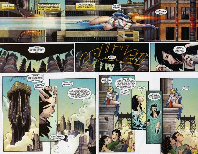
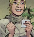
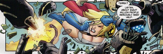
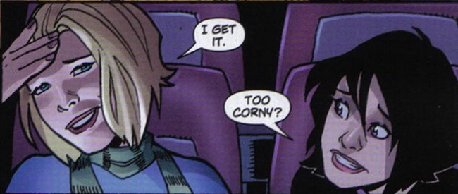
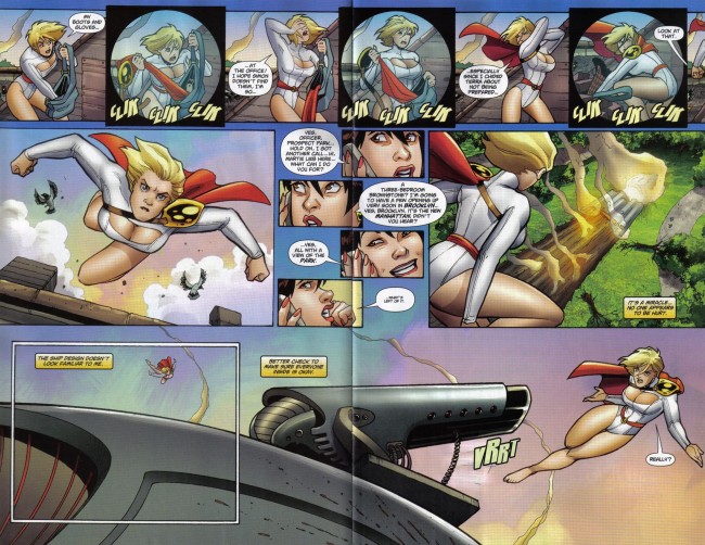
Her most recent work was a twelve issue run on Power Girl with Justin Gray and Jimmy Palmiotti. It was the DC Comics equivalent of one of Marvel’s mid-list titles like Immortal Iron Fist. It didn’t ever really tie into the overall story of the DC universe, instead picking up and running with stories about the day-to-day life of the titular character. Power Girl gave Conner plenty of room to play around with her art, using a lot of funky body language and facial expressions to push the story along.

What’s interesting about acting in comics is the way it replaces dialogue and exposition. Shouts, grunts, screams, growls, and certain other noises don’t actually need the word balloon with “AHHHHH!” or “Grrr” or “sigh” to get the point across. Think of Edvard Munch’s “The Scream,” where a man standing on a bridge screams in silence. Sure, you could add some sound effects on that, preferably by John Workman, but you don’t need it. The expression is clear enough.


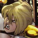
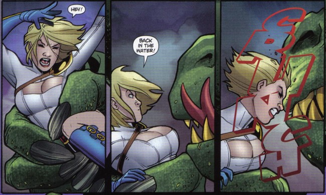
Conner incorporates this fact into her work, and Power Girl became one of DC’s strongest comics because of it. There are tons of scenes where grunts, gasps, or shouts would have been appropriate, but instead, all of the expression is left to Conner’s art. Power Girl biting her lower lip is an expression we can all understand. She’s angry and focused. With her eyes half closed and her lips molded into something like an “O,” it’s clear that she is sighing.


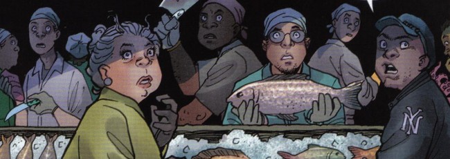
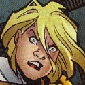
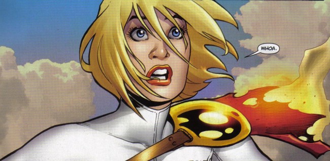
Conner’s art doesn’t stop at your usual mix of facial expressions. She runs through grumpy, happy, sleepy, bashful, sneezy, and dopey, which already puts her over and above most artists, but also throws in exasperated (my personal favorite), violently determined (as in when she scrunches her face before headbutting a monster), giddy, slack-jawed surprise, fear, bemusement, amusement, embarrassment, skepticism, irritation, and uncontrollable anger. Even that emotion that can be best surprised as what you feel when someone tells you that something was due forty-five seconds ago, that kind of “Wait… what?” feeling–it’s in there.


Facial expressions are just one part of acting, obviously. Body language counts for a lot, too. How close you’re standing to someone, the distance between your hands and your body when standing with your arms at your side, the tilt of your head, the angle of your shoulders, the way you clench your fist, and the width of your stance convey an astonishing amount of information. You can take in someone’s mood at a glance once you start paying attention to body language.


In comics, this is just additional storytelling. The more you can display in your art, the less you have to actually write. A cocked eyebrow, tilted head, crossed arms, and crooked mouth says, “Oh, is that so?” better than dialogue ever can. Tightly clenched fists and a scowl are extreme anger. Nervousness is a full body emotion. A goofy smile and eye contact says more about attraction than “You had me at ‘hello.'”


These are all tools in a comic artist’s repertoire, and Conner used them to their fullest in her run. There’s thirty-five images in this post, most of them single panels, and all of them pulled from the first five issues of Power Girl. Many of the faces reflect the same emotion (anger and surprise, mostly) but in a different way each time. I chose Power Girl as the example for a couple of reasons. First is that it’s her book, so she gets the majority of the attention. The other reason is to show that just because you’re focusing on one person doesn’t mean you get to come up with just one expression for each emotion.


What makes Conner such a great artist is that detailed and expressive faces, a glaring omission for most comic artists, get just as much care and attention as huge splashes or the carefully crafted contours of your average superheroine. Conner’s work on expressions and body language is a smaller reflection of the attention she pays to comics art in general. Conner’s art is focused on telling a story in the clearest and best possible way. If this means getting important information across via body language, rather than dialogue, so be it. If it means explaining a character’s personality by way of her facial expressions, rather than oodles of exposition and quips, so be it.


Post to Twitter Post to Facebook Post to Reddit Post to StumbleUpon