Archive for 2012

h1

Help me back the Carbon Grey Kickstarter

April 4th, 2012 Posted by david brothers

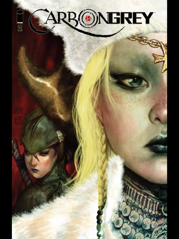
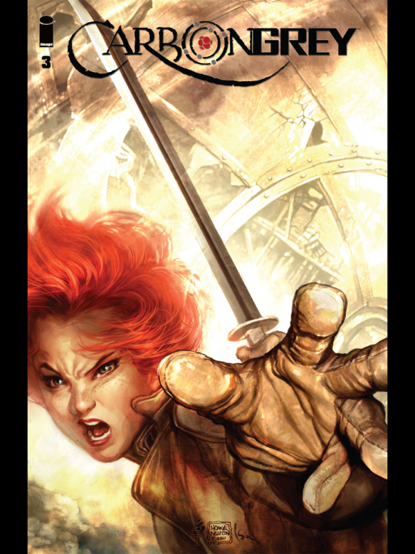
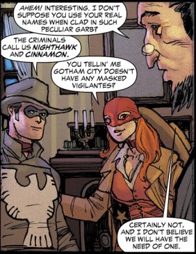
I like this comic Carbon Grey quite a bit. It’s created by Hoang Nguyen, Khari Evans, Paul Gardner, Mike Kennedy, and Kinsun Loh. The first four came up with the story, Gardner scripted it, and then Evans, Loh, and Nguyen are responsible for the art. It’s this fairly solid little steampunky tale, with a World War I-type setting and dirigibles and stuff. But really, it’s an art showcase. It’s very pretty.

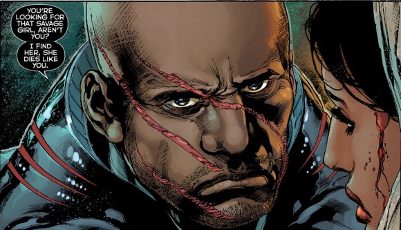
Nguyen provides layouts for the issues, Evans does the pencils and inks, and then Loh colors everything. Evans is freakishly talented, one of those dudes who gets me to check out a comic just because his name is on it. Carbon Grey is clearly a Khari Evans joint, but it’s also unlike the rest of his work, due in large part to Loh’s colors. Loh’s doing a lot of rendering with the colors, and it makes Evans’s inks look more realistic than they usually do. There’s a synergy going on there that I like a lot.

I mention this because, unbeknownst to me, a Carbon Grey Kickstarter has been going on. They need forty grand to finish the series, and they’re a little over halfway there with just ten days to go. I kicked some money their way tonight, and if you like how this comic sounds, you should think about doing so, too.

I always make this assumption that people who make comics that I like are well off and can afford to do it forever. Part of me still thinks, “Oh, you’re doing books? You’ve made it! You’re doing great!” But that isn’t true, is it? If it was true, my bookshelf would look a lot different. It sorta sucks, really. I’d like to believe that everyone can make a living doing what they love, but that isn’t true, I guess. So when push comes to shove, if I’m able, I’m more than willing to help support the work of people whose talents I’ve enjoyed. (That sentence is awkward, but you get me.) I’m blessed enough to have a steady job that leaves me with a little bit of spending money, so I might as well pay it forward, right? Comics are hard, and I don’t mind helping out when I believe in the work.

I’ve written about Carbon Grey and Khari Evans a few different times. Here’s some further reading:
‘Carbon Grey’ Gives Khari Evans A Chance To Show His Stuff (a detailed look at the art of Carbon Grey)
Black History Month 2011: Khari Evans (a quick look at what makes his art so good)
Pretty Girls: Khari Evans (a look at how important a sneer can be when you’re drawing ladies, amongst other things)
Great Moments in Black History #11: “Leave a ring around your eye and tread marks on your back” (I like this fight scene)
All the books available digitally (the original series is two bucks each, so if you’ve got coffee cash to spare, give it a go)

Here’s the Kickstarter vid and a widget:

If this is your thing, give some thought to backing the project. I’d like to see it finish.

Post to Twitter Post to Facebook Post to Reddit Post to StumbleUpon

h1

Whodunnit? I can’t call it.

April 3rd, 2012 Posted by david brothers

I’m working on another Thing, and that Thing led to me downloading Brian Bendis and David Finch’s New Avengers #1 off the iBooks store for free. (iBookstore?) It’s intended to get you to buy the full trade for $10.99. I flipped through it and had a funny thought. I thought this was a stupid little mistake and almost didn’t post this, but I thought about it and here we are. Bear with me.

This is the page where you go to download the sample:

This is the title page:

This is the inside front cover:

This is the recap:

And this is the second story page:

Here’s a random page with a blank spot thanks to two-page spreads:

And here’s the last page (tapping this page takes you to the iBookstore to buy the full comic):

Nowhere in the comic is the creative team listed, barring the front cover, which just lists Brian Bendis, David Finch, and Danny Miki. I downloaded a sample of the actual book, which is the first twelve pages, and found a similar issue.

Here’s the page with the creative team from the printed comic:

I was thinking about this, and I sorta understand what happened. Bendis and Finch are listed on the cover to the free preview (and on the covers in the sample), as well as on the iBookstore. Cutting the credits box is SOP for Marvel’s trades, since it leaves the art cleaner and they throw a credits page into the front of the book anyway. This time, it slipped through the cracks. I checked another sample, Amazing Spider-Man: Big Time, and it still has a credit box on the opening spread. It’s an accident, then, right?

But what made me pull this post from the trash and finish it is that there’s an entire page dedicated to Marvel’s execs. A new page, one that hasn’t been in any printed comic ever. I think it’s pretty messed up, whether it’s once or twice or three times, that people who had very little to do with the actual creation of a comic get better billing than the people who spent months of their life working on the stupid thing. I mean, let’s be real here–I’m sure that Marvel Senior Counsel David Althoff (to pick a name at random) is a nice guy. He’s got a splendid first name, in fact. But what did he do that gives him bigger billing than anyone else on the creative team, half of which doesn’t even get credited at all?

This is a nitpick. I’ll cop to that. But at the same time… it really isn’t. Mainstream comics has a real problem with valuing the people who actually make the comics, and I think the prioritization of corporate over creative, which is exactly what this is, is pretty screwed up. I feel like it’s important to point out when this happens, even if it’s an innocent mistake. (Also I think I got the flu while I was out of town, I’ve been doing shots of cold medicine, and everything feels like a good idea right now.) We’ve got to do a better job of prioritizing creators over characters, and especially over corporate, especially when it would be as easy to fix as this would be. Yes, Bendis & Finch’s names are on the store, but there’s nothing about their roles. At the very least, that info should be in the comic.

If you’re inserting a dedicated corporate masthead into the book, make the facing page the creative team. The creative team is the important part, anyway. I try to emphasize that whenever I can. Let’s do better.

Post to Twitter Post to Facebook Post to Reddit Post to StumbleUpon

h1

Annie Hall

April 3rd, 2012 Posted by david brothers

Annie Hall, written and directed by Woody Allen, 1977 (script, Amazon VOD): I watched this for the first time after talking to Sean Witzke about it. I liked and disliked it at the same time. I thought it was pretty well written and the direction was great, but I never really got into any of the cast. Woody Allen as Alvy Singer was basically my exact mental image of Woody Allen, which was funny to see. I guess I’ve absorbed some of this movie over the years. But every character wasn’t repellent so much as… just kind of there. I never found myself caring what they did, though I did have a strange sense of dread every time Alvy met a new woman. It’s well-acted, but like… there’s something I didn’t get here.

The direction, though, rules. It only took a handful of scene changes for me to pick up on what Allen was doing with the transitions between scenes. I didn’t even have the words to describe how I felt about the transitions before I reread the first issue of Alan Moore & Dave Gibbons’s Watchmen and everything clicked. I don’t know that it works for every transition, but I got the feeling that each scene built on the previous one or was directly connected to it, either by way of a scrap of dialogue, a phrase, or some theme that was being explored.

Sometimes it was overt, as in when Alvy’s mother is talking about how he distrusted the world and they cut to Alvy ranting about hearing someone muttering “jew” under his breath. Other times, it was more subtle, like when Alvy says he needs a cold shower and then we cut to Rob telling him that he’s gonna send him to the showers. There were a few of those bits, and I really enjoyed them.

The cuts also made the movie more interesting to me in a structural way. It feels like a cut-up movie, like if a movie had been made and then diced into pieces and… not rearranged, since it’s mostly in chronological order, but had all the fat cut out, I guess. Annie Hall feels lean, and I couldn’t find any wasted space. I didn’t really care what happened to the characters, but I did like seeing what happened… which I guess is a kind of caring. (Now I’m wondering why my reaction is “I like this but I don’t like it.”) But the scenes are short and snappy, the dialogue pops, and I don’t think I was ever bored. It’s easy to see why so many people love this movie.

It’s such a funny movie, too, and I loved how weird the cast was. Christopher Walken as a creepy brother, Jeff Goldblum as a party member with one line, and Shelley Duvall was the reporter, right? Alvy’s asides to the camera were all pretty good, and I loved the subtitles when he and Annie were freaking out about each other. I think my favorite part was the cocaine scene.

There’s this one bit in Jean-Luc Godard’s Pierrot Le Fou, one of my favorite movies, when Ferdinand looks at the camera and says “All she thinks about is fun.” Marianne notices, and says “Who are you talking to?” “The audience,” Ferdinand replies. I love that bit, that conscious recognition that you’re watching a movie, and a lot of Annie Hall gave me that same feeling. The asides, the pace, the editing… it’s a movie that couldn’t be a play or a book or a song or anything but exactly what it is. Pierrot Le Fou lingers and lavishes attention on its subjects, while Annie Hall hits you with rapid-fire anecdotes. There’s a charm and a conscious acknowledgement that it’s a movie, a filmed record of someone’s life. I thought that was a very cool touch, and it deepened my appreciation of the movie. “I’m a movie,” both films say. “Watch me.”

I said, “I liked and disliked it at the same time.” Now that I’ve actually written this out, I’m gonna go with just, “I liked it on several different levels.” I don’t know why I’m so hesitant to admit that.

Post to Twitter Post to Facebook Post to Reddit Post to StumbleUpon

h1

This Week in Panels: Week 132 (for reals this time)

April 2nd, 2012 Posted by Gavok

Now that my tomfoolery is out of the way, it’s time for the actual ThWiP update. With me are Space Jawa and Was Taters, who as it turns out, are NOT figments of my beautiful mind.

Deadpool MAX ended this week. I should be sad, but honestly, it was time. Same with Captain America and Bucky.

All Star Western #7
Jimmy Palmiotti, Justin Gray, Moritat and Patrick Scherberger

Aquaman #7
Geoff Johns and Ivan Reis

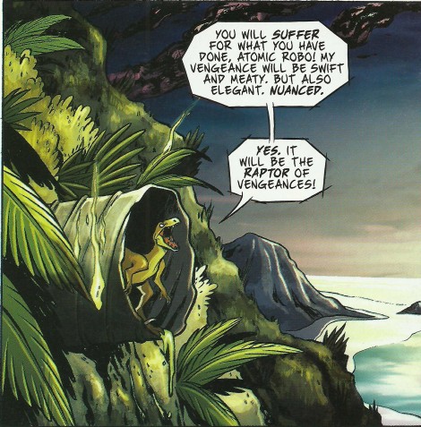
Atomic Robo: Real Science Adventures #1 (The Revenge of Dr. Dinosaur)
Brian Clevinger & Yuko Oda

Read the rest of this entry �

Post to Twitter Post to Facebook Post to Reddit Post to StumbleUpon

h1

The Raid: Redemption

April 2nd, 2012 Posted by david brothers

The Raid (written and directed by Gareth Evans, fight choreo by Yayan Ruhian & Iko Uwais, 2012): You can tell whether or not you’ll like The Raid by looking at the full cast and crew on iMDB. See all those dudes with numbers by their name? Five members of the Machete Gang, eighteen Special Force dudes, 21 guards for the drug lab, and all the rest? Basically all of those dudes are gonna get destroyed, on-camera, in excruciating detail. You can see it in the trailer. Heads slammed into walls repeatedly. A handful of people get the punch-punch-stab-stab-stab-flip-slam-stab again treatment. Another goodun is the slam to close range gunshot. Or yo, every time the blades came out. You’re going to this movie to see a bunch of dudes get wrecked, and it more than delivers.

This is another movie that felt like a video game to me. The structure is very much like Final Fight or Double Dragon. You meet the guy with the wife and unborn kid in the beginning while he shows off his skills. There’s a briefing that lays out exactly how the movie is going to go. There are hordes of faceless goons, most of which are beaten down in huge group fight scenes. There are guys with specialties. There are actual factual midbosses. (They all use the same weapon, too, and are treated like horror movie monsters in a few great scenes.) There’s an end boss. The sets are pretty samey, and everything is fragile. One guy breaks a window at point blank range by rolling into it with maybe a foot’s worth of movement beforehand. It’s all very basic.

But The Raid: Redemption‘s not here to wow you with stunning set design. This is a murder movie, and one of the best examples of the type I’ve seen in ages. It’s a movie that benefits from being seen with a bunch of people, too. At my showing, the audience was mostly quiet for the first fifteen or twenty minutes. But as the tension ramped up and the action got more and more extreme, you could hear the audience getting into it. Sometimes it was a joke, like a hissed “Awkward” during an elevator scene. Sometimes it was a gasp of surprise. More often, though, it was a pleasurable exclamation. “Oh MAN!” “Aaaaaaaayo!”

I know a lot of people hate loud audiences, but this totally enhanced the movie. The Raid gives you a lot of spins on things you’ve seen before, but always manages to go one step past where you think it’ll end. It’s going to shock and make you want to cringe and look away. THat other people around you are reacting similarly is a boon. It’s a bonding, or maybe just communal, experience when someone loudly curses after a characters gets his brains blown out at close range.

I liked all of this one, basically. It did exactly what the trailer promised it would. We saw twenty cops fight their way into an apartment complex and then through a video game-style army of thugs. We saw people get stabbed up. We saw people get shot. We saw a few pretty great hand-to-hand fights. The main character, played by Iko Uwais, is just baby-faced enough that we believe he’s an earnest, classical hero, but not so baby-faced that we aren’t completely under his control when he sets about demolishing a hallway full of dudes armed with knives.

I want to talk more about the action scenes, but it’s tough. I don’t want to ruin any of the specific surprises that make the scenes so much fun to watch, and also, I saw this movie on Sunday and some of those specifics are fading. But the gore effects are horror movie quality, the fight choreography is consistently interesting, even if probably a dozen guys get thrown up against a wall during a fight. There’s a frantic and manic pace to the fight scenes that perfectly gets across the tension the characters are experiencing and makes it a very painful movie to watch at times. But at the same time, it gets away with being a little clever, too. There’s a gimmick with a machete and blood that worked really well for me, and there’s another bit where someone goes out of a window that I thought was monstrously effective and exciting.

The Raid: Redemption actually reminds me a lot of Crank 2. It’s nowhere near as profane as that flick, but both share a certain level of relentless action. The pauses for breath in The Raid are more like brief gasps of air. “Okay, my knees aren’t wobbling and I’m only seeing double. I’m ready for round two.” Crank 2 benefitted from me watching it with my friends, too. You have to be able to react, whether that’s flinching (you will) or gasping (you will) or laughing. Do you ever get that? Where something surprising and awful happens and you bark laugh in the throes of horrible tension? You’ll do that a lot. The Raid: Redemption is positively gleeful in its action, and that makes it an incredibly fun movie to watch. I’m waffling on whether or not I’ll see it again in theaters, but it’s a day one blu-ray purchase for sure.

Post to Twitter Post to Facebook Post to Reddit Post to StumbleUpon

h1

This Week in Panels: Week 132

April 1st, 2012 Posted by Gavok

It’s Sunday, so that means it’s time for This Week in Panels! Lot of good stuff came out this week.

Usually, I’d be accompanied by my usual crew of contributors like David Brothers, Was Taters, Space Jawa, Jody, luis and the others, but recently it’s been brought to my attention that none of them are real. They’re all figments of my imagination, linked to my amazing ability to make mathematical connections. Lately, I’ve been taking pills to help me with this problem, so I should be okay.

And go!

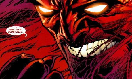
Amazing Spider-Man #544
J. Michael Straczynski and Joe Quesada

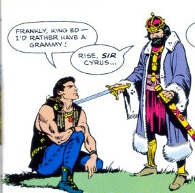
Billy Ray Cyrus #2
Paul S. Newman and Dan Barry

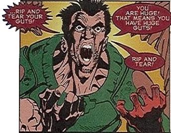
Doom
Steve “Body Bag” Behling, Michael “Splatter” Stewart and Tom “Gallows’ Grindberg

Read the rest of this entry �

Post to Twitter Post to Facebook Post to Reddit Post to StumbleUpon

h1

Dictator vs. Wrestler: Vega and the Vegan

March 29th, 2012 Posted by Gavok

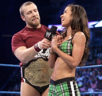
Wrestlemania 28 is a couple days away and I feel the need to write up something on it. So let’s see… wrestling… wrestling… I could always talk about—no, I did that already. Um… Oh! I can talk about my favorite wrestler, right? Sure! Right now my favorite would probably be current World Heavyweight Champion Daniel Bryan. Second favorite, actually, but I’ve already written at length about Mark Henry, so I’ll go with the American Dragon.

Daniel Bryan’s really come into his own as Smackdown’s top heel. He’s also garnered quite a smark following to his recent heel catchphrase. Whenever he wins, survives a match with the title or even stands in the corner during an AJ victory, he begins to loudly celebrate and scream, “YES! YES! YES! YES!”

It didn’t take long for the internet to put 2 and SF2 together by merging it with a meme about M. Bison during the Street Fighter Saturday morning cartoon from the 90’s. In a scene, Bison reacted a little too happily to seeing Guile get beaten up by a mutant and the show went to commercial on a dramatic cliffhanger of him screaming, “YES! YEEEEESSSS!” Maffew from Botchamania had his own version, but here it is simplified.

That got me thinking. The similarities between M. Bison and D-Bryan go further than that. You just have to dig deeper and see that the villain of Street Fighter and the villain of Smackdown exist more as counterparts than you’d think. For the hell of it, here are some comparisons between the two.

M. Bison was originally named Vega, but when Street Fighter 2 came to America, they had to change him to M. Bison due to legal reasons.

Daniel Bryan was born Bryan Danielson and wrestled under that name until coming to WWE. Then they changed his name so they could hold onto the marketing of his image. According to Pro Wrestling Guerrilla canon, Bryan’s true name is John Jacob Jingleheimer Schmidt, which happened to be the same real name of opponent Kenny Omega.

M. Bison claims that, “This place will become your grave!”

Daniel Bryan got buried for 90% of his WWE tenure.

In Street Fighter x Tekken, M. Bison is accompanied by Juri, a pandering minx of a fighter who should by every reason want to kill him for all the abuse he’s put her through.

Daniel Bryan is accompanied by his GIRLFRIEND AJ, a pandering minx of a wrestler who should by every reason want to kill him for all the abuse he’s put her through.

Read the rest of this entry �

Post to Twitter Post to Facebook Post to Reddit Post to StumbleUpon

h1

“Insides fish sticks, outside tartar sauce”

March 28th, 2012 Posted by david brothers

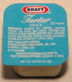
“Insides fish sticks, outside tartar sauce” is something Young Jeezy said on his hit song “Put On” with Kanye West. It’s probably my favorite color-related punchline. Yes, that is a category in rap, and yeah, dudes like Young Dro have raised color-based wordplay into an art form. (Sidebar: “The platinum is grey like grandpa/ Spray the Chevy all kinda sour apple colors/ Diamonds up in my charm look like pineapple suckers” aYO!) I could explain this line, but it’s easier to show you these images I got from this guy’s site:

plus

equals

“Insides fish sticks, outside tartar sauce.” I live for that sort of thing. Anyway.

Back when I was young, black, and depressed in the early 2000s (yeah, big deal, ya big dummy), I spent a lot of time wearing two things. Video game t-shirts, because I got them free from both my GameStop job and my “write about video games on the internet” job, and shirts in varying shades of black. I didn’t wear black because I was all wrapped up in the idea of being sad. I wore black because I was basically lazy. (Same reason I wore the game shirts, too.) Black matches everything, it looks nice longer than white does, and… well that’s about it, honestly. It’s a versatile color.

But if your closet is full of black shirts, some with funny jokes set in Helvetica or involving ampersands, guess what: black is awful boring. When you add in the fact that my shoes tended to run toward dark browns and blacks, I figure I was looking double terrible.

So part of my ongoing attempt to become an actual grown-up is expanding my personal palette. Black is probably always going to dominate — black hoodies are the best hoodies, especially when they have little details like blue interior trim and a small white logo, and my black Polo Rugby with the big skull is never not going to be my favorite shirt — but there’s plenty of room for me to add some sauce into the mix. To experiment, to broaden my horizons, to wear actual colors instead of just being as lazy as I can be when it comes to clothes shopping.

I’ve been thinking of my ongoing wardrobe expansion primarily in terms of colors and color combinations. The specifics of the clothes isn’t that big a deal — as I’ll discuss in a later post — but the colors are what’s most crucial in my mind. You can’t tell if a shirt is a polo or a tee at a distance, but you can tell that it’s bright blue or ugly orange.

My first move was to figure out what colors I didn’t want. I’m open to whatever colors happen to be present on a shirt, but the dominant color is what I tried to pay attention to the most. I’ve never particularly liked orange, and yellow tends to be way too bright for how I like to look. And honestly, yellow needs another color for it to work for me. Lakers gear is a good example of that, and so are the Blue Angels. I could probably swing pink, but the problem with that is that I don’t really like pink as a dominant color, either. As a flourish? Sure. Dominant? Nah. I love it when I see somebody rocking a garish pink, though, like they just got beaten up by mob of angry Lisa Frank binders, though. That’s a statement.

I do like reds, though, like you’d see on a Bulls or Hawks jersey. I like basically every shade of blue, too, from so pale it’s basically white to navy to sky blue. Green is pretty okay, but not a favorite of mine when it comes to clothes colors. I love brown, too, usually a deep, fall-y, 1970s detective suit-y brown. My oldest pair of shoes right now are a pair of brown Nike Ace 83s, and they’re my official beaters, something to wear when I’m feeling lazy or making a quick run somewhere.

“Wow, David!” you’re thinking. “You like brown, blue, and red? You’re soooo brave and progressive. Should I give you my phone number and hotel key now or later?” Shut up.

I made a conscious decision to branch out, too. I want to rock some things I’ve never rocked before. I want to blaze some trails I’ve never been down. So I decided to pick a color I don’t usually get down with and figure out how to run it. It took about one second to eliminate orange from the equation (I guess I really hate orange). I flipped through some fashion blogs to look for inspiration. (I reblog the stuff I like sometimes.) I don’t remember what I saw, but I eventually decided on purple.

I’m not really a purple type of dude. It’s one of those colors I decided was for girls when I was a kid, because young boys think stupid things, so I sorta wrote it off. But at the same time…purple is a Lakers color. Purple is my grandmom’s favorite color. It’s a royal color. And if I’m uncomfortable with it for stupid reasons… I might as well get comfortable with it for good reasons. I might as well own it like I invented purple.

It basically took buying one shirt, this lavender polo from Old Navy, to turn me around. I like polos in general, and this one forced me out of my comfort zone shortly before depositing me in another. It looked nice when compared with my skin tone, and oh man. Oh MAN. Why didn’t anybody ever tell me how well purple and black go together? A stiff black and a deep purple is crazy. It looks SO good. On me, of course, but also on other people, I guess.

I’ve expanded a bit since then, mostly buying purple shirts, but my favorite purchase is probably this purple Nike web belt I picked up for twenty bucks. It’s varsity purple, according to Nike, and in the same range of purple as the Lakers logo. I think purple jeans might be a bit much, but shirts, watches, belts, shoes, jackets? Yeah, I’ll do that. My next purple grail is this Jordan Brand Varsity. It’s mulberry, but it looks like the exact purple I need to match this belt and the details on my Chris Pauls.

The other half of this color thing for me is how colors work together. Wearing a new color doesn’t mean anything if it looks stupid. Mixing and matching colors is fine and fun, but I’m really fond of what I’ve been thinking as “spot color.” I’ve got a black suit, and I like to have black suit with a black shirt, and then a white tie with white kicks. Or black jeans, black shoes, red shirt with black detail. All black everything and then a purple belt or white kicks. Building up a shape with items that are the same (or similar) colors and then a splash of something else for some flair. Creating a visual style that has a certain level of flash.

I like clothes that are solid colors, or feature one color above all the others. Not exclusively, of course, but just as a matter of general preference. It lets me get away with the spot color thing pretty well, in a way that a shirt that’s grey on blue wouldn’t. I still own way too many black shirts, too, and I don’t want to ditch them. How do I make them look better? By making whatever colors are on that shirt stand out by being conscious of the rest of my clothes, all the way down to my shoes. I’m all no show socks everything (almost, I keep tripping over ankle socks when I do laundry), so socks don’t really matter any more.

Picking colors was another fashion choice that I made and then decided I felt good about. I’m wearing and contemplating wearing stuff I normally wouldn’t, and my wardrobe is looking nicer accordingly. I’m going to Emerald City Comiccon this weekend, and I briefly entertained the thought of going all purple and black everything. I’ve got the wardrobe to pull it off now, but I feel like it’d be a bit much. I’m probably just going to pack a couple of purple-oriented outfits for Friday and Saturday (I already know exactly which, in fact) and then match the rest of what I have to wear to whichever pair of Air Force 1s I decide to pack and how the weather’s looking (rainy).

It’s a nice feeling to get up in the morning and go “What do I want to look like today?” rather than grabbing jeans and a shirt at random in the dark and trusting that everything’s gonna match. Versatility and diversity is crucial.

(I donated all the video game shirts to charity.)

Post to Twitter Post to Facebook Post to Reddit Post to StumbleUpon

h1

Sharknife Power Level: Tight!

March 28th, 2012 Posted by david brothers

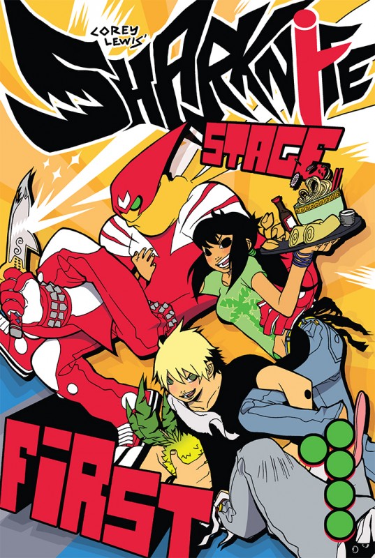
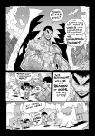
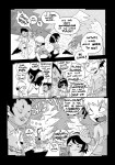
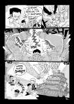
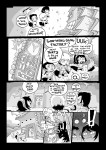
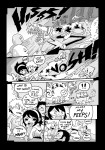
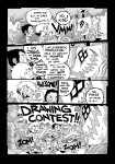
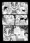
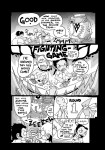
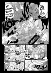
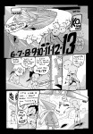
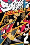
I was heavy into Warren Ellis in 2005. I was on the Bad Signal mailing list, even, and I remember him hyping a lot of comics. I feel like there were three comics that were Big Deals in 2005. One was Bryan Lee O’Malley’s Scott Pilgrim. The other was Brian Maruca and Jim Rugg’s Street Angel. And the third was Corey Lewis’s Sharknife. All of these comics were examples of what I think was being called the New Mainstream at the time. The New Mainstream was an alternative to the old mainstream, which was corporate cape comics. The New Mainstream was mostly creator-owned adventure comics, some of them with goofy high concepts, but these three were pretty much golden. I’m sure you’ve seen the Scott Pilgrim flick by this point, which is about as good of an adaptation of that comic as you’ll ever see. If you haven’t read Street Angel, you should. (I’m still waiting for a chance to see that Street Angel indie film that those Australians did years ago.) It’s very good. Lewis’s Sharknife was good, too.
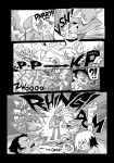
In fact, Sharknife is a pleasantly weird comic. It feels like one of those comics where the creator just empties out his brain on the page. Whatever he’s into, from music to video games to tv to whatever, ends up there in black and white. I don’t know Sharknife‘s secret recipe. I catch a lot of what Lewis is throwing — Street Fighter, kung fu, Power Rangers, manga (my guess is Akira Toriyama) — and that’s always cool. We’re probably around the same age, judging by the stuff he’s into.
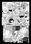
But all of that stuff is secondary to what makes Sharknife so good. Sharknife works because Lewis gets that style is substance. How you say something is as important as what you’re saying. Something like a Lil Jon single isn’t gonna be that complicated. But Jon knows how to say things in a way that’ll get you hyped up and throwing elbows. It’s a combination of lyrics and music in the case of rap, but for comics, it’s a combination of ideas and art. The words matter, sure, but “He headlocked a bear” is .0001 as effective as a drawing showing the same thing.

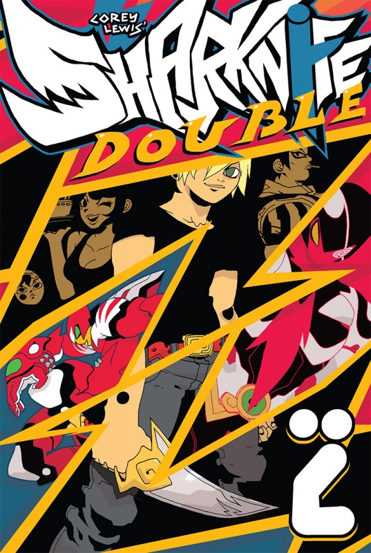
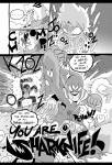
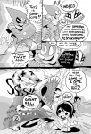
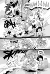
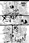
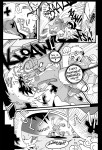
Sharknife has style. You can see it in the logo and lettering, for one thing. Lewis’s sfx, with its filled-in letters and irregular forms, are idiosyncratic and perfect for the series. They look like they should bounce over the page rather than just sit on top of the art. Have you seen what happens when lettering shows up in a cartoon? His sound effects are like that. His art sits comfortably in that “manga-inspired” lane, for lack of a better descriptor. He does super deformed characters, he does super detailed characters, and his sense of design leans toward videogame flourishes. Everybody gets a cool touch to their wardrobe or costume. People have names like Ombra Ravenga and Caesar Hallelujah.

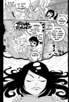
The feel of Sharknife is kinda like how people describe action or kung fu movies to their friends. The Killer is a deadly serious movie, but nobody is dour when explaining it. They’re psyched, they’re excited to even be talking about it. Words spill out of their mouths and they get ahead of themselves, but it’s always fun. That’s what Sharknife is like. There’s this bit where Sharknife is fighting in his restaurant and a table full of patrons freaks out and worries that they’re gonna die. Sharknife turns, says, “It’s cool!!!!”, and then slams the table through a wall while the patrons scream “Thanks Sharkniiiife!”

Sharknife is full of stuff like that. Those little flourishes and embellishments make the comic. The story is goofy, but simple. Busboy by day, superhero by slightly later in the day, Sharknife fights evil and protects the chinese food restaurant The Guangdong Factory! But the cast is filled with Megaman-style villains (i.e., ones with real specific gimmicks) and weirdos.

All of this takes place in a heightened version of reality, or maybe just a Saturday morning cartoon. Or a Saturday morning cartoon version of a really good video game. Something like that, but anyway, the point is, physics and realism don’t matter. Sharknife is go with the flow comics. It’s id comics. You just want to let it seep into your brain and see what switches it flips. And Sharknife is a good comic, too. That’s what’s most important. All of the style and video game-y stuff coalesce into a really solid form and make for a supremely entertaining comic.

I haven’t read Sharknife ZZ yet. I expect to like it as much as I like the first one. There’s a lengthy preview below, and you can and should buy both Sharknifes on Amazon (Volume 1 and Volume 2), at your local comic shop, or digitally (volume 1 and volume 2). When taken together, you’re looking at what, 400 pages of good comics? More than worth it.

Post to Twitter Post to Facebook Post to Reddit Post to StumbleUpon

h1

Steve Lieber & Rachelle Rosenberg on Alabaster: Wolves

March 28th, 2012 Posted by david brothers

I like Steve Lieber’s work, though I’ve been crap at saying so. I spoke briefly about Underground, his book with Jammin’ Jeff Parker, and even did a podcast about it. He’s done other stuff I liked. I remember some Batman-related work, a 52 spinoff… stuff here and there.

I was surprised to trip over his work in Dark Horse Presents 9, in a story called “Alabaster: Wolves.” I didn’t know he had comics work coming up to begin wtih, but the real bombshell was how good it looked. I like when good artists suddenly show up better than they were before. It’s like–what changed in this person’s life? What did they change about their approach? Did they happen upon some new technique by accident? If you look at Daredevil Frank Miller and Ronin Frank Miller, something is different. Quantifiably different, yeah? It isn’t incredibly different, but it is different.

Same thing here with Lieber. I can’t really put my finger on it, but his story in DHP 9, featuring a script by Caitlín R Kiernan and colors by Rachelle Rosenberg, popped. Some of it is Rosenberg’s great palette. Flammarion, the albino girl, stands out in the grungy watercolor-y surroundings, and the splash of red across the werewolf’s cheeks is so good. But Lieber’s faces feel like they shot up another level, or maybe to a sideways level, or something. His body language is great. Lieber even drops the backgrounds out of a few panels, including one in this post, and it just looks great.

I dunno. I don’t really have anything to say but “look how nice a job Lieber and Rosenberg did on this comic.” I liked Kiernan’s script, too. I liked all the parts, so much so that I’m on the hook for Alabaster: Wolves 1 in April despite not knowing nothing about the series. That’s a good feeling. It’s like finding something new in the middle of something familiar. “I like this guy’s work, so let me take a–WHOA, what is this? This looks great!”

You can check out DHP 9 for like four bucks. There’s some Kristian Donaldson, Richard Corben, and Geof Darrow in there, too, so I can’t really see you being disappointed with it, art-wise. Great Mignola cover, too.

edit: Turns out Dark Horse released this eight-page story for free this week.

Post to Twitter Post to Facebook Post to Reddit Post to StumbleUpon