h1

The children are the future, and King City is for the babies

May 12th, 2010 Posted by david brothers

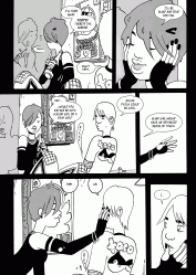
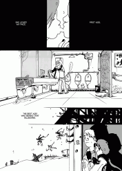
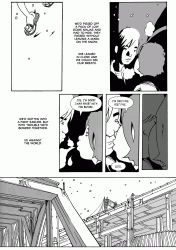
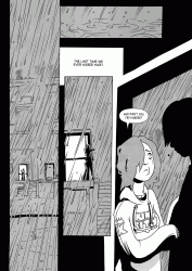
I wrote about Brandon Graham’s King City for Comics Alliance.

It’s dumb, but I’ve been trying to write about King City for ages. The last time I tried was around issue 4. I think the final text on CA is a mixture of ideas and sentences from three different drafts from several months worth of starts and stops. I finally got focused and put some elbow grease into it, using issue four as the lynchpin, and I think it turned out pretty okay.

The thing is, King City may well be my favorite ongoing comic right now. It’s a book I save to read until several days after new comics day, in part because I know it is going to be fantastic and in part because it makes everyone else making comics look lazy. It’s that serious. Graham is filling each page with amazing ideas and the briefest of thoughts and it all works. It hangs together. Reading King City is like playing Jenga with ideas and concepts, but it never tips over. It stays upright. The oversized floppy format, the black and white art, the page count, the backups, the back cover, the whole book works. It’s cluttered and messy and it all works.

(I haven’t been able to get “Sometimes her cigarette smoke smells like flowers” out of my head since I read it.)

I didn’t want to screw it up when I wrote about it. This is the book that everyone should be reading. It’s your stepping stone to a world of great comics. And like, writing it up and doing a halfway job on it? That’d just be sloppy. I wouldn’t do it justice. I think the CA piece comes as close as I can right now. I may write about it more later on, as the series lumbers toward its conclusion.

One more thing.


I love this comic, man. Y’all should be reading it.

Post to Twitter Post to Facebook Post to Reddit Post to StumbleUpon

h1

Last Year in Covers

January 5th, 2010 Posted by Gavok

When I noticed that last week was so dry in terms of releases, I got the idea of doing “This Year in Panels”, especially since I’ve only covered a fraction of 2009. I suggested the idea to hermanos, who wasn’t a fan because he can’t remember enough of 2009 to come up with a collection of panels. Thanks a lot, pot.

Instead, he suggested we do a lovefest gallery for our favorite covers of the year. I’m easy. Let’s do it.

20th Century Boys v.4
Naoki Urasawa

100 Bullets #100
Dave Johnson

Read the rest of this entry �

Post to Twitter Post to Facebook Post to Reddit Post to StumbleUpon

h1

Put You On Game Linkblogging

October 6th, 2009 Posted by david brothers

-Emi Lenox of EmiTown creates one of my favorite online comics, and one of the few journal comics I’m willing to read on a regular basis. Her art is very endearing, and her point of view is always interesting. She did a comic in 24 hours in honor of 24 Hour Comic Day, and it’s a good one. Check out the comic here. It’s pretty awesome.

-Jason Thompson discusses Felipe Smith’s Peepo Choo, which looks like exactly the kind of manga I want to read. I may order Smith’s MBQ just off the strength of this feature.

-Chad Nevett, once again proving that my opinions are the best opinions, agrees with my unspoken opinion that the first half of Hancock was very good and interesting and that the second half goes completely off the rails. He’s got some good thoughts on the movie, and Hancock’s motivations.

-Jim Rugg and Brian Maruca are dropping an Afrodisiac book later this year. You have bad taste in comics if you don’t pick it up.

-Kate Dacey dropped her Manga Hall of Shame, a list of terrible books that she’s read. In what I hope is the first of many, Erica Friedman does her own list for yuri manga. I don’t know if I could make a list of my own. Maybe the Cowboy Bebop mangas, which were both amazingly not charming at all? The Gundam tie-in manga that Tokyopop put out when I was dumb enough to buy every manga on the shelves?

-Leylaaker (apologies if I missed a real name) writes about a pretty sour experience visiting comic shops on both coasts. Dear comic shops: get your acts together. Comic Shop Guy should be an aberration, not the norm.

-Ian from The Eastern Edge posts the final part of his six part Naoki Urasawa interview translation project. It’s a good read, and links to the previous installments are in the post.

-Brandon Graham’s blog is a must-read, though it’s sometimes NSFW. He renewed my eternal love in this post and with these words: “Where did that L7 square, space wingtip wearing motherfucker ever come up with the feet for that robot? Those feet were clearly designed by someone that regularly mastrerbates into a pair of 93 Reebocks.”

-Jog wrote a wrap-up of SPX 2009, and as usual, it’s must-reading. It ranges from a look at old Mazzucchelli art to panel recaps to books he picked up at the show.

-FBB did a podcast on Frank Miller and Dave Gibbons’s Martha Washington books. I haven’t listened to it yet, but black people.

A brief bit of Richard Corben animation from 1968. NSFW, but guess what: it’s Richard Corben. Props to Sean Witzke for the link.

-Cheryl Lynn is reading a couple comics on recommendation from Ragnell and David Uzumeri. Which did they recommend? Tarot and Fantastic Four. Prologue is up, and part 2 covers Tarot.

Post to Twitter Post to Facebook Post to Reddit Post to StumbleUpon

h1

Marian Churchland is Beasting

September 4th, 2009 Posted by david brothers

Marian Churchland is the real deal.

I hadn’t heard of her until Sean Witzke started talking her up and I began following Brandon Graham’s livejournal. I haven’t read anything else by Churchland, though she’s done some Conan and Elephantmen work this year.
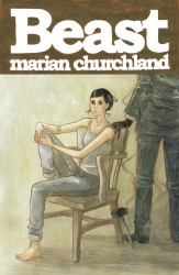
beast_ogn_coverHer original graphic novel “Beast,” which hits comic shops on September 23rd, is an amazing introduction to the woman and her work. It’s the tale of Colette, a young sculptor, who ends up being hired to sculpt a piece of flawless white marble for a client. In return, she’ll get enough money to pay her rent for a year, if not more. The issue is that she has to live in the house with the block until she’s done, and her client is something other than human.

As with any good story, that is just where it begins. Beast veers off into something else entirely very quickly. Within the first dozen pages is a very good horror turn, one of the best in recent memory. A slasher doesn’t jump out of the bushes while Colette runs away in her underwear, or anything even remotely as obvious, but the book takes a hard left where I was expecting something else.

It instantly made me re-assess what I thought the book was about. I wondered if the book was about the Apocalypse, and that the titular Beast was the Beast of Revelation. If she finished the sculpture, was the end of the world going to begin? Was she going to fight back somehow?

The idea floated around in my brain while Churchland slowly revealed the secrets of the marble and Beast and eventually debunked what was, in hindsight, a cockamamie theory. That vague sense of ambiguity about the story enhances the work, though, turning it into a tale that’s occasionally melancholy, always compelling, and, as a first work, simply amazing. It isn’t a horror comic, it isn’t a romance comic, it isn’t a weepy depresso comic. It’s just the kind of comic you should read. You don’t get to prejudge it and put it in a little box.

Churchland wrote and drew the story, and her art is full of those useless details that count for so much. The tag sticking up from Colette’s boxer shorts, the way her vest rides up a little, and her messy hair bun– all a lot of nothing, but very important in terms of building atmosphere and character. The art has a bit of Geof Darrow about it. Couches aren’t just the platonic ideal of a couch. They’re ripped, rumpled, and torn. Clothes shift and bunch, and faces turn from sleepily tired to worried and don’t need words to express it.

When the art goes from the soft tan tone and clean line work to the gritty and messy pencilwork that is the first appearance of Beast, you feel uncomfortable. When Colette wakes up, the world is different and she’s a little off. The art, too, is different- a different shade of color. That shade soon gives way to grey, as Colette finally meets Beast, and when she shivers and bursts into tears while an uncaring woman stands behind her, well– it works. It works really, really, really well.

beast_ogn_009beast_ogn_010beast_ogn_011beast_ogn_012

The details are what stuck with me the most, I think. The dried smudge of leftover tears on Colette’s face, the way Beast is defined (but not really), the disarray of the house, and the way the marble looks. All of it looks great. The colors change fairly often, but it always works within the story. It happens when a new day appears, or Colette’s perspective changes, or Beast reveals something new.

Beast is a mature and wonderfully paced work. It’s melancholy, wistful, maybe a little magical (for lack of a better term), and the character interaction is what makes it work. It can be a little rough around the edges, but never in a way that’s distracting. In fact, I never felt like the story was dragging, and I breezed through all 140-ish pages in one sitting. There are a few things I don’t quite buy, but that’s pretty much water under the bridge. I’m genuinely impressed, and I can’t wait to see what she’s doing next. If she can hit us with one of these a year, I’d be happy. Really, I think I’d be happy to read whatever she wants to work on.

Post to Twitter Post to Facebook Post to Reddit Post to StumbleUpon