

Citizen Steel and Jock(s)
April 23rd, 2007 by david brothers | Tags: jh williams iii, jsa, Marvel comics, rap, steelThere’s been a bit of a hullabaloo about Alex Ross’s cover for the new issue of JSA #7, featuring Citizen Steel. Let’s take a look at it.
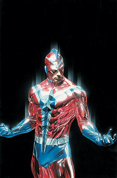
Ooh, I see what the problem is! It’s really, really obvious and sticking out shamelessly!
It’s boring is what the problem is. It’s some dude checking himself out in the mirror after working out, with added Photoshop Blur filters. Yes, Citizen Steel, 8-Minute Abs are working out for you. Great. I flex in the mirror, too, everyone does. It’s a great esteem builder! It is also bland and uninteresting, just like every other cover Ross has done for JSA. It’s always someone standing bathed in light, looking thoughtful or profound.
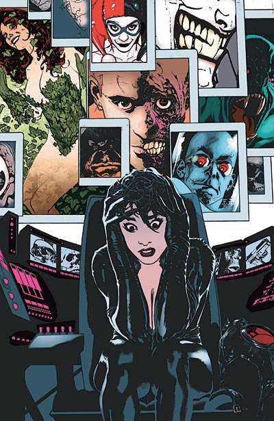
Let’s talk about an awesome cover– Jock’s cover for Green Arrow Year One.
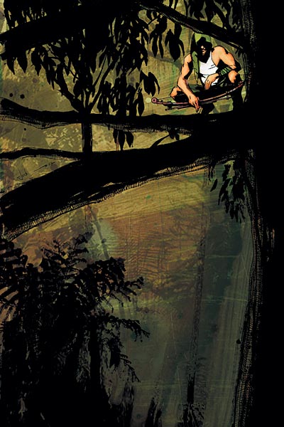
Here’s another, and another, and a sister and her brother:
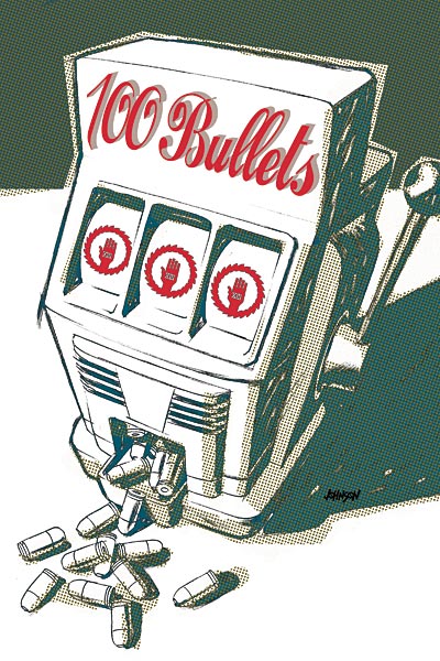
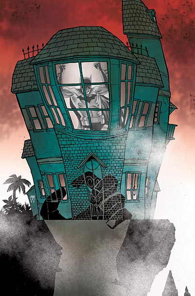

In a world where Jock, Brian Wood, Dave Johnson, JH Williams III, and Adam Hughes are delivering awesome covers, month-in month-out, can someone give me one rational reason why we should talk about Alex Ross and his boring and unexciting covers? Marvel got a lot of crap for their “Our Covers Have Nothing to Do With The Book” covers a year or two back, but at least those were done by Adi Granov, JRjr, Mark Bagley, Tim Bradstreet, and a host of other great talents. It wasn’t just a character on a black background because everyone knows that that is boring. “That’s not how we rock in Theodore,” as a wise man Ghostface Killah once said.
Sorry, just wanted to put that out there.
None wiser than P-Tone.
I would’ve thought the novelty of Ross’ ultrarealistic style would’ve worn out by now. He just seems too much of a one-trick pony to me. You can only be wowed so much by life-like paintings of people looking almost decent in spandex costumes before it gets boring. I guess Ross just speaks to the dead serious and realistic sentiment going around. 😛
I remember picking up the Hulk a few years back during Jones’ run based mostly on the covers. Bruce Banner in a “Where the Wild Things Are” parody was brilliant. Whoever did Batgirl’s covers (seems like the same dreamy, soft style for the lovely Fables covers, too) also rocked.
How dare you not give Alex Ross and his beloved JSA characters that no one would give a shit about if they remotely resembled their 1940’s versions the respect and reverance they deserve!
Maybe it’s just me being a dork, but Citizen Steel looks like Ultraman (the Japanese live-action one) with an American flag paint job. He’s even got the fin on his head.
You really should have had the cover to the last issue of Civil War up on there. Regardless of what you think of the series, that was a freakin’ rockin’ cover. Lots of tension, thematically correct, and it told you what the comic was going to be about unambiguously. It was Good Stuff.
Civil War is probably the prettiest series with a story that I never liked. Maybe that and The Ultimates. McNiven is brilliant.
Ahh. I’m the only one who’s still diggin’ on Ross’ covers.
For me, it works – particularly if the lone character is largely the focus of that issue’s story. That and seeing Ross render characters I’ve never (or rarely) seen him illustrate before usually pleases me.
I think the fact that the cover is so boring and has absolutely nothing interesting going on only accentuates the crotch bulge even more.
Tom Grummet’s covers for Thunderbolts were amazing, and his covers for Zemo: Born Better continue to follow in the same vein.
I can see where the Ross covers are…lacking.
“Whoever did Batgirl’s covers (seems like the same dreamy, soft style for the lovely Fables covers, too) also rocked.”
James Jean, and indeed he did both fables and batgirl covers and one of runaways. =)
“why we should talk about Alex Ross and his boring and unexciting covers?”
He does interesting interior art but I agree with you his covers are quite static and sometimes boring.