h1

“number five said it ain’t worth being alive” [casanova: avaritia]

September 21st, 2011 Posted by david brothers

Y’all read Casanova: Avaritia 1 yet? Two bucks online, get on that. Matt Fraction, Gabriel Bá, Cris Peter, Dustin Harbin.

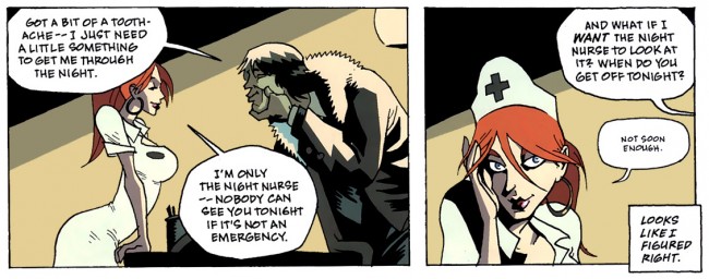
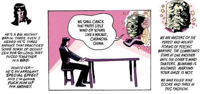
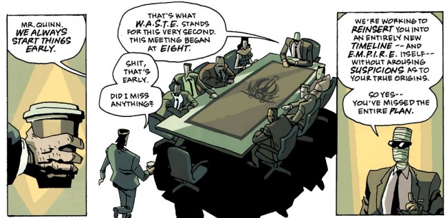
People (meaning people I follow on Twitter, really) thought that this page was real clever and mind-blowing:
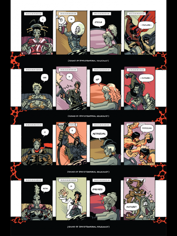
(i forget who said that actually, but it was several people and I love all of you)

And it’s cool–the art is fantastic, obviously–but it’s pretty Jim Starlin-y and a little too “Ha ha here’s a cowboy monkey ninja ape kicksplode whoaaaa” for me. It works in context, but it didn’t knock my socks off. You know what did?

We’ll get there. First:

Remember when Bendis said this?

“So, on top of having a cool team and some cool stories to tell, I thought, ‘If I’m going to be the writer of both books, they both should feel very different.’ They shouldn’t just be the bi-weekly Avengers titles. It should be two unique writing styles and the one I’m using for ‘Mighty Avengers’ has new usage of thought balloons and narrative. It has first person and omniscient first person narrative, which I never do. I want to make sure that each character has a unique voice and point of view that gets across to the reader as well as their actions in the story. I’m not using these techniques to be retro or cheeky. I want to try new stuff with more modern [storytelling] techniques.”

CBR, 2006

The result was this (no context, sorry, but drawn by Mark Bagley):
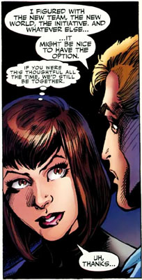
They weren’t thoughts so much as interjections, insults, brief comments, half-thoughts, and things like that. They’re nowhere near as purple as Claremont’s balloons during his heyday, which is my main benchmark for balloons, but they don’t work for me at all. They aren’t thoughts. They’re internal monologues, caption boxes transferred to fuzzy balloons. No one thinks like that. I get what Bendis was trying to do, which was approach real life a little closer, but he got a bit too close and his wings melted. Or something. The point of that metaphor is that it didn’t work, and also Bendis is Kid Icarus.


Okay, this isn’t the part in Casanova that knocked my socks off, but I liked it a lot:
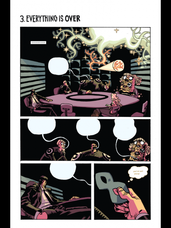
The balloons coming out of their mouths are great, and super creepy, as if the words (which we can’t see because Cass isn’t paying attention) are parasites. It looks evil, yeah? Like something you cough up. But that’s not it, either. It’s panel four, where Cass is looking at Sasa Lisi’s domino mask. In the scene before this one, Sasa tells him that his father is dying of cancer. He rejects her verbal reassurances (I think she was going to say “Cass, it’s going to be okay” and he stops her, saying, “Don’t. …just don’t.”) and they hug.

But here, though, he’s zoned out, he’s gone, and he’s looking down at her mask and the mask is thinking what she represents. “you’re not alone” is heavy, and I like that an inanimate object is what’s thinking it. It feels like when you look at something with a lot of personal history and you sort of flash over what it has been over the years. “I got this from Sarah, the day after she told me she loved me for the first time, and she’s gone now, but I held onto this thing.” Does that make sense? The domino mask isn’t thinking at Cass. He’s thinking about it, and we’re seeing the result.

“you’re not alone”

It’s not enough though. It never is.
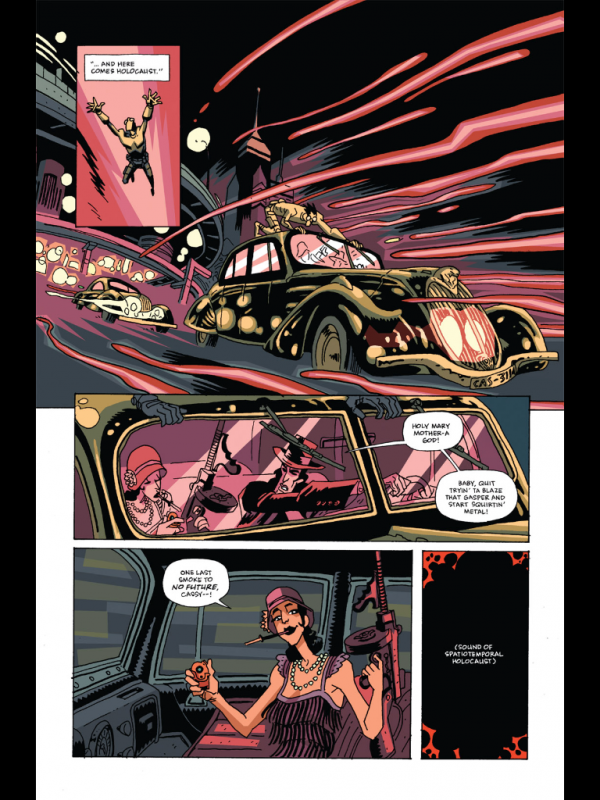

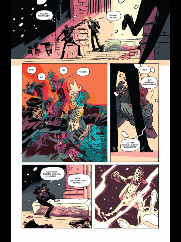
It’s stupid to talk about Casanova as if it were “Matt Fraction’s Casanova.” That’s woefully incomplete. It’s Matt Fraction, Gabriel Bá and/or Fabio Moon, Cris Peter, and Dustin Harbin’s Casanova. The whole team goes in. They’re animals, man. Collaborative savages. Look at these pages. Harbin’s letters are especially great in an industry that often seems to under-sell the importance of lettering, but Peter’s colors are dead on, and blah blah blah it looks great. Best looking Marvel comic? Probably.

I’m getting to what knocked my socks off.
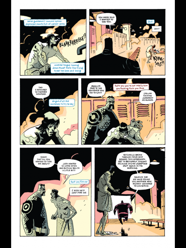
Fraction found a way to do thought balloons, though these are technically captions, that actually feels like real life thoughts. They’re raw, unfiltered, and the sort of thing that actually fits in between speech. They’re the voice of the lizard brain, mean and ugly. I love how Harbin (or Peter?) colors the angry thought caption to red. It comes across like a blast of hate, the sort of thought that makes your eyes narrow and your lip curl before you can make it stop. And then the next caption–petulance.

Colored captions: lizard brain. Regular captions: forebrain.

(or, as a commenter points out, it’s actually Cornelius’s caption and I’m slightly wrong.)

This page is so sad. Cass comes off kind of pathetic and lost. Small.


Here it is:
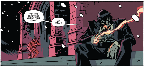
Lotta build-up for a little nothing, yeah? It’s not even a full page. It’s just one panel from early in the book, and it’s been almost entirely stripped of context by me pulling it out from its page and scene. On the page before, a janitor asks, “Was it the cancer? Lotsa folks dyin’ of cancer these days.” Cass’s response: “It’d take something worse than that. I’m afraid.”

Page two of the comic.

This is one of those things that comics can do that movies or books or whatever can’t. That space between the two balloons speaks volumes. Say Cass’s line aloud and you hear “It’d take something worse than that, I’m afraid.” Somber, yes, but the sort of thing you say with a sad smile. A deflection, kind of.

The space changes the tone of the sentences, though. “I’m afraid” is a complete thought. Taken in context, he’s saying that it would take more than cancer to kill him, and he is literally afraid of that fact.

There were a few phrases that echoed through Gula: “What thing can kill me?” and “No one ever dies.” Those are paraphrased, maybe. Cass said “What thing can kill me?” early in the first issue, and it was a bit of mid-fight sass, something to show off and strike a bit of fear into Dokkktor Klockhammer. Panache.

Now that we’re in Avaritia, “What thing can kill me?” has become “What thing can kill me? Because I would like to die.” He’s suicidal, maybe overtly, maybe latently, and he wants out. And he’s afraid of what he has done, what he has to do, and what he’s become. He’s the greatest killer mankind has ever created, and it… chafes, to put it lightly. He’s beyond burned out. He just wants everything to be different, but he doesn’t know how to make that happen.

“What thing can kill me?” has become a plea. All of his swagger has paled in the face of the murder of billions. It’s tough to spit wisecracks when you’ve got the taste of coppery blood in your mouth.

And the… the ease with which Fraction and Harbin slip this in there, and Bá and Peter give us this sad, dejected, and slumped super-sexy super-spy with Xs for eyes (what do dead men have in comics?) knocked me off my feet. Or my socks off. Whatever. It’s panel two of the entire comic, of the entire series, and I instantly got it.

Imagine “What thing can kill me?” echoing off the walls of eternity, warping and shifting until it becomes “Fuck your future. Nothing is sacred. Harm everyone. Save yourself.”

Casanova Quinn went from super cool to broken, and you can see it in that little strip between (“It’d take something worse than that.”) the balloons (“I’m afraid.”).

Post to Twitter Post to Facebook Post to Reddit Post to StumbleUpon

h1

It Ain’t No More To It: Casanova & Growth

April 18th, 2011 Posted by david brothers

(A brief explanation: I feel bored and weird and unsatisfied and like I need something new. It Ain’t No More To It is borrowed from a Biggie song where he drops in, busts a verse like that Schooly D joint, and gets out in 50-some seconds. So: I took a loose idea [in this case, talk about Casanova] and spent thirty minutes writing about it. No post-writing edits, either, beyond adding in images and links. This’ll be an ongoing thing, and eventually they might even get good.)

My man Sean has me thinking about Matt Fraction, Fabio Moon, and Gabriel Ba’s Casanova tonight.

I read Casanova: Luxuria 1 and was turned off. I couldn’t put my finger on exactly why, but it felt see-thru. Ephemeral, light, full of nothing. References for references sake, and the backmatter actually grated. Having such an overwhelmingly negative reaction to Fraction, Moon, and Ba’s book was a huge surprise surprise to me. Years ago, Casanova was everything to me, a bright, shining beacon of what comics could be, something that ran counter to the mainstream superheroes that tended to turn to ashes in my mouth.

Casanova launched in 2006. Since then, I’ve been through several major life upheavals. I moved two thousand miles from home. I sold my car. I got a job with a salary. I started drinking. I quit drinking. I met girls, I forgot girls, and then met them again. Saying “Everything is different now” is probably hyperbole, but in a very real way, I’m not who I was five years ago. I’ve done a lot of changing and a lot of growing up.

I get the Beatles, Blur, and David Bowie references in Casanova now. The story is different to me, though it’s the same story it’s always been. I’m different, and what was once revolutionary and mind-expanding is… just okay. Been there, learned what I needed to learn, and left it in the dust.

I used to love the backmatter in Casanova. It was like getting a guided tour behind the curtain, a personal connection between creator and consumer. It deepened my appreciation of the book, the way getting a glimpse of the person behind the pen tends to do, and it was something I wished more people would do. Bendis’s letters pages in Powers were a hot mess, but Casanova‘s text pieces clicked with me.

Part of it was that it served to make the book more clear. It made it plain that, yes, Casanova was about Jim Steranko comics and music and movies and sex, but it was also about Matt Fraction (and maybe to a lesser extent, the brothers Moon and Ba). It was his The Invisibles, a distillation of things he loves, hates, and fears put down onto the comics page. I could relate. Writing has always served as a way for me to work out issues (perhaps not always as well as I’d like) and crystallize my thoughts. Writing makes thoughts real. It creates realities. And reading Casanova felt like watching someone else work through that process.

The new backmatter struck me as the opposite. It felt like a flinch, like he’d touched a hot stove and drew back. It was alternately smug, infuriating, and annoying. The rejection of snark from Fraction felt fake, as did the “stop downloading and start uploading” tag in the indicia. It sounded like the old dichotomy of an artist up there, a reader down there, and if you’re one, you clearly aren’t the other, so man up and make something. And that grated.

I don’t think I’d realized how much I’ve changed until I read through Casanova: Luxuria. I say there were upheavals, but it was more like anything else. Brief bursts of growth that, when viewed in hindsight, were more gradual than they felt. I wonder if I was expecting Casanova to still have that revelatory effect that it had when it was fresh to me, and that’s why I had an allergic reaction to something I used to love?

I can’t really call it. I’m different, Fraction’s different, and I’d come to terms with not really checking for his work until I read this essay by Sean Witzke. A character says, “I’m not doing this for you. I’m doing this for me. I don’t care about your expectations. So go fuck yourself, Doug. Fuck everybody. Fuck you.” Fraction often used to put overt examples of his voice into his characters, and this reads pretty plain to me.

And I liked it.

The story that followed clicked in a way that his Iron Man and Uncanny X-Men didn’t. It was weird and noodly and personal and all the things I originally came to love about Casanova. And that line, and Sean pulling the story apart on his autopsy table, convinced me to go back. I want to read the next volume of Casanova now. He’s ditching the backmatter, it looks like he’s telling the stories I want to read, and it feels right.

It won’t be the same, but that’s obvious. Things can only be revealed once. The Dark Phoenix saga is purple and bloated now. Miller’s Daredevil is an arrangement of cliches. Back then? They were the bomb. Now, they’re classics with caveats. So it’ll be nice to see where Fraction goes next. Claremont has pretty much kept pressing the same button for the entirety of his career–whether to maintain or refine, I do not know–and I can’t think of a single reason to pick up his comics now. Miller, on the other hand, has pushed himself forward with each project. For all the talk about how Miller only has one gimmick, you can’t look at his projects and go “This guy hasn’t learned anything or changed.” The Sin City projects are pretty different from each other, and All-Star Batman and Robin the Boy Wonder is an experiment with the grotesque that proves that he doesn’t stand still.

Fraction’s Marvel work went from being pretty good to losing me entirely. Almost all of Iron Fist and specific bits of The Order? They hold up pretty well. Iron Man? Tried to like it, wanted to like it, but Salvador Larocca’s art is garbage and I can’t get into the story. Uncanny X-Men has been adrift since Austen left. But the last eight pages of Casanova: Gula feel pretty good, like finding an old friend that grew up different than you expected, but no less interesting. So which one is Fraction going to be? Claremont or Miller? Stagnant or open to mutation?

It’s tough to tell. Five years is a long time, and in hindsight, I’m not too surprised my overwhelming enthusiasm for Casanova cooled. That’s natural, isn’t it? That’s how it’s supposed to be. If you’re still psyched about something you were into five years ago, you either need to consume more culture or stop being so excitable. Embrace the new. Learn something. That forces you to readjust and reconsider.

Which I think is absolutely a good thing. I may not love Casanova like I did, but I think I might be able to appreciate it more now. Back then, it was all about being fresh and shiny. Now, it’s more like seeing how the puzzle pieces of influence fit together to form a brand new whole.

Post to Twitter Post to Facebook Post to Reddit Post to StumbleUpon

h1

I Bought Thor 615 For John Workman

September 27th, 2010 Posted by david brothers

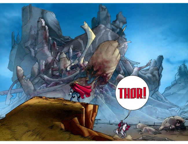
Not a joke! Not a snarky dismissal! I’m buying the Matt Fraction/Pasqual Ferry Thor because John Workman is lettering it.

That’s the pithy summary, anyway, but it’s no less true. Fraction is an okay writer who has done a few things I like (Casanova, Immortal Iron Fist) and a few things I don’t (Invincible Iron Man, Punisher War Journal) and Pasqual Ferry is a tremendous artist as far as I’m concerned, with great work done on everything from Superboy to Adam Strange to Ultimate Fantastic Four. Together, though, they aren’t quite enough to get me to read about Thor. I was going to give it a miss until I heard that Workman was lettering the book.

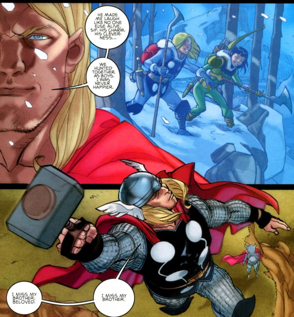
As far as I can tell, the only Thor you really have to read is Walt Simonson’s run on The Mighty Thor from the ’80s. The Kirby stuff never really clicked with me beyond the art, and the ’90s-era Thor was a tangled, knotted mess of a bunch of things I couldn’t have possibly cared about, no matter how hard I tried. Dan Jurgens and John Romita, Jr gave it a worthy try and told some good stories, but it never felt essential. J Michael Straczynski’s run on Thor had pretty pictures from Olivier Coipel and the same brand of overwrought moralizing that has infected JMS’s amazingly awful DC Comics work. Michael Avon Oeming and Andrea DiVito came closest to making great Thor comics with Avengers Disassembled: Thor, which wore its Simonson influence on both of its sleeves and down the seam of its pants.

No, if you want Thor, you gotta go to Walter Simonson. With the aid of letterer Workman and colorists Christie Scheele (who I think also colored the Miller/Romita Man Without Fear, maybe?) and George Roussos, Simonson crafted a genuinely epic story. He took Thor high and low, introduced new members of the cast, took the traditional cast in new directions, and turned Thor into his book the way Miller did with Daredevil.

I only had a few random issues of his run as a kid, being focused mainly on Spider and X-related titles. I liked what I had, though, and I remembered my uncle being a big fan of his work, so I sought out the trades once I grew up. One thing I learned from them is that lettering matters. It is undeniably an integral part of the art. If you’ve ever read a comic where word balloons overlap and crowd out the art, you know exactly what I mean. Placement, type, and yes, even spelling, matter. Marvel’s flirted with lettering experimentation lately, probably most notably in Incredible Herc, but the majority of their books are more or less lettered identically. You never look at an issue of Avengers and go, “Whoa, that lettering looks great!”, you know?

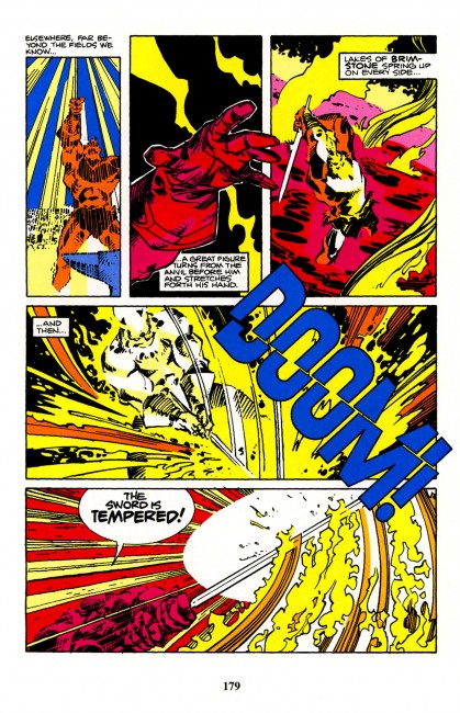
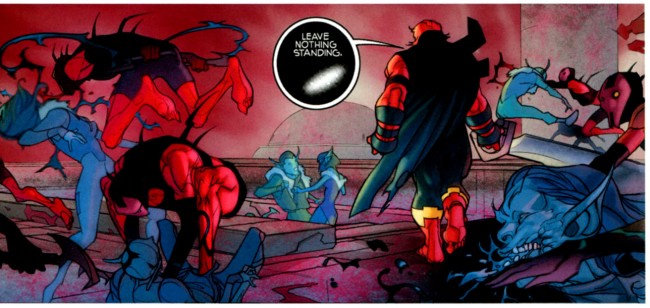
Workman is the guy who gives your book personality. His style is distinct and instantly recognizable. Brett Lewis and John Paul Leon’s Winter Men benefitted greatly from his work. He lettered Paul Pope’s Batman Year 100 (in concert with Pope and Jared K Fletcher) and 100%. His balloons have tons of white space, more than they probably need, and long, crooked tails. His sound effects fill entire panels, and are as much a part of the art as Simonson’s pencils or Scheele/Roussos’s colors. The style of Simonson’s Thor is inextricably linked to Workman’s letters.

I mean, seriously. The foreshadowing of Surtur wouldn’t have been half as awesome without Workman’s letters, and the bit where Surtur cuts a “DOOM!” in half with Twilight? Fantastic. Pencils, inks, colors, and letters all working in concert to tell one story. That’s how comics should be.

Everyone who comes onto Thor is sitting in Simonson’s shadow. He’s the guy to beat. Most people who end up working with Thor are honest about it in interviews (JMS, Fraction, Ferry, Simone Bianchi, for example) or it reflects in the work (Oeming). Fraction and Ferry have been very open about loving Simonson’s run, which is cool, but plenty of people have said that and then produced crap. How many people have talked about Grant Morrison when taking over one of his characters, ideas, or former series and then delivered nothing worth reading? Talk is cheap.

The presence of Workman on the book, though, is the difference. I hadn’t realized it, but Workman’s letters are how Thor is supposed to talk. The sound effects, the balloons, the letters, all of that is undeniably Thor to me. Similar to how Spawn needs Tom Orzechowski or seeing a realistically rendered Patsy “Hellcat” Walker looks wrong, Thor without Workman just isn’t Thor. Going off and getting Workman speaks to the kind of story that they’re trying to tell. It’s an effort that I can respect, and moved me enough to grab the first issue of the Fraction/Ferry run.

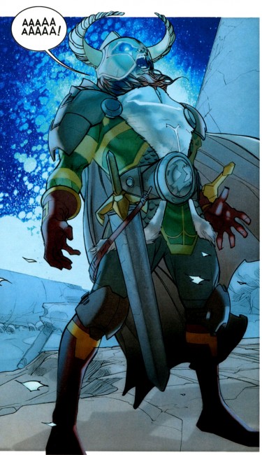
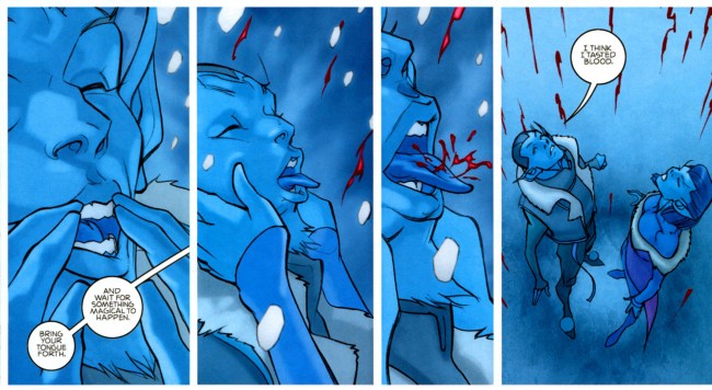
Verdict? Four dollars for a 22-page comic is entirely too high, but Ferry’s art is off the meter, Hollingsworth’s colors are real good, and Fraction’s got a great handle on everyone involved. The plot is looking good, just that sublime mix of sci-fi and magic that makes Marvel’s Thor what he is, and the enemies are appropriately fearsome. Workman absolutely kills on the lettering, particularly on the last balloon in the book, “I think I tasted blood,” the creepy black balloons, and Heimdall’s scream. The fact that there are ten double page spreads, all dedicated to non-Earth locales, is interesting. I think it’s too soon to call, but my best guess is that Fraction and Ferry are doing that to show the larger than life nature of the gods and the other of the nine worlds. There are three pages set in Asgard that aren’t spreads, and all the Earth pages are singles. I’m definitely going to be watching to see how that develops.

You should be reading it.

Post to Twitter Post to Facebook Post to Reddit Post to StumbleUpon

h1

Fourcast! 60: Tales Designed to Thorzzle

September 6th, 2010 Posted by david brothers

-You Made Me Read This!
Thor: Ages of Thunder vs Tales Designed to Thrizzle (Vol. 1)
-Big ups to Chris Eckert for introducing me to Thrizzle
-Big ups to Carla Hoffman for putting Esther on to BLOOD COLOSSUS
-6th Sense’s 4a.m. Instrumental for the theme music.
-See you, space cowboy!

Subscribe to the Fourcast! via:
Podcast Alley feed!
RSS feed via Feedburner
iTunes Store

Post to Twitter Post to Facebook Post to Reddit Post to StumbleUpon

h1

Invincible Iron Man Omnibus: Cheap!

March 4th, 2010 Posted by david brothers

Pardon the crass commercialism, but if you’ve been thinking about picking up Matt Fraction’s run on Invincible Iron Man, Amazon’s got a surprise deal for you. Marvel’s releasing an Invincible Iron Man Omnibus collecting the first 19 issues of Matt Fraction’s run. While it was originally supposed to come out in early April, it looks like it’s gonna ship early next week. They tell me mine’ll arrive 03/10/10.

This is a good deal because a) it’s 40 bucks retail, b) 26 bucks on Amazon, and c) a steal at that price. This will also get you more or less caught up to Fraction’s run on Invincible Iron Man, too. There is one arc between the omnibus and being caught up: the five issue “Stark Disassembled.”

So, yeah, if you’re addicted to hardcovers (holla) or you’ve been wanting to see what’s up with Iron Man before the movie drops– it’s a good deal.

Post to Twitter Post to Facebook Post to Reddit Post to StumbleUpon

h1

Frank Castle and the Marvel Universe

November 25th, 2009 Posted by Gavok

Solo #7 was originally supposed to have a cover by Mike Allred that depicted the 1960’s Adam West incarnation of Batman dancing the Batusi. It was replaced with Wonder Girl doing the same pose. One of the rumors as to why it was scrapped was that Dan Didio wants to put the kibosh on emphasizing the West-style Batman due to beliefs that West’s portrayal ruined the character for many decades up until Dark Knight Returns returned him to form. You get the idea: you can’t take a man dressed as a bat with underwear over his pants seriously if you’re reminded of that show where Cesar Romero painted over his mustache.

Is it true? Probably not. Batman: The Brave and the Bold is very Dick Sprang Batman and Sprang’s take on the Caped Crusader is practically brothers with Adam West Batman. Then again, I’m not sure if Didio had any real say in that.

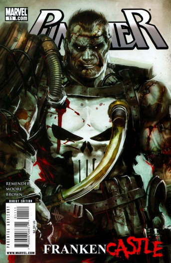
But the precedent is there. There are fans out there who seem so stuck in their ways that to even portray their beloved character in a different tone offends them. That’s the case with the current Rick Remender Punisher storyline, Franken-Castle.

People HATE this image and all it represents. If you’re seeing this for the first time, chances are you might be thinking, “What the hell is this shit?!”

It’s awesome, that’s what it is.

Read the rest of this entry �

Post to Twitter Post to Facebook Post to Reddit Post to StumbleUpon

h1

Black History Month ’09 #04: Never No In-between

February 4th, 2009 Posted by david brothers

Anyway. New King Kong. It’s not so good. You probably heard that from, y’know, the rest of the world.

They get to Skull Island where savages feed virgins to King Kong. And, while remaining faithful to every aspect of the ’33 Kong, bajillionaire director Peter Jackson populates the place with, as our fisherman in Casanova calls the citizens of Coldheart, “ooga booga bone-nose nigger savage motherfuckers.”

Now, I’m about as sensitive to race issues as the next middle-class white guy. But- really, Peter? Really? That’s the best you could do? You can show us the monkey and the girl ice skating in Central Park but you can’t manage to update the D.W. Griffin-level of stereotypical Savage Nergro Monster? Were there no assistants or friends, colleages or freakin’ P.A.s that took his Grande Hobbitness aside to point out that, hey, maybe we’re spending two hundred million dollars and short of top hats and canes, we’ve just filled Skull Island like it was the Isle of Misfit Al Jolsons?

It wasn’t re-envisioning, re-mastering, reinventing, or re-presenting anything but bigotry; Jackson and co. trucked in racism and wrote it off as an act of fidelity and faithfulness to flawed and ignorant source material.

And anyway it just pissed me off. So when, a few months later, I read about North Sentinel Island for the first time, the two thoughts collided with one another.

Fuck that guy. Here are savages to save the world.
-Matt Fraction, Casanova #5 (back matter)

I can’t help but feel like Matt Fraction, though obviously well-intentioned, missed the point.

Black Panther has Wakanda. Superman’s got Vathlo Island. Tyroc has Marzal Island. Casanova has Coldheart. They all have a few things in common. Remote or isolated countries filled with technologically advanced black people, untouched by the evils of colonialism.

If I had to put my finger on it, I guess it’s born from some kind of political correctness gone wrong. In an effort to avoid creating stereotypical black or African savages, the creators overcorrected in the opposite direction. They put the black characters on a pedestal, turning them into paragons of virtue and exemplars of everything good about humanity.

The thing is, the noble savage portrayal really isn’t better than the ooga booga bone-nose nigger savage stereotype. Both are equally unrealistic. Both of them treat black people as something outside of the norm. “Look! They aren’t stereotypical! They’re super-advanced! They’re sci-fi savages!”

There’s a line from Black Star’s Thieves In the Night that applies here. Mos Def says, “I find it distressing there’s never no in-between- we either niggas or Kings, we either bitches or Queens.” It’s a sign of the gulf between blacks in comics and blacks in real life. You’ve got your unrepentant villain or mugger (more likely the latter) and then you have your heroes, who do it because it’s right.

You don’t have that in-between guy, who tries to be faithful to his girlfriend, but man, he can’t quite make it. You don’t have the girl who strips to pay for her degree in botany. You don’t have that guy who comes home from his high paying job, rolls a blunt, and zones out for a couple hours.

No, you have virtuous-to-a-fault musclemen and super scientists. You have angry black men turned BFFs and haughty queens. You have a bunch of not-stereotypes that end up being just as bad as the stereotypes.

See what I mean?

I think that Casanova is one of the best comics in recent memory, but the Coldheart stuff was pretty eye-rolly. Just another bunch of super savages, here to save us all. Super or not, they’re still savages. Savage or not, they still don’t reflect anything but a distorted view of political correctness.

When Fraction says, “Fuck that guy. Here are savages to save the world,” he basically sums up his motivation for creating Coldheart: revenge on racism. Racism is such an ugly and hated thing that it becomes way too easy to overcorrect. It becomes a battle of extremes. For every bone-nose savage, you create a hyper-advanced doctor. For every street thug, you create a king. For every neck-rolling sass-mouth chickenhead, you make a queen. And in doing so, you get further and further from anything resembling a black experience.

It’s really easy to fall prey to unconscious racism when you’re trying to avenge a racist act. “He’s very well-spoken!” and “You people are all right!” and “All black people aren’t like that!” aren’t racist in and of themselves, but they definitely fall into that realm of “Hang on, what do you mean by that?”

I like a couple of those super savage cultures. Wakanda is pretty awesome, due in large part to Kirby throwing everything at the wall and having it stick, and like I said, I love Casanova. Tyroc’s home is pretty much the only thing I really know about the Legion, because I had a comic with him when I was a kid. Even still, the two extremes are, like most extremes, not reflective of how things really are. If you really want to fight racism, you’ll answer that extreme with something in-between.

Post to Twitter Post to Facebook Post to Reddit Post to StumbleUpon

h1

Return of the Wrath of Comic Con

April 22nd, 2008 Posted by Gavok

The weekend of chunky guys dressed like Colossus and hot women dressed as Slave Leia has come to an end. I myself had a great time, spent with hermanos from this very site and a whole bunch of guys from Funnybook Babylon. Sadly, Thomas “Wanderer” Wilde deemed himself “too broke” to consider joining us and Hoatzin would have probably involved a gigantic plane ticket paid in rare diamonds, since he’s from Europe. I don’t know. I really have no grasp on how that type of thing works. Besides, Hoatzin seems to have vanished from our planet. What happened to that guy?


This one movie sent the other movie into space.

Day One

Last year I got to New York the day before the con started, which allowed me enough rest and whatnot. This year I had to come in the first day of the event and kill time until David Uzumeri came in from Canada, since he was in charge of dealing with the hotel. I walked straight from the Port Authority bus terminal to the Javits Center, which tired me the hell out.

After getting my swanktastical press pass, I met up with hermanos and Joseph of FBB. They were at a panel starting up that was a screening for a new Will Eisner documentary. Since I was tired from all that walking, I decided to stick around and watch it. I found it interesting in the sense that I honestly didn’t know all that much about Eisner, which is almost a sin if you’re a comic fan. The four of us (David U. showed up towards the end) mostly agreed that while it had some fantastic stuff in there, such as taped conversations between Eisner and guys like Kirby, the sum of it was incredibly dry.

Shortly after, we went to the panel on online journalism, with guys from Newsarama and CBR there. It wasn’t as good as the comic blogging panel from last year and mostly focused on arguing over criticism vs. getting press releases. Once that was done with, I was rested up enough to do some wandering.

Read the rest of this entry �

Post to Twitter Post to Facebook Post to Reddit Post to StumbleUpon

h1

Yo, Cheryl Lynn!

April 7th, 2008 Posted by david brothers

TALKING IRON FIST WITH SWIERCZYNSKI, FRACTION, BRUBAKER AND FOREMAN – NEWSARAMA

Highlights: Misty with a fro, and a “Ten years later” flash forward of a little boy asking Misty how his father died.

I’m sad that Bru/Frac/Aja are leaving, though.

Post to Twitter Post to Facebook Post to Reddit Post to StumbleUpon

h1

X-Men with O-Faces

March 15th, 2008 Posted by Hoatzin

Marvel’s panel on the X-Books at Wizard World Los Angeles just ended. Check here for Newsarama’s coverage, here for CBR’s. The most interesting news? Matt Fraction is joining Ed Brubaker on Uncanny X-Men as co-writer starting with issue 500, with rotating art duties by the Dodsons and Greg Land.

Wow. The Lord giveth, and the Lord taketh away. Fraction and Brubaker are two great tastes that taste great together, and the Dodsons are fine artists, but Greg Land? Seriously? Haven’t people caught on to his plagiarizing ways yet? Why is he on a comic that matters? He’s going to make that book annoying to read at best, unreadable at worst. Just look at the cover for issue 500 alone:

uncannyxmen500_cov.jpg

Let’s play “Spot the Ripoffs”!

– Warpath, Cyclops and the guy behind Cyclops have exactly the same body. Land has used it at least once before.
– Tattooed guy on the left and Colossus have exactly the same body.
– Wolverine and long-haired shouting man in the background on the right have exactly the same body, only Wolverine’s head is different. Land has used it at least once before. I distinctly recall Ultimate Namor in this pose as well, but I don’t have the relevant issue at hand.
– Land has used Cannonball’s body at least once before.
– Land has used Rogue (is that Rogue?)’s body at least once before.
– Land has used Storm’s body at least once before.
– Land has used Pixie’s body at least once before. It also happens to be the one with that ridiculous porn face made immortal by Ultimate Scarlet Witch. Very appropriate for a sixteen year old girl!

This is from spending maybe five minutes looking at this image and skimming through four issues of Ultimate Power. I could probably find a lot more if I spent effort on this. Maybe I’d even find the photographs he traced these from. Come on now. This is absolutely ridiculous. Why can’t we have an artist that actually draws?

Post to Twitter Post to Facebook Post to Reddit Post to StumbleUpon