Archive for the 'Black History Month' Category

h1

Black History Month 2011: Marguerite Abouet

February 15th, 2011 Posted by david brothers
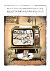
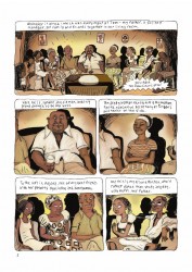


art by clement oubrerie

Marguerite Abouet
Selected Works: Aya, Aya of Yop City, Aya: The Secrets Come Out

The thing about race and comics, or race and anything really, is that it’s vastly more complicated than people often think it is, but it’s really pretty simple at the same time. It’s complicated because every culture has something weird that they do, a certain set of values, and a wide spectrum of experiences. It’s simple because every culture is weird when you’re on the outside looking in. The unfamiliar is weird, that’s just how life works.

Once you peek beyond the surface, though, you’ll find that most cultures are actually pretty similar. We go through the same journeys, have the same problems with our family, and so on. The specifics of different, sure, but life on Earth is a lot more universal than some people realize, I think.

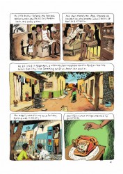
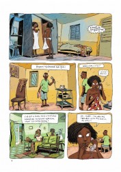
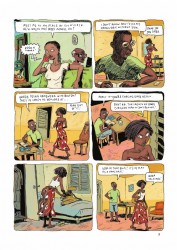
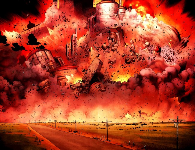
I don’t have much at all in common with most Africans, beyond a skin tone and some distant ancestor. I don’t know what Africa’s like to live in, and I’ve never been, but the most surprising thing about Marguerite Abouet’s Aya, illustrated by Clement Oubrerie, was how familiar Aya’s life was. This is a book that’s supremely easy to relate to if you’ve ever been a teenager. Every family in the book is familiar, from the stuffy businessman’s house to the fake aunties. Aya is just about real life.

Books like Aya remind me that it’s bigger than just some black/white dichotomy or being mad about some black character that’s only been in two good stories ever getting disrespected and dismissed in Cape Comix Cuarterly. Being black, and being able to recognize my life in a fictional account of someone else’s life decades ago, is a better thing, and a beautiful thing. It’s just another reminder that being black is normal. Being black is being human. While that seems like a weird thing to need reminding about, but take it from someone who knows: it helps.

Post to Twitter Post to Facebook Post to Reddit Post to StumbleUpon

h1

Black History Month 2011: Olivier Coipel

February 14th, 2011 Posted by david brothers


Olivier Coipel
Selected Works:: Siege, Thor by J. Michael Straczynski Omnibus

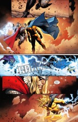
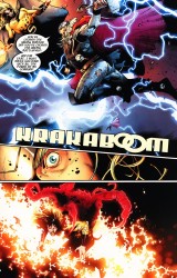
For a while, Bryan Hitch held the crown of slam bang superhero action. On The Authority and The Ultimates, he took his Alan Davis-inspired style and redefined how what cool action scenes meant in cape comics. Hitch splurged on spectacle: hundreds of space ships, hyper-detailed rubble, and battle-scarred landscapes. He held the crown, until Olivier Coipel came along and knocked it right off his head.

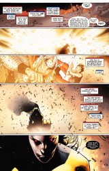
My first exposure to Coipel came in House of M, an event comic that had a story that was actually pretty terrible. Despite that, Coipel’s art shone through. His broad, muscled figures really sell the power and majesty of the superhero. He can do that big, nasty superhero action that the fiends live for, and he only got better as time went on. He knocked Thor out of the park, and Siege, with inks by Mark Morales and colors by Laura Martin, looked amazing.

I don’t think of Coipel being a realistic artist, at least not in the way that Hitch or Alex Ross are realistic, but I do think that his comics look real. He’s got more in common with that old Alan Davis style, where characters have believable proportions but are absolutely subject to cartooning or exaggeration for effect. Coipel draws straight up comic books, without realism being the goal. If it looks good on the page, he does it. Sometimes this means drawing regular humans, but more often than not, it means playing with scale. His superheroes are barrel-chested and broad as a house. His faces are cartoony, perfectly caricatured, and exaggerated when things get emotional.

I dig this guy quite a bit. His comics look real because he’s just a consummate artist. He doesn’t have to work in the same lane as Hitch to get the same effect, and for my money, he’s holding the crown of what an event comic should look like.

(I accidentally uploaded a fifth image. Here it is.)

Post to Twitter Post to Facebook Post to Reddit Post to StumbleUpon

h1

Black History Month 2011: Kyle Baker Interlude

February 12th, 2011 Posted by david brothers


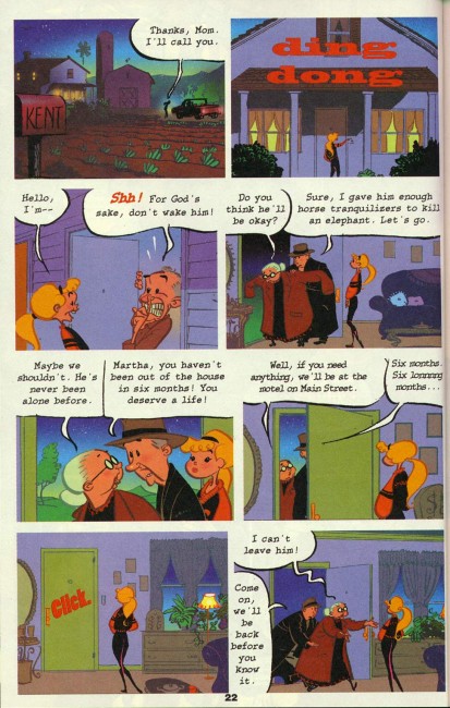
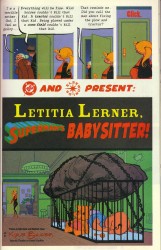
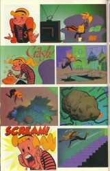
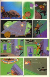
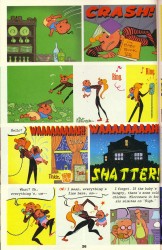
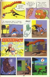
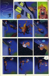
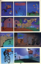
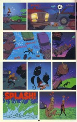
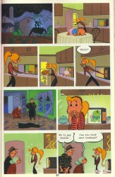
kyle baker, letitia lerner, superman’s babysitter
you can find it in bizarro comics, which is out of print, but widely available used or new for more than reasonable prices. hey dc! hook up a digital reprint of this tale and everything else from bizarro comics. you could be rolling in tens of dollars!

Post to Twitter Post to Facebook Post to Reddit Post to StumbleUpon

h1

Black History Month 2011: Dwayne McDuffie

February 11th, 2011 Posted by david brothers


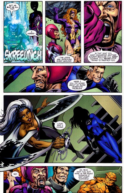
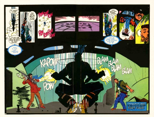
(pencils by powerful paul pelletier, inks by rocking rick magyar, colors by preening paul mounts)

Dwayne McDuffie
Selected Works: Hardware: The Man in the Machine, Icon: A Hero’s Welcome, Static Shock Vol. 1: Rebirth of the Cool

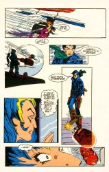
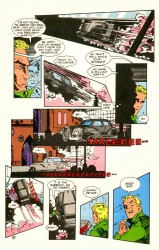
Just by a happenstance of birth, I was the perfect age for Dwayne McDuffie’s work to have an effect on my, what, mental growth? Racial consciousness? Whatever smarty art type of word you want to use. Spike Lee’s Malcolm X was a watershed moment for me. Less watershed, but still important, was the formation of Milestone Media, courtesy of McDuffie, Denys Cowan, Michael Davis, and Derek T Dingle.

In hindsight, the Milestone books I was really checking for as a kid (Static, Blood Syndicate) weren’t McDuffie joints. He was working on Icon and Hardware, which I tend to think of being more adult oriented rather than teen. I didn’t read all the way through those until I was grown. Despite that, the fact that Milestone existed was big for me. It showed that there coule be actual black people in comics. The company was full of people who looked, acted, and talked like people I knew. This is a big deal, believe it or not.

Years later, McDuffie helped shepherd Static Shock to beating Pokemon in ratings on TV. After that, he helped make me a believer in the JLA by way of the cartoon. Still later came a sequel to Secret Wars called Beyond! and his all-too-brief run on Fantastic Four: The New Fantastic Four and The Beginning of the End. He did all of this while maintaining a career making successful cartoons.

McDuffie did the job, and he kept doing the job. He’s built up a body of work that most people in his field should be jealous of and that fans should be thankful for. I’m thankful for the fact that he’s cognizant of his power as a creator, and simply tries to create worlds that reflect the ones we live in now. That was a big help as a kid, and his career has been an inspiration as an adult.

Post to Twitter Post to Facebook Post to Reddit Post to StumbleUpon

h1

Black History Month 2011: Denys Cowan

February 10th, 2011 Posted by david brothers


Denys Cowan
Selected Works: Hardware: The Man in the Machine, The Question Vol. 2: Poisoned Ground, Batman: Lovers and Madmen

I’m usually pretty okay at figuring out an artist’s influences, but Denys Cowan is a mystery to me. There are traits he shares with other artists, sure. He’s kind of scratchy like Bill Sienkiewicz got on Moon Knight once he hit his stride, or maybe some of those really dirty Jamie Hewlett pages. He works cityscapes like Frank Miller used to when he was on Daredevil, where they don’t quite make real life sense but they make perfect visual sense. His figures are a little off, just this side of Kirby’s flexible proportions.

That’s not to say that his art is a hodgepodge of techniques from other artists. Cowan’s art has certain aspects in common with other artists, but his art definitely stands alone when you look at it. Whatever his influences, he’s created something that’s distinctly his. The way he draws muscles are a couple points that stand out to me. Cowan draws some knobby elbows and knees, a couple of joints I generally think of as being bends in comics art, rather than anything with detail. It’s such a little thing, the sort of thing you have to work to see, most likely, but there it is: knobby elbows.

His faces are good, too. If you look at a close-up of Hardware or Barraki, they look black. Not just comic book black, where they look like generic (white) dudes with brownish skin, but actual black. Broad noses, full lips, cheekbones, everything. He nails it.

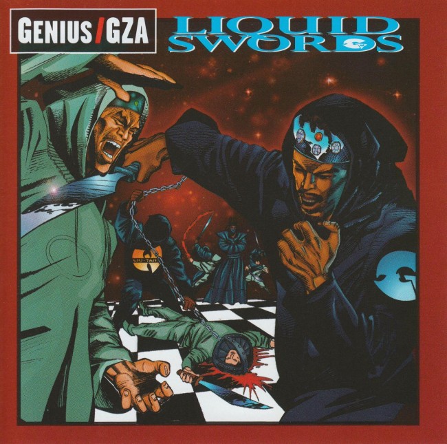
One last point: I listened to GZA’s Liquid Swords until the tape popped a couple times. Cowan did the cover and liner art for that, and I still love them.

Post to Twitter Post to Facebook Post to Reddit Post to StumbleUpon

h1

Black History Month 2011: Kyle Baker

February 9th, 2011 Posted by david brothers


Kyle Baker
Selected Works: Deadpool Max: Nutjob, Nat Turner, Special Forces, Modern Masters Volume 20: Kyle Baker (the Modern Masters volume is really good)

Kyle Baker is mean, man. He’s got a well-deserved rep for being the funniest guy in comics, and his only real competition is Sergio Aragones, I’d say. If you put Baker on a book, he’s going to make you laugh, guaranteed. But at the same time, some of my biggest laughs from his books have been in how he walks that fine line between unbelievable cruelty and amazing comedy.

Take Plastic Man. It was a back-to-basics approach to a goofy character that had been turned fairly serious. Baker took it back to the Jack Cole days, with lots of funny shapes, sight gags, and rapid-fire jokes. At the same time, he slipped in some pretty overt commentary on the state of the general style of DC Comics at the time, which was largely focused around emotional and physical trauma. So Baker took shots at the new Dr. Light, Identity Crisis, Plastic Man being a deadbeat dad, and everything else, while simultaneously having Plastic Man ensure that Abraham Lincoln dies, adopt a goth girl after he killed her vampire dad, work for the FBI, and team up with a fantastic foursome.

Special Forces is a straight up war/action comic, a Bush-era fantasy that’s full of glory, boobs, and great action scenes. The punchline comes when you get to the end of the book and realize that the cast of felons, autistics, and mercenaries are ripped straight from the headlines. That awesome war comic you just finished? That’s social commentary, sucker.

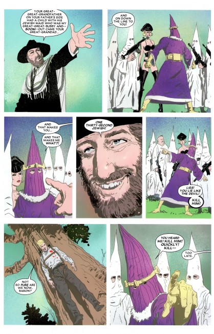
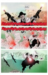
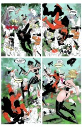
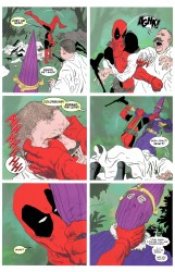
Deadpool MAX with David Lapham is a new level of comedic cruelty. Lapham knows how to inflict emotional trauma (whattup Stray Bullets) and Baker knows how to make it funny. In the end, Baker and Lapham justify Deadpool’s existence by way of a story where he kills Nazi Klan members with guns, swords, and Krav Maga while dressed like a Hasidic Jew.

Baker keeps getting meaner and meaner, and his books just keep getting funnier. I can’t wait to see his next self-published work.

Post to Twitter Post to Facebook Post to Reddit Post to StumbleUpon

h1

Black History Month 2011: Keith Knight

February 8th, 2011 Posted by david brothers


Keith Knight
Selected Works: The Complete K Chronicles, The Knight Life: “Chivalry Ain’t Dead”

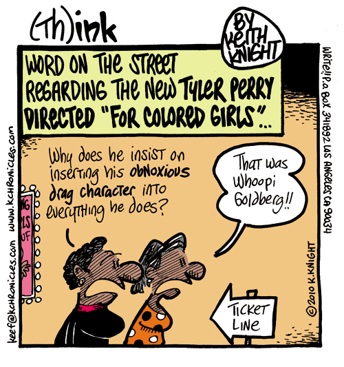
Keith Knight is funny, but not funny like a lot of funny people are. Some people specialize in certain types of humor. They’re good at gag humor, or building a story up until you’re begging for a punchline, wordplay, or whatever whatever.

Knight is good at several different types of funny. He can roll out dumb jokes one after the other, embarrassing personal anecdotes, storyline-based gags, and ripped from the headlines, all in one strip and with the same cast. It doesn’t ever feel out of place or jarring. My favorite of his various styles of humor is where he takes a real life situation, breaks it down clearly, and then throws a mean punchline onto the end of it.

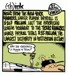
Knight’s got two strips that you can read for free online. The K Chronicles is more politically oriented, while The Knight Life is more of a real life diary. K Chronicles is where the knives come out. He takes on politicians, real life, and anything and everything that could be considered pop culture. He’ll rip on Obama, music, or whatever’s made the headlines. It’s essentially a political cartoon in terms of execution, with a new target every week.

There’s a little personal spillover, generally of the joyous variety, but The Knight Life is where Knight takes on real life, rather than public life. Details from his life form the backbone of his strip, especially his relationship with his wife. It reminds me of Kochalka’s American Elf, in that both of them are more than willing to 1) make themselves look dumb, 2) sometimes share with surprising honesty, and 3) are punishingly funny.

I catch up on Knight’s strips about once a month. He’s super prolific and can work with serialized strips and one-shots alike, so catching up is a always nice way to kill an hour or so. Put that in your RSS and smoke it.

Post to Twitter Post to Facebook Post to Reddit Post to StumbleUpon

h1

Black History Month 2011: Trevor Von Eeden

February 7th, 2011 Posted by david brothers


Trevor Von Eeden
Selected Works: Blood Syndicate 1, The Original Johnson Volume 1, The Original Johnson Volume 2

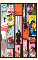
I came to Trevor Von Eeden very late. He’d done Thriller the year that I was born, and Power Man & Iron Fist before that. On top of that, the majority of his work was done at DC Comics, a company I generally didn’t read as a kid. It was a mix of not knowing anyone past Superman and Batman and Marvel having all of the hot artists of the time. I almost definitely saw his work on the first issue of Blood Syndicate, but I was definitely too young to get the significance.

As it turns out, Von Eeden is a dude who was worth paying attention to. He has an interesting approach to panel layouts in comics. Each panel is a specific moment in time, and how you move from panel helps dictate the pace and mood of a comic. Watchmen was a hard nine panel grid, with a few exceptions, throughout, and everything in it feels inevitable. Like, bam-bam-bam–you can’t escape its pace. It moves along at the same speed. Layouts are vitally important, and if you get them wrong, you can wreck a comic.

In Thriller in particular, his work with Robert Loren Fleming, Von Eeden takes that most basic part of the comics page and starts playing with time travel. There are pages that depict one very short moment in time, broken up across several panels. Others have panels that don’t just read left to right. They bounce back and forth across the page, creating a zigzag of storytelling. Other pages have one moment per panel, and then a huge splash of several moments.

It’s an interesting technique to utilize, and while it isn’t necessarily uncommon, seeing it done as well as it is in Thriller is nice. What’s nicer would be a digital comics release, of course.

Post to Twitter Post to Facebook Post to Reddit Post to StumbleUpon

h1

Black History Month 2011: George Herriman Interlude

February 5th, 2011 Posted by david brothers


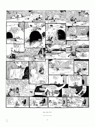
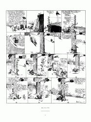
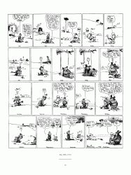
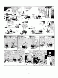
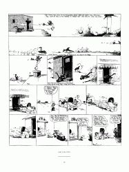
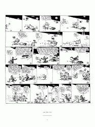
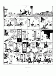
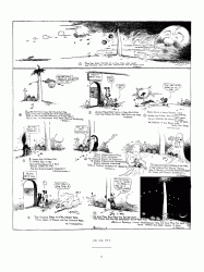
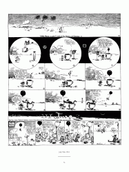
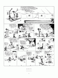
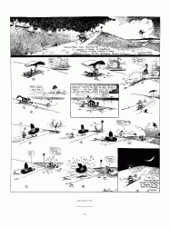
from george herriman’s krazy & ignatz 1916-1918: “love in a kestle or love in a hut”.
krazy and herriman are two kool kets i wish i’d discovered earlier. thanks to jacq @ fantagraphics for the preview.

Post to Twitter Post to Facebook Post to Reddit Post to StumbleUpon

h1

Black History Month 2011: Billy Graham

February 4th, 2011 Posted by david brothers


Billy Graham
Selected Works: Essential Luke Cage/Power Man Vol. 1, Marvel Masterworks: Black Panther

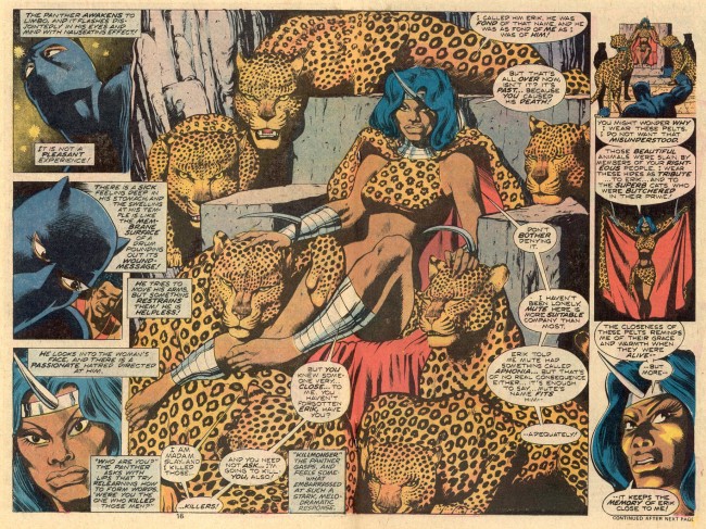
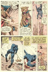
Billy Graham is an art monster. He helped define Luke Cage for the first sixteen issues of Hero for Hire and he worked on what is still the best Black Panther story of all time: Don McGregor’s Panther’s Rage. Prior to that, he worked at Warren and banged out some perfectly solid horror comics work.

This guy draws great comics, with a Gene Colan’s figurework meets Jack Kirby’s explosive action sort of thing going on. He has these wonderfully proportioned and fairly realistic figures doing insane Kirby judo throws and flips. Characters have genuine facial expressions, often exaggerated for effect but still reasonable, and idealized bodies. Graham can even draw people of different races without descending into caricature, a gift that some modern artists can’t even match.
More than that, though, is that Graham’s art is raw. There’s this looseness or roughness that make his pages really interesting. They aren’t unfinished or lacking in detail, but the detail they do have is rendered in a way I don’t see too often. His work is chunky and scratchy, and I always feel like if you could wipe away the color, you’d see pencils that were worthy of being shot straight from the board.

Graham’s Kirby-influenced realism was vital for both Cage and Panther at the time, I’d say. The two books depicted a Marvel universe that varied from being even more street level than Amazing Spider-Man to being about half as cosmic as Fantastic Four. Graham’s art split the difference. Cage and Panther were both grounded, but not so grounded that they couldn’t expand into more comic book-y situations. If you look at something like Daredevil, which has been banging the Early ’80s Frank Miller Drum for entirely too long now, you see a series that has been defined and limited to one style. Graham was just street level and cosmic enough to make everything work.

Post to Twitter Post to Facebook Post to Reddit Post to StumbleUpon