Author Archive

h1

Fourcast! 29: Talking About Comics Internet

January 18th, 2010 Posted by david brothers

Ooh, welcome to Name Drop City, where the comics are good and the girls are pretty!

-Noted comics critic David Uzumeri of Funky Babylon gives us an intro
-Theme music: 6th Sense’s 4a.m. Instrumental
-What’re we talking about? Comics internet! Who we read, what we like, what we dislike, and so on.
Twitter is David‘s favorite comics site, and at recording time, David Uzumeri‘s open letter to DC Comics was the big thing.
-Peter David and Gail Simone: sometimes they get into heated arguments with people on the internet. Here is Jim Halpert from The Office doing an impression of what Esther does when things like that happen:
Read the rest of this entry �

Post to Twitter Post to Facebook Post to Reddit Post to StumbleUpon

h1

Marvel vs DC: What’s Beef?

January 14th, 2010 Posted by david brothers

Here’s an excerpt from a press release Marvel sent out yesterday:

In an effort to provide assistance to comic retailers in 2010, Marvel is offering retailers an opportunity to turn unsold comics into an extremely rare Siege #3 Deadpool Variant!

Retailers – for every 50 stripped covers of the following comics sent to Marvel, you will qualify to receive one FREE Siege #3 Deadpool Variant. The 50 stripped covers can be any combination of the comics listed below and all submissions need to be received at the Marvel office at the address below by Tuesday 2/16/2010. Also included with the stripped covers must be your store contact information including Diamond Account # and email address.

Stripped Covers To Be Sent:
Adventure Comics #4
Booster Gold #26
Doom Patrol #4
Justice League Of America #39
Outsiders #24
R.E.B.E.L.S #10

Ooh, that’s shots fired.

Let’s pull this apart piece by piece, okay? Top to bottom.

First is the timing. This is the first real week of comics news in 2010. Last week was Christmas recovery and fairly light. This week, DC has been slinging high profile announcements left and right. Among other things, they’ve shown off Gail Simone being back on Birds of Prey with some crappy artist, a preview of Jock’s take on Batwoman with Greg Rucka, a look at the Return of Bruce Wayne, and Keith Giffen is getting a Justice League book. Fan-service announcements all, two trying to recapture past glories and two pimping big deals. Add the announcement of Brightest Day, their new biweekly comic and probable spine of the DCU, into the mix and you have a big week just three days in.

This press release is aggressive and instantly controversial, the type of thing that makes people want to argue about it ad nauseam. It’s sharp and pits the two companies right up against each other, upping the ante on the competition between the two companies. It also disrupts DC’s grip on the news cycle in a very major way. At the time of this writing, the Robot6 article on Gail Simone’s return to BoP has 32 comments. The piece on the press release has 107, despite being posted several hours later. Marvel pushed DC right out of the limelight with something that is sure to cause discussion (fights) for days to come.

Second is the subtext of the press release. The first line begins, “In an effort to provide assistance to comic retailers in 2010[.]” Marvel is positioning itself as doing the retailers in the Direct Market a favor by allowing them to trade unsold books for a rare variant that’ll go for big bucks. Essentially, they are saying “We are the good guys. Those other guys did you wrong, but we’ve got your back.”

The subtext doesn’t end there. The books that are part of the promotion have one thing in common: they were all part of DC’s Blackest Night promotion, where ordering 25 or 50 copies of each issue gave retailers the chance to order a bag of plastic rings. That promotion was a huge success for DC, with several books moving as many as thirty-five thousand more copies than they did the month before. They ran the sales charts for November 2009. It left DC holding seven of the top ten spots in the Top 300 sales chart, up from six in October and September and four in August.

Some retailers required customers to purchase a book to get the rings, others treated them like the giveaways they were intended to be and gave them out like candy on Halloween, and others, the worst of the lot, sold the rings on their own. Conventional wisdom and anecdotal evidence, however, suggests that the books stayed on the shelves. The sales charts for December seem to suggest the same thing- once the promotion was over, a few of the books involved lost roughly twenty thousand readers. Past experience suggests that that fall will continue into January. (I’m rounding these numbers off, by the way. To compare for yourself, look at the October, November, and December charts. I’m an English major, I can barely count to ten.)

Now, Marvel is taking a shot at what is basically DC’s biggest sales success in ages, and doing it in such a way that wipes the foundation for that success away. Suggesting that the comics didn’t sell implies that the entire draw for the increased orders were the bags of plastic rings, which honestly probably isn’t that far off from the truth. REBELS is an enjoyable book, but even for a Blackest Night tie-in, it got a huge bump. Comic fans like collecting stuff.

So, top to bottom:
1. Marvel is saying, “DC left you holding a bunch of stuff you cannot sell.” It’s a serious diss, attacking DC’s entire reason for being. Regardless of the quality of the books (I’m fond of REBELS myself), DC needed a gimmick other than good storytelling to sell these comics. If a comics company needs plastic rings to sell comics… well, you do the math on that one.

2. The timing is kicking sand all over DC’s big week. It’s a release calculated to cause controversy, gain a lot of attention, and piss people off. It’s very, very public, and definite shots fired.

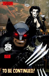
3. Deadpool, as in the cover boy of the “extremely rare Siege #3 Deadpool Variant,” is a copy of Deathstroke. Marvel is shipping a cover with a knock-off of a DC character, one who has enjoyed inexplicable success over the past year, in exchange for stripped DC comic books. That’s just salt in the wound, isn’t it? A cheap shot nestled inside a larger cheap shot?

Marvel’s promotion is cruel. Taking DC’s big win last year and big week this year and upending them in an attempt to put DC in its place is fairly messed up. At the same time, it isn’t exactly inaccurate. Despite DC’s big month, Marvel still won November ’09. It’s definitely a cheap shot, but… it’s kind of funny, isn’t it?

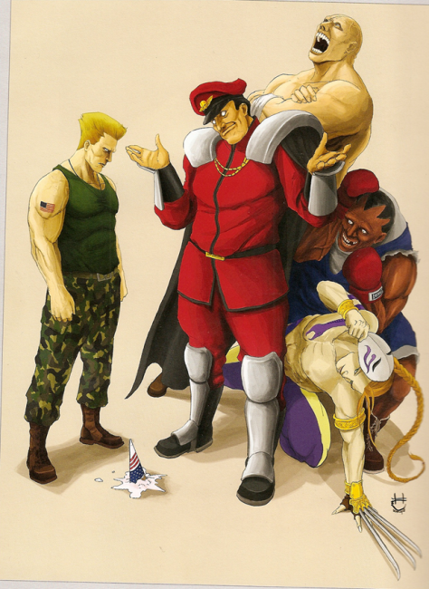
This release is the kind of aggressive posturing we haven’t seen out of Marvel since Jemas and Quesada simultaneously pissed DC off forever and rocketed Marvel back into the limelight. It’s Marvel thumbing its nose at DC and reminding them who has the market share advantage. Basically, Marvel is M. Bison and the gang, and DC is Guile.

Verdict? Ouch.

Post to Twitter Post to Facebook Post to Reddit Post to StumbleUpon

h1

Ganges #2: Unexpected and Good

January 13th, 2010 Posted by david brothers

I picked up Ganges #2, my introduction to Kevin Huizenga, on Tucker Stone‘s recommendation, so it’s only fitting that I bite Nina’s Virgin Read gimmick, right?

I’d heard of Huizenga before, of course. He made several Best Of 2008 lists, but I’d never really bothered to check him out. I dunno what it was–maybe being a little wary of trying new things, hopping onto a book I knew next to nothing about, maybe just being a little dumb–but I didn’t get around to it until I ended up at APE ’09 with a list of books from Tucker to keep an eye out for. I was short on money, long on time, so all I got was Ganges #2. I mean, I didn’t even know that it was about a guy who can’t sleep. I found that out weeks later. I came into this colder than cold.

My first reaction when I started reading Ganges was a mixture of confusion and surprise. The first panel is clearly a menu from a video game, and the next few panels hit all of the video game staples. I saw a select screen, some platforming, some exciting zooms, and a little fighting before it all went weird. The next ten pages are a blur of bizarre shapes and experiments in symmetry, all filtered through the language of fighting games. There are health bars and charge meters, and there’s even a bit where the black figure (player one) checks his upgrades and moves in a pause menu.

Huizenga uses the large-sized page to great effect here, as he moves from relatively normal-sized panels to one- and two-page spreads. The level of detail and complexity of the figures in the image expands drastically as they warp from form to form. There are no words, save a few text boxes in Japanese, so the art stands on its own.

It’s weird and it’s different and it immediately showed me that Ganges #2 is not what I thought it was. I was expecting mopey autobio, a distant cousin of Blankets with better artwork, and instead got something that was well worth the hype.

The game is something that Glenn Ganges is playing while his wife sleeps in bed. After a sequence where he restarts the game and gets back to it, a caption informs us that Glenn used to play a game called Pulverize when he worked for an internet startup. From that point on, I was instantly hooked. I got my first job when I was 14, doing web design (I think in Front Page and Notepad.exe) for a local non-profit. We left work at around 630. The boss left an hour earlier. Someone on staff had a copy of Quake II, and soon that last 45 minutes of work (just in case the boss came back) was game time. We had custom skins and everything.

Ganges #2 is about how people come together. While everyone in the book has their own problems and worries, Pulverize becomes an equalizer. In the game, they’re their avatars. Nothing more, nothing less. Playing together gives them a common ground to stand on, strengthening bonds and turning people from coworkers into something akin to friends. But not exactly- at the end of the day, the camaraderie is fleeting. Pulverize brought them together, but in a very specific way. The friendship was like watching a movie through a piece of glass, a little foggy, a little distant, and not quite real.

But even still, Huizenga shows how these kinds of relationships can be important. When layoffs begin at Ganges’s company, they send off one employee in grand fashion. Their bond may not be the thickest there is, but it is a bond, nonetheless, and valuable simply because it brings people together. The connection existing in that moment is what counts, not how long-lasting it is.

By the end of the book, the story is nothing more than an anecdote, something you could tell in ten minutes over drinks. In the book, it’s framed as just that. We see Ganges playing the game, the caption tells us about the time he was really into another game, and then the story ends.

Despite that, Ganges #2 is never boring. The video game that serves as the glue for the story is interesting, basically GeneriQuake, but what’s important is that the game puts the people on a level playing ground, allowing Huizenga to illustrate differences of personality by how they approach the game. It’s an obsession for Glenn, and something he hides from his wife, behaving a lot like a cheating husband when he works late and lies about it. His boss plays it because he thinks it’d be good to bond with the team, but soon quits. It’s a calculated decision, not one he did for fun, and as authentic as his relaxed posture when asking his employees about whatever small detail he’s latched onto as being the best way to relate to them. He’s fake.

Ganges isn’t at all what i expected. Taken on its own, #2 is a comic about nothing. A guy plays a game, we read a brief story about his past, then he gets some water from the sink and plays again. That’s it. But, the story is deeper and more entertaining than that summary suggests. It’s a comic about people and how they interact, held high by shockingly good art. The first ten pages show that Huizenga can do some amazing things with storytelling and the rest of the book shows his strong grasp of body language and how to make talking heads interesting.

I’m going to try to pick up the rest of Ganges (numbers one and two, which are in stock at Fantagraphics.com) and do another review, this time knowing exactly what it’s about going in. I think it’ll be interesting to see how my assessment of the series and Huizenga’s work changes. Based off Ganges #2, though, I expect to enjoy both.

Post to Twitter Post to Facebook Post to Reddit Post to StumbleUpon

h1

Hulk is the Funnest One There Is

January 12th, 2010 Posted by david brothers

Over the last year or so, I’ve really grown to appreciate Jeph Loeb. I don’t think that he’s a particularly good writer, and he’s been justifiably parodied in Gavin’s Ultimate Edit series, but I do think that he fills a niche that I’ve come to enjoy. He writes very simple, completely un-self conscious stories about superheroes. If you want a dumb comic about dumb dudes wearing dumb tights fighting each other… Loeb’s Hulk is very entertaining.

I’ve liked a few Loeb books before. Spider-Man: Blue and Daredevil: Yellow were entertaining and very pretty, thanks to quality artwork from Tim Sale. While they tended to be fairly emotionally manipulative, they also really got at what makes Peter Parker or Matt Murdock work. A sheepish Peter Parker being tended by Gwen Stacy and Mary Jane, looking they best they’ve looked since John Romita Sr. last drew them, is dead on.

Loeb’s Hulk, though, is his All-Star Batman & Robin the Boy Wonder. ASBAR is distilled Frank Miller, all of his idiosyncrasies and interests packed into a bullet and fired directly at your brain. Hulk is Loeb jettisoning any semblance of emotional connection or nostalgia-as-crutch, instead choosing to focus on the purely superheroic aspects of the superhero genre. There are no secret identities, no real subplots, no supporting cast, none of that. Everything is about Red Hulk. Everything in the book ties back to him, or was caused by him, or is about him.

Hulk is distilled superheroics. While Captain America, Daredevil, New Avengers, and even books like Batman & Robin feature overt influences from other genres and mediums, Hulk really only has two influences: comics about the Hulk and other Jeph Loeb comics. There is no noir, spy, soap opera, manga, or exploitation influence to be found here. Every single twist and turn and plot can be traced back to comic books, whether it is the unstoppable new creation beating up All Your Favorites or a group of women teaming up seemingly because they are women.

Large and in charge.


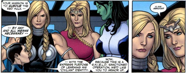
This is a book where Moon Knight, the Sentry, and Ms Marvel team up because they kinda resemble Batman, Superman, and Wonder Woman– DC’s Trinity. They not only team up as a replacement Trinity, but Loeb’s dialogue for them is exactly the same as it would be if they were the real thing.

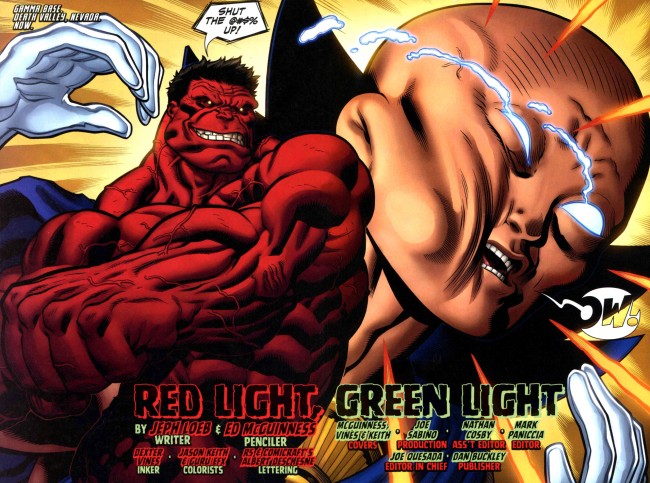
The introduction of Red Hulk is equal parts appealing and off-putting. He beats, outsmarts, embarrasses, and harasses everyone he goes up against, coming out on top each time. He’s the unstoppable force and immovable object all rolled up into one being. We’ve seen this before, where an author’s pet character is put over by beating up a recognizable character, but Loeb ups the ante to an absurd degree. Red Hulk punches out the Watcher in a beautiful spread. He beats Thor with his own hammer through the kind of plot maneuvering little kids routinely practice.

It is loud and it is dumb and it is on a scale that is extremely entertaining. It’s like being in a speeding car on the highway, doing 90 in the fast lane, during a pouring rainstorm. You know how things should work, and generally they perform as expected, but there’s that moment when you pull the wheel left and the car’s momentum shifts and suddenly you’re spinning and completely out of control. Then you stop spinning and you laugh and shake and laugh some more. It’s stupid, and it isn’t a good thing, but you get a weird rush off it.

Basically, what I’m saying here is that, when it comes to Hulk, the best possible comparison is Big Boi and Gucci Mane’s Shine Blockas. Jeph Loeb is the Gucci Mane of comics. He’s not great, but he’s catchy and doing something familiar in a slightly different way. He’s passable, just there to provide a little background noise (‘s gucci) and provide a way for the artists to put some drawings on the page. A little lowest common denominator, not very clever, but gets the job done. At the same time, the artists are the Big Boi in this extraordinarily tortured metaphor, banging out art that’s intended to impress you and drawing the kind of things they’ve apparently always wanted to draw. You check for it, and you feel a little bad over it, but you still seek it out to see what’s next.

You can look at the plot and work out the mystery yourself (Glenn Talbot is pretty clearly Red Hulk, Red She-Hulk is probably Betty Ross, Thunderbolt almost definitely isn’t dead), but all of that is beside the point.


The mystery is just a storytelling engine, something to throw Red Hulk into fight scenes with other characters. Loeb builds it up and ignores it in equal amounts. Domino sees Red Hulk transform, which sets off a story arc about Red Hulk trying to protect his secret identity. During the course of the story, there are no hints about who he is or what she saw, besides a guy in a hat turning into a monster.

Hulk is a book where the plot is secondary, at best, to the action. This is due in no small part to just how Jeph Loeb writes comics. From an interview on CBR a couple years ago:

Hulk fans will surely agree Ed McGuinness’ exaggerated and highly expressive style is uniquely suited for depicting the adventures of Marvel’s green goliath. Appropriately, the artist is himself one of professional comics’ most zealous Hulk devotees. “Ed has wanted to draw the character since he was a kid (and if you know Ed that was like two years ago) – so it’s just a pleasure giving him cool stuff to smash!” Loeb remarked. “And there’s a lot of that!”

“The Hulk is the type character that has affected me on the genetic level, ” Ed McGuinness told CBR News. “There’s just something so cool about this guy who has all the power in the world and can’t do anything to control it. I love the misunderstood monster idea, too. I want the Hulk to be a force of nature! I want the Hulk to wreck stuff! Who doesn’t?”

Writers always talk about “tailoring their scripts” to their artists. Sometimes it means adjusting the number of panels, adding or removing wiggle room, or something like that. When Loeb does it, though, I get the feeling that he’s just writing what his artist wants to draw first, and then fitting his story around that. Grant Morrison’s Seven Soldiers was tailored to all of its artists, but it was still primarily Morrison’s story. Hulk, though, gives Ed McGuinness a chance to draw almost every major Marvel hero doing what they do best: battling each other. And it continues on for all the other artists, too. Frank Cho gets to draw the lady-centric arc. Art Adams draws monsters. Ian Churchill gets to work some new artistic muscles. John Romita Jr gets to take a tour through the Marvel U and draw an amazing Kirby-style spread of the Fantastic Four versus the Hulk.


Comics, for me, are a 50/50 affair. Half of the appeal is in the writing, the other half is in the art. Hulk is a book where more than half of the appeal is in the art. Loeb gives these guys a chance to go wild, often leaving the plot or common sense in the dust, and the book is better for it. I wouldn’t want every book to be like this one, but Hulk? I like it a lot.

There are three, technically four, collections out right now. The hardcovers are annoyingly priced (25 or 20 a pop), but the first volume is available in softcover. Personally though, Hulk: Green Hulk/Red Hulk is the way to go. It’s in Marvel’s oversized hardcover format, which is honestly the absolute best way to read Marvel books, and collects the first couple arcs. Ed McGuinness, Frank Cho, and Arthur Adams’s art looks great at the size. If you’re in the mood for something loud and dumb, give it a try.

Post to Twitter Post to Facebook Post to Reddit Post to StumbleUpon

h1

Fourcast! 28: Squadron Supreme Power

January 11th, 2010 Posted by david brothers

John provides a brief intro
-Theme music: 6th Sense’s 4a.m. Instrumental
-Gavin gave Esther Mark Gruenwald’s Squadron Supreme for Christmas. She gave him a scathing review in exchange.
-Psyche.
-We talk about Squadron Supreme, its place in history, and a few things Esther liked about it.
-David didn’t like Supreme Power much at all, seems like.
-CEOutro

Subscribe to the Fourcast! via:
Podcast Alley feed!
RSS feed via Feedburner
iTunes Store

Post to Twitter Post to Facebook Post to Reddit Post to StumbleUpon

h1

Ian Churchill: Remixed, Relapsed

January 8th, 2010 Posted by david brothers

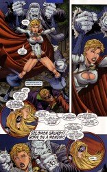
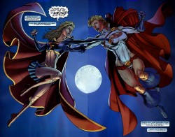
I was never an Ian Churchill fan, even as a kid. I have some friends who really dig his stuff on the various X-books in the ’90s, but I never got into him. And when I came back to comics, his art was of a style that I definitely wasn’t into. It was a little too derivative of Jim Lee, but even more stereotypically Image Comics– unlikely breasts, boobsocks, stick legs, super long torsos, poor acting, etc. He was, in essence, what I didn’t like about superhero books.

supergirl-001supergirl-002supergirl-003

Back in October, I read interview on CBR with Churchill about him doing an arc on Jeph Loeb’s Hulk. The stuff about him adjusting his style in the ’90s to be more like Jim Lee in order to get more work was interesting. I’ve heard about Herb Trimpe trying a similar tactic and not meeting with much success. I read the interview, found it a little interesting, but still decided to skip the issues. How different could the style be? It’d still look more or less like his work on Supergirl, right?
supergirl-004supergirl-005

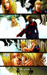
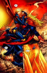
I skipped the first couple issues and didn’t think twice. I saw the cover to the second issue on a wall at the comic shop and was kinda surprised. It really, really didn’t look like Churchill’s style. Lots of spot blacks, no crosshatching, the hair wasn’t plasticky… weird. So I picked it up. That ended up being a good decision.

I really dig Churchill’s new style. He’s jettisoned a lot of what I disliked about his work and come up with something really interesting and neat. You can look at it and see some of Churchill’s flourishes. The chins are undeniably Churchill’s work, but overall, his style is something like Dan DeCarlo meets Ed McGuinness, with a small dose of Humberto Ramos in terms of character anatomy and structure. It looks good on the page, and is appealingly “superheroic” in terms of style.

hulk-001hulk-002hulk-003

I’m enjoying Churchill’s storytelling a lot more now, too. He’s still using around the same number of panels as in his prior work, but the cleaner style gives him room to make the faces more cartoonishly expressive. The figure work is better, too. There are still muscles stacked on muscles, but the lack of excessive detail makes it look cleaner, less cluttered, and more attractive.

A few artists I like have gone through serious changes to get where they are now. Chris Bachalo reinvented himself as as a monster of an artist, a guy who can make anything look good even as he weirds it up to the max. Travis Charest used to be a crappy Jim Lee knockoff before he was a master of hyperrealism. Patrick Zircher went from doing okay middle of the road stuff on Cable/Deadpool to knocking Terror, Inc. all the way out of the park with a fresh new style. (Ask Carla about his work on BLOOD COLOSSUS sometime.) With able assistance from Mark Farmer on inks and Peter Stiegerwald on colors, Churchill has managed to reinvent himself for the better.

hulk-004hulk-005

Post to Twitter Post to Facebook Post to Reddit Post to StumbleUpon

h1

Three Webcomics You Should Be Reading

January 7th, 2010 Posted by david brothers

-I usually say “I don’t really read autobio comics,” but that’s pretty much a lie, I’ve realized. Erika Moen’s DAR: A Super Girly Top Secret Comic Diary is fascinating to me. She ended it yesterweek, and I’ve had it open in a tab ever since, hopping around from strip to strip. It’s really strong and very entertaining. It’s also a little baffling to me, as well. Moen is able to share things on a level I’m completely incapable of duplicating. It’s not that I’m emotionally cold (hey lay-deez, how YOU dooooooin’), it’s just that she’s open in a way that’s both foreign and appealing. It’s good reading, and her farewell strip is a beast. Plus, the series of strips about the guy who pooped on her bathroom floor was funny.

-Emi Lenox’s Emitown is also must-reading, for both similar and different reasons. What I like is that it’s almost like a highlight reel, or skimming someone’s diary. You never know if you’re gonna get a post about one subject or six. It’s a fifty-fifty draw- you’re getting either a single round or buckshot. The only surety is that you’re gonna get shot. Pardon the tortured gun metaphor, what I’m really trying to say is that the strip is entertaining and her art is great. Great emotional work and it never feels cluttered. Look at the faces in this one. I particularly like the bit where the cat laughs at her. Dope sense of humor at work there. She updates throughout the week.

-Julian Lytle’s Ants is more of a sitcom than a serial gag comedy strip. You dip in and out of watching these guys interact with (or talk about) current events, video games, music, whatever whatever. The slanguage is on point, and each strip is just a glimpse into the life of these guys. The latest is part of a series where the ants are riding on Asgard because they’re out of Eggos. Lemme tell you this: I can relate, because if EL Fudges end up shorted? I’m going out masked up, eyebrows down, and a whole bunch of guns on the backseat of the car. Julian updates on Thursdays.

D-pi‘s Gratuitous Ninja has a few episodes out right now, and it’s shaping up to be pretty cool. It’s fresh, working in that same kind of cultural fusion lane as Jet Set Radio Future (sorry kids, I copped that on Xbox and missed it on Dreamcast) ran in. There’s a strong influence from video games, music, Japanese culture, and something I can’t quite put my finger on. I think Ron and I grew up on a lot of the same things, and it’s dope to see that on the page. Check it out on Wednesdays.

Post to Twitter Post to Facebook Post to Reddit Post to StumbleUpon

h1

7 Things About Yotsuba&! 7

January 6th, 2010 Posted by david brothers


I grew up around a small battalion of cousins. I was part of the first wave, and we had around seven years before the next group came through. Even now, I’ve got a younger brother who’s a year old, and if I didn’t live all the way across the country, I’m sure I’d still be in the thick of it. So, a lot of stuff in Kiyohiko Azuma’s Yotsuba&! is old hat to me. Only, it’s funny now, because I’m not being shanghai’d into watching someone else’s kid or changing diapers. I can appreciate it for what it is, rather than wishing I was outside on my bike instead of watching some rugrat drool all over the place.

I read the 7th volume in December and loved it. My complaints about the translation still stand, but that’s a difference of opinion. The source material is incredibly strong, from art to writing, and it shows in the translation. Yotsuba&! is the kind of book that you makes you bark laugh, or snort, or guffaw, or whatever embarrassing laugh it is people hate to do these days. When you read Yotsuba&!, you’re going to like it. That’s just the way things work. It’s natural. I read Yotsuba&! 7 while going through hell at work. Bad day after bad day, coming home pissed off, so on and so forth. But, Yotsuba&! was a bright spot. It’s the kind of book that cheers you up, if only for a little bit, and is more than welcome due to that fact.

I picked out seven things I liked from this volume of Yotsuba&!. I don’t know that they’re the seven funniest things, but they are things that I think encapsulate what Yotsuba&! is all about. They range from comedy to craft to characters, all from volume 7. This is a good volume to pull from, being both the latest and blisteringly funny, to boot. There’s a couple pages in there that kill me every time I look at them.

(After you read this, read this. Azuma won the Excellence Prize in manga at a 2006 media festival and gave an acceptance interview. It’s pretty interesting and well worth a read. Thanks to Jog for finding it.)

mundaneYotsuba&Mundanity
Real life is mundane. When I wake up in the morning, I calculate whether or not I can sleep several more hoursminutes, figure out what time I finally fell asleep, and then get out of bed, landing on the wrong side. I brush my teeth with my eyes closed, pull on clothes, and hit the streets. Have you ever seen a little kid wake up? No, you haven’t, because they wake up before we do, with three times as much energy.

I like the body language in this panel, with Koiwai and Yotsuba both brushing their teeth the same way, but looking completely different at the same time. Yotsuba is wide-eyed and alert, while Koiwai is still sleepy. It’s not too hard to see that Koiwai probably taught her how to brush her teeth, judging from their posture, but the difference between the two speaks volumes. To Yotsuba, every action, every event, is something to be devoured. To Koiwai, it’s just another morning.
lifeYotsuba&Real Life
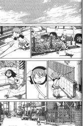
The attention to clothes in Yotsuba&! is lovely. Characters don’t just wear Generic [Color] Shirt and Straight Slacks. Clothes have patterns, jeans look like jeans, and people actually look like they pay attention to what they put on in the morning. Yotsuba and the girls next door all wear age appropriate material, from an adorable shirt with a bunny on the front on Yotsuba to classy sweaters and skirts on the eldest girl. Even Koiwai, who spends most of each volume in boxers and a white t-shirt, makes sense when he goes out. If all you did all day was type at a computer at home, you’d do the same. (Don’t front. I know several pro bloggers and none of y’all wear pants, except when someone asks you to.)

What’s nice about Yotsuba&! are these occasional interludes where Azuma just lets Yotsuba roam freely around the area. Part of it is that I like seeing him being able to break out of the tiny panels that made up his Azumanga Daioh work and really go at a panel. There’s some photoref going on, but the way his cartoony characters interact with their environment is always golden. Yotsuba never sleeps straight. She’s always sprawled or draped over something. Falling asleep partially draped over a table with cup phones wrapped around her body? It looks good and it fits her personality.

But the best is just seeing Yotsuba roam and the things she does. Everything focuses down onto the most important part of Yotsuba&!, which is that everything is wonderful if you look at it with the right eyes. A walk to the store isn’t just ten minutes of walking. It’s strolling past neat bushes, finding a cool stick, making noise (everyone who has ever seen a kid make noise just to make noise raise your hand), and, when all that becomes boring, turning yourself into an airplane and flying along.

There is a purity in Yotsuba that I can appreciate. A lot of the appeal of the series is that she isn’t tainted by the things that make adults bitter and mean. Everything is new, everything is wonderful, and Yotsuba is in the perfect position to appreciate all of it. And, by seeing the world through her eyes, we can appreciate it, as well.
punched

Yotsuba&Comedy
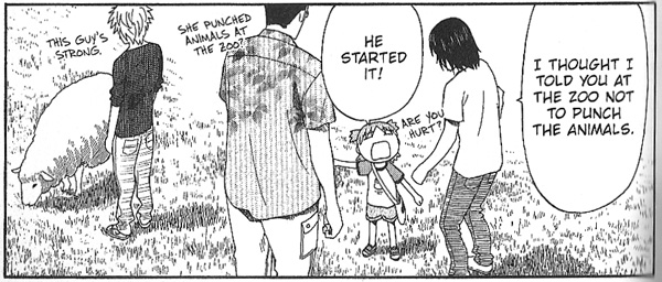
Sometimes, man, Yotsuba&! is just funny. Yotsuba runs afoul of a sheep, gets knocked down, hops up, and hits the sheep with a hook. That’s comedy. The cherry on top is that this is apparently not just a one time thing- she makes a habit of punching animals.

whichYotsuba&Cartooning
Yotsuba trying to decide what to put back at the story, and putting all five years of her experience toward figuring out her dilemma, is another good scene. This one shows Azuma’s skill at cartooning. Yotsuba goes from listening intently in panel two, paying close attention, to carefully examining the goods, to realizing that she can’t put anything back because she needs all of it, before being told a possible solution that she hadn’t even thought of, and then she’s determined.

I really like this progression. Azuma gets a lot across with not a lot of lines, particularly in the fourth panel, where Yotsuba’s practically in agony over having to make a hard decision. His realistic approach to clothes and backgrounds gives way when it serves the story, turning faces into two circles and a line. It’s easy to overdo, hard to get right, but Azuma tiptoes on that line with a deft touch. Yotsuba is the most expressive, but her expressiveness tends to infect other characters in a believable way. Her nature encourages other people to turn child-like, like when Yotsuba and Koiwai have giant monster battles.

hamburgerYotsuba&Focus
One of my favorite things is when a little kid gets super fixated on something. I have a cousin who loves to play video games. I made the mistake of showing him the Wii at an early age, and he was the first one that wasn’t dumb enough to fall for the old “give a kid the controller, leave it unplugged, pretend like it’s two player” trick. After that, it was on. Wii, GameBoy, Xbox, whatever, he was all about it. He was really into Rayman Raving Rabbids for a while, and it got to where you couldn’t mention anything that even sounded like Wii or Rayman or Rabbits without him peeking around the corner like, “Are we about to play Wii?” He knew what he wanted and anything that brought him close to that was a good thing.

That’s a big part of why I like this scene in Yotsuba&! 7. Yotsuba doesn’t know what a patissier is, but she knows that chefs cook food, and food is hamburgers, so Fuuka is… going to cook hamburgers! Duh! It’s obvious! Of course, when Fuuka reveals that she is going to make a cake, Yotsuba loses it and declares her undying love on the next page. That’s the other thing about kids. Show them the next awesome thing, or another awesome thing, and they’re ready to go, they don’t even have to switch gears.

And once again, through Yotsuba’s eyes, everything is magical. I’m a big fan of hamburgers, but I don’t think I get as excited as Yotsuba does over them. We might be equal on cake, though.
crosscutter

Yotsuba&CrossCutter
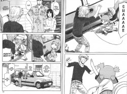
In terms of calling shotgun, Cross Cutter beats all. Right, Heidern?

crosscutter

Right.

Yotsuba’s “Hmph!” in the second panel on the second page is amazing. That’s Azuma’s cartooning at work again, using a little to accomplish a lot. It getting an entire panel to itself is a deft touch, giving the comedy a chance to breathe. We’re right there with Yanda, wondering “Did that just happen?”
yandaisstupid

Yotsuba&Yanda
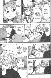
Yotsuba is adorable, but she’s also a smug jerk. She’s just so matter of fact and condescending on this page. Why else would you go to a ranch, but for the cows? C’mon Yanda, you’re dumb. The little fist pump in panel five like “So there!” would make it if not for panel 7 and the look on her face. That panel kills me every time.

Post to Twitter Post to Facebook Post to Reddit Post to StumbleUpon

h1

We Be That Afrodisiac

January 5th, 2010 Posted by david brothers

Blaxploitation, like film noir before it, was very much a product of its time. The effects of bitterness about Vietnam and the way the Civil Rights movement turned from great success to tragedy can all be seen in the best blaxploitation films. As time goes on, though, audiences get more sophisticated, absorb the lessons of the genre, and then we collectively move on to the next one.
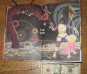
Doing straight blaxploitation doesn’t work these days. There were a couple attempts in the ’90s, the most memorable being Original Gangstas, but it doesn’t really work out as it should. It feels kitsch or like a relic from the past. You need a hook, whether it’s Black Dynamite slyly winking at the audience or World of Hurt‘s painstaking attention to what made blaxploitation work back in the day.

Jim Rugg and Brian Maruca’s Afrodisiac, presented in a fancy hardcover from AdHouse, has a hook, but I don’t know that I can do it justice. It’s kind of a love letter to blaxploitation, but filtered through the style, feel, and design of ’70s Marvel comics. It’s also really, really good. If it had come out in 2009, Parker: The Hunter, Asterios Polyp, and Pluto would’ve suddenly been part of a Top 4, instead of a Top 3.

Alan Diesler, sometimes Afrodisiac, often Mack Midnight, other times The Afrodisiac, still other times Dr. Rufus Blackguy, and even more often simply “Daddy,” is the hero of the book. He runs girls out of Afroca, his headquarters in Wilkesborough. When he’s not pimping, he can be found saving the hood, the world, or some new skirt from predators. He’s distilled John Shaft, smarty, sexy, and able to talk the pants off a clothes store mannequin. There’s not a problem he can’t fix with his charms or his fists.

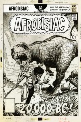
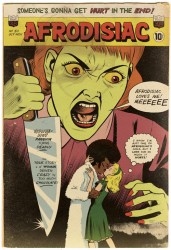
Afrodisiac is a peek into an alternate history, one where Afrodisiac was a long-running comics franchise, racking up 144 issues, spawning cartoons, manga adaptations, multiple ongoing series, romance comics, and even a magazine, judging by the art on a cover in the book. It reads like an abridged omnibus, spanning the 12-year history (longer if it ran bimonthly, like Luke Cage did off and on) of the character but only showing glimpses into that past.

afrobushIt’s an interesting approach for a standalone book, but it lets Rugg and Maruca cover a lot of ground and build a fascinating world while telling varied stories. There are only so many times that you can fight the man, of course, so Afrodisiac takes on aliens, Dracula, demi-gods, Tricky Dick Nixon, Death, corrupt religion, and computers.

What’s crazy is how well it all manages to come together. Afrodisiac punches Dracula’s whole brain out, teams up with Richard Nixon as tag team partners, and fights a sentient (and evil) computer, but it never feels forced. It feels like Marvel’s ’70s exploitation books, where a hard-hittin’ black hero teams up with a white kung fu master and it’s all to the good.

The thick vein of humor running through Afrodisiac helps quite a bit with that cohesiveness. Afrodisiac is raunchy, clever, and more than willing to poke fun at itself. It revels in its own gimmick, pushing the blaxploitation humor as far as it’ll go. Afrodisiac fights a giant cockroach (“even by ghetto standards” proclaims a caption box) to save #72, one of his working girls. What follows is a series of cheap cockroach jokes and, incredibly, a boxing match involving a car, and a giant cockroach.

afroduckFrom weird to mundane, Afrodisiac stays clever. The dialogue is pitch perfect for the tone of the book, just the right mix of self-conscious cool and slick slang. Dizzy, Afrodisiac’s numbers girl, loses her temper when Tricky Dick threatens to sic the IRS dogs on Afroca. She gets right in his face, telling him to “settle this like you got some class or we can get into some gangster shit.” The dialogue works. It’s not so stilted or stylized that it sounds awkward. There’s flow and rhythm to it, and most of all, style. The slang is never out of place or awkward. And the slang no one uses any more (bloods, turkey) fits the time period perfectly. Rugg and Maruca avoid having their book sound dated or unreal, managing to always land on the side of “cool.”

The capstone on the whole work, though, is Jim Rugg’s art and design. It looks like a collection of old comics, even down to wrinkled pages and names scrawled across covers in pencil. Some pages look like they were scanned in, complete with the scanning bed or the background showing through the edges, while still others have dog-eared corners or worse. This sort of thing could easily go overboard, but Rugg and Maruca strike a really nice balance between properly printed art and faux flawed repro. It never gets in the way of the story, but it does help to build the myth.

Rugg’s characters are great actors, too, with everything from body language (Afrodisiac wondering if he “finally checked out?”) to the face of Vixena’s mom or Nixon selling emotions without dialogue. Sometimes it goes straight cartoony, as Nixon does when he gets angry. Other times, Rugg goes in close, kicks up the detail, and check that out, Afrodisiac is visibly determined.

afroloveAfrodisiac is incredibly enjoyable. It feels like the work of people who not only enjoy blaxploitation and comics, but get why the two work. There’s never anyone delivering a ton of exposition, explaining what Rugg and Maruca were trying to do. All of it is there on the page, just waiting for you to take a second look.

The easiest point of comparison for Afrodisiac is Street Angel, but even that isn’t quite on this level. They share a similar tone and sensibility, but Afrodisiac is composed of shorter stories, allowing it to get across more content, and completed years after Street Angel. The creators have grown in skill since, and it shows in this.

It’s a book that works on a number of levels. AdHouse has its genres defined as hip-hop, superhero, comedy, and art, and all of those are true. It’s funny, beautiful, and it’s got a toe in that ’70s Marvel aesthetic. It wears a lot of hats, but never seems cluttered or unfocused. It just sets out to do something and succeeds admirably.

Afrodisiac is dope. That’s really the only way to put it. Jim Rugg and Brian Maruca get it. Afrodisiac is a lot of cool in a small package, and my early front-runner for book of the year. It hits retail 01/14/10, so keep your eyes peeled.

Grab an extended preview of the book from the official site and check out these six images to see how the book looks in real life. See if you can spot the silhouetted woman:

afrobody_001afrobody_002afrobody_003
afrobody_004afrobody_005afrobody_006

Post to Twitter Post to Facebook Post to Reddit Post to StumbleUpon

h1

Fourcast! Updated!

January 4th, 2010 Posted by david brothers

The RSS feed and iTunes should be working now. I think I broke something on the backend, though, so pardon this post this consists entirely of the theme song while I check things out. If my guess is right, this won’t publish to iTunes, so this is a website exclusive. Download it, stream it, do whatever while I try to fix this thing.

Post to Twitter Post to Facebook Post to Reddit Post to StumbleUpon