Frank Miller: Best In Flight
March 23rd, 2012 by david brothers | Tags: frank millerOne thing I’ve long enjoyed about Frank Miller’s work is how he draws a body in flight. Not in motion, though he’s good at that too, but in flight. Leaping, falling, swinging, jumping, or flying. He has this way of suggesting bodies flashing past at high speeds and spinning through the air that’s… elegant, is the closest word I can think of for it. Especially mid- to late-era Miller. The big splash in Dark Knight Returns — you know the one, if not, guess and you’ll probably be right — is obviously cool, but it’s not as raw and frantic as his Sin City and 300 work. I actually have a selfish wish that he’d gotten to do a real Spider-Man job at some point over the years, just because he’s so good at this and he’s fond of lean, scrawny heroes. Would’ve been the best leap forward in Spider-stylings since Todd McFarlane.
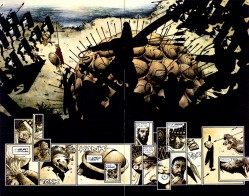
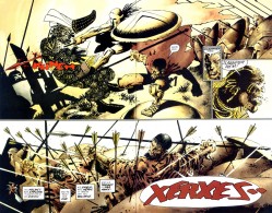
I like this page from the end of 300, color by Lynn Varley:

I love the claustrophobic stillness on that first page. Everything is on hold, like a pregnant pause. Every panel is one still moment, fraught with tension. I actually love the little zoom from “You there, Ephialtes.” to “May you live forever.” And then, at the peak of the stillness, “Stelios.” And then:

Stelios coming out of formation and into the air. This is Stelios on the way down, long after his leap. He’s all muscle, whether leg or arm, and his cape is all the way Batmanned out. There’s such a shift between these two pages, from claustrophobia to freedom, maybe. Anyway.
I can’t decide which page of Holy Terror is my favorite. Here’s one of them, though.

Miller does some of his best work yet in the service of a story that doesn’t even deserve it. He also does some of his worst work, so I guess it evens out. But this page of Fixer chasing Natalie Stack is like a shot across the bow of cape comics, most particularly the ones that sit in Miller’s lane: Spider-Man, Daredevil, Punisher, all those books that feature dudes running across rooftops and through alleys in New York.
There isn’t even a lot to this page. The building is a raggedy amalgamation of every building ever. Look how thin it is, how many pipes and antennas sit on top of it, and that useless pipe going down the side. The night sky is just a splash of white with a smudge of black clouds providing flavor. But look at Natalie Stack flipping up and over that pipe. Feet together, arms in the process of flexing, and body nearly horizontal. There’s a sense of momentum in her body language. She looks like people do when they jump over fences at high speeds. She’s not just climbing or running. She’s moving.
And then there’s that fist. The staging here is great. You’ll occasionally get a story where Batman lurks in the shadows for part of an issue (most recently in David Lapham & Ramon Bachs’s City of Crime, I think), but by and large, if there’s a hero on the page, he takes precedence over everything. Not here. Here you just have a fist and a taut rope. You don’t even have to see the Fixer to know that he’s moving fast. All you have to do is let the image sink in a little. Think about that taut rope, the angle of his arm and where his body is likely positioned.
I also love the punctuation-less word balloon, something that too few comics creators utilize these days. “Oof.” has a different impact on your brain than “oof” does. Exclamation points are excitement. Periods are flat. A lack of punctuation has a sound and import all its own. It should be a tool in the toolbox, rather than an exception.
Another favorite:

The rope, the loops, the soles of the Fixer and Natalie’s feet… I just love how this looks. People talk a lot about flying representing freedom. The freedom to go anywhere and do anything at will. Freedom in its purest form. Nobody can tell you “No” or hold you back. But nobody ever talks about swinging. You don’t remember being a kid and that vicious thrill you got when you could swing on a rope or slap your way down the monkey bars at recess? Of sitting in a swing, getting up as high as you can, kicking your shoes off even higher, and then launching yourself into the air to risk either death or glory?
I don’t want to over-sell the feeling, but I grew up in and around areas where monkey bars were everywhere and chain link and wooden fences were even easier to find. But there’s definitely a thrill, every single time, when you don’t climb a fence so much as leap over it, pushing yourself up and over. It’s different from flying and falling, but equally dangerous. It’s like the bastard child of both of them. You could screw around and catch your hand on the sharp part of the fence instead of the round pole, or misjudge your jump and land on the fence or worse. But if you hit it just right, that combination of momentum and weightlessness kicks in and you feel real good. It’s a thrill.
That’s what that page feels like.

The way lettering happens nowadays, I have to wonder at the risk that any non-superstar creator runs by trying to include punctuation-less dialogue or any sort of typographical innovation.
I mean, Morrison and Miller and so on can probably count on a faithful translation, but some newcomer on a tie-in? He might not have his wishes respected so carefully.
While I’ve never liked Frank Miller’s art style much, one thing that always struck me about it, aside from his incredible pacing and page layouts, was the pure physicality on display, even as far back as his Daredevil work. He knows how to make you feel a punch or a gunshot. It never quite registered until I read this, though, that the talent extends beyond just violence.
Also? I loved hopping over fences and poles as a kid. Actually, I still do. Wish I had the endurance to be a parkour runner, heh.
[…] Commentary | David Brothers shares his appreciation for how Frank Miller “draws a body in flight,” showing examples from 300 and Holy Terror. “He has this way of suggesting bodies flashing past at high speeds and spinning through the air that’s… elegant, is the closest word I can think of for it. Especially mid- to late-era Miller. The big splash in Dark Knight Returns — you know the one, if not, guess and you’ll probably be right — is obviously cool, but it’s not as raw and frantic as his Sin City and 300 work. I actually have a selfish wish that he’d gotten to do a real Spider-Man job at some point over the years, just because he’s so good at this and he’s fond of lean, scrawny heroes. Would’ve been the best leap forward in Spider-stylings since Todd McFarlane.” [4thletter!] […]