
7 Artists: Paolo Rivera
July 9th, 2010 by david brothers | Tags: 4321, paolo rivera, spider-man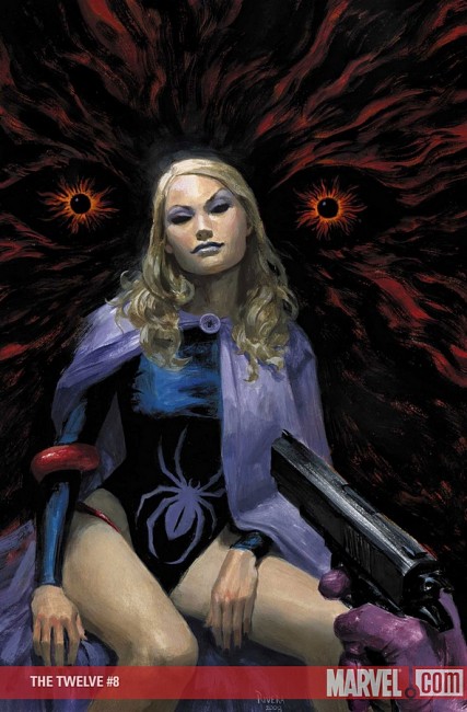
Covers sell comics. I mean, obviously, right? Back when you could buy comics in public, covers had to be exciting and interesting as a general rule. Severed heads, gorillas, and frankly stupid ideas were commonplace, and it was all calculated to catch your attention. As the comics industry became more insular, the covers did the same. They stopped trying to attract civilians and started trying to trick comics fans into buying the issue because “nothing will be the same!” If you look at early ’00s Marvel, and actually several covers recently, it’s clear that they weren’t even trying to reach even comics fans. “Get Adi Granov to draw She-Hulk standing on a gunmetal-y background! That’ll move units! Get Greg Horn to throw some D’s on that joint!” In a word: lazy. Another word: boring. Those are two of the worst things a comic book can be.
Paolo Rivera, though. This guy did a series of fully-painted Marvel books with Paul Jenkins that I liked well enough. They were origin stories, slimmed down and tightened up. Fun, but not particularly interesting, you know? They were stories I’ve read dozens of time before. The art was good, and the writing was okay, but it wasn’t groundbreaking. But his cover work… that’s where he shines. This guy actually makes interesting covers, something that was in short supply for a long time.
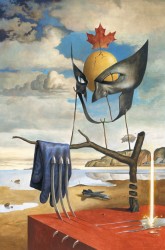
I don’t really have any science for this one. I don’t really know cover theory beyond realizing that some cool type, clever copy, and great art makes for a good cover. I have several cover artists I like (Dave Johnson, Rafael Albuquerque, Frank Miller, Walt Simonson, Jordi Bernet, others), but I couldn’t genuinely tell you why I like them. Not beyond “It looks good.” I’m not equipped.
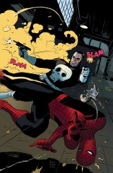
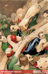
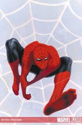
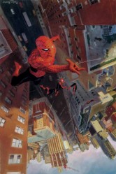
If I strained, I could point out reasons why Rivera is a great cover artist. It could be the little details he puts on his covers, like Spidey’s tiny (but expressive!) eyes, the glow of Cyclops’s visor on the snow, or the awkward mid-motion poses of Punisher and Spider-Man (and his web). Maybe it’s the draftsmanship/craftsmanship in his work. His characters tend to have real weight and are believable in context. Spider-Man is kinda thin, Cap a little tall, and Punisher looks a little like a creepy child molester. Maybe it’s the hand-lettered sound effects. Maybe it’s how he knows how to draw your eye to a specific point on the cover. Maybe it’s the look on Sandman’s faces while he pummels Spider-Man. Maybe it’s the incredible sneer on Black Widow’s face.
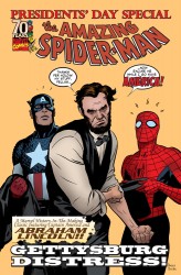
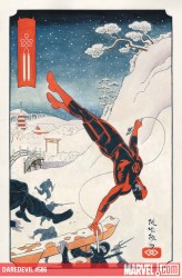
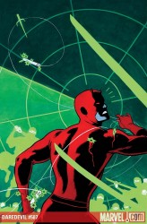
Who knows. Who cares. I’m a firm believer in examining what you enjoy. If it’s worthy of time, it’s worthy of examination. Why you like it, what’s good about it, what it says, what it means. Whatever. At the same time… sometimes you just have to sit back and like things. Sometimes that’s nice.
I like Paolo Rivera’s work.
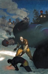
And this cover down here, with the blue and the red? Cover of the year and instantly one of my favorite Spider-Man images. No contest. It doesn’t even need any copy. It knocked my socks off when I first saw it. Even if you didn’t know from covers, that’s a cover. Check the process here.
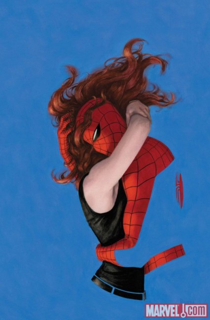

Yeah, Paolo Rivera is a beast. The last image you posted and the Japanese print looking Daredevil one are two of the best covers in awhile period.
I “just like” covers too. I could go on and on analyzing them but like you sometimes I just like what I like. That sandman cover is boss. Other artists kind of like Rivera for me are Dustin Nguyen, Skottie Young and Stuart Immonen.
I really love these articles, David. I’ve been sick this week and it’s been great to look forward to them. In my downtime I’ve been trying some of my own. It’s fascinating to look at artists in a more in-depth way like this.
Marvel should have Rivera do an artist tutorial on how to take your own reference photos instead of tracing magazines.
http://paolorivera.blogspot.com/search/label/Wacky%20Reference%20Wednesdays
Riviera is a fantastic cover artist and I like his interior artwork too. There’s a Spidey/Wolverine story in a recent Spider-Man collection that’s easily one of the best post-Brand New Day stories that really made me take notice of his artwork.