Black Future Month ’10: Julian Lytle
February 18th, 2010 Posted by david brothers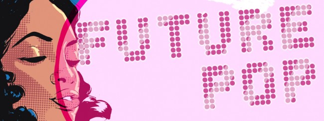
I’ve known Julian for a few years now, and he’s even contributed to a couple of posts I’ve done here. We came up around a lot of the same stuff, though several states and a couple years apart, and his perspective is always something interesting and engaging. I’m pretty sure I spent most of one New York Comic-con chilling at or around his table while he was hustling to get some commissions done and chatting about ’90s rap, superheroes, and where comics need to go. Pay attention.
His style is something like modern pop–something you could describe as “ripped from the headlines” if it wasn’t just slightly ahead of the curve. Bright colors, bold design, and slick composition make up his Guns’n’Honey series, while his figure work is part-manga/anime, part-superheroic style, and part-something else. We’ll call it Future Pop. Right now, you can check his website or his webcomic Ants. Click any of the images in this piece to be taken to his Flickr account. If you see him at a con, hit him up and get on his list for art. You won’t regret it.
We’re around the same age, though I think you’re a little older than I am. What’s your genesis? How’d you get into comics and what made you pursue in art? Basically, who is Julian Lytle, and how did he come to be?
Yeah, man, I’m getting old. It’s all mental though. When I was little, I wanted to be an “everything scientist.” I can’t tell you what that is, but then I saw the original weeklong Teenage Mutant Ninja Turtles cartoon. That got me hyped. I started drawing really back then. I could draw a perfect copy of the cartoon-style Turtles. I also used to watch this show called Secret City on PBS. It was like a personal art class everyday. I used to tape it. I loved to watch Bob Ross, all the landscapes and happy trees.
I didn’t fall in love with comics or anything until X-Men #1, which I think is one of the best superhero comics ever made. Jim Lee was gully on that book. The opening with the training to this day looks beyond what I can do to me. I was hooked on X-Men from that day. I had all the trading cards. My first comics were DC though. But, comic books wasn’t my thing until 12. Before that, the comic strips were my thing.
Another thing that got me into art was popularity to a degree. I wasn’t an athlete or the smartest or the best looking, but I could draw the best. And as a kid, being the guy that could draw a Ninja Turtle was some juice. Even girls liked them. The schools always pushed me, like them kids who could play basketball and stuff. I never felt like the ostracized fanboy, I guess ’cause I liked video games and sports. I think that helped my art, I try to stay with what’s current, what’s poppin’.
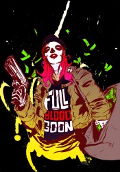 Your style is pretty distinct. If I had to describe it in terms of genre, it’s like “retro future pop.” Your style brings throwback designs, trends, and styles into the future, updating them for the modern day and adding a splash of bright color into the mix. I’m thinking specifically of the Jubilee picture you did a few years back and your Guns’n’Honey series. They aren’t in a typical pinup style, but still manage to work extremely well. How’d you develop this style?
Well, my mom died in the summer of 2006 and I didn’t draw for a couple of months. I was watching some videos on TV and it got me thinking. My friend gave me the line “guns and honey” and I started drawing a cute woman from a picture and she had a gun. I changed some stuff that I didn’t like. I did another one and another.
Those are the first Guns N’ Honey. Kind of just experiments and getting my feet wet again. Then I started thinking about what I was seeing in rap videos. The things you see the most are women, usually objectified. They also, most of the time, talk about violent acts. Rap also has a need to boast about things, particularly fashion–Gucci, Yves Saint Laurent, Louis Vuitton, all of that. So I mixed all that up, but instead of men with guns, like others have done before, I used women. But I wanted it to look like a fashion spread you’d see in Vogue or V.
I used design elements and typography to set apart my pieces from the most. I want to use bigger, coloured, zip-a-tone style shading. I started taking lyrics from songs I listened to. I got “Talk to the Cannon” from Weezy on that Dedication 2 mixtape. The piece made itself. I found the reference on my computer that I knew would work, changed some things, had my colourway set, and laid out the type and bam, it was done.
Over time I started trying to make them look like old genre movie poster or pulp novels. Robert McGinnis is a big influence, but so is Hype Williams. I’ve also always wanted to get into fashion illustration since I was really young. So, this is, in a way, me just doing stuff on my own for myself.
I’ve been told I draw the type of girl I want. I don’t know about that, but I do try to draw women that look strong and dangerous, but not all naked for any old reason. Not every woman has huge breasts, and, you know, a woman with a B-cup and a t-shirt on looks good too. I also like taking poses of men and flipping them with women, like Malcolm X’s window picture and James Bond’s Quantum of Solace newspaper ad.
So, you could say that my style is from consumption and regurgitation. It is pop culture because that is where it comes from. What’s funny is that I couldn’t draw a female without copying from a comic book until I was like a senior in high school. I sucked at drawing women until college. Now, that is all I draw.
Read the rest of this entry �

