

Luke Cage, keeping it realer than most
March 12th, 2014 Posted by david brothers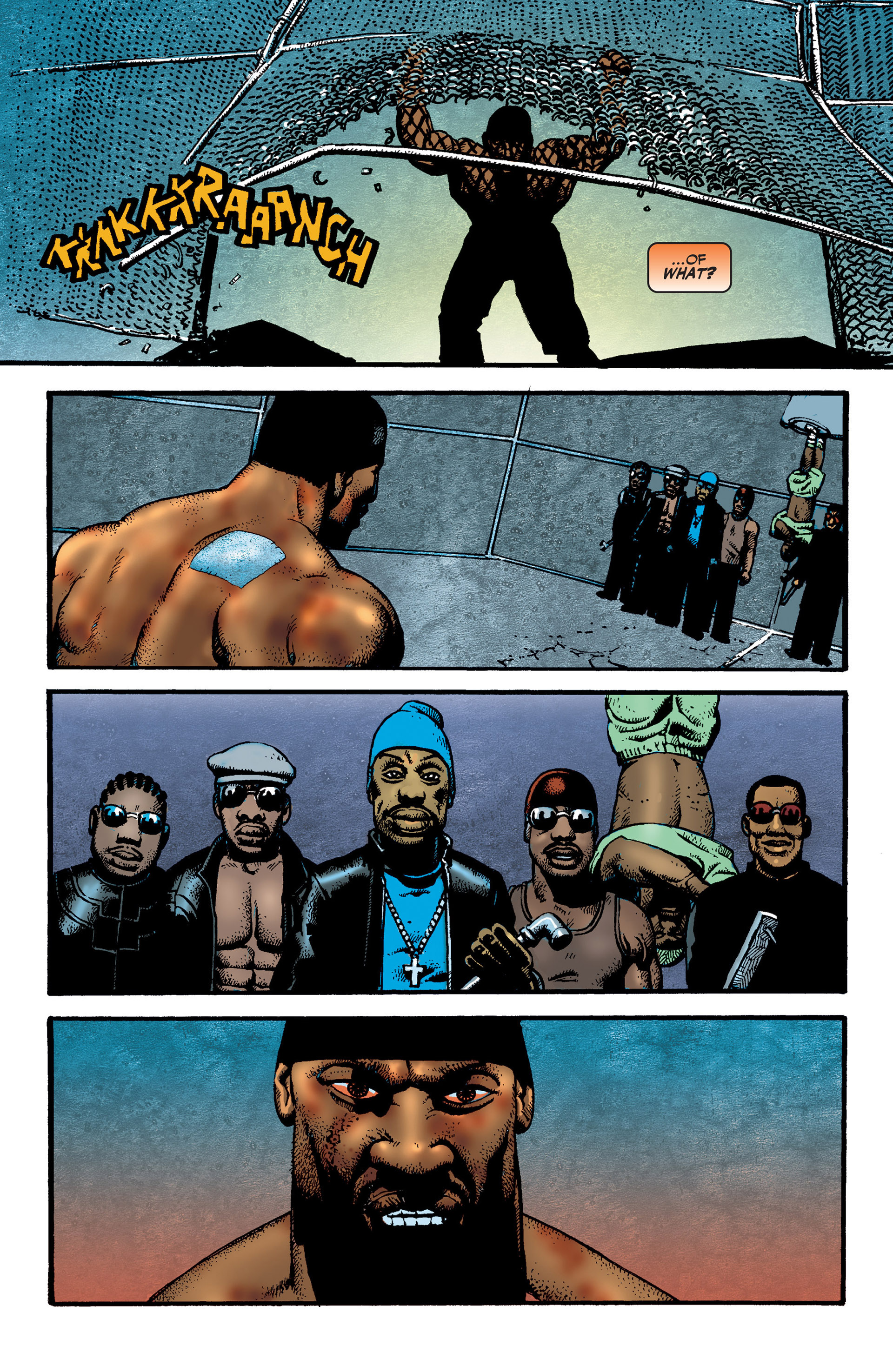
Richard Corben, Brian Azzarello, Jose Villarubia. CAGE, 2002.
I re-read this one the other week. It’s one of the comics I got way back when I was getting back into comics, and was probably one of my first Corben comics, too. I hadn’t read it in years, and I’ve been thinking about it a lot since I re-read it. It looks like the last edition debuted in 2002, and the series hasn’t been re-packaged since, which is a shame. The intro to the hardcover, written by Darius Jones, is called “Straight-up Real Nigga,” something I can’t imagine Marvel ever associating with Cage in the here-and-now, but also an idea I’d love to see the character actually be able to deal with in the comics themselves.
Corben and colorist Villarubia put in work on this page, and it’s probably my favorite image of the character. There’s no tiara, no yellow shirt, nothing that screams “This is Luke Cage!”, but it’s still signifying nonetheless. You get the sense that he’s dangerous, he’s mad, and he’s invincible. You can hurt him, you can knock him down, but you don’t get to win. That background Villarubia threw behind him in panel 4 is great, a bloody sunset that follows in Cage’s wake.
![]()
![]()
![]()
![]()


