Archive for the 'Read Good Comics' Category

h1

“Could ya see yourself with a Spider workin’ harder than 9 to 5?”

September 29th, 2009 Posted by david brothers

Sometimes you don’t realize how much you miss something until it comes back.

One of the best parts of Spider-Man’s supporting cast are the female characters he meets, befriends, and sometimes dates. Glory Grant, Gwen Stacy, Mary Jane, Betty Brant, Liz Allan, and probably a dozen others. They ran the gamut from weepy and hot-for-teenager Lee/Ditko-era Betty Brant to determined Gwen Stacy to party girl with a heart of gold MJ.

While Aunt May and MJ’s Aunt Anna were both pretty much cut from the same cloth, with Aunt May being a little more frail on occasion, the rest of the women came from all walks of life, and the series benefitted from it. One woman who is absolutely in my top three, though, is Felicia Hardy, the Black Cat.

Felicia brought a more realistic version of the Clark/Lois/Superman love triangle to comics. In a world where you honestly have a choice between the heroic hot dude and the shlub who just kinda stutters a little, who in the world would choose the shlub? Felicia is an attractive cat burglar and lives the high life. When Spider-Man reveals his identity, all she can say is, “Put your mask back on!” It’s Spider-Man she loves, fabulous man of mystery and amazing hero, not Peter Parker, Dude Who Worries About His Rent.

Felicia brings something to the Spider-books that MJ or Gwen never could. She’s got abilities that raise her above the level of “normal comic book girl.” Her bad luck powers are only icing on the cake for her agility, general physical fitness, and ability to plan a crime. She knows the risks and enters into them of her own free will. Her fun-loving nature, too, provides a wonderful contrast to Peter Parker’s constant gnashing of teeth.

She was actually in my first comic, though she jobbed to Venom there. Amazing Spider-Man #316, the beginning of Venom’s big comeback tour. She comes looking for Spider-Man, not knowing that 1) he’s married and 2) moved out. Venom catches her while she’s in Spider’s old apartment, beats the snot out of her, and leaves her in tears. Great going, guys.

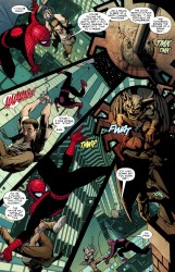
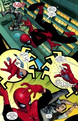
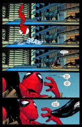
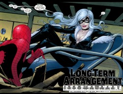
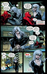
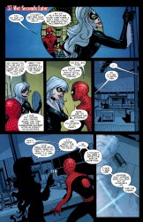
Amazing Spidey #606 brought the Black Cat back into the Spider-Man family proper, with her first appearance in the flagship book since Maximum Carnage. Do the math: that’s 16 years. She showed up in various miniseries and probably Spectacular or Web Of, but Amazing is the Spidey book. Seems like a long time, doesn’t it? Luckily, her return to Amazing Spider-Man is also a return to form, as she reminds me of the character that I loved back in the day.

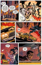
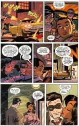
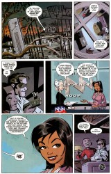
From Amazing Spidey 606, words by Joe Kelly, pictures by Mike McKone, with Chris Chuckry on colors:

blackcat_001blackcat_002blackcat_003
blackcat_004blackcat_005
blackcat_006blackcat_007

Welcome back, Felicia Hardy.

Post to Twitter Post to Facebook Post to Reddit Post to StumbleUpon

h1

Darwyn Cooke’s Richard Stark’s Parker: The Hunter

September 18th, 2009 Posted by david brothers

There are three books all comics readers should be forced to read this year, at gunpoint if necessary. One is David Mazzucchelli’s Asterios Polyp. It’s the kind of book you read a couple times, discuss with your friends, and dig into to figure out what it really means. The second is Naoki Urasawa’s Pluto. Pluto re-contextualizes a children’s character for an adult audience and creates a compelling work that inspires complicated emotional reactions and rewards careful reading. The third is Darwyn Cooke’s Parker: The Hunter, which presents a classic revenge tale in a new format and is just an all-around great read.

Richard Stark’s The Hunter is a classic novel and an almost archetypal revenge tale. Man is wronged by his partner and his woman, has his money stolen, and is on a quest to get it back, no matter the consequences. The titular hunter is Parker, no other name given, and he is, almost to a fault, a professional crook.

Cooke’s adaptation a word for word transplant of the novel into comic form, nor the rote adaptation of a work you’d see other companies hack out to secure a quick buck. Cooke took the book, examined what worked as a novel, figured out what would work as a comic, and, well, he did it and he succeeded.

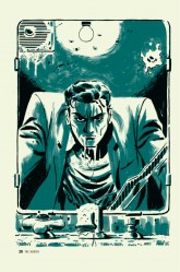
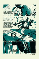
There are two two-page spreads in The Hunter, which are roughly 80 pages away from each other. The first of two two-page spreads opens the book with an overhead shot of a city, with “New York City 1962” stamped on top of it. The second spread is inevitable, something we all knew was coming and eager to see. Parker finally locates and gets a chance to get his hands on Mal, who has literally been caught sleeping.

thehunter_02That first spread is a starter’s pistol, as the next 80-some pages build up directly to the second spread. We see Parker’s long walk into the city and solvency, a largely wordless sequence save for a couple of muttered insults. While the wordlessness is nice, the real thing to pay attention to is Parker’s reaction to society.

He blends in very well. People, innocent people, offer him rides, give him blushing looks, and proposition him. He’s large and imposing, but he isn’t immediately identified as trouble. He’s enticing. Parker’s reaction to all this, though, is contempt at every turn. He tells the man who offers him a ride to “go to hell,” he walks down the middle of the bridge, he hops a subway turnstile, and he bums a smoke off a cute waitress before blowing the smoke in her face and leaving. Parker’s an outlaw. He’s got no place in proper society, and he doesn’t want one. He knows that he can take what he wants and, with proper planning, get away with it.

When the words come back, Parker’s reintroduction to the world is over and he’s all business from there on out. There’s little to no emotion to be found, and Cooke’s art reflects that. He doesn’t break from a strict grid for action shots or cool poses. It just hits, one after the other- bam-bam-bam.

When the grid finally breaks, it’s due to a change in the story. Parker’s flashback of his betrayal forces the words and the art into separate boxes, giving both room to breath and stretch their legs. They snap back to the grid soon after, though, and the story proceeds apace.

The first spread comes before books one and two. Book one is Parker’s reintroduction, while book two features the last days of the traitor, Mal. The second spread is the last image in book two, and it’s Parker coming through the window for Mal’s throat.

While the first two books were far from actionless, the second spread sets the stage for the rest of the book. Parker is within spitting distance of his target, and from here on out there is only going to be violence and death. Book three is the chase, and culminates in the end of Mal Resnick.

TheHunter_01Mal’s death, despite being a big deal, is treated as economically as the rest of the book. There’s no grand struggle, no promises, nothing. There is just a man and his big hands wrapped around the throat of the man who wronged him. Cooke is telling a story first and foremost, and everything is subject to that. Dialogue is to the point, the art enhances what’s going on. Characters act through facial expressions and body language. When Parker twists the filter off a cigarette, that’s character. When he slouches on a couch to sleep and awakes from his nightmare, you can see the malice in his pose.

Even the art style is economical. Black, white (though really an off-white/cream, due to the paper), and brushed green are the only colors you’ll find in Parker: The Hunter. Nothing stands in the way of the story that Cooke is telling. The limited palette gives the book a different feel than your normal black and white affair. It feels murky, not in a muddled art sense, but in the sense of a tale that’s nice and grimy. It’s dirty and thick, with some panels colored in completely and others decorated by splashes of green.

I think part of why I love The Hunter so much is because it doesn’t mess around at all. Each page is packed with info, whether there are words on it or not, and the grid is only broken for very specific reasons. The fact that it’s in a grid makes it very easy to read, but it also gives it an inevitable feel. The book moves along at a rapid pace, building up momentum toward Parker’s revenge like a snowball rolling down a hill, and you can’t escape from it any more than Mal can.

Parker: The Hunter is a page turner. You start it and you burn through it, and you’re left feeling satisfied and thirsty for more. The art and the story came together in a way that resulted in an excellent adaptation that’s extremely faithful, but still different enough to stand on its own. I read over a dozen of Stark’s Parker novels in the month or two leading up to Parker: The Hunter’s release, but this book still felt as fresh as a new Caddy. This is how you do an adaptation.

Three books: Asterios Polyp, Pluto, and Parker: The Hunter. As far as I’m concerned, Best of the Year is a three-way tie.

Post to Twitter Post to Facebook Post to Reddit Post to StumbleUpon

h1

She’s Just Not That Into You, Denny Colt

September 17th, 2009 Posted by david brothers

I didn’t really care about The Spirit before Darwyn Cooke came along. I knew of the character, and I’d read Dark Horse’s excellent Eisner/Miller, but I never had any interest in the character or the comic. Really, about all I knew is that everyone loved it, it was a classic, that it’d influenced a handful of writers and artists I enjoyed, and that Ebony White was shameful.

I finally gave the character a chance when Cooke’s run began. Darwyn Cooke, J. Bone, and Dave Stewart on colors is really the kind of creative team you shouldn’t turn down at all. So, I got over myself and finally dipped into Eisner’s character… and I wasn’t disappointed.

Cooke hits the ground running in the first issue, providing only a hint at The Spirit’s origin. Barring that page, the rest of the issue is essentially a series of chase scenes and fights. The Spirit has to rescue a kidnapped TV reporter while simultaneously evading her kidnappers and surviving Ginger Coffee’s idea of journalism.

This version of The Spirit feels old-school without being old. DC has been trying to bring back the olden glory days of their universe by bringing back Supergirl, Hal Jordan, and Barry Allen, but the stories just feel overwrought and hollow. With The Spirit, though, it just feels classic. You’ve got a hero (clean-shaven, lantern-jawed, virtuous), a damsel in distress, an angry ally/mentor, and a kid sidekick with a smart mouth.

I think what sold me on it in the end, though, was the last panel. The Spirit #1 ends with a joke, in the comic book-equivalent of a sitcom freeze frame. And that’s good. That’s the mythical “fun comic” that everyone’s been looking for and talking about. Open on action, throw in some adventure, end on a laugh. The hero spends 21 out of 22 pages being heroic, and the last panel is a joke at his expense. It reminds me of old cartoons, but with 2009% less cornball behavior.

The Spirit #1 is a fair indicator of the rest of Cooke’s run. The remaining issues dip into melancholy, slapstick humor, weirdness, action, and adventure in varying amounts, but it’s all here in microcosm. Cooke gives us the hero, but having a generic hero can get a little boring, so he throws a little sauce into the mix. Yeah, The Spirit is a good hero, and sometimes troubled, but you know what? He likes life. He has fun.

And Ebony White is dope.

spirit01spirit02spirit03

Post to Twitter Post to Facebook Post to Reddit Post to StumbleUpon

h1

How I Learned to Love The Cat

September 16th, 2009 Posted by david brothers

Before The Hunter came out, Selina’s Big Score was my favorite Darwyn Cooke book. I’ve liked Catwoman for years, but for no good reason. It wasn’t the spandex, because I got over “ooh, hot girl comics!” pretty quickly. It definitely wasn’t the character, as I only really liked her in Miller and Mazzucchelli’s Year One before I read SBC.

I think what it was that made Selina’s Big Score work so much for me was the tone. SBC is this dark, inky, noir-y heist tale. There’s no costumes, not really. It’s just about a woman who needs a big score, the team she gathers to make it work, and the troubles she runs into. More than anything, though, it’s glamourous. The cover promises the kind of heist tale that features fast chases, pretty people, and action, like the finest of ’70s crime cinema.

The insides more than deliver. Characters are introduced by text on black panels, a technique I’ve always loved when I’ve seen it in movies. The graphic novel is divided up into four separate books, making for easy chapter and story breaks.

The first chapter, Selina, sets the stage for the book. Selina had money, but lost it, and now she needs it back. The second chapter, Stark, focuses on the muscle. The third chapter, Slam, gives us the down low on the man chasing Selina. The fourth chapter, Score, gives us the heist itself.

The writing is sharp and fast-paced. Old friends and new enemies are introduced with aplomb, leaving you just enough to get going, but not so much that you can’t apply a bit of imagination into the mix. Cooke doesn’t overload on the first person captions, either. Slam’s section is appropriately hardboiled, Stark’s is cynical and, well, stark, and Selina’s is borderline hopeful. Rather than being a crutch, or another way to show the tortured existence of these heroes as they buckle under several tons of angst, the captions come across as genuine character builders.

Selina’s Big Score crawls across genres, too. Slam’s the tired avenger, the very picture of the good man alone in a hard world. Stark is Parker– impatient, amoral, skilled at violence, and professional to a fault. Chantel is a blaxploitation figure, a good girl in a bad situation, and uses her sass as a defensive mechanism. Jeff is your ’90s action movie criminal, seemingly all flash and recklessness, but with a surprisingly solid core. And Selina? She’s the ever-present femme fatale, but put into a position where she’s the focus, rather than a sidekick or villain.

Cooke mines several decades of American cinema to create the comic book heist story to end all comic book heist stories. It gives Selina Kyle the Year One treatment. It redefines her for a new era, re-contextualizes her as a character, and provides a focus that I feel like wasn’t there before. Pre-SBC, to me, Catwoman was another sexpot in spandex, all cat puns and tortured Jim Balent poses, clothes strategically torn. After? She’s viable, interesting, and has a movie-ready story that puts a lot of other books to shame.

Post to Twitter Post to Facebook Post to Reddit Post to StumbleUpon

h1

Happiness is a new Yotsuba&!

September 9th, 2009 Posted by david brothers

Yotsuba&! is basically the best manga.

I mean, there may be better. I’m pretty fond of Akira and Pluto, and Pluto is hands-down the best comic to come out this year, but Yotsuba&! is basically the best. It’s the one that leaves me in the best mood after I finish it. Where Akira and Pluto are something to ponder and mull over, Yotsuba&! is a book to enjoy.

ADV published Yotsuba&! up until 2007’s volume 5. Volume 6 was scheduled for early 2008, but it never appeared on shelves. Luckily, Yen Press is there for us, as volume 6 comes out this month. Either this week or next, depending on your local retailer. Perfect time for a look back at the series, right?

Kiyohiko Azuma’s Yotsuba&! began life in March 2003 as an ongoing feature in Dengeki Daioh. His previous strip, Azumanga Daioh, was a four panel strip, called a 4-koma, that was set in a high school and had a cast that was largely composed of high school girls. It was another feel-good strip, which was turned into a successful anime. However, Yotsuba&! surpasses it by far.

Azumanga Daioh, successful as it was, was pretty simple, visually. The comics were four vertical panels, about half a page wide or so, with light background work. He added just enough detail so that you’d know that the characters were in a class room, or a pool, or outside, and then put most of his effort into funny facial expressions and pratfalls.

Azuma’s work on Yotsuba&! switches that up completely, as he works with normal-sized comics pages, and rare goes higher than five panels a page. This gives him plenty of room to display a pretty stunning level of talent. He’s created a realistic world that still meshes with his cartoony and expressive art. So, when something crazy happens and Yotsuba’s eyes go swirly or Fuka’s mouth goes wide, it all works. It doesn’t yank you right out of the work, like other deformed works can.

Yotsuba herself is a very young girl who isn’t naive so much as she is a child. She’s less mischievous than Calvin, but enjoys life just as much. Everything has its charm, and nothing gets her down. She lives life full throttle, never pausing for breath. She takes everything in stride, and all of it’s awesome. When she learns about global warming, she angrily confronts her father about being an enemy of the earth because their house has an air conditioner. When she gets locked in a bathroom early in the morning, she just crawls out of the window and goes for a walk in her pajamas.

The cast is small, but effective. There are three sisters who live next door with their mother, Yotsuba’s father, his best friend Jumbo, and a couple other characters who move in and out as time goes on. Jumbo is extremely tall for a Japanese man, sending new friends into hysterics, and is amazingly lazy. The three sisters are various ages and of varying temperaments, leading to fun interactions with Yotsuba. Her father is a translator by trade, and doing the best he can with his adopted daughter.

Yotsuba&! is, if anything, a look at real life through a child’s eyes. It’s a reminder of just how awesome all these things we take for granted, like rain, ice cream, cicadas, and good friends. Yotsuba approaches everything with the same amount of wonder and glee.

Yotsuba&! is a lot like a warm hug, if I can get sappy for a minute. It’s the kind of book that leaves you feeling good after you read it, like payday or a smooth date. If you can read it and not be charmed… well, you should probably see a doctor about some antidepressants.

Yen Press has released six volumes of Yotsuba&! this week. The first five (Amazon: one, two, three, four, and five) are re-releases of the volumes that ADVManga printed before they went belly-up. The sixth is brand new and fresh out. I’ll have my copy later today, so look for a review of it later this week!

Post to Twitter Post to Facebook Post to Reddit Post to StumbleUpon

h1

Parker & Lieber’s Underground

September 8th, 2009 Posted by david brothers

ug_01_00_colorUNDERGROUND #1 (of 5)
Story JEFF PARKER. Art STEVE LIEBER. Color RON CHAN.
32 PAGES / FC $3.50
Diamond Gem of the Month. Solicited in the July Previews, page 132.
In stores September 23rd, 2009. Order code: JUL090341

As WHITEOUT readies to hit theaters worldwide, artist STEVE LIEBER returns to the adventure genre with a new thriller, pairing with acclaimed writer JEFF PARKER (AGENTS OF ATLAS, EXILES)!

Park Ranger and avid caver Wesley Fischer is on a one-woman mission to stop Stillwater Cave from being turned into a tourist trap, but public opinion is not on her side. When locals begin blasting in the cave, Wes and a fellow ranger investigate – and a confrontation spirals into a deadly chase deep under the Kentucky mountains!

I first had the pleasure of reading Jeff Parker and Steve Lieber‘s Underground a couple months ago, when the first wave of review copies went out. I read it, went “Hey, that was pretty good! I should write about this!” and promptly forgot about it. When issue 2 came around… I did the same thing. Here’s a bit of True American History for you: I’m terrible.

Underground is definitely not terrible, though. In fact, it’s pretty good. Seth and Wes, two Park Rangers in Marion, Kentucky, work in and around Stillwater cave. That’s not going to be enough to hang a story on, so Parker and Lieber tossed a few complications into the mix. Winston Barefoot wants to turn the cave into a tourist attraction to bring some money into the community. Wes is a believer in the value of the area’s history, and stands in opposition to Barefoot, even though that also puts her at odd with the citizens of Marion who could really use that economic injection. Also? Seth and Wes just slept together, even though they’re coworkers, and that doesn’t help the fact that Seth doesn’t 100% agree with her.

Complications, right? When you toss in some unsavory types trying to stack the odds in their favor, you’ve got the makings of a good story.

Parker and Lieber do some great things with their storytelling, too. The first issue opens on the naked forms of Seth and Wes laying in a cave. Wes is awake and in silhouette, leaving her fairly mysterious, and looking at a fully lit Seth. As the panels progress, elements of her exploration gear slowly appear, like her gloves and helmet, and finally her full outfit. While this is going on, a newscast is playing in the background, directly on the art. After Wes finishes self-assembling, characters from the town, including Barefoot, appear as an overlay on the cave itself. It’s attractive and effective, and something I can’t recall executed this way before. I’ve seen newscasts and I’ve seen montages, but I haven’t seen them put together this way, or this well, before.

Lieber’s art throughout the rest of the issue is no slouch. The facial acting as Wes relieves the events of last night in her bathroom mirror (another well-done bit of storytelling) before practicing her first words to her new complication. Her final choice, “I… I don’t know what to say or do,” with a freaked out look on her face? Good choice on the part of Parker and Lieber.

The first issue does a good job setting up the town, its conflicts, and its citizens. The second gets right into it, turning into an action sequence, though not really, almost from jump. It’s essentially the tensest exposition slash history lesson you’ll read, as Seth and Wes have to move through the cave while avoiding the aforementioned unsavory types.

Underground is good stuff. The first issue hits on September 23rd, but if you’re really curious, you can grab a black and white PDF of the first issue on Undergroundthecomic.com. The actual comic, though, will be in color, with Ron Chan doing the honors. It looks great, with the cave scenes being properly dark and gloomy. His work on the morning after scene alone is worth the price of admission.

Also, the last page of issue two, with the white outlines? That’s some good comics right there.

Post to Twitter Post to Facebook Post to Reddit Post to StumbleUpon

h1

The Punisher: …and those for whom there are no words

August 12th, 2009 Posted by david brothers

In the end, Garth Ennis’s Punisher was about both the best and the worst of humanity. The worst, in that he represents just how thoroughly a human being can be broken by the unthinking and inhuman actions of others. The best, in that he looks at the terrible things that the best of us tolerate and says, “No more.”

Ennis’s Punisher isn’t a hero. He may do heroic things, and he may save lives, but he’s no hero. He is, at best, a murderer whose goals happen to coincide with those of many members of society. Punisher MAX really works for two reasons. Ennis treats the series as a war comic, making sure to show the effects of the violence on society and the characters. He writes Frank Castle not as the Punisher, a costumed mental case with a mad-on for criminals, but as a soldier using the things he learned in Vietnam to put the screws to the people he hates.

Frank Castle is no one to look up to, but he exists as the ultimate “If I could…” character. A social worker partway through the series, in the phenomenal The Slavers arc, gives Castle information on his targets, against her better judgment, because she wanted them to pay for what they’d done. She knew the law would never be able to touch them and that they would skate through life, and she hated them for it. They were trash, less than human, and the only person who could do what needed to be done was a man wiling to be inhuman to them right back.

And he does so, if not admirably, then with a certain amount of skill. He makes a child of a hard man with ease, before he finds the woman who helped mastermind the entire scheme. When she begs for her life, explaining that they just wanted to be in America and do business, he coldly tells her, “All that counts is you can’t stop me. I’m stronger than you, so I can do anything I want.” There’s a beat, as time passes and the panel switches, and he asks her, “Isn’t that the way it works?”

And it’s wrong, he’s beating this woman to death, and it’s terrible… but she’s the one who came up with the “rape them to break them” plan. She was willing to use other people as cattle to make sure that she lived a life of luxury. You’re appalled, and it’s ugly, but deep down, you understand that she’s getting exactly what she deserves. Getting to be a monster with no repercussions is unthinkable. It makes for some uneasy feelings. So, you don’t cheer, exactly, but there’s a quiet understanding, the feeling you get when you squash a bug that might have, or did, sting you. It is ugly, but it needed to be done. It is not a good thing that it was done, exactly, but it was necessary.

Frank Castle is a monster, but he’s also a representative of our gut instinct when confronted with some fresh horror. He does what a lot of wish we could, or, failing that, wish would happen, but make no mistake: he is only better than those he kills by comparison. He is a monster, and when confronted with this fact, he agrees. He cannot bring anyone into his life, because at some point, no matter how happy his life is, he is going to turn on the news and see someone that must be punished. He’s damned, he knows it, and he accepts that it is what it is.

The thing about Frank Castle, the thing that keeps him from becoming a generic and bloodthirsty action hero, is that he takes no joy in what he does. One-liners are rare, and stand out when they do occur. It is clear to both the reader and to Frank Castle himself that he takes no pleasure in what he does. The closest he comes is satisfaction, and even that is a vague inference. He does it because it must be done, and he does it because no one else will.

When confronted with the death of a broken and sad woman, all he thinks is, “If I could, I’d kill every single one of them. I’d wipe them out. And you’d never have had to exist at all.” It isn’t an honorable sentiment, but it is a sad one. Whenever Frank Castle meets a normal person, someone not in his line of work, he’s met with shock, scorn, and horror. They understand his appeal, and a couple characters even take him up on it, but his way is not the way life should go. There is no honor, no glory in being Frank Castle.

Garth Ennis took a derivative character, a Dirty Harry for superheroes, a character used to reiterate the ridiculous idea that heroes should never kill, and used him as a mirror for us. Our fears and our insecurities were put on display and put down over the course of the past five years.

Frank Castle didn’t die at the end of Ennis’s run on the Punisher, but I’ve read all the Punisher stories I need. I can’t read the one that fights supervillains, gets up by superheroes because he’s a loose cannon, and never seems to accomplish anything. I can’t take him seriously. It’s like going from photorealism back to stick figures, from the modern age back to the Silver Age, or aging backwards. I’ve read a Frank Castle that brought feelings and thoughts that I’d left unexamined right to the forefront of my mind. I watched him murder people, people who absolutely deserved it, and felt that that was the only way their story could have, and should have, ended. I’ve had to examine my reactions to his actions, and figure out what that means about me as a human being. And, honestly, I’m better for it.

After The Slavers, Punisher vs Kingpin is hollow. I’ve seen real villains in these pages, and that comic book nonsense is just that. The Punisher shouldn’t be a character that makes you pump your fist and go “YEAH!” At this point, that’s a take on the character I want nothing to do with. It’s boring and retrograde.

Those five hardcovers on my shelf, though? Those are five of the finest, and most thoughtful, books Marvel ever put out. It’s a poorer comics world without them. All five volumes are on Amazon. Five, Four, Three, Two, One. The hardcovers collect two stories a piece, and are by far the best way to read the series. These are comics to get angry to and comics to care about. These are comics to think about.

Post to Twitter Post to Facebook Post to Reddit Post to StumbleUpon

h1

And the Panel of the Millenium Goes To…!

July 22nd, 2009 Posted by Gavok

No, not the last couple pages of Legion of Three Worlds with Superboy Prime. Though David Uzumeri had his own fun with that scene. The bastard.

Dethklok vs. the Goon is great fun.

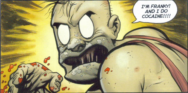
Eric Powell’s cartoony depictions of Dethklok and the other Metalocalypse characters is wonky at best, but the one-shot is still worth picking up. Funny and filled with such meetings as Rockso and Franky, Pickles and Willie Nagel, Skwisgaard and Momma Norton, Toki and Peaches Valentine and, best of all, Goon and Dethklok’s hooded security army.

On a similar note, Dethalbum II has been given an official tracklist. “Laser Cannon Deth Sentence” is on there, which is all I need.

Post to Twitter Post to Facebook Post to Reddit Post to StumbleUpon

h1

Bloody Pulp: 9 Months

July 20th, 2009 Posted by david brothers

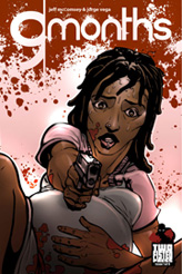
ad_9mI dig Jorge Vega and Jeff McComsey’s 9 Months, but I think my favorite part might be the cover. It’s a simple picture, just Thomasina, knee-deep in pregnancy and holding a gun while looking surprised. Something about it manages to sum the series up pretty well. This isn’t one of those books where it’s about backflips and double dragon flip kicks. It’s about desperation, and hard choices, and responsibility.

9 Months is, more or less, about the funny turns life takes. Thomasina went from a promising track star to being stuck in a rut. She got the coolguy boyfriend who turns out to be more of a jerk than a coolguy, she alienated her family, and now she’s pregnant. Her past as a track star and present as something else are constantly put into direct conflict over the course of the first issue. Running is even used as a metaphor for why she distanced herself from her family. It was teenage rebellion, basically, but she was sure she was running toward something sustainable.

Later, covered in blood (her own and her late boyfriend’s), I think she starts to realize that she hadn’t. Instead, she’d forsaken what was good in her life in favor of what was flashy. When she’s forced to choose between her current life and the life of her unborn child, she picks the youth and fights back, killing her boyfriend.

The problem is that her boyfriend was far from a nobody. He was the younger brother of a local big shot, and that big shot has a list of demands for Thomasina. She’s going to abstain from alcohol and drugs, take her vitamins, and have the baby. After that, the bigshot gets to keep it.

The last page of the book asks “how far [Thomasina will] go to protect her child?” and answers “too far.” I’m interested, because Jorge and Jeff have built a small, but realistic, cast of characters and created a way to throw them into conflict with each other over the nine months of Thomasina’s pregnancy. They don’t shy away from violence, but they don’t dwell on it, either. It happens, it’s horrible, and then you have to pick up the pieces.

I’ve only read the first issue of 9 Months, but I get the feeling that it’s about picking up the pieces. You can check out a preview of the book here, and read the first eight pages of Bloody Pulp, Jeff & Jorge’s new work over at Zuda. If you like it, vote for it. Let’s see more from these guys.

Post to Twitter Post to Facebook Post to Reddit Post to StumbleUpon

h1

On Asterios Polyp

July 14th, 2009 Posted by david brothers

Asterios Polyp
David Mazzucchelli
Pantheon
344 pages
ISBN: 0307377326

David Mazzucchelli’s Asterios Polyp is looking like the latest capital A Art book, the kind of thing that people smarter than I (such as Jog or Douglas Wolk) are doubtless going to pore over, deconstruct, reconstruct, and analyze over the next few weeks. And, well, with good reason– Mazzucchelli does a lot of interesting things with the format and formula of comic books, and ends up creating amazing. More than anything, all ideas of what constitutes an “art” comic aside, Asterios Polyp is fascinating.

I read through this 344-page book pretty quickly, and barely noticed the time passing. Each chapter alternates time periods, telling us about Asterios’s history and his present, and are visually distinct. Every fistful of pages, the style switches from a standard comic format to something more influenced by graphic design and experimental. Mazzucchelli shows off a variety of styles in the book, even going so far as to have individual characters exist in their own styles.

There’s a visual metaphor introduced fairly early on, where Asterios and his wife are a combination of two different styles, with Asterios taking the form of the building blocks of a drawing of a human and Hana being the details and shading. When they meet, they merge to form a complete drawing. When strife hits their relationship, Hana violently pulls out of Asterios’s reality. It’s an amazingly effective move, and one which works on a gut level. You don’t need captions to tell you that they’re troubled, or growing apart, or anything– you simply have to look.

Asterios Polyp is so fascinating because it approaches storytelling in a way that only comics can. It takes advantage of the format to do something new and interesting, while coming at it from a new angle. Everything in life is about delivering information of one sort of another, be it via text, pictures, texture, or taste. Mazzucchelli doesn’t use the images in Asterios Polyp to show cool images or poses. Instead, each image has a point. We never (well, maybe twice, but he’s obscured) see Asterios’s face from the front. He’s always looking to the left or the right. It struck me in a few different ways while I was reading. It makes Asterios seem like he’s always doing something. There’s something just off-panel that we can’t see that’s he’s really interested in. However, it also makes him somewhat untrustworthy or uncomfortable. He’s never looking you in the eye. He never seems to be paying attention. There’s a level of distance there.

Most of all, though, it plays into the dualism that forms the foundation of his personal philosophy. Asterios Polyp can be accurately described as the story of a man learning to count to three. He embraces the idea of there being 1 and 2, yes and no, linear and plastic, and form and function. When his life falls apart, he learns to count in threes. (It’s interesting that twos vs threes is portrayed as a yin/yang of its own, inflexibility vs flexibility, but I’m not sure what that means just yet.)

Asterios is a book that’s fun to look at. The color palette is very focused. There are a lot of purples, yellows, pinks, blues, and blacks. Toward the end of the book, though, for a few pages, the palette opens up in an amazing scene. It’s a burst of color, and life, and a symbol of things to come. It’s a counterpoint to the beginning of the book, which was somber and fairly depressing.

Basically, Asterios Polyp is a must-read. It’s straightforward enough that anyone can enjoy it, but has layers that you can peel back and examine. I’m probably going to read it agin in a couple weeks, with the goal of just poring over the art. Mazzucchelli uses a lot of techniques in Asterios Polyp that all comics could benefit from. He got there first, though, and set the bar pretty high. The writing and art are excellent, and full of insights on how both comics and life work.

Asterios Polyp is objectively better than anything you’ve read this year thus far. There’s absolutely no question in my mind about that.

Post to Twitter Post to Facebook Post to Reddit Post to StumbleUpon