buckshot blogging: akira toriyama, static shock, chew, breaking bad, naruto
September 7th, 2011 Posted by david brothersStatic’s back. Have you heard?
Static is one of those series that’s near and dear to my heart. It’s the hands down best updating of Peter Parker thus far, and since Spider-Man is the best expression of a superhero (it’s not Batman, chuckles, Spider-Man is a genuine everyman fantasy character), that’s saying a lot.
Anyway, I was most interested in Static Shock #1 out of DC’s New 52 books that are launching this week. (DCnU looks and tastes like poop when you type it, so chill with that.) It was equal parts interest and trepidation. I mean, DC has managed to screw up everything else relating to Milestone except the trades of previously printed material, you know? What’s next? Ed Benes on Icon?
As it turns out, my fears were pretty much unfounded. Here’s page two of the issue, the moment I decided I would enjoy reading it:

And man, Static is such a goofball and this is exactly what I was hoping to see. Well, not exactly–that’s definitely hyperbole, but as far as the platonic ideal of a comic featuring Virgil Hawkins goes, I’ve got to tip my hat to John Rozum, Scott McDaniel, Jonathan Glapion, and Guy Major. This was a pretty good stab, and enough to make me commit to buying the issues at $3. It’s well worth your time. You can cop it here.
I wrote about Akira Toriyama drawing fight scenes in Dragon Ball, more specifically DBZ for ComicsAlliance. Dude is super talented and I finally figured out a way to say so without just saying “I like how Vegeta effortlessly murks this guy right here.”
I like how Vegeta effortlessly murks this guy right here.
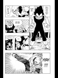
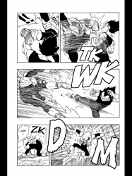
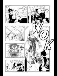
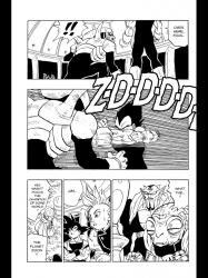
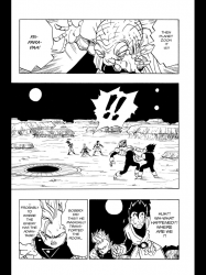
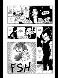
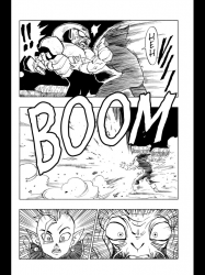
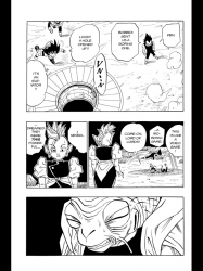
He’s such a thug. ~swoon~
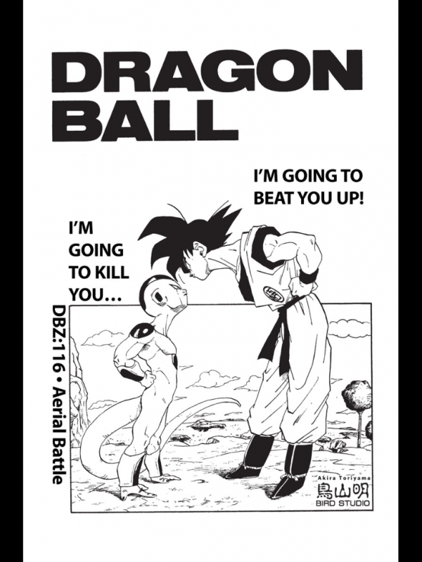
Buy Dragon Ball Z, or just v22 if you want to see this scene.
I wrote a post about how I don’t really dig on steampunk and you know what happened? I went and read a steampunk comic book that I really dug. What’re the odds, man? Here’s a page from it, though, and I think you’ll see why I dug it:

Art team: pencils by David López, inks by Álvaro López, Nathan Fairbairn on colors, and Jared Fletcher on letters. Words team: G Willow Wilson, who I’ve praised before.
This book really clicked for me. It’s a little Cinderella-y, with a twist I saw coming halfway through the book but was still well-executed. I might want to talk about it in-depth later, I dunno, but I liked this page and the book enough to share it. The Lopezes have come a long way since Catwoman, and I remember liking their stuff back then, too. Fairbairn does wonders for their art. It’s like magic.
I’ve been reading/rereading Masashi Kishimoto’s Naruto. Five bucks a volume, man. I didn’t expect to be so weak. I’m ten volumes in now. I got to my favorite bit from the cartoon–the Rock Lee vs Gaara fight? It’s either this or this on Hulu, I dunno. (Hulu is down for me right now.)
I loved the Rock Lee vs Gaara fight because it got so bananas in a way I really, really dug. Fast punches, clever gimmicks–it starts with a punch from the front that almost hits the back of Gaara’s head. It’s awesome fight staging. They blew their animation budget on this episode, because everything after looks like crap crapped out of a crap-filled crap butt.
It looks way better in the comic. Here’s three pages that I liked:


From Volume 10, my dudes.
I love page 3, panels four and five. The dust in the air over Gaara’s head in 3, and then Gaara being almost entirely constructed out of speedlines–including his fist, eyebrows, eyes, and mouth–is fantastic. Good looking comic.
I’m writing these while watching Breaking Bad. I download it, so missing it when it airs isn’t really a huge deal, but it’s marathoning this show is crazy. It’s SO tense, but also very, very funny. Walt is so passive-aggressive. Every once and a while he decides to show everyone who wears the pants and whoops look at that, look who’s pants have pee on them. It’s you, Walt. They’re your pants, and you peed in them, because you suck, son.
Jessie Pinkman is incredible this season. Everything he does, man. A+, give that dude some awards.
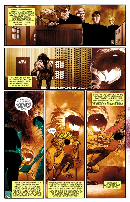
I liked this bit from Chew 20, now on sale digitally:

Tony’s sister doesn’t curse, you see. Simple, ain’t it?
But quite clever.
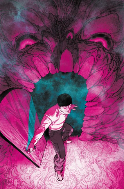
I love this image.
Read Good Comics.

