Archive for the 'Create/Consume' Category

h1

Create, Consume, Recycle 07/05/11: James Stokoe’s Orc Stain

July 4th, 2011 Posted by david brothers

stuff i made

-In a weird funk, like I can’t produce like I usually do. It’s been there before the Akira posts, and is still here now. Working my way through it. Might spend some time talking about things other than comics this week, too.

*~melancholia~*

-Does the blink tag still work? That should be blinking.

Archie’s on Windows Phone

Hey, stop making digital comics just like regular comics, stupid

-Two posts? Cripes. The nice thing about these posts is that it lets me see exactly how much I’m writing elsewhere, compare that to what I’m doing here, and then attempt to adjust.

-Enough talking about writing, read this:


something i like

I bought the first issue of James Stokoe’s Orc Stain way back in December. I finally read it earlier today. Pathetic, right? I have plenty of excuses, if you’d like to hear them.

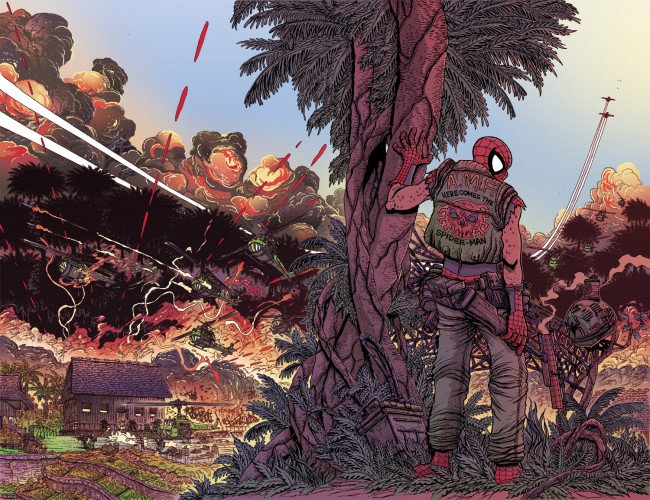
All my friends like Orc Stain. I like Orc Stain, at least what I’ve seen around online. Stokoe has drawn some stuff that blew my mind, most particularly the Spider-‘Nam thing here (brief sidebar: the tone is perfect for both that type of story and Spider-Man, who remains my favorite superhero, even if I haven’t actually liked a Spider-Man comic in ages. I would personally put tens of dollars in Stokoe’s pocket if it meant he’d do an entire story, but I’m also content just seeing him noodle around with the idea. briefer sidebar: it’s also a creepy, unsettling Spidey, just like Ditko’s best.). I just never sat down and read it for whatever reason, even after having bought it.

I like a lot of different things in it. The world-building is pretty smooth, the characters are interesting, I wanted to read more by the end of the first issue, blah blah blah. It’s a good comic, right? Y’all know what goes into good comics. I don’t need to tell you that. I will say that I’m buying 2-6 once I finish this post, so, y’know, there’s that.
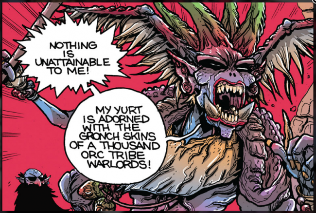
Okay, colors in comics. Specifically, colors in mainstream books, which Orc Stain isn’t, really. The colors tend toward realism, rather than expressionism. Colors are meant to represent what the characters or whatever would actually look like in real life, rather than a mood or tone. There are a few exceptions–I like Bettie Breitweiser’s colors on Jeff Parker and Gabriel Hardman’s Hulk, Frazer Irving is the king of “this isn’t real life, so stop pretending” coloring right now–but by and large, if you flip open an adventure comic right now? You’re looking at colors that are meant to evoke real life.

This isn’t a bad thing, exactly. It’s just a thing that I noticed. Noticing it (probably after reading some Frazer Irving book or getting mad at how Frank D’Armata colors murder the work of artists or noticing how John Rauch’s work on New Mutants and Pete Pantazis’s colors on Justice League were washed out and bright, like a police spotlight focusing on your friends) made me start paying attention to palettes in comics and how they can be used for good, rather than realism.
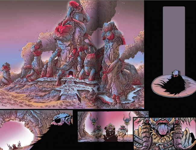
Orc Stain‘s palette is interesting. If I had to put a word, or words, on it, I’d say that the palette is… sickly and visceral, like a half-healed wound. It’s evocative of guts and organs–no, not organs. It’s evocative of guts and hearts. The purples, reds, and blues on this spread remind me of a beating heart, and the dominance of the purple and blue puts me in mind of a heart that’s straining to beat.

(Also? It reminds me of tentacle porn.)

And it fits. It’s a war scene, the orcs are a blight on the land… when you look at the world of Orc Stain, you’re looking at a gaping wound. When you look at the Orc Tzar, with his bright red lips and shock of green atop his head, you’re looking at poison.

Scene two.
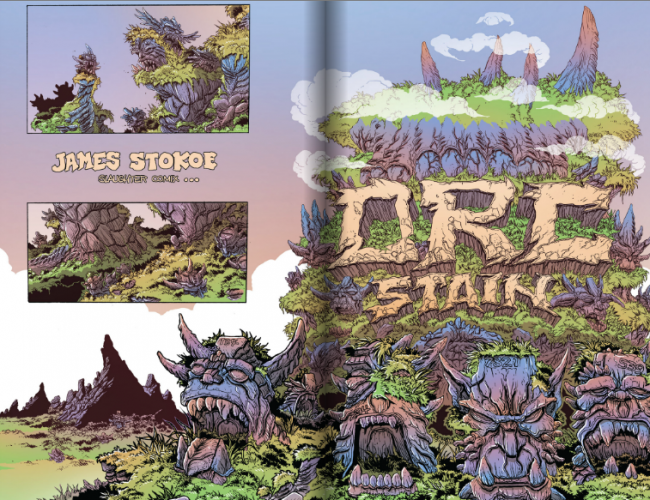
Blue fading into… what is that, orangish brown? in the sky. Blue and tan on the rocks. Translucent white clouds. The striation and layers on the rock faces, continuing the queasy organic horror point, looks like the same stuff on your finger nails, doesn’t it? The orcs are bluish/purplish, brighter than the rocks, with green highlights. Love nymphs are bright blue, like the sky.

What gets me most is that grass. It’s this bright green, the sort of green that comes from either Photoshop, artificial grass, or a fleet of yard workers pulling a week of overtime. Growing up, I never saw grass like that. The sun baked the grass in Georgia to a darker green. Brighter than pine needles, darker than flowers. This color is snot green–well, cartoon snot green. It’s bright and shocking. For us, anyway–it’s natural there.

I like looking at Orc Stain, and the palette is a big part of that. It’s not trying to show me a vision of real life like Dave Stewart did a great job of doing over on Conan with Cary Nord. That palette was rugged and raw, like Conan himself, but was still some measure of realistic. There’s no reason for Orc Stain‘s world to look like the Earth, is there? Orc Stain is a monster comic, and it looks like someone took the 1931 Frankenstein and put it through a Technicolor blender.

It works, and it works well. I’m a fan.

Here’s a Spider-‘Nam spread that Stokoe colored:
Post to Twitter Post to Facebook Post to Reddit Post to StumbleUpon

h1

Create, Consume, Recycle 06/27/11

June 27th, 2011 Posted by david brothers

stuff i made

I got quoted on HuffPo about Green Lantern

Writing about Akira for ComicsAlliance, making all you other websites look bad

something something captain american movie stand for france

something something hal jordan bomber jackets

somethings something bomber jackets part one point five

who let all these frigging bomber jackets into my digital comics


something i like

This is a minor aspect of the text, perhaps, but I say it is still significant because this is my blog and my Akira website. (Join the webring.)

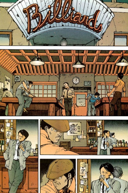
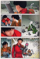
I’m about 9500 miles too far away and twenty years too late to want to wear most of the clothes in Otomo’s Akira, but I do enjoy his sense of fashion. Characters tend to be grouped into demographics and dress accordingly–twentysomething men rock button-ups and ties, military men wear suits, and teenagers dress casually or for biking.

It’s sort of a throwback, but the billiards scene up there? That makes sense to me. It’s a bunch of guys who are fresh off the job and looking to de-stress after a long day. Loose ties and rolled up sleeves, right? The man still wearing his jacket still has his collar buttoned up and tie straight. He looks out of place, doesn’t he? He does. And later, in another bar, he’s figured out how to blend in. Big smile, sleeves up, jacket in hand.

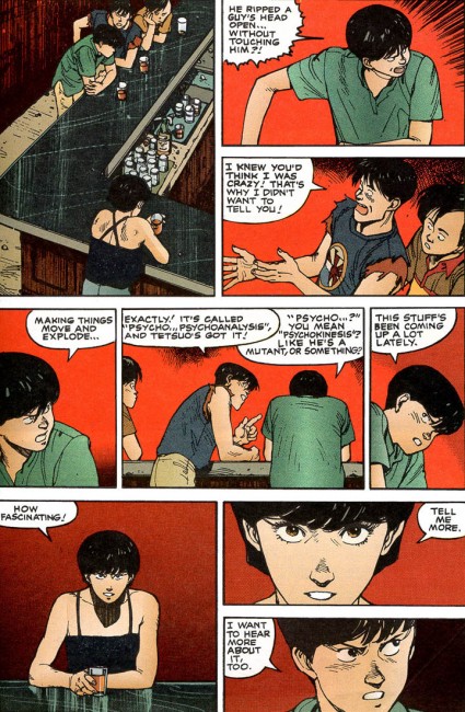
I like this bit, too. Otomo’s good at picking outfits that make you think, “Yes, this character would wear that.” You can’t see it, but Kai’s polo is tucked in. It’s partially buttoned, too. Kaneda’s isn’t, and when we first see him in that green shirt, he’s working on his motorcycle. What’s the point of tucking in your shirt if you’re doing work? It’s just going to come out, anyway. And Yamagata, delinquent to the core, is rocking a cut-off sweatshirt over a cut-off t-shirt. Nah, son.

Kei is interesting. I like this jacket and black on black outfit she has. It’s sensible, but the glasses make sure that it’s still a little secret agent-y. Her halter top fits her personality, too, in the same casual way that Kaneda’s shirt fits his.

The Colonel has an interesting progression. He’s in very severe suits for the majority of the book, and then the apocalypse hits. His gear becomes much more obviously military in nature, despite the ragtag and piecemeal appearance of it. While others are wearing ripped clothes and pants, the Colonel’s got clothes that let him hold things. They’ve got pouches and pockets, they’re heavy, they’re thick enough to hide stuff…

But yo, check out what the Colonel wears when he gets a late night phone call. Look at that robe, man. What a classy dude. Nobody should answer a video phone shirtless. (He throws a suit on before leaving the house later that night.)

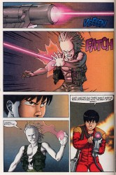
Otomo is the king because panels 1.1 and 1.4 on these two pages. Tetsuo is putting on these clothes. How often do you see that, man? It’s not even a cool “SUITING UP FOR ACTION RARRRR” joint. He’s just chilling in the background, puttin’ on some pants.

Tetsuo is… he’s not pretending, exactly, but he’s definitely playing a role for the majority of the story. “This is what a man is, this is how power should be used,” etc etc. Does that make sense? Viewed in that light, his various outfits click. He wears heavy riding gloves (which he doesn’t even use) and a tank top while leading a motorcycle gang. He wears this all white thing with a red cape for a decent portion of the book, sort of as a symbol of his #2 nature to Akira. His outfit is plain, while Akira gets a nice blue.

And this tactical vest and pants… he’s got no reason to wear that. They just look good. They’re a symbol of conquest and power, since he’s taken the outfit off a soldier he killed. This is just some straight up Arnold Schwarzeneggar swag, something that lets you show off what makes you strong and look ill at the same time.

It’s also an expression of humanity, because Tetsuo is teeter-tottering between complete and total ego death due to his powers and holding it together, but that’s a post for another day. (Wednesday?)

Post to Twitter Post to Facebook Post to Reddit Post to StumbleUpon

h1

Create, Consume, Recycle 06/20/11

June 20th, 2011 Posted by david brothers

stuff i made

Buy some digital comics! These have dongs flopping around and vampires suckin’ blood. That’s a theme, right? Anyway: Butcher Baker, Wolverine & Jubilee, and American Vampire: Survival of the Fittest, get get get it.

-Here’s a dumb question: Why can’t we preorder digital comics?

top 10 marvel comics for September, get up on it

something something green lantern


something i like

E.X.P.L.O.D.E.

Otomo’s Akira exists in this weird quantum state in my head. Schroedinger’s Anime? Sure, why not.

I first saw it probably in ’91 when the VHS dropped. My uncle picked up that and Fist of the North Star from the video store (Video Warehouse?) for some Sunday watching. We bogarted the bigger tv (it was one of those old fat 36″ joints, I think. We finally threw it out in maybe 2003?) in the house while everyone else was cooking and ran through FotNS. It blew my mind. It was so unbelievably violent and just amazing. I would’ve been eight at the most. Akira was the second feature, and it was even more mind-expanding. The story, the animation, all of it was like opening a door. I don’t think we were even joking around while the movie was on. That bit where Tetsuo’s guts fall out and the ground dissolves under him is burned into my head in a way that most things I encountered at that age aren’t.

I made it all the way up to the bit where Tetsuo turns into a pile of grotesque tumors before my cousin (she was, and remains, sixteen months younger than me) came into the room, made a face, and went and snitched to my grandmom that I was watching something gross. I was ordered into the den and that was a wrap, at least until I could sneak and finish watching the movie on my own.

That’s how Akira exists in my mind: sitting on the floor on a lazy Sunday after church, family noises in the other room, but in the living room? New things and shock endings. Fullscreen picture on the VHS tape, getting the tracking just right, on and on. My memory probably isn’t accurate, but that’s what the mental picture is, so that’s what’s true in all the ways that matter.

Time passed. Today, Akira exists in four states. There’s the original anime, 4:3 in aspect and dubbed onto a video cassette before I could afford the real deal. Then there’s the new dub, which features Vash the Stampede as Kaneda instead of a Ninja Turtle. It’s widescreen and (after a blu-ray purchase) hi-def. I like both probably equally. The more recent dub is undeniably better from a craft and quality perspective, but the old one has its charms. A little nostalgia goes a long way, right?

I did look around the internet and find a 720p rip of the Blu-ray that includes the original and 2001 dubs, though. I bust that out when I’m too lazy to get up and put a disc in the PS3.

The manga, too, has a couple of versions. There’s the color Epic ones I grew up with and comprise the majority of my collection, where Kei is Kay and everything is rendered in this really interesting palette that the rest of the comics industry never fully caught up to (Vertigo bogarted the brown, obviously, cape comics jacked the reds and highlights, and the more impressionistic stuff sorta fell by the wayside in favor of ugly gradients). Neo-Tokyo is a city I believe in, as large in my mind as the fictional New York City of rap that I love so much. It’s a city with gutters and layers, and you want to roll in one and peel back the other.

There’s the black and white version, which I still haven’t read in full. Kei is Kei, and some of the dialogue is a little different. It’s fine–I think the color adds a lot of personality to Akira, honestly. Steve Oliff did a pretty amazing job, and I wish that Kodansha had just reprinted those, instead of the black and whites. Still–these are good, and as far as one of my top three favorite series ever goes, well worth it.

(I’ve been eyeing these color Japanese volumes for a while, but they’d be a stupid purchase. I still want them.)

Strangely, Akira doesn’t exist in Japanese for me. I’ve watched the subtitled version… well, I’m not sure how often, definitely less than ten? I’ve watched it rarely enough that it barely registers in my head. I have spent a lot of time writing to the soundtrack, though. Remember when video game stores used to carry game soundtracks? I think I paid a grip for mine from Funcoland, ripped the CD to MP3, and promptly lost it. C’est la vie, long live digital media.

All of these things sorta swirl around in my head. I knew the different versions back to front (“Just when my coil’s reaching the green line!” > whatever it was Kaneda said in that new dub, but Kei > Kay as far as spelling goes), but it all adds up to one gestalt, a superAkira. This is one of those books/series/concepts that looms large in my head, large enough that I’ve genuinely put off talking about it in any sort of depth. I’ve taken stabs at it, sure, but I haven’t put my hands into its guts yet. I don’t know that I can do it without devolving into “This is SO GREAT you guyz” material, with long low-content posts masquerading as actual content.

But here we are, and here we go.

Post to Twitter Post to Facebook Post to Reddit Post to StumbleUpon

h1

Create, Consume, Recycle 06/13/11

June 13th, 2011 Posted by david brothers

stuff i made

-A quick preview of Adam Warren and Emily Warren’s Empowered: Ten Questions for the Maidman, a one-shot released last week that was pretty dope.

Graphicly just redesigned their site, and I took a quick look at what works.

-This is the remix: I took this post about X-Men First Class and turned it into this post, inviting dozens of comments from idiots about race. That sorta thing is sorta why I hate writing about race for a mass audience, because sucker ducks always got something to say. Whatever though. I’m gonna go sleep on this pile of money.


something i like

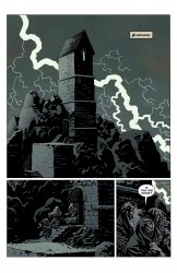
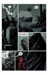
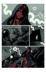
Four pages from Mike Mignola, Duncan Fegredo, and Dave Stewart’s Hellboy: The Fury, a series that’s going to be positively apocalyptic and more worthy of your attention than pretty much any other ongoing comic:


There’s something incredibly pure about Hellboy these days. Mignola and company have been pumping out quick series or one-shots that do a lot with a little. With The Fury, we’ve got three issues that can go in any direction, save for maybe the death of Hellboy. Then again, we’ve already seen him maimed, so that might not even be off the table.

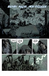
This intro is enormously effective. It brings to mind a ton of things. I look at it and see a boxer’s long walk to the ring. It’s the stranger riding into town while strangers grip their pistols and spit. It’s Deebo walking up and everyone in the hood going silent. It’s the beginning of the big war conference in any movie ever, where warriors bang shields and monsters roar at the moon. Lightning strikes either as a show of approval or as an omen of disaster.

“Now I am become Death,” the witches say as they look on their handiwork. “The destroyer of worlds.” They’re not as powerful as they thought they were, and now they’re wracked with doubt and guilt. Then they spot a lone figure walking out of nowhere, and begin creating stories about him to suit their purpose.

“It’s Odin out wandering the world.” Wise and all-seeing, Hellboy is the all-father in human form. Wikipedia tells me that Odin is “related to ōðr, meaning ‘fury, excitation,’ besides ‘mind,’ or ‘poetry.'” There you have the title of the series and the tone. The Fury is the epic poem of Hellboy’s life. Hellboy’s stuck in a Homeric tale, and he’s almost at the end of his run.

“He carries a hammer. Thor then.” He’s the thunder and the lightning, destruction and health, a terrifying protector. A hammer is used to build and destroy. Sometimes that’s the same thing. The myth parallels Hellboy’s journey, too. Thor battles Jormungand, the Midgard Serpent.

Hellboy is every god, every hero, every messiah, and not in some stupid Joseph Campbell sort of way, either. He’s fighting something that is the ultimate evil, so it stands to reason that he has to be the ultimate good. The only thing that matters is beating her.

This is the eschaton in progress, where evil breathes in before pulling the trigger and heroes stride down off the mountain, glorious in demeanor and unafraid of death.

It’s Mignola synthesizing all of his interests, from myths to ghost stories to Jack Kirby comics, and creating something fearsome.

More than anything, though, this has what a lot of theoretically exciting cape comics lack. This is exciting. It builds tension. This is how you do the slow walk.

Funny coincidence. Marvel’s Fear Itself, courtesy of Matt Fraction, Stuart Immonen, Wade Von Grawbadger, and Laura Martin, features the Asgardian host battling an ancient evils. I picked up the first issue and found it overwritten by far, though the art was nice. It had a bunch of people telling you why something’s scary or dangerous instead of that thing putting the fear of God in your heart. What little tension there is isn’t earned at all.

Fear Itself didn’t feel effortless like this does. The Fury is a snowball rolling down a steep hill, and the weight of the past few years does it wonders, but the difference is still striking. Maybe that’s unfair. I don’t think so, though.

There’s a gang of Hellboy available digitally. Read ’em in order, or check out The Island and the Third Wish, Makoma, or Buster Oakley Gets His Wish. I like those a lot, especially Makoma and Buster. Corben and Nowlan are beasts. Nobody should be able to draw cows as cool as Nowlan does.

Post to Twitter Post to Facebook Post to Reddit Post to StumbleUpon

h1

Create, Consume, Recycle 06/06/11

June 6th, 2011 Posted by david brothers

stuff i made

A reprint of an old post about The ‘Nam

A preview of the Static Shock Special, which I had previously discussed in March. I wasn’t really going to pick up the special until I saw the preview. I’m still a little grossed out, to be honest, but it’s clearly a good faith effort on the part of the creators involved. Comics will make you feel weird about things you like, man.

I wrote up Ed Brubaker and Sean Phillips’s Criminal: Last of the Innocent. It’s good. Buy it.

Digital ComicsAlliance: this week, I tackle the DC digital pricing scheme with veiled drug references, overt drug references, and references to going on a blackout bender with friends.


something i like

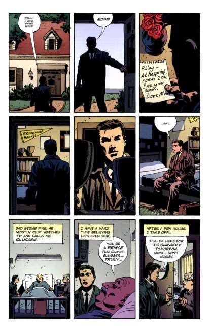
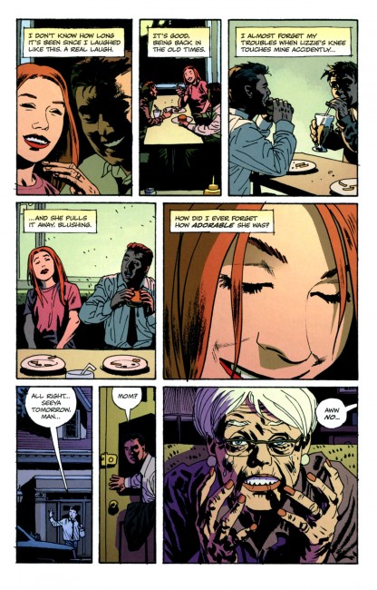
From Ed Brubaker and Sean Phillips’s Criminal: The Last of the Innocent, two non-consecutive pages that I liked a lot:


I read and reviewed this book while sitting in a room I haven’t slept in for four years. I took a trip back home for a week, and it’s been sorta weird. The first thing that happened when I got back into town, like right after I got off the airport shuttle, was that the lady at the desk recognized my last name, asked if I was related to a couple people, and told me about my aunt holding back on a recipe. The rest of the trip has been a whirlwind of sideways nostalgia, where everything is too small or out of place or weird or different from how it was four years ago/when I was a kid. (though small is almost definitely a metaphorical thing, now that I’m looking around my room and mentally comparing it to my apartment)

This latest Criminal is about a man coming home after five years away and being completely seduced by nostalgia for the way things were. The gap between then and now shakes him up early on, but later, when he’s conversating with old friends and having a good time, he starts thinking about how great then feels and how broken and corrupt now is.

This sort of stuff is basic, I think, the sort of universal emotions we all experience at some point. I just happened to read the book at the best/worst possible time to do so. Brubaker and Phillips came through with the execution, and the basic nature of the story (“Life was better then,” whether “better” is true or not) gives it a little extra punch. Widest possible area of effect, right? Even famous people feel that. (“Ain’t kill myself yet, and I already want my life back.”)

This is a good first issue for what will hopefully be the best Criminal yet. It feels very resonant; it’s easy to relate to. Well worth a look.

Post to Twitter Post to Facebook Post to Reddit Post to StumbleUpon

h1

Create, Consume, Recycle 05/30/11

May 30th, 2011 Posted by david brothers

stuff i made

I got quoted in the Wall Street Journal talking about digital comics and Marvel’s vault. How crazy is that? Very flattering.

Thor: Tales of Asgard is soft. Netflix it if you have to, ignore it if you don’t.

Ten Marvel comics that are worth buying in August
Here’s some free digital comics

A quick look at Adam WarRock’s new EP

A preview of Miners Mutiny from Stackhouse x Shahan

More digital comics, but not free


something i like

John Rozum and Frazer Irving, Xombi 3:

Rozum’s contribution to Xombi is far from insignificant (the story’s pretty good, and I’m really very happy with how the series is shaking out), but Irving’s work is what I want to focus on right now. Off the top of my head, I’d say that the series rarely goes above five panels per page, which gives plenty of room for action and dialogue. Irving’s had a chance to show off some low-key acting (David Kim on the phone is #1 is great) and some large-scale action scenes (check out the panel progress from panels 3-5, particularly David’s head), and he’s done well with everything. At the moment, this is probably my favorite DC book. Maybe a tie with the Milligan/Camuncoli/Landini/Bisley Hellblazer.

(The colors are interesting, too. The series feels like it’s colored by mood [a burning, angry orange, a twilight blue, a calm, natural green] rather than traditionally realistic colors.)

Xombi is fairly free of metatextual commentary. Xombi isn’t a comic about other comics. Everything you need to know takes place inside the panels. This might be the first time the story in the comic breaks out of the panels. I like the extra punch it adds to the scene, though I feel like the lettering being over the action, rather than near, hurts it a little. But that right there, the blood splatter breaking out of the confines of reality, is a great touch.

Post to Twitter Post to Facebook Post to Reddit Post to StumbleUpon