Archive for the 'manga' Category

h1

Fort of Apocalypse: violence comix

July 2nd, 2014 Posted by david brothers
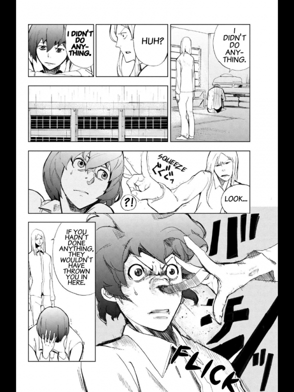
Fort of Apocalypse - Kazu Inabe - 03

Fort of Apocalypse, written by Yuu Kuraishi and drawn by Kazu Inabe, isn’t that great. It’s serialized on Crunchyroll, and the hook is that it’s a horror manga with a zombie twist, mostly set in and around a Japanese juvenile detention center. It stars a group of boys who have to fight to survive in the school before being forced to fight for their lives as the world goes to hell. The problem is that it jettisons the most interesting aspects of that concept in favor of…bland twists, basically. It opens with a Nietzsche quote about gazing into the abyss, a painfully obvious move, and most characters are either borderline psychopathic, deranged, or totally cool with people doing deranged things on a regular basis. “You must be new here,” Fort of Apocalypse says. “Let’s start from the beginning.”

It’s endlessly derivative—or, being generous and disingenuous, “reminiscent”—of other, better, more popular works. Deadman Wonderland and The Walking Dead are the two most obvious touchstones for me, but there’s a bit of Highschool of the Dead and Lord of the Flies peeking in around the edges, too. Fort of Apocalypse lacks the ultra-fetishized hyper-sexuality of HotD, which has a weirdo carnival appeal/anti-appeal of its own, and instead goes for broke in another direction.
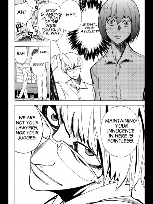
Fort of Apocalypse - Kazu Inabe - 04

The art’s weird. It’s similar to a less stylish and stylized Dogs: Bullets & Carnage. It’s usually passable—not great, but good enough for a good panel here and there, and some good monster monster design and composition overall. Paired with the tone of the writing, Fort of Apocalypse feels seedy-but-familiar, a feel-bad comic that doesn’t actually make you feel bad at all but makes a big production out of going through the motions.

It’s not great, but it is lurid. One short scene:
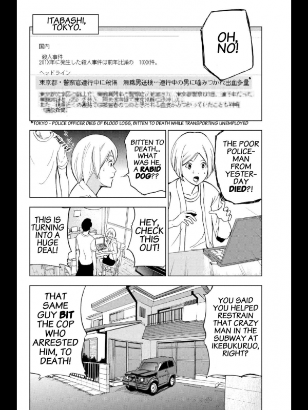
Fort of Apocalypse - Kazu Inabe - 06

Fort of Apocalypse - Kazu Inabe - 07

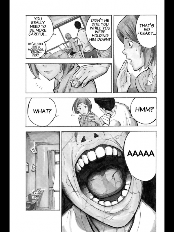
Immediately before this moment in time, a different man in an irrelevant location sits up on his autopsy table, his back arched and general body language definitively inhuman. It’s an old trick—show the thing, then cut away to build tension or emphasize the spread of a sickness. The apocalypse is not coming. It is here.

These characters are blanks, almost. Generic Husband and Generic Wife, unnamed and un-missed. They’re there to die, and while that isn’t remarkable (even the shot of the room to suggest unseen horrible violence is old and busted this time around), the next spread was:
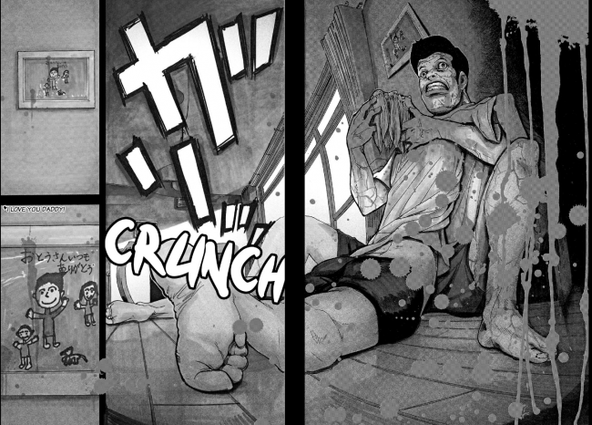
Fort of Apocalypse - Kazu Inabe - 08

I was expecting a bunch of cuts away from the action to show the apocalypse rising, but I wasn’t being mean enough. A spread of the husband eating his probably-dismembered wife is bad enough, but what killed and grabbed me was the way the scene ends with a close-up of a family photo drawn by their kid, complete with an “I love you daddy!” inscription.

It’s one of those hilariously manipulative moves people pull sometimes, stacking up sad concepts like cordwood without putting in any work to make you believe in those concepts enough to feel bad about it. In better hands, this scene would be the ultimate betrayal. But Kuraishi and Inabe lean edgy, not poignant. I was struck by the meanness of that choice, the way it puts the idea in your head and then immediately moves on to the next one after your imagination fills in what happens next.

While the comic isn’t great, it’s got a mean edge that I enjoy. It’s sorta like the first season of The Following, the Kevin Bacon/James Purefoy serial killer cult thriller on FOX. That show is frequently trashy and incredibly poorly written. But it has a habit of going there that makes for good tv. Spearguns in diners, stabbings on subways, Edgar Allen Poe fetishists, and a conclave of serial killing English majors. A little “Can you believe this?” goes a long way. (Not that long, actually—season two doubled down on sad boring stubble dudes and I raced for the door before it was half-over.) It got me through a dozen volumes of Gantz, maybe even more. This isn’t Gantz on account of being nowhere near misanthropic and evil as that series, but it gets by.

Fort of Apocalypse is lurid, but doesn’t feel cruel, even when a zombie grabs a teen’s upper and lower jaws and yanks them in opposite directions. Mitsuhisa Kuji’s Wolfsmund is real. She wants you to feel it, and it feels cruel. Fort of Apocalypse isn’t that. They want to show you outrageous things so you can go “yo, gross!” and then turn the page for more, and it turns out the best way to do that is to fill your comic with damaged and broken people who adjust to the end of the world by losing their minds.
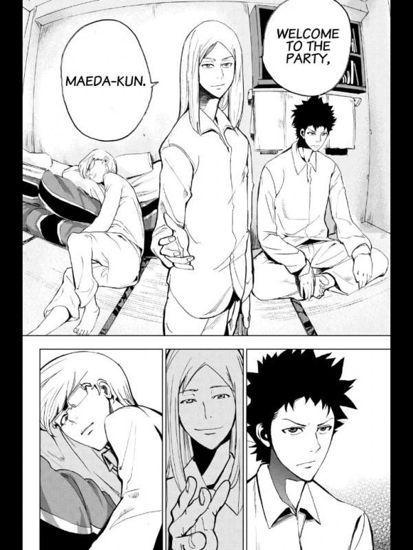
Fort of Apocalypse - Kazu Inabe - 05

I’m not sure how long I’ll last with Fort of Apocalypse, but it seems like once a volume, something outrageous enough to keep me interested happens. It goes there.

Post to Twitter Post to Facebook Post to Reddit Post to StumbleUpon

h1

Q Hayashida’s Dorohedoro: violence comix

June 25th, 2014 Posted by david brothers

q hayashida - dorohedoro - chapter break

This chapter break from Q Hayashida’s Dorohedoro (print, digital, but buy it on iBooks or Android if you want it mobile) sums up a lot of what I like about her style. She works in this kinda gritty, grimy occult comics style, and while the surface-level stuff is great—the skulls, the snakes, the black smoke—what really makes it go is how grounded it is. It’s a comic about wizards and demons that wear street clothes, Nike Dunks, and custom masks.

Block out this guy’s arms and skulls; focus on his body and head. The stuff I’m noticing are the way the belt fits around his waist, the rumpled clothes, and his jacket flaring out. The hood over the eyes is a look I’ve chased several times over the course of my life. The HR Giger-esque rib-piece is pretty out there, but by and large, this guy is wearing clothes you’d see people rocking in the street. It’s a “cool” look. The snakes and skulls add to it, giving it that occult feeling.

q hayashida - dorohedoro - spread 01

Here’s a spread from Dorohedoro, volume 12. Hayashida’s great at making regular buildings look like they’re on the wrong side of the tracks in Hell. It’s very different from Mike Mignola’s more ornate and classic approach, where Hell is Movie Prague, full of long long hallways, classic buildings, and traditional environments. Hell-as-University. Hayashida’s Hell has food trucks and everything’s a slum covered in a thick coating of grime, like smog after it settles.

I like the implied menace in the bottom tier, too. The fisheye effect heightens the X vs Y aspect of things, but Hayashida’s style is great at maintaing a consistent level of background menace, too. It makes it look like the crew on the left got caught in the act by the crew on the right, which is literally true. But the hallway they’re in is great. There’s dust clouds, filthy walls, an alarm box or something on the far left, and you just know that if this were animated, the bare bulb on the right would flicker so that the hallway was more dim than lit. The smudges make me think of water damage, like the building is as run-down as it gets without being marked for destruction.

The fisheye effect makes me feel like this is a moment to breathe in just before the curtain comes down and the violence starts. Luckily, this comes a few pages later:

q hayashida - dorohedoro - ha ha ha ha

T-shirts, jeans, polos, and intense action. The violence is obvious and extreme, with the claw end of a hammer and pure brute force getting the job done. I like the storytelling when the swordsman gets grabbed a whole lot. It got me thinking about which panels we’re seeing are specific POV panels and which are meant to be our standard third-person view. The man with the sword gets grabbed, and the following panel is his view: we see a blurry, blacked-out vision of a face. Then, in the next panel, we’re tracking his reaction. His instinct is to draw his sword, but Noi, the masked arm-puller, is ahead of him. And the potential energy in that panel, when he realizes he’s stuck and you realize he’s stuck and what’s coming next is going to be bad—yes. This is Q Hayashida.

On the facing page, that laugh is everything. Dorohedoro is a great comic because Hayashida blends great jokes with explicit violence and grim mood-building. There are sentient gyoza creatures, rotted husks of men, and capricious demons in the same world. Some of the demons even like gyoza. Noi’s laugh manages to combine all of that. It’s dark humor, and the blood spray is extreme, but it’s also a perfect demonstration of how much and what kind of trouble these guys are in.

Covered in the blood of their friend, whose arm she just successfully yanked off, and taking time for a hearty, gleeful laugh: Noi gives pause.

Post to Twitter Post to Facebook Post to Reddit Post to StumbleUpon

h1

Ajin: Demi-Human: violence comix

June 20th, 2014 Posted by david brothers

I like fight comics, violence-as-genre comics. I like comics where one of the most significant thrills come from the fights. There’s something about a well-done fight scene that turns a solid book into a good one. My true love as far as comics action scenes go is largely choreography. Does A flow into B into C into something incredibly painful-looking but well-drawn? If you give me a fight scene where I can follow every block and punch and shot to its logical conclusion, I’m in heaven. It extends to non-fight scenes, too. Takehiko Inoue’s Slam Dunk is great at depicting basketball in such a way that it feels like real basketball. There’s an implication of motion in well-done action scenes that I really enjoy.

Isolated instances of punches and kicks don’t really move the needle. It’s sort of the default mode of the comics I grew up on, where the action is generally secondary to the plot, so you can’t blow eighteen pages on a fight between two warriors. Loving action is probably part of why I’m drawn to manga. The storytelling standards are different, and if you want to do a six hundred page fight scene, you can. (Takehiko Inoue did in Vagabond.) But at the same time, a little spectacle goes a long way. If the isolated instances are striking or exciting in their own way, that’s about as good as the highly choreographed stuff. Mostly, I just want to be impressed.

I’ve been reading Tsuina Miura and Gamon Sakurai’s Ajin: Demi-Human as it comes out, a manga by currently being serialized on Crunchyroll and seeing print later this year from all-star manga publisher Vertical, Inc.

Here’s a summary of the series:

Seventeen years ago, an utterly immortal human was discovered on an African battlefield. Since then, more of these new and unknown life forms began to appear among mankind. These undying beings start to be known as “demi-humans.” One day, just before summer break, a Japanese boy leaving his high school is involved in a traffic accident that kills him on the spot. Then, he comes back to life. A huge bounty is placed on his capture. Now the boy’s attempt to evade all of mankind begins.

It’s just interesting enough to keep my attention, and sort of pleasingly grim, too. It’s like a turned down action comic, a little slow but plenty mean. Demi-humans can instantly come back fully healed from any wound if they die. This makes them great for human experimentation, but it also has led toward a pretty good “assault on base” scene. Here’s a couple pages from a recent chapter that really got me good:

sakurai - demi-human 01

sakurai - demi-human 02

The men are shooting tranquilizer dots at the man with the rifle in order to capture him. He’s a demi-human, which means he’s functionally immortal, and his gun has real bullets.

I like Sakurai’s style. It’s pleasingly realistic in terms of approach, and even the monsters (not pictured) have a nice weight to them. The characters aren’t very stylized, and there aren’t a lot of wild camera angles unless you count close-ups. It’s cool, it makes Demi-Human interesting to look at.

The little dodge in page one, panel three—that’s a cool thing to put into a comic book gun fight, and the casing being ejected right behind it is something that I really keyed on when I read this the first time. You know how something can seem significant? You notice it and it feels bigger than it seems? This felt like that, and I thought about it until I realized that he must have dodged so fast that he returned fire before the dart probably even got to him. You can almost see the motion, and I like how the panel leads your eye up (the whiffing dart), down (the gunfire), left (the casing), and right (the dodge) basically simultaneously.

Page two, panel 1: his nonchalant face, the detail on his gun and vest, the belt, the motion, and the act itself…what a great idea for a panel. I mean, it’s horrible or whatever, it’s nasty, but it’s something I haven’t seen before and surprising—not shocking—enough to raise an eyebrow and half a smile. The anonymous close-up after is great, like a visual gasp, and then panel three is another new thing. This is Hawkeye in Ultimates 2 cool, Frank Miller discovering ninjas cool. All those speedlines on just one side, too, weighing the panel down.

The next bit implies suicide, and in so doing ups the ante considerably:


sakurai - demi-human 03

sakurai - demi-human 04

Sakurai’s use of reaction shots are well-placed, I realizing. The timing on them in general is great. The way the “huh” comes after the shot but before we see the ooze is crucial for setting the pace for how quickly all this is happening. The man is launched into the air (somehow) and we see them noticing something we can’t see before the ooze reveal. We know something’s about to go down, just not what. Here’s what:

sakurai - demi-human 05

If I saw this in a movie, I would freak out on the spot.

It’s just two panels, but the sense of motion and implied movement are so good. He’s falling more down than back, so his legs kick up in panel two. The lines on the floor tell you how far backward he fell. I’d already been impressed enough to want to write about this before this page, but this was like manna from heaven.

I like watching martial arts-oriented action movies, especially non-American ones, more than just about anything else because the choreography really impresses me. I get to see people do incredibly difficult things at a high level and higher speeds, and watching them set up a punch for a kick for a toss through a window is totally my bag. Great choreo has kept me watching movies that you’d be better off fast-forwarding through, and great choreo combined with a great story is my bread and butter. It’s something I cannot do, but am consistently impressed by and jealous of. It’s not the violence so much as the configuration of the violence, the beauty of bodies in motion. A bunch of my favorite films are borderline bloodless, even.

It’s different in comics, because motion is this whole other animal. It’s implied, because sequential art is composed of single images instead of twenty-four frames a second. I like being able to track action from panel to panel, the perfect moments in time chosen to heighten the impact. I don’t think Sakurai excels at that kind of thing, his approach to continuity isn’t that great, but I do think he has an amazing talent for drawing cool things well. And this scene was a very cool thing. This is the most inventive and immediately impressive by far, but bits like this are littered throughout Ajin: Demi-Human.

It’s a good action comic. The story’s taken some surprising turns after a pretty basic opener, and the action is getting better the more I read. It feels like Black Lagoon without the sleaze, but with a heavy faux-Tarantino accent and magical sci-fi elements. I like that even though it feels so familiar, I can still be surprised by what’s going to happen. It’s like a skillful rendition of an old standard in tone—not super impressive, but still enough to make you feel good. As long as they keep coming with the action, I’m hooked.

Post to Twitter Post to Facebook Post to Reddit Post to StumbleUpon

h1

Mitsuhisa Kuji’s Wolfsmund: death

May 21st, 2014 Posted by david brothers

Wolfsmund is created by Mitsuhisa Kuji, translated by Ko Ransom, and published by Vertical. I’m talking about volume 3, but you should start with the first volume, assuming your stomach and soul can handle it. I waffle and wobble a bit, personally.

I’m not too squeamish when it comes to entertainment, but it’s really down to presentation. Flash beheadings, brutal beatings, none of that really moves the needle in terms of actual existential terror. It’s when things get too specific and personal that I start checking out. Eyeball trauma gets me good, even in garbage movies like 28 Weeks Later. Hannibal was gross from jump, but it didn’t gross me out until season two showed someone tearing themselves free from a sculpture they’d been stitched into.

Mitsuhisa Kuji’s Wolfsmund excels at the specific and personal, and I’m torn between being into it and hitting the emergency eject button. It’s set in the past, at a gateway between two lands governed by a man who specializes in educational cruelty. It is grim and difficult to read. I’m three volumes in and there’s no real hope in sight. Compelling characters are put to the sword or worse on a regular basis. The first volume lays out what to expect: there are people who die, there are people who escape, and there is the man who sits in judgment of all of them and doesn’t let anyone pass without taking skin off their back.

Volume two was exceedingly cruel, cruel enough to where I put the series to the side for a few months. Volume three, purchased on a whim relatively recently, still made me cringe. In movies, if someone’s getting their eyes stabbed out, I can look away. In comics, you gotta look before you turn the page. You have to register what you’re seeing before you realize it’s horrible.

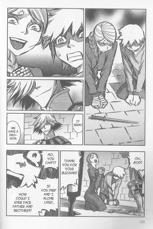
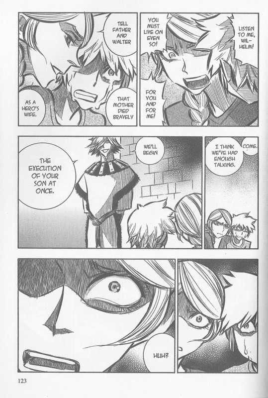
I tried to read the torture scene in volume three a couple times, not willing to admit defeat, before I eventually just bit down and flipped past it. Kuji got me. She got me good. The fingernails, or the imaginings that come along with reading a scene of fingernail torture, put me down for the count and I lost a few panels. She followed it with a scene where a man offers a mother and son a chance. He will spare one of them. Whoever the sword points to when it falls will die. The sword is placed point-down, tips, falls, and:

Mitsuhisa Kuji - wolfsmund - 01

Mitsuhisa Kuji - wolfsmund - 02

A sword is for stabbing, you see. It’s cruel poetry. The pommel doesn’t matter. Starving dogs are set on the son. The mother rushes to his rescue. She fails.

Kuji played assistant for Kentaro Miura, creator of hyper-violent medieval tale Berserk, and Kaoru Mori, creator of the maid soap opera Emma. Wolfsmund doesn’t feel like a marriage of those influences, but you can feel both influences creeping into the work. The art in Wolfsmund is very well-rendered and detailed. I can’t speak to its period-appropriateness, but the costumes feel real. They’re full of details and accoutrements that feel like they make sense.

Wolfsmund is an easy book to fall into, to believe in, and that makes the trauma all the worse. It’s a creeping, personal kind of cruelty. The characters in the book and Kuji herself dedicate scads of time to showing us someone else’s pain in excruciating detail. It’s not like Gantz, which could never figure out if it wanted to terrify or titillate. It’s un-erotic in the extreme, so uncomfortable and dark that you wince at the art. (The actual instances of sex and nudity in Wolfsmund are often difficult. There’s no guarantee that either party will survive the scene, much less the book, and they’re often book-ended with skin-crawling horrors.)

Wolfsmund is feel-bad comics, the sort of book you read and swear off and come back to again after a few months have passed. It’s full of non-stop cruelty and horrors, definitely beyond what I personally prefer. But there’s something about it and the feelings it inspires that is compelling, too. It’s a difficult kind of pleasure, and probably not even pleasure at all.

I read the second volume of Tsutomu Nihei’s Knights of Sidonia and the third volume of Wolfsmund back-to-back one night, well after the sun went down. The treatment of death in both books captured my imagination. Where Knights of Sidonia had an incredible depiction of impersonal cruelty, Kuji indulges in indulgent and beautiful cruelty in almost every chapter. You either get the knife or the glint of it. It’s mean and it’s ugly, heartbreakingly ugly at times, but I keep coming back to it.

Post to Twitter Post to Facebook Post to Reddit Post to StumbleUpon

h1

Tsutomu Nihei’s Knights of Sidonia: death

May 20th, 2014 Posted by david brothers

Knights of Sidonia, created by Tsutomu Nihei, translated by Kumar Sivasubramanian, published by Vertical. This is volume 2, there are several others, including ebooks on your preferred digital platform.

Set in a far-flung future after the destruction of Earth, Knights of Sidonia takes place in and around a spacecraft that contains the entirety—maybe so, maybe no—of humanity. They’re being hunted by powerful and utterly alien beings. One day, things go wrong and the ship must change course. Imagine being in a car taking a turn at 60mph. Now multiply it by several thousand orders of magnitude.

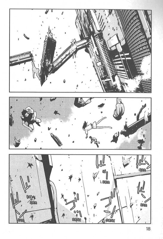
This happens:

Knights of Sidonia - death - 01

None of these people are named. They aren’t characters, just bodies that transition from human to smears. They’re indicators of scale and trauma instead of people. Imagine you, your best friend, and your circle. Now imagine what happens when they hit God’s windshield at eighty thousand miles an hour.

This follows:

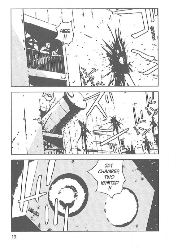
Knights of Sidonia - death - 02

Nihei’s got a killer sense of scale and perspective. It made Blame! claustrophobic despite being full of open spaces and it made Biomega creepier than sin. Here, he goes from a long-distance shot to a close-up one, adding the remnants of human remains to the smears.

I keyed on the couple the first time I read this. They might not even be a couple—they might be two people caught by surprise in the moment. But under Nihei’s pen, they’re here and then they’re gone and that is the entirety of their existence.

The impersonal nature of these deaths, and this scene as a whole, struck me. These deaths happen because someone makes a decision to save the many at the expense of the…well, not few, as you can see. At the expense of those unfortunate enough to be away from safe areas at that specific moment in time.

Despite these deaths being utterly impersonal, they’re far from bloodless. Something about the way Nihei draws the splatters, the choice of sound effect, and the sheer number of them make the scene feel like one final upset and insult before the victims are sent on their way. It feels like a chill, an Act of God.

There was a person here. There’s not now.

Post to Twitter Post to Facebook Post to Reddit Post to StumbleUpon

h1

Space Brothers: Maybe Next Time

April 17th, 2014 Posted by david brothers

chuya koyama - space bros - nope

Created by Chuya Koyama, translated by William Flanagan, serialized on Crunchyroll. Space Brothers.

Not even humans can defeat the weather.

I like Space Brothers a lot. I’m ninety-some chapters in at this point and it’s managed to be funny, thrilling, sad, poignant, and good without really being anything but a low stakes slow motion kind of comic. There may be death or failure or tragedy, but it’s not really a comic that trades on those. Koyama is telling a story about triumph more than tragedy, so any setback is put into a greater context that ameliorates it some.

Space Bros is good because its two lead characters are a remarkably motivated and successful astronaut and his unlucky older brother, who is attempting to become an astronaut. He’s a dummy, but he’s not dumb, like an adult version of a shonen protagonist, so the series is constantly walking this line between comedy, motivational speaking, and amazing and meaningful coincidences from the past reflecting in the present day. It’s all very unbelievable, but it makes me feel good/sad/good, so I’m into it.

It’s facile, but it reminds me a lot of Twin Spica, one of my favorite comics from a few years back. Twin Spica had a cast of mostly underdogs knocking down obstacles left and right on their way to the top. It was sweet, it was earnest, it was very good. Space Brothers is very similar, though with sibling rivalry and friendship at its core instead of cute stubbornness. Space Brothers is astronomically less melancholy than Twin Spica, but they both share a certain amount of bittersweet sentiment, which in turns makes the triumphs better.

Or the jokes, like this one, where the dummy older brother gets ready to train to become an astronaut, sees the weather, and thinks twice.

(Vertical’s begun releasing Twin Spica in ebook format. You should read it. I wrote about it a little.)

Post to Twitter Post to Facebook Post to Reddit Post to StumbleUpon

h1

Nisekoi: Love Hurts

April 14th, 2014 Posted by david brothers

nisekoi - jokes 01

nisekoi - jokes 02
Written and drawn by Naoshi Komi, translated by Camellia Nieh, edited by John Bae. Nisekoi: False Love, 2014.

On the one hand, Naoshi Komi’s Nisekoi: False Love, currently being serialized in Weekly Shonen Jump is not my type of comic. It stars a Polite Loser who has girls of various types of specific fetishes chasing after him or aggressively ignoring him, depending on the lady. He’s pretty clueless and he secretly likes someone, but he’s in a fake relationship with another girl to bring peace to their respective Yakuza/mafia clans, so soap opera hijinks result…blah blah blah. It’s a hijinks romcom manga, not a crime manga, which is basically my entire problem. “This comic isn’t like an entirely different comic.” There’s a lot to like about it, anyway, though.

Nisekoi is drawn pretty well, despite not being my bag, so I like to flip through it when Jump comes out to see if anything catches my eye. While it isn’t entirely my type of comics, the joke in the middle tier of the first image and the entirety of the (nonconsecutive) second page have a sense of humor that are definitely my type of humor. I didn’t know comedy suplexes were a thing until I read GTO, and now I get a kick out of it every single time.

Post to Twitter Post to Facebook Post to Reddit Post to StumbleUpon

h1

Stuff I Liked in 2013: Loving Bas-ket-ball

December 30th, 2013 Posted by david brothers

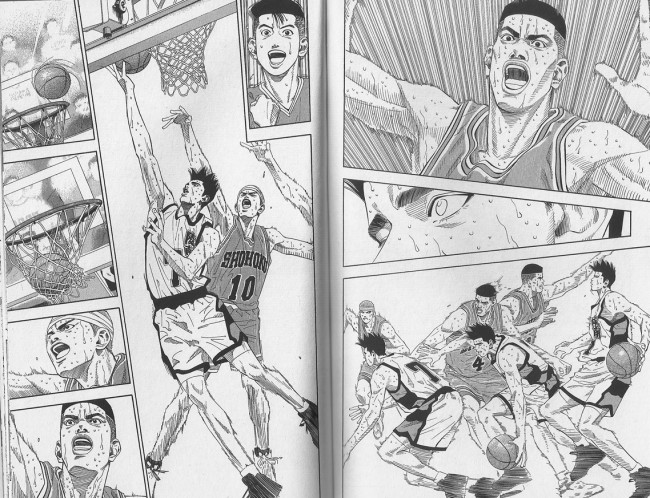
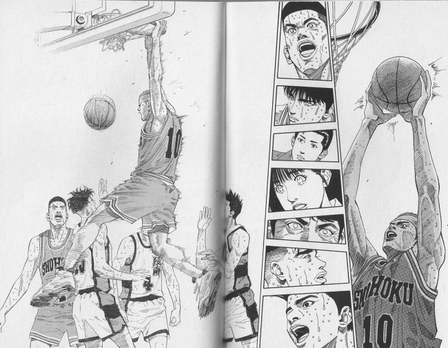
Takehiko Inoue - Slam Dunk - 01

Takehiko Inoue’s Slam Dunk (manga, anime) is basketball. Inoue is a tremendous talent, one of those guys who I always forget is a favorite artist until I trip over his work or am reminded of it. Inoue worked on Slam Dunk from 1990 to 1996, long before he reached the heights he would achieve in Vagabond and Real. It’s interesting as a time capsule. There are a couple moments where Inoue’s art takes a leap forward, becoming closer to what we’re used to seeing from him. I think volume 12 was the first major one, but even the gradual growth is pretty impressive.

There’s a story in Slam Dunk, full of cute characters and motivations and things that make for good comics. It’s geared toward children, so the bad guys are rarely out-and-out bad. They all have their reasons, and most of them are very good. But what I’m here to talk about isn’t stories. I want to talk about basketball.

Part of the reason why Slam Dunk is so good is that it’s about the fundamentals. Kuroko’s Basketball, the current hit basketball anime, works on magic. The main guy is invisible and racks up dozens of assists per game, other characters have unlikely specialties, and there’s generally not much real basketball to be found. It’s all right, but it’s not real. In Slam Dunk, every character has a skill, but that skill’s the result of practice based in real world fundamentals. The main character sucks at basketball, so they make him shoot two thousand shots as practice. Another character may be the greatest one-on-one player in Japan, and it’s a direct result of not just his drive, but the fact that he played against his father since he was knee-high all the way up through to high school. He put in the hours and earned the results.

Inoue will explain basketball terminology in the middle of a story, but generally in a natural way. The eyes of players or journalists will widen, they breathe the name of the move that they just witnessed, and break down how and why it works, but only rarely dip into Naruto-style “Here’s a few diagrams and charts and exposition.” It feels more like commentary than edutainment, but like good sportscasting, you come away from it with new or deepened knowledge.

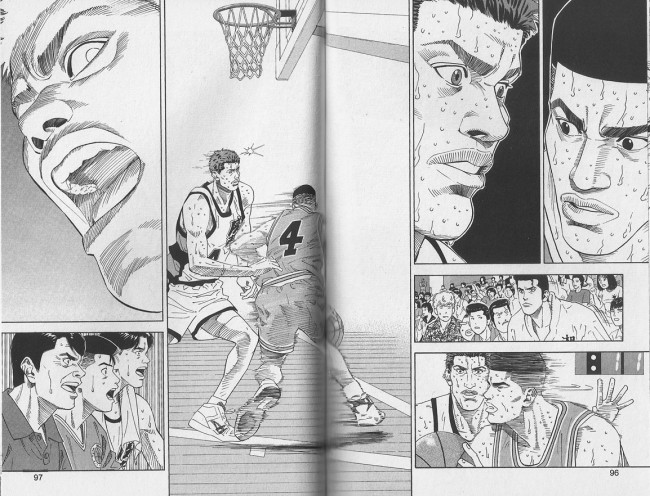
Takehiko Inoue - Slam Dunk - 02

That grounding makes Slam Dunk really enjoyable. Kuroko’s isn’t bad by any means, but it’s not basketball basketball. It doesn’t scratch that same itch for me. It’s a drama set in a basketball gym, rather than a basketball drama. Slam Dunk is all ball. The realism makes the cartoonier aspects work, because you’ve already bought in. It feels like the real thing.

I’m knee-deep in basketball right now. I was reading Slam Dunk and playing NBA 2k14 before the season started, and now I’m doing both of those, watching NBA games a few times a week, and going to a game a month or so. Next year, I’m going to start going to pickup games with a coworker, because why not?

There is something about that is pleasing, relaxing, stressful, and wonderful. I was watching Hawks @ Cavs on 12/26 while I cooked. I was listening mostly, but the closer they got to the end of the 4th quarter, the more time I spent standing in front of the TV while mixing or waiting out a cooking time. At the last play of the quarter—in a game that I did not bet money on and have no stake in beyond liking the Hawks—I threw my arms up and cheered when Jeff Teague hit a deep three to tie at 108 with 0:04.2 left in OT. I was into it, I was feeling it, and that’s a feeling that’s worth chasing.

That feeling has levels, too. Slam Dunk is by far the most passive basketball experience, but it’s still incredibly deep. The NBA season has narratives and storylines, but they’re nothing like the stories in Slam Dunk. Slam Dunk will squeeze tears out of your cold heart when you realize what’s at stake for the cast and how bad they want a win. The non-basketball parts, the relationships and history, are lethal when combined with Inoue’s storytelling abilities. In real life, it’s never so cut-and-dry, which is fine. They’re serving different masters.

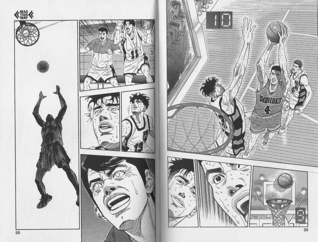
Takehiko Inoue - Slam Dunk - 03

Watching ball is active, especially with friends. You’re critiquing the game as it evolves, hoping for your team to come home with a W and maybe a few good highlights you can brag about and watch on youtube or tumblr over and over. You then take that experience to work with you the next day and talk about your favorite plays, like this absurd Iguodala almost-highlight that dominated my day job. The athleticism and acrobatics will stun you in every single game if you let them. I’ve got an NBA League Pass account, and being able to watch replays on demand is incredible. (Not being able to watch Warriors games live, however, is garbage.)

NBA 2k14 is video game ball, a fantasy land where you can make anything happen, assuming you’re good enough. In previous versions of the title, I binged hard on a single mode (create a player, Jordan, Association, whichever appealed) and playing online with a friend. In NBA 2k13, before we called it, I’d won 57 games and the homey won 66. We kept a spreadsheet, too, so I knew that I’d racked up 8489 points to his 8498, and we were both averaging around 69 points per game—69 on the dot for me, 69.098 for him. Keeping track of that stuff changed the game, in a way. The stakes changed from trying to beast him in one game to trying to match him in dozens. That changed how we played, and I think made the games even more interesting and intense for us.

I’m taking it easy in 2k14 this time around, though. I play a few times a week, usually the featured game of the day or whoever the Hawks or Warriors are matching up against that day. (Sometimes I use it for revenge, too.) I’m only dabbling in the Lebron James fantasy mode, and I’m not playing a full season or two in a sports game for the first time since they put seasons into sports games. It’s all about will and skill this year, because the AI is punishing enough that if you slip for a quarter, you’re going to have to fight to get it back. But it’s all about you. It’s what you can and cannot do, your own personal talent for fake basketball. You can’t re-create things you’ve seen in real life, but you can get into the ballpark and make highlights of your own. I’ve been paying closer attention to how the commentary will guide you or subtly suggest tactics or players to focus on. If you pay attention, they can give you vague hints that’ll let you turn a game around or avoid a pitfall you keep running into. (I shoot a lot of frustration threes, and the gang is rarely happy about it.)

I can’t get enough of basketball, be it drawn, broadcast, or programmed. It’s my favorite sport, hands down, at this point. It feels good.

Takehiko Inoue - Slam Dunk - 04

Post to Twitter Post to Facebook Post to Reddit Post to StumbleUpon

h1

ONE & Murata’s One-Punch Man: Pure Cape Comics

September 26th, 2013 Posted by david brothers

One-Punch Man is an ONE & Yusuke Murata joint. It runs in Weekly Shonen Jump (preview pack here), an anthology of boys’ comics that’s currently serializing Tite Kubo’s Bleach, Eiichiro Oda’s One Piece, a colorized version of Akira Toriyama’s Dragon Ball Z, and several other series. The gist is simple and enjoyable: Saitama wanted to be a hero, so he trained. He trained so hard that he actually became capable of ending any fight in a single punch. He dreams of having a glorious, devastating battle, but it doesn’t happen. It can’t happen. He’s too good. He’s Slacker Superman, and he’s in a gag comic.

A big part of my enjoyment of OPM is that ONE & Murata clearly love the same things I do about superheroes and shonen comics, but have no patience for the nonsense that infests both types. So OPM feels very lean and easy-going, but explodes into incredibly enjoyable high action.

Chapter twenty-six came out this week and is the finest cape comic I’ve read in ages. I try to avoid hyperbole, and that sounds hyperbolic, but dig:

Mumen Rider is a Class C hero. His power is that he has a bicycle and moves like JUSTICE CRASH!, where he throws a bicycle at someone, or JUSTICE TACKLE!, when he tackles someone. He’s a normal dude with a heart of gold, but hearts of gold and bicycles only take you so far against a nigh-invincible Deep-Sea King. A wise man knows his limitations and acts accordingly.

The Deep-Sea King, he of the heart nipples and massive strength, has spent the past few chapters tearing through every hero in sight, including ones with names. He hammers Genos, Saitama’s cyborg sorta sidekick, and is ready to finish the job when a JUSTICE CRASH! grabs his attention. He manhandles Mumen Rider, Looney Tunes-style, by simply intercepting an attack and beating Mumen Rider against the ground repeatedly.

one-punch-man - 01

But Mumen Rider stands up again.

What makes a hero? Is it the powers? The tortured past? The borderline-authoritarian insistence that you know right from wrong better than anyone else? Or is it something else? For me, growing up, it was scenes like this, when someone looks at injustice, holds up a hand, and says “No,” no matter the risk that entails. It echoes through Frank Miller’s Sin City, the Michelinie/McFarlane Spider-Man, and even a little bit in Jim Lee-era X-Men. It’s all over Hiromu Arakawa’s Full Metal Alchemist. You can see it in real life heroes. A hero is someone who is willing to throw their life away to protect someone else, regardless of their level of skill or destiny. You get up out of your seat and on your feet and you tell them people “No.”

That near-suicidal courage is inspiring. It’s a reminder that we’re not alone, that we’re all in this together, and that one man can make a difference if he tries. It’s hope. Something works as it should in our fallen world. And so:

one-punch man - 02

When Mumen Rider showed up, these people were excited, but confused. They’re locked in a shelter to hide from Deep-Sea King’s attack, and they’ve seen him utterly dominate another, higher-ranked hero. They know that Mumen Rider has no chance. But a little bit of courage, a little bit of confidence, goes a long way. They believe because he believes.

Mumen Rider has no chance. Deep-Sea King clobbers him effortlessly. But in taking a stand, Mumen Rider did exactly what a hero should do. He held the line.

one-punch-man - 04

Saitama catches Mumen Rider before he falls. Saitama tells him “Good job. Nice fight,” and carefully lays him on the ground. Saitama understands and respect sacrifice. In a way, Mumen Rider is the hero Saitama wishes he could be. He wants that glory. So he treats Mumen Rider with the respect and tenderness that he has not just earned, but deserves.

There’s a few pages left after this sequence, but that panel of Saitama catching Mumen Rider? That’s the real cliffhanger. That’s what’s going to get you hype, because it’s a moment for you to reflect. You know that Saitama is invincible. You know that he only gets beaten in his dreams. You know that he’s a little dumb, but genuinely kind. You know that he’s a hero. You know that heroes win, especially in cape comics, and you know exactly how Saitama wins his fights.

Deep-Sea King has caused a massive amount of destruction, shown a callous disregard for life, and generally acted a fool because he can’t be stopped. He’s a bully.

Here comes Justice.

Post to Twitter Post to Facebook Post to Reddit Post to StumbleUpon

h1

Moodbuilder, Worldbuilder: Tite Kubo & Chapter Pages

July 30th, 2013 Posted by david brothers

I liked Tite Kubo’s Bleach a whole lot until I suddenly didn’t. Y’all know how that goes. You get into it, you give it a lot of rope to hang itself, then you get comfortable, then you let it coast a little bit, and then you realize you’ve just read 38 volumes of a comic and haven’t liked anything about these stupid Arrancars but every one of the last ten or so volumes have had exactly one REALLY GOOD chapter or scene near the end, just good enough to convince you to pick up the next volume and—enough. And then I ended up with a Weekly Shonen Jump subscription and now I get it for basically free. Life! I recommend it, though. If you like this kinda story, Bleach is the real deal for a good while.

Two things I never stopped enjoying about Bleach, though, are Kubo’s way of rendering fashionable clothes and the chapter pages. The fashion’s got obvious appeal, but it’s a bit harder to explain the appeal of the chapter pages. That sounds a little stupid to even type, mainly because the short version is “Kubo has a great sense of fashion, design, wonder, and that shows on his chapter pages, especially as the series goes on and he becomes more daring and creative with the layouts and art.” That makes sense, and I imagine you’d agree if you saw a few of them. Luckily, I happen own a lot of Bleach and I picked twelve of them that I like from the first few volumes of the series, plus the first three so you can see how soon Kubo started doing interesting things.

tite kubo - bleach chapter pages - 01

tite kubo - bleach chapter pages - 02tite kubo - bleach chapter pages - 03tite kubo - bleach chapter pages - 04

tite kubo - bleach chapter pages - 05tite kubo - bleach chapter pages - 06

tite kubo - bleach chapter pages - 08tite kubo - bleach chapter pages - 09

tite kubo - bleach chapter pages - 10tite kubo - bleach chapter pages - 11

tite kubo - bleach chapter pages - 12tite kubo - bleach chapter pages - 13

tite kubo - bleach chapter pages - 14tite kubo - bleach chapter pages - 15

tite kubo - bleach chapter pages - 07

“Violate the Dead” is surely the result of some kind of confusion. Bleach isn’t really that type of series…

But you can see the appeal of these, I think, particularly if you’re into this kind of story. These early chapter pages are cool, but par for the course for series like this. There are cool costumes, interesting What Ifs, some good humor (I especially like numbers seven and twenty-six), and they’re honestly just very strong images. They work.

Part of the reason why they work is Kubo’s choice of titles. There’s some musical-sounding phrases like “Binda Blinda,” which is cool, and straightforward titles like “The Gate of the End,” which is also cool. Kubo does most of his chapter titles in English, and I’m always pleasantly surprised by both the poetry and quality of the titles. I love Eiichiro Oda’s One Piece and Takehiko Inoue’s Vagabond more than most comics, but they don’t have memorable chapter titles. Bleach does.

Once chapter nine hits, Kubo gets a lot more inventive, playful, and melancholy with the titles. The titles for 1-8 aren’t bad, but they aren’t full of potential like “Wasted but Wanted” or “6/17 op. 2 Doesn’t Smile Much Anymore” or “Paradise is Nowhere”/”Paradise is Now Here.” There’s a playfulness or sense of foreboding in some of these, and that carries through to the stories, too. A good title is legendary. “Valley Forge, Valley Forge.” “This Man… This Monster!” “Lonely Place of Dying.” “Tommy’s Heroes.” “First Shot, Last Call.” “Days of Future Past.” “How to Murder the Earth.” “A Game of You.” “Rake at the Gates of Hell.” “The Death Wish of Terrible Turpin.” “The Great Cow Race.” “Anything Done for the First Time Creates a Demon.” (I asked friends for some memorable names so this list wasn’t just my own, and now we are off at the races naming great titles, even the ones with so-so stories. Could do a post on those alone, easy. Comics!)

Here’s a few more chapter pages, but from volumes 34-38, and then later still in the series, from middle/late 2012 through middle 2013 Weekly Shonen Jump.

tite kubo - bleach chapter pages - 16tite kubo - bleach chapter pages - 17

tite kubo - bleach chapter pages - 18tite kubo - bleach chapter pages - 19

tite kubo - bleach chapter pages - 25tite kubo - bleach chapter pages - 26

tite kubo - bleach chapter pages - 27tite kubo - bleach chapter pages - 28

tite kubo - bleach chapter pages - 29tite kubo - bleach chapter pages - 30

The first thing to notice is that the covers in a pin-up style have gotten better. Kubo’s a pretty talented artist, and it’s cool to see the leaps in quality that he made over the years. The characters feel rounder, his storytelling choices are more confident, and there’s a sense that Kubo wants to push the limit of the chapter page.

It’s not obvious here, because these chapter pages are stripped almost entirely of context, outside of a loose chronological progression (the negative numbers are flashback chapters). You don’t know where the pages fall in the chapter, what the story’s about, or anything like that. But what makes so many of these chapter pages so great is that Kubo treats them as a cold open rather than anything dedicated to purely saying “This is chapter three hundred and eight-six of Bleach, a comic series by Tite Kubo.”

The chapter pages hit at the end of scenes, on the last page of the chapter, two pages before the chapter, and pretty much anywhere, including occasionally the first page. Instead of using them like American comics use recap/credit pages, Kubo uses them as just another storytelling device. It’s like watching a tense scene in Breaking Bad and feeling yourself surprised by the fact that you unconsciously exhaled as soon as that music twanged up, or feeling that split-second of dead air before Justified‘s theme kicks in.

tite kubo - bleach chapter pages - 20tite kubo - bleach chapter pages - 22

tite kubo - bleach chapter pages - 23tite kubo - bleach chapter pages - 24

It’s a mood-building breather, and it’s something that is rare in my comics-reading experience. Story titles are often included in comics often as a matter of fact, something to sit atop the credits and define the arc. It’s cool when they’re worked into the art, but they never actually feel like part of the story. They’re just an accessory, if that metaphor makes sense. But when the chapter pages, and titles, are used like this, it really, really adds to the story.

I can see how people would think it’s wasteful, since comics only get a few pages. But Kubo is spending one or two pages telling several pages worth of mood. It helps. It’s an enhancement.

tite kubo - bleach chapter pages - 21

I read a lot of comic books. Part of what keeps me coming back to the comic book as a format, be it stapled or glued or digital-only, is seeing fresh things like this, things no other medium could really do properly. I like to be surprised and entertained, and even when Bleach is busy disappointing me, I know that Kubo’s got something up his sleeve that makes checking in on Bleach worth it, almost every single time. Weekly Shonen Jump makes that easy, of course, but even when I was binging and not particularly enjoying it, this held true.

You can get Bleach and Weekly Shonen Jump on your tablet or computer monitor of your choice. Five bucks a volume makes it easy to dive in, and honestly, the early stuff is really good, and there’s flashes of great moments throughout. But when the quality of the writing declines, the art stays strong and gets stronger. The chapter pages are just one manifestation of that.

Post to Twitter Post to Facebook Post to Reddit Post to StumbleUpon