
a jim lee joint
August 1st, 2011 by david brothers | Tags: jim leeIt wasn’t Chris Claremont that made me an X-Men fan. The Dark Phoenix Saga ended and John Byrne left the series well before I was born. Scott Summers and Madelyne Pryor married in a comic cover dated for the month I was born. By the time I was old enough to read, Maddie was long gone. By the time I hit the series, Claremont was past his prime and on his way out. I didn’t read but maybe two parts of the Muir Island Saga, and that was just enough to learn the word “pyrrhic” and the phrase “Bang, you dead.”
No, it was never about Claremont. It was about Jim Lee, whether he was assisted by Scott Williams or Art Thibert. It was about this:

and this:
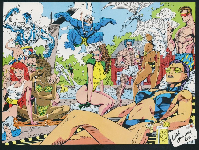
It’s Jubilee flexing with Colossus, Iceman and Opal cracking jokes, Gambit getting his card pulled, Cyclops with a smile, and Archangel with the razor wings.
X-Men #1 wasn’t my first comic. That was Amazing Spider-Man #316, which I got from my uncle. X-Men #1 was probably one of the first ones I bought with my own money, or money begged off my mom, though. I’ve managed to hang onto it all these years, too. It’s well worn, which makes sense considering the fact I probably know it by heart, but not tattered, which is basically a miracle. Spider-Man was my entry drug, but Jim Lee’s X-Men hooked me. Last week on the internet, I said this:
Lee’s issues of X-Men are great comics. They’re pure spectacle, a series of really quick bursts of action and characterization. Some of Wolverine’s best moments ever are here, Gambit gets in a “gotta be da shoes” moment or two, and Bishop hits Rogue in the face with a boysenberry pie. Maybe you had to be there, but as an eight or nine-year old kid, these comics were the absolute apotheosis of comics as an art form or entertainment medium. “Jim Lee’s X-Men: David Brothers Likes It More Than He Likes Watchmen.”
The last line was a throwaway at first, something half meant to rile up the usual suspects and half sincere. The more I thought about it, though, the more sincere it became. I really do prize those comics more than Watchmen. In Watchmen, Alan Moore, Dave Gibbons, and John Higgins showed the world that cape comics were more than just entertainment for kids and shut-ins. They took the form and elevated it, charting new ground and changing the face of cape comics forever.
Jim Lee’s X-Men showed me that comics could be incredible, and crawled all the way up into my lizard brain to do it. I’m not even sure if I have the vocab to explain how or why. When someone says the word “superhero,” I think of Jim Lee’s art. He defined superheroes for me, and probably redefined them for the genre, too.
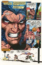
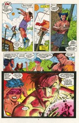
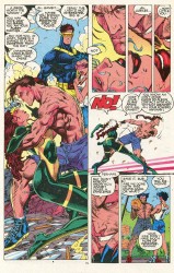
I know now, as an adult, that the visual language of cape comics comes from Jack Kirby. I can spot the influences in Lee’s art, too, the Art Adams business and John Byrne jawlines and Neal Adams physiques. I can break him down into his component parts if I put my mind to it, but Lee’s art is bigger than the sum of his parts. His characters look like superheroes should look: toothy grins, babyface or stubbled chins, physiques like Greek gods, and they positively bleed sexiness–granted, a very specific type of sexiness, aimed at pubescent boys, but it’s so easy to see his appeal.
I devoured those comics as a kid. I had a nearly uninterrupted run of Lee’s X-Men–that was probably a first, too–and I read most of them until the staples came out. Everything about comic books clicked for me and I had to have more.
His style defined the X-Men for years, to the point where the next big seismic shift in their visual style was when Joe Madureira mixed Lee’s costuming with a big sack full of manga tropes. The X-Men in X-Men: Children of the Atom up through to Marvel vs Capcom 2 are Lee’s X-Men, whether in design or in spirit.
Lee, even to this day, is probably the purest example of pop comics art. He doesn’t go in for Frank Quitely-style storytelling, David Aja-style body language, or Alan Davis-style realism. That’s not his thing. Instead, he has a keen eye for the cool. He knows what works on the page, and he gets that sometimes spectacle is more important than substance. Sometimes, substance is secondary to entertainment.
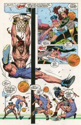
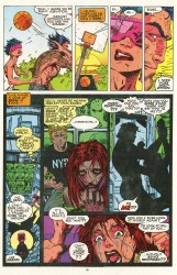
Grifter’s mask, Rogue’s bomber jacket and extra-long hair, Colossus being like eight feet tall, and Zealot are all things that shouldn’t quite work. If you think too hard at them, they fall apart. But when you’re swept up in the comic and watching these characters move across the page, none of that matters. It’s a cool visual, and it’s the type of cool that sticks with you. There are some scenes from X-Men that I first read twenty years ago and still hold in higher esteem than a lot of recent stuff. This “gotta be da shoes” reference right here:
I love this. It was topical back then, and probably passed through a corny phase a few years after that, but now, twenty years removed from its source? It’s fantastic. It’s just a guy having fun showing characters having fun. It’s not gripping reading, but it is compelling. There’s so much character and excitement packed into this dumb old basketball game.
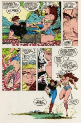
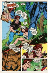
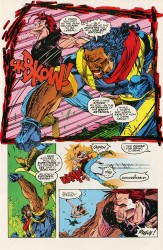
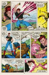
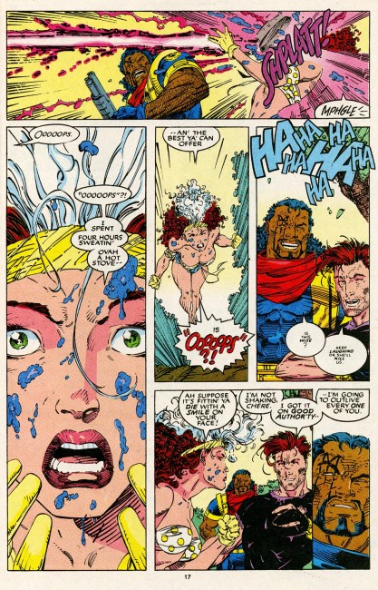
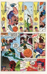
I definitely imprinted on this stuff as a kid. I’ve never even seen a boysenberry pie in real life, so every time I hear the phrase, I think of this scene. I get and enjoy dozens of artists, Kirby included, and have a pretty good handle on the evolution of how cape comics are drawn. Paolo Rivera or David Aja may draw cape comics that are technically better, and Frazer Irving or Travis Charest may draw ones that are prettier, but nobody ever gets me hype off superheroes like Lee does. It flips some switch in my head and I just gotta check it out.
I’ve seen Lee draw the WildC.A.T.s, Batman, Superman, and the X-Men. Flash, too, I think–maybe a cover or three during Geoff Johns’s first run on the series. I sorta wish he’d done something substantial on Spider-Man. Spidey’s still the perfect superhero, and probably the one major gap in Lee’s body of work.

It’s weird, because I both agree and disagree. Lee’s art is pure superhero and yet bad comic book. At least for this day and age. For me, Lee draws gorgeous, dramatic scenes – just look at ASBAR, which has this ‘unf’ even if misplaced – but his narrative flow is standard at best. It doesn’t really use the comic book medium.
I’d argue that Quitely is the true face of “pure pop comics art”. He understands the medium, plays with it, embraces all it’s virtues and faults, and then produces something that makes your eye travel naturally around the page. And even though it looks like it could exist in a Warhol production or feels naturally cinematic, it’s just pure comic – it couldn’t be replicated anywhere.
Lee draws scenes, storyboards, the money shot. Quitely draws comics. And the perfect comic artist would have Quitely’s insane concept of narrative and body language, and Lee’s superdynamic Grecian God-like figures.
I agree with you no question on his X-Men run there. Those comics are in my soul. But outside of there, I don’t know. I think JL + X + 90s was a Perfect Moment that’s unlikely to be matched.
Lee was the best of the terrible trio of Image founders. Which is damning with faint praise, I know. But his work was what finally drove me out of reading X-Men.
To be fair, Claremont’s plots disappearing up their own asses over the previous few years with no payoffs, and endless crossover events had me halfway out the door by the time he came on board. But even today his art bleeds the eye.
I was a kid in the ’70s, so I’m old enough to have received Neal Adams hand-me-downs (X-Men 57 & 58). I also read Claremont & Byrne’s “The Death of Phoenix” (X-Men 137) when it was new, having received it in a big stack of comics my grandfather sent me for my birthday. I was a Freshman in high school when I saw Uncanny X-Men 169 on the spinner rack at the White Hen Pantry convenience store (Chicago), and Paul Smith’s images, coupled with Claremont’s stories made me the X-Men fan that I am today.
In fact, X-Men 166 through 175 are ultimate sentimental favorites for me.
As it happens, though, during high school I got more into other pursuits (girls, hip-hop, etc.), and stopped buying comics. But, during my second year of college I broke my ankle and was stuck at home for however many weeks it took for the injury to heal. Bored senseless of television, I remembered how I used to love reading comic books, and cautiously drove to the old shop from my high school days.
On the bottom of the new comic book rack was Uncanny X-Men 275. The blue and gold uniforms on the cover hit me in the head like brick. Staring wordlessly at the beautiful art as I folded out the cover, I remember thinking that I was looking at the reincarnation of Neal Adams. The illustration was absolutely mind-boggling to me.
Anyway, I limped outta the store with Uncanny #274, #275 and some other comics that I don’t remember now. Needless to say, nothing could compare to the impression that Jim Lee’s art made on me that day. In no small way, his work ushered in my re-entry into comics, and I’ve probably not gone a month without ’em since.
You know, I was briefly willing to think “huh, I guess it’s just generational subjective tastes. I can see what would be exciting about this stuff, even though to my older eyes it was just garish and messy.”
But then I actually read the scanned panels, rekindling my hating-Gambit-with-the-fiery-white-hot-intensity-of-a-thousand-suns, and remembering that this era of X-Men made him a featured star, and my willingness to think that it was just a matter of subjective taste that these comics were awful evaporated!
@Jacob T. Levy: Ditto. I’d actually forgotten why I hated Gambit so much. Good thing someone decided to post those pages…
I probably don’t know as much about your tastes as a longtime reader probably should but maybe you would find the Hush Unwrapped volume as intoxicating as I did.
I am a big-time critic of Hush and, subsequently, of Loeb, but this version increased my appreciation of just about all aspects (even the omitted ones) of the creative process – especially Jim Lee’s art. In case I’m actually (and uncharacteristically) NOT the last to know, the book is all pencils. No ink. No color (except in captions and word balloons).
I’ve got you by a good decade, but I feel almost the same way that you do about Lee’s illos. Fun article – the kind I might have to bookmark and reread once in a while, like a good book.
@West: You know, I knew that was coming out, but totally spaced on picking it up. It’ll go nice next to my Absolute Hush. thanks for the reminder.
@Evil Abraham Lincoln& @Jacob T. Levy: gambit rulez, y’all drool
Umm…I will cop to having flipped through both books, Absolute Hush and Hush Unwrapped, side-by-side.
And loving every minute of it.
(In case someone’s keeping score, I’m cool with the Cajun.)
Great take on Jim Lee’s appeal here. I will always have love for these early X-Men issues, especially the Gambit / Wolverine Jordan / Bird rivalry (the angle of Gambit’s shots at the top of that one page, yikes!). The only real misfire of Lee’s projects for me was Divine Right: I don’t want to see Jim Lee waste pages on no skinny computer hackers, and even the fantasy bits were dull.
I’m not sure how big you were into WildC.A.T.s, but Lee’s art, combined with the coloring upgrade, is aces from issues 5-13 during that first run.
I couldn’t do X-Men comics as a kid. I started and ended with X-cutioner’s Song. Mark Bagley’s Spider-Man held me rapt.
Hells yes…I was an X fan starting in the mid 80’s, but I still like the early-mid 90’s run a whole bunch. The art was great and the storytelling, while not as good as the 80’s era books, was still a whole bunch better than the Morrison and Wheadon stuff that came later…
[…] It’s Jim Lee, stupid. Lee’s great, still one of my favorite guys. Seeing him on some new familiar faces will be interesting. And Johns’s only competitor for big action writing is Mark Millar, and Johns has twice the heart that guy does. I think this’ll be a pretty good read. STATIC SHOCK #1 Written by SCOTT McDANIEL and JOHN ROZUM Art and cover by SCOTT McDANIEL and JONATHAN GLAPION On sale SEPTEMBER 7 • 32 pg, FC, $2.99 US • RATED T The brilliant, slightly awkward high school student Virgil Hawkins transforms into the cocky electromagnetic hero Static! […]