
I Bought Thor 615 For John Workman
September 27th, 2010 by david brothers | Tags: john workman, matt fraction, pasqual ferry, thor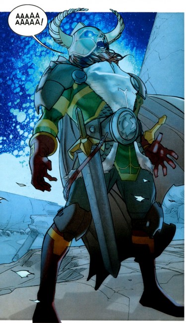
Not a joke! Not a snarky dismissal! I’m buying the Matt Fraction/Pasqual Ferry Thor because John Workman is lettering it.
That’s the pithy summary, anyway, but it’s no less true. Fraction is an okay writer who has done a few things I like (Casanova, Immortal Iron Fist) and a few things I don’t (Invincible Iron Man, Punisher War Journal) and Pasqual Ferry is a tremendous artist as far as I’m concerned, with great work done on everything from Superboy to Adam Strange to Ultimate Fantastic Four. Together, though, they aren’t quite enough to get me to read about Thor. I was going to give it a miss until I heard that Workman was lettering the book.
As far as I can tell, the only Thor you really have to read is Walt Simonson’s run on The Mighty Thor from the ’80s. The Kirby stuff never really clicked with me beyond the art, and the ’90s-era Thor was a tangled, knotted mess of a bunch of things I couldn’t have possibly cared about, no matter how hard I tried. Dan Jurgens and John Romita, Jr gave it a worthy try and told some good stories, but it never felt essential. J Michael Straczynski’s run on Thor
had pretty pictures from Olivier Coipel and the same brand of overwrought moralizing that has infected JMS’s amazingly awful DC Comics work. Michael Avon Oeming and Andrea DiVito came closest to making great Thor comics with Avengers Disassembled: Thor
, which wore its Simonson influence on both of its sleeves and down the seam of its pants.
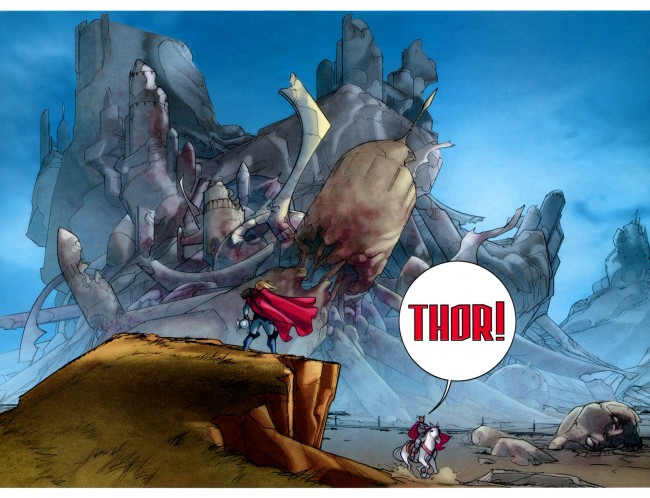
No, if you want Thor, you gotta go to Walter Simonson. With the aid of letterer Workman and colorists Christie Scheele (who I think also colored the Miller/Romita Man Without Fear, maybe?) and George Roussos, Simonson crafted a genuinely epic story. He took Thor high and low, introduced new members of the cast, took the traditional cast in new directions, and turned Thor into his book the way Miller did with Daredevil.
I only had a few random issues of his run as a kid, being focused mainly on Spider and X-related titles. I liked what I had, though, and I remembered my uncle being a big fan of his work, so I sought out the trades once I grew up. One thing I learned from them is that lettering matters. It is undeniably an integral part of the art. If you’ve ever read a comic where word balloons overlap and crowd out the art, you know exactly what I mean. Placement, type, and yes, even spelling, matter. Marvel’s flirted with lettering experimentation lately, probably most notably in Incredible Herc, but the majority of their books are more or less lettered identically. You never look at an issue of Avengers and go, “Whoa, that lettering looks great!”, you know?
Workman is the guy who gives your book personality. His style is distinct and instantly recognizable. Brett Lewis and John Paul Leon’s Winter Men benefitted greatly from his work. He lettered Paul Pope’s Batman Year 100 (in concert with Pope and Jared K Fletcher) and 100%. His balloons have tons of white space, more than they probably need, and long, crooked tails. His sound effects fill entire panels, and are as much a part of the art as Simonson’s pencils or Scheele/Roussos’s colors. The style of Simonson’s Thor is inextricably linked to Workman’s letters.
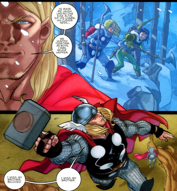
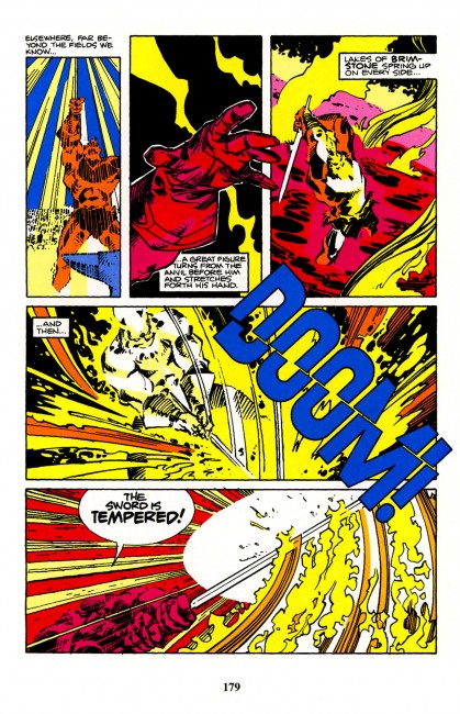
I mean, seriously. The foreshadowing of Surtur wouldn’t have been half as awesome without Workman’s letters, and the bit where Surtur cuts a “DOOM!” in half with Twilight? Fantastic. Pencils, inks, colors, and letters all working in concert to tell one story. That’s how comics should be.
Everyone who comes onto Thor is sitting in Simonson’s shadow. He’s the guy to beat. Most people who end up working with Thor are honest about it in interviews (JMS, Fraction, Ferry, Simone Bianchi, for example) or it reflects in the work (Oeming). Fraction and Ferry have been very open about loving Simonson’s run, which is cool, but plenty of people have said that and then produced crap. How many people have talked about Grant Morrison when taking over one of his characters, ideas, or former series and then delivered nothing worth reading? Talk is cheap.
The presence of Workman on the book, though, is the difference. I hadn’t realized it, but Workman’s letters are how Thor is supposed to talk. The sound effects, the balloons, the letters, all of that is undeniably Thor to me. Similar to how Spawn needs Tom Orzechowski or seeing a realistically rendered Patsy “Hellcat” Walker looks wrong, Thor without Workman just isn’t Thor. Going off and getting Workman speaks to the kind of story that they’re trying to tell. It’s an effort that I can respect, and moved me enough to grab the first issue of the Fraction/Ferry run.
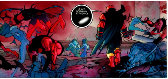
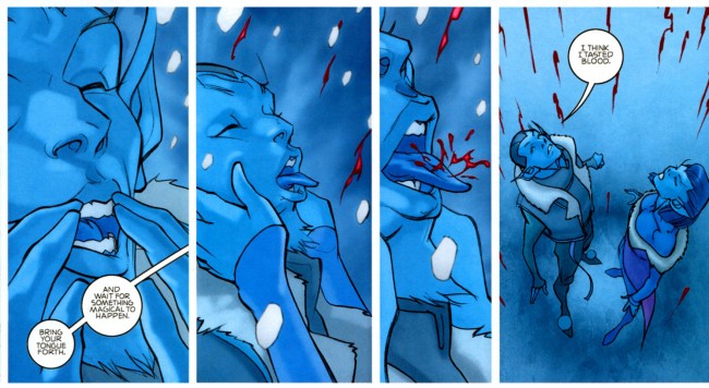
Verdict? Four dollars for a 22-page comic is entirely too high, but Ferry’s art is off the meter, Hollingsworth’s colors are real good, and Fraction’s got a great handle on everyone involved. The plot is looking good, just that sublime mix of sci-fi and magic that makes Marvel’s Thor what he is, and the enemies are appropriately fearsome. Workman absolutely kills on the lettering, particularly on the last balloon in the book, “I think I tasted blood,” the creepy black balloons, and Heimdall’s scream. The fact that there are ten double page spreads, all dedicated to non-Earth locales, is interesting. I think it’s too soon to call, but my best guess is that Fraction and Ferry are doing that to show the larger than life nature of the gods and the other of the nine worlds. There are three pages set in Asgard that aren’t spreads, and all the Earth pages are singles. I’m definitely going to be watching to see how that develops.
You should be reading it.

That two-page shot you used as your second image… that’s when it clicked for me that this was “the guy who lettered Simonson’s run!” The way “Thor!” is lettered just hit it on home. I knew ahead of time that Workman was doing it, but it never really sunk in until that word balloon. It just made the whole thing better; brought on a nice wave of good feelings.
Workman was the thing that got me to look at that Thor too, though I was disappointed it turned out to be Workman-via-computer. For so long that guy was the last holdout of hand-lettering in the mainstream, up through like 2005. His sound-effects lettering (the font in the big THOR! on the opening splash) always reminded me of “Transformers”, like it was the lettering equivalent of the logos all the robots had. Dude can draw too, he did some pretty okay Heavy Metal stories ‘n’ such, but god, I was looking at a book he lettered the other day, and he’s like the Harvey Kurtzman of the craft, man, just big bold CARTOONIST lettering. Killer. Nice article.
There’s no doubt it is an attractive mix of sci-fi and magic. Also Fraction appears to be taking Thor in a more cosmic direction. I’m quietly hoping he might even increase Thor’s power levels slightly.
Not that there was anything wrong with Gillen’s run on Thor – it was excellent!
As an Aussie science fiction writer I’ve been a Marvel Thor fan since the original Journey into Mystery of August 1962.
If you get a chance check out some of my Marvel (mainly Odin and Thor) fan fiction. Just scroll down below my author profile and you will see over 40 fan fiction stories here:
http://www.fanfiction.net/u/1276881/David_Scholes
Cheers
Workman is pretty awesome. I’m excited for the Simonson Thor omnibus, too. Just a note, there were actually around 29 pages of story in issue 615. Makes it a better purchase.
@RZ: Normally, it will be 22 for $3.99, though.
I liked the “DOOM” thing but nothing else impressed me – certainly not the last line, which seemed to be written by someone else and sized and styled identically to every other line in the provided examples.
I kinda have to agree with West… Maybe I’m just missing something. 🙁
Not too sure how the last line is depicted any differently that makes it kill. It’s incredibly unremarkable–the cracked DOOM however, is fantastic.
It’s probably totally intangible, but for me, it’s the thick white space above and below the words, leaving them floating in a sea of white. The top and bottom white space is a Workman Thing, but something about this time just clicked with me.
@RZ: Chad got it–the whole run is currently set for 4 bucks a piece at a regular page count. Lame.
@Matt Seneca: I was flipping through the first Simonson Visionaries volume (which quickly turned to just straight up reading) to look for good bits. There’s a gun fight toward the end of the book, maybe 3/4 of the way through the book, and the gun’s sound effects (I think they were a “ka-pow” or something like that, two syllables for sure) were encased in sharply ruled boxes. Two effects layered on top of each other, ka-pow ka-pow, with the first effect sitting halfway behind the second effect. Aural overlap depicted visually and off-set for the usual bombastic gunfire sfx. Workman’s the best. I’d post scans of it, but my thing’s at home.
Should also be recommending Esad Ribic and Rob Rodi’s Loki miniseries for essential Thor reading. Fraction’s Ages of Thunder was amazing as well. Both are ‘out of continuity’ though if your criteria is from the main Thor title only.
Lettering can make or break a Thor book. Eliopoulos was one of the reasons I bothered reading the latest one.
In part, it’s because Thor really depends on all the Kirby-era stuff – constant exclamation points, people declaring what the hell they are doing as they do it. It’s myth, and it’s aware of itself, and it couldn’t be otherwise when Thor meets his new robot sidekick, or Loki becomes radioactive. It’s why Kirby’s weirdly ambitious New Gods books remain so influential.
The contemporary way to do that, in order to keep it look like your characters are loud idiots, is lettering. And as other Marvel books (probably rightly) define themselves away into techno-thrillers, spy stories, and true-crime, Thor has to keep one foot in the 1960s.
“keep it from looking like your characters are loud idiots”, rather
Workman is also lettering Turf, and he’s essential. The book is so packed with text that without his stunning lettering, it could be a chore to read, rather than a delight.
Workman is a pro, and his lettering is distinctive. He definitely brings a huge amount to the table, and was one of the many ingredients that just made Simonson’s Thor look different from most superhero books. I wish more books had unique lettering that suited the tone of the work. Hellboy is another work that has great lettering. Pat Brousseau and now Clem Robins are great at their craft.
I’m going to have to be That Guy and defend Jurgens’ Thor – I know you’re not slagging it, but I’ve got to go to bat anyway. It was my Thor gateway, really. I wouldn’t have read Simonson if it wasn’t for Jurgens and his cool stories. The Cask of Ancient Winters, The Dark Gods, Odin’s death, Thor: Lord of Asgard, Asgard above New York, even Tarene The Designate/Thor Girl stuff. All great memories, and it shouldn’t be ignored by any Thor fan, and I include it as part of the general high quality of Marvel’s stuff in the late 90s-early 2000s. The great covers and the interesting logo (Thor: Lord of Asgard rendered with runes in the letters) really popped out on the stands, back when I bought floppies.
Also, check out Thor Blood Oath by Michael Avon-Oeming and Scott Kolins. Great stuff.
I’ve loved Workman’s stuff since I read those Simonson Thors as a kid. He’s the most instantly recognizable letterer out there, is always excellent, and I just love his style. Him and the astonishingly versatile Todd Klein … masters of an underappreciated art form.
I was going to pass this issue up until I read you’re post. Ferry’s art is the main draw for me on this book, though. (But you made a darn compelling case for the lettering as well!) I just kept looking at the images you provides – and the art looks like it was painted with magic; which is a pretty good style to be going for in a Thor book.
Thanks for the recommendation. My only fear about it is Fraction writing. He’s spun magic with Iron Man, but it’s been the complete opposite from his X-Men run. So he’s a tricky writer to favor going into a new series.
@Kandou Erik: I dunno what’s up with Fraction’s X-Men. Some writers who are generally good to great really lose their voice when they go aboard that franchise. Look at Brubaker’s short lived work, it was trash.
@Lugh: Actually, I liked Brubaker’s stint on the X-Men. It’s when Fration came on board, co-writing, that everything took a nose-dive for me. Then once Brubaker was offically off, I dropped the title entirely. I tried the series again later during Utopia, but the writing was just so bad. Which (I recently got to read Thor #615) just contrasts so much with the brillant execution I’m seeing in Thor and Iron Man. Maybe it’s just the the directionless feel the X-Men have which is the problem.
Though I completely agree about that Workman’s lettering is fantastic, I don’t think he did the sound effects that you are crediting him for in the Simonson run. This from Workmen himself, who says the sound effects were pretty much all Simonson. Check out the Comic Geek Speak archives for their interviews with Workmen and you’ll hear him say so. (He’s also a fantastic interview–if you are interested in his stuff, it’s really worth checking those out. I kind of want John Workman to tell me stories at bedtime….!)
I should correct that, David, since maybe you aren’t crediting Workmen with the sound effects. Anyway, still worth hearing the man talk…
[…] David Brothers explained why Workman’s letters are essential to the appeal of this issue for 4th Letter last week, and if you haven’t read it yet, I encourage you to check it […]
[…] with lifeless lungs or come in peace -Remember when I said “You should be reading it” in relation to the Fraction/Ferry Thor? I take it back. I […]
Found you article when I was looking to see what people though of the Thor run. Many thanks for your kind comments.
The reference made by one of the people replying to your review … the one about computer lettering … confuses me. This Thor material is all hand-lettered, as is the majority of my stuff. The last time I lettered an entire book using a typeface was when John Paul Leon drew a Sgt. Fury one-shot a couple of years ago. I much prefer hand-lettering, whether done directly on the art boards (as I currently do with stuff at Archie and by Walt Simonson and Tommy Lee Edwards) or directly into a computer by way of a Wacom tablet(as is the case with Thor, Torchwood stories for Titan, and the latter issues of Turf). Using a commercial font to do comics lettering is just the same as doing typesetting.
Oops… something that I just saw in another reply just caught my notice. Sometimes I don’t make myself clear about things. The majority of the sound effects in the Walt Simonson Thor work is mine. Walt and I shared those chores on the earlier Alien and parts of Star Slammers. Walt even did all the balloons (not the lettering inside the balloons, but the actual ovals and tails) on Alien. However, by the time Thor came around, I was doing all the titles and sound effects. There are a couple in there that Walt re-did because he came up with something better and there was no time to get the pages back to me to re-do those particular bits. In addition to his incredible abilities as an artist and a writer, Walt is a very accomplished letterer with a highly individualistic style.