Archive for July, 2010

h1

Big Boi – Sir Lucious Leftfoot, the Son of Chico Dusty

July 6th, 2010 Posted by david brothers

Half of the greatest rap group of all time drops his solo record today. I copped the deluxe edition, personally.

The intro track to Big Boi’s Sir Lucious Leftfoot is called “Feel Me (Intro)” and was produced by Malay. It sounds like Sleepy Brown singing, with a Roger Troutman accompaniment, but I might be wrong. It’s Antwan Patton’s resume. 15 years off in this game, still ain’t changed, feel me. It’s a command, not a request. This song is funky, with an Ennio Morricone whistle and laid back sound setting the stage for the album. There are no vocals from Big Boi until the very end, after the music drops out. “Damn,” he says. “And that wasn’t nothing but the intro!” Cocky or confident? Who cares, he’s right.

I’ve been looking forward to it forever, personally. OutKast always got broken up into the pimp and the poet, but that was never quite right. Big Boi was just as weird as Andre, but weird in a different way. SIr Lucious Leftfoot, as an album, is proof of that. He finally gets around to rhyming orange in a song, something I’ve been telling people he’d do since I was in high school. He flows over a variety of beats that have one thing in common: they all knock.

There’s a gang of guest appearances, but his album never feels crowded. George Clinton makes his second appearance on a Kast track, Yelawolf and Bobby Ray represent for the New New South, Andre 3000 produces one song (and would have had a spot on the album if Jive wasn’t run by idiots), Gucci Mane delivers a verse that doesn’t suck, and Big Rube makes a triumphant return to wax. Too $hort comes through for a guest appearance, and apparently he listened when GZA told rapper’s to make it half short and twice strong. His four bars are his whole style in miniature and still being dope.

You can easily draw a line from Speakerboxxx to Sir Lucious Leftfoot. The production doesn’t sound like your normal radio clips, and what samples there are are all over the place. There’s a lot of Dungeon Family-oriented production, too, whether from Mr DJ, Big Boi Andre, or the almighty Organized Noize itself. It’s a little more focused than Speakerboxxx, but when separated from Andre 3000, you can see where Big Boi is spreading his wings. He switches up his flow, whether via computer tricks or just good old fashioned spitting. There’s not necessarily a Rosa Parks or Hey Ya on this record, nothing that’ll put the radio on smash, but every song is bumpable.

I dunno if I can or should pick a favorite. “Turns Me On” is silky smooth, and I love Sleepy Brown. “Tangerine,” his joint with T.I. and Khujo Goodie is ill, too. “Fo Yo Sorrows” is nuts and includes a breakdown, something you don’t see often enough in rap these days. Big Boi’s verses on “Night Night” is crazy. Don’t even get me started on “Shine Blockas.”

I like this one. That’s really all there is to it.

You might wanna argue with me about best rap group of all time, but go ahead and listen to Southernplayalisticcadillacmuzik, ATLiens, Aquemini, Stankonia, Speakerboxxx/The Love Below, and watch Idlewild. We told you the South would rise again. You just didn’t realize it happened in 1995. DF!

Relevant videos:


Post to Twitter Post to Facebook Post to Reddit Post to StumbleUpon

h1

7 Artists: Chris Bachalo

July 5th, 2010 Posted by david brothers

Nobody in comics draws quite like Chris Bachalo.

I’ve seen people complain that his work is too confusing, hard to follow, or too jumbled. There may be a point there, but not one that I ever really agreed with. Bachalo’s art is dense. He draws in a way that fills panels with details. He doesn’t do the Bryan Hitch thing, where every jet has several realistic parts. He’s not Moebius or Katsuhiro Otomo, so he’s not throwing in every detail there is to throw in. No, Bachalo has more in common with Geof Darrow than any of those guys.
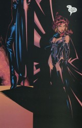
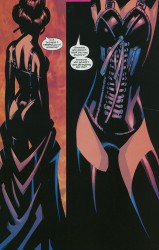
Darrow and Bachalo have a style that can be described as “obsessive.” In Shaolin Cowboy, Darrow drew every rock and lizard and butt crack he could get away with. His figures look like real people, but as you look at his work, you see more extraneous information than you would with the average comics artist. There are too many details, too many little touches, for them to be realistic.

Bachalo’s work is similar, though for different reasons. Bachalo doesn’t even try to replicate reality in his work. He’s more concerned with replicating the experience of life, rather than the appearance. In essence, where Hitch or Otomo try to make their drawings as close to real life as possible, Bachalo wants to replicate the feel of real life via caricature. Bachalo’s approach is fascinating, and makes for exciting, and beautiful, comics. The closest person to his drawing style in American comics is Humberto Ramos, but that is more due to the fact that they have complementary styles, rather than styles that resemble each other (i.e., Alan Davis & Bryan Hitch).
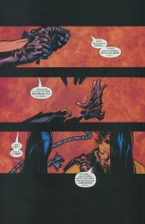
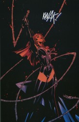
Bachalo draws these smooth, Play-Doh-type people. They have smooth skin, prominent noses, gelled-up hair, and wide mouths. Bachalo doesn’t go in for the muscles-upon-muscles style of superheroic art. Instead, he shows how powerful someone is by simply drawing them bigger and broader than everyone else. His Spider-Man is tiny and fairly muscleless, but he’s also lithe and practically a contortionist.
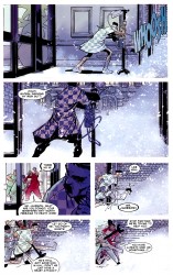
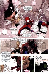
One of my favorite visual gags that Bachalo has drawn came early in Amazing Spider-Man: Brand New Day. J Jonah Jameson, after suffering a heart attack, is in the hospital, crankier than ever before and ready to go. He sneaks outside into the snow, barely making any headway against the wind. Panel five has the money shot–James with his leg thrown out far, bound and determined to take another step while a nurse drags him back inside.

That one panel is a perfect look at how Chris Bachalo uses caricature to create believable body language. It’s not realistic by any means. The snow is a big ball of blurred white, Jameson’s gown is just a little wrinkly, and his neck is way too long. This is practically a Three Stooges or Buster Keaton shot in comic book form. Jameson’s exaggerated motion, along with his stick-thin legs, enormous chin, and long neck, all work in concert here to tell you everything you need to know, clear as day.
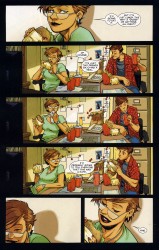
Bachalo is a master of acting. In this page from Amazing Spider-Man: Shed, Carlie and Peter are having an impromptu lunch. Bachalo uses close-ups to frame the page and three wide panels to show the actual action. Peter has a Ralph Dibny nose when he goes “Cheers” with his cup, Carlie’s carefully dabbing at her mouth after a messy bite, and her relaxed lean in panel four is killer. The quiet laugh in panel five is pretty great, too. Peter and Carlie come across as comfortable and friendly, and you don’t need dialogue to figure that out. It’s a little goofy, a little funny, but it’s great work.

What’s interesting about this page is the way that both people are drawn. Peter and Carlie both have Ralph Dibny or Mr. Magoo noses, strangely round jaws, and there’s a bit of Colin Mochrie in Peter’s face. Carlie’s mouth is unnaturally huge in panels five and six, especially in six. It’s kind of weird that she’s clearly taking little bitty baby bites out of that sandwich with her big ol’ mouth, but that doesn’t matter any more than the big noses and Peter’s weird hair does. Bachalo warped them in tiny ways, but uses that to his advantage.
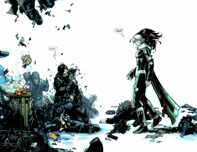
Bachalo uses unrealistic proportions well, but what he’s best at is playing with space. His mostly-white two-page spread from X-Men: Supernovas is beautiful, with the left-hand side being stacked with the aftermath of an attack, including some adorable flopping fish, while the right side is left largely empty. The composition is impeccable, perfectly displaying the chaos of half a second previous and the quiet moment just after.
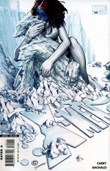
I’m really fond of the cover to X-Men 190, too. Again, it’s very busy, overflowing with information in the form of clumps of ice, puddles of water, and the mountains in the background. The best part of the cover is the embrace between Mystique and Iceman. She has long arms and fairly thin shins, but she’s all round angles and smooth. Iceman is the opposite, with hard-edged ice, broken limbs, and a pointy face. I can’t quite put my finger on it, but something about this cover stuck with me. Maybe it’s the way the blue and greys blend together (which I think is due to Antonio Fabela, Bachalo’s usual colorist) or the splash of color that is Mystique’s hair. It’s a striking image, and positively claustrophobic.
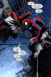
In this page, where Spider-Man has a guy strung up and is trying to scare him straight, the panel is tilted to the left and comparatively filled with information. The chimney stacks, water towers, and brickwork all work to show you exactly where this is taking place, but the real meat and potatoes are Spider-Man and his webs. Bachalo draws the best webs since Todd McFarlane left the Spider-books, and he’s just showing off here. Bachalo’s Spider-Man is crunched down into a tiny ball, ready to spring, and has huge and expressive eyes. There’s a lot to look at here.

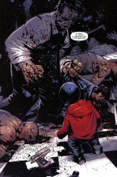
Look at the image of Hammerhead, from Amazing Spider-Man: Crime and Punisher. This is how Bachalo shows power. Hammerhead is huge. Hulk huge. The scale would have you think that the kid in the foreground is barely a toddler, but no. He’s in his pre-teens. Hammerhead is just that big, and he’s half-crouched. One of his fists is as big as the kid’s head. The page is weighted toward the background, making the kid look even smaller. This is an effective choice, in part because it instantly gets across how dangerous Hammerhead is, even without the piles of beaten and brutalized bodies behind him.
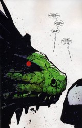
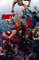
Space and scale again. The Lizard dominates this page from Shed. He’s enormous and right in Spider-Man’s face. All of the details on the page go to the Lizard, leaving Spider-Man featureless, save for his wide eyes. A later page features Spider-Man swarmed with civilians, buried under a mass of them and drowning in the chaos.

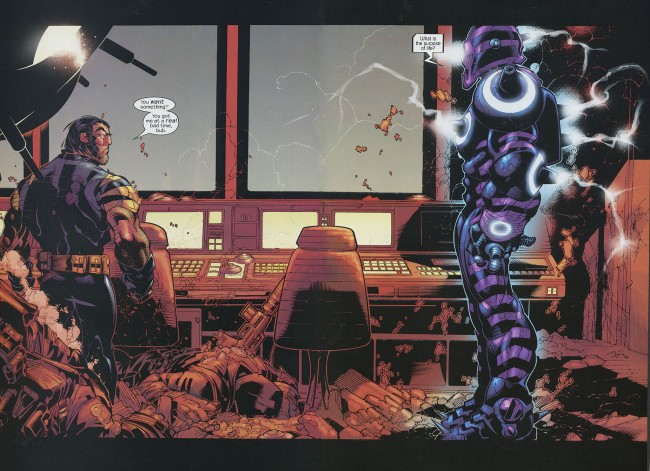
Bachalo alternates between flooding a page with information and leaving them wide open. This is the way storytelling in comics should work. Every element of his work is done in service of the story, whether the characters are warped and compressed under the pressure of all the debris on the page or given room to breathe. He’s killer, and extraordinarily suitable to drawing Spider-Man comics. His take on the character gives you a short, fairly skinny version of Spidey, a take that works really well and makes everything a little more interesting.
Post to Twitter Post to Facebook Post to Reddit Post to StumbleUpon

h1

Fourcast! 52: Madvillain

July 5th, 2010 Posted by david brothers

-All villains, all the time in this extra-sized Fourcast!
-Esther liked last week’s Green Lantern 55 and Action Comics 890.
-Yes, even the sad/silly cat story.
-We smoothly segue into talking about Batman’s villains.
David is in love with the idea of apophenia.
-We discuss the workman-like qualities of Flash’s Rogues.
-David makes a case for Spider-Man’s villains.
-Esther ain’t having none of it.
-Esther was recovering from being sick.
-David was in the process of getting sick.
-David will be smarter next time or he’ll be fired.
-6th Sense’s 4a.m. Instrumental for the theme music.
-See you, space cowboy!

Subscribe to the Fourcast! via:
Podcast Alley feed!
RSS feed via Feedburner
iTunes Store

Post to Twitter Post to Facebook Post to Reddit Post to StumbleUpon

h1

This Week in Panels: Week 41

July 4th, 2010 Posted by Gavok

Time for another go. It’s July 4th weekend (happy 4th from the 4th, I suppose), meaning two Captain America comics and one Steve Rogers comic. It’s kind of moot when you consider I have three Deadpool comics on here. Only two of them are any good. I thought I was losing my mind when Deadpool Corps was starting to win me over, but seeing that I am really not feeling Wade Wilson’s War is almost a relief in some sense.

Abe Sapien: The Abyssal Plain
Mike Mignola, John Arcudi and Peter Snejbjerg

Captain America #607
Ed Brubaker, Mitch Breitweiser, Sean McKeever and David Baldeon

Read the rest of this entry �

Post to Twitter Post to Facebook Post to Reddit Post to StumbleUpon

h1

7 Artists: Ed McGuinness

July 4th, 2010 Posted by david brothers

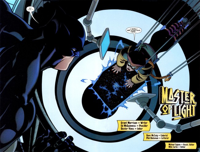
JLA Classified 1-3 is the perfect superhero story. As far as stories about tights and fights go, it is top notch and one you can point to that has almost everything that makes superhero comics work. Grant Morrison supplies a script that’s packed with jet apes and killer robots, but Ed McGuinness, ably assisted by Dexter Vines and Dave McCaig, knocks the ball entirely out of the park with his art. Without McGuinness, this wouldn’t be half as good as it is.

For a long time, Jim Lee defined comics art for me. Todd McFarlane drew my first comic, but Lee did X-Men 1, which blew the roof off superheroes for me. His characters were tall, imposing, built, and attractive. They were the movie stars of comic book heroes. They aren’t as weird as McFarlane’s creepy take on Spider-Man, they were more realistic than Jack Kirby’s work, and they looked like they were chiseled, rather than drawn. They looked like the end point of the superheroic ideal, beautiful people doing powerful things.

After I came back to comics after a long time away, Ed McGuinness soon took over Lee’s spot. His take is even less likely to appear in real life than Lee’s, but something about his squat, muscular, and clean take makes superheroes look like they should. There are touches of CC Beck and Curt Swan in his work, but McGuinness never looks like a Silver Age throwback. There’s definitely some of the Image “muscles upon muscles” in his work, but it doesn’t ever look garish.

McGuinness’s superheroes look like cartoons, which is an astonishingly good take on the genre. Hyper-real superheroes look ridiculous, as a glance at any superhero movie you care to name will tell you. Superhero comics indulge in larger-than-life theatrics more than any other kind of book I can think of, and McGuinness’s art reflects that.

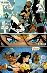
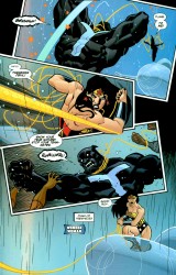
The most striking thing in these two pages are Wonder Woman’s eyes on page one, panel four. They’re made of very simple lines, free of wrinkles, and with the barest hint of a furrowed brow in the center. Instead, her eyebrows do all the talking. They’re unnaturally cocked high, aren’t they? Page two, panel two features Wonder Woman breaking the panel border as she flexes and pulls her lasso taut. Her back muscles are drawn in thick and large, but her hair is a solid mass of black. There’s no noodling or unnecessary details to gum up the works. He draws a lot of details, from pouches to cracks in armor to wrinkled cloth, but he always stops short of over-rendering. His characters are simple, with strong silhouettes and lantern jaws.


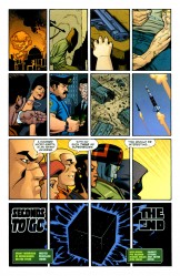
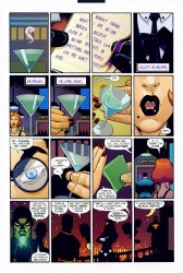
His storytelling is clear as a bright summer day, too. This story takes him from hyper-compressed sixteen panel grids to wide open two page spreads and he handles both of them with ease. McGuinness has never had a problem with readability, and his sense of panel to panel progression is impeccable. He repeatedly uses characters as part of the design of his pages in this story in particular, and it never stops being anything but good. When things go all sideways and his panels start twisting and turning, it’s to emulate a high-speed mid-air dogfight. At the end of the fight, when a laser goes straight through Squire’s arm, the panel is straighter than a ruler.

In the years since JLA Classified came out, McGuinness has been working mainly with Jeph Loeb on Hulk. He has introduced several new elements into his style, making his style less cartoony than it used to be, but still clearly his style. If JLA Classified was the Saturday morning cartoon, his work on Hulk and a few other comics since then is the big budget feature film.

On Hulk, he’s working more details into his art, embracing several techniques he didn’t employ previously, and upping the spectacle in his work by several orders of magnitude. Everything is bigger. The figures are more detailed and more traditionally expressive. What’s notable about these style changes is that McGuinness manages to do all of this without breaking what made his style so attractive in the first place. The figures are less simple than they were in JLA Classified, but no less recognizable and attractive.

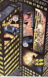
Watching McGuinness on Hulk is kind of like watching Miller on Sin City. You can see where he’s pushing against his limits, bringing in outside influences or diverse styles, and still keeping it all within what you could call his style. He’s still doing interesting layouts, particularly in the Secret Warriors special he drew where Nick Fury and a friend engage in a midair dogfight as displayed on the sides of a few skyscrapers or when characters break the panel borders in Hulk.

McGuinness is definitely what pops into my mind when I think of a generic example of superhero art. Kevin Maguire’s strength is accurate facial expressions, and Frank Quitely is fantastic at body language, but McGuinness’s characters look like superheroes should look. Big, beefy, cartoony, and exciting. His strength lies in accomplishing that without sacrificing storytelling on the altar of pin-ups and so-called iconic shots. He knows how to tell a story, and often delivers work that completely out-classes the scripts he’s given to draw. As time goes on, he becomes more and more versatile and that’s what makes his work worth checking out.
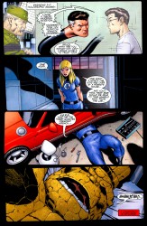
You don’t get sub-par or uninteresting work out of this guy, and every time he takes a short break, he comes back with something new. Credit is also due to his inkers, usually Dexter Vines or Mark Farmer, and colorists, Dave McCaig, Dave Stewart, Jason Keith, and Morry Hollowell. They bring out a lot of the details McGuinness puts into his art, and you can tell that they’re a complementary team. Together, they do powerhouse work.

Post to Twitter Post to Facebook Post to Reddit Post to StumbleUpon

h1

Darkwing Duck’s Ian Brill: When in Trouble You Call an Interview

July 1st, 2010 Posted by Gavok

He is the terror that flaps in the night. He is the hangnail that ruins your day. He is the milk that smells funny even though you just bought it two days ago. He is the duck who will fight for your honor. He is DARKWING DUCK!

And he’s back!

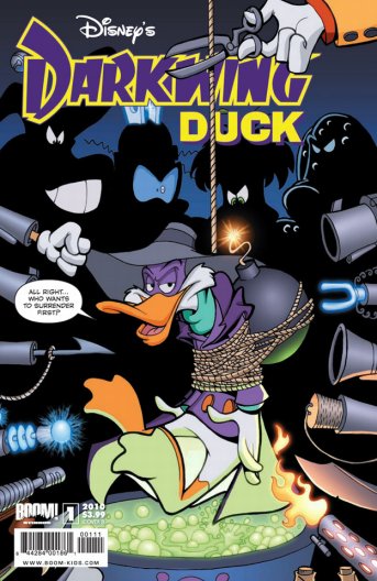
BOOM! Studios has been gangbusters with the various Disney comics, so it brings me great joy to see one of my favorite cartoons growing up has been brought back to the forefront. With words by Ian Brill and art by James Silvani, the billed vigilante was originally set to return in a four-issue miniseries, but now it’s been stretched into an on-going. I picked up the first issue a couple weeks ago and it’s definitely lived up to expectations.
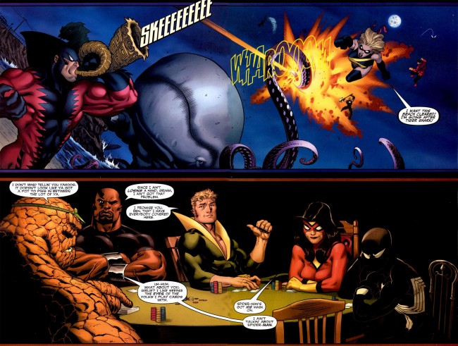
Then David Brothers told me that he personally knows Ian Brill and since David still owes me for that time I saved his life during that whole bullfrog incident years back (don’t ask), I called in that favor and had him put together this interview. Surprisingly, Ian agreed and questions and answers were had.

Now, then. Let’s. Get. Physical.

…DANGEROUS! I meant to say DANGEROUS! God, why do I keep doing that?

Read the rest of this entry �

Post to Twitter Post to Facebook Post to Reddit Post to StumbleUpon