Archive for September, 2009

h1

Awakening Answers: An Interview with Zombie Comic Writer Nick Tapalansky

September 23rd, 2009 Posted by Gavok

About a year and a half ago, I got into a comic called Awakening, written by Nick Tapalansky and drawn by Alex Eckman-Lawn. Released by Archaia, the dark zombie mystery of a title had me interested for the first three issues, but then… nothing. The series went on hiatus for the longest time, only for it to finally resurface.

Did it resurface as #4? No, even better. Recently, a hardcover collection has been released, featuring the first half of the planned ten-issue series. It’s good stuff and is a good read for the upcoming October mood.

I invited writer Nick Tapalansky to an interview. He was gracious enough to both answer my questions and not hit me.

Read the rest of this entry �

Post to Twitter Post to Facebook Post to Reddit Post to StumbleUpon

h1

Yotsuba & Translation Issues

September 23rd, 2009 Posted by david brothers

Yotsuba&! 6 is very, very funny. Easily the best book in the series thus far, if only due to the way the stories end up snowballing into a larger tale. Yotsuba’s trek to Fuuka’s school did an amazing job of capturing just how awesome real life is, which is something Yotsuba&! already does very well.

You already know how much I like Yotsuba&! Rather than doing a recap and review of volume 6, I want to discuss something that makes me love it a little less.

My problem is with the translation. It’s not to my liking, to be honest, and pales in comparison to the ADV Translation. It’s not that it’s bad, exactly, but it is a little too faithful to the source material.

Part of the beauty of Yotsuba&! is that the source material is very, very strong. The relatively few cultural jokes have easy analogues, as in Miura visits the Ayase household dressed as a cardboard robot. In the ADV translation, she says that her name is Cardbo. That’s pretty easy, right? Cardbo->Cardbord->Cardboard robot. It makes sense.

In the Yen Press translation, Miura calls herself Danbo, a reference to the Japanese word for cardboard. And, okay, that’s cool, but it isn’t a joke, exactly. It’s a reference with a footnote. It’s like when someone tells you a joke, and you don’t laugh because you don’t get it, and then they explain why it was funny. The problem is that after all of that… it still isn’t funny. You get it, but you don’t laugh.

Similar to the Danbo translation is the use of honorifics– chan, san, and so on. While an integral part of Japanese, they don’t really have any place in English. It’s another joke that doesn’t work. There are ways around it, of course– Fuuka-neesan can just be “big sis,” for example. Oftentimes, however, nothing is truly lost by leaving them out. An adult referring to Yotsuba in Japan may say “Yotsuba-chan,” while an American would say “Yotsuba.” Both are equally valid and both read the same. The chan is just a clue for us to go “Oh! She’s talking to a child!”

The sound effects are also left untranslated, for the same reason that I assume the honorifics were left in. Untranslated isn’t exactly right, though. There are little notes next to the first iteration of each sound effect in a group that explains what the sound is. Otherwise, the sfx are untouched.

It’s a little lame and distracting, if I’m being perfectly honest. It’s another case of being too faithful. I’ve been reading manga for a long time. I know that “doki doki” is the sound of a heartbeat, “ora ora ora!” is what people say when they’re punching someone over and over, and that chicks go “piyo piyo!”

The thing is, that sort of thing doesn’t really translate. It tends to just look silly, and yep, in Yotsuba&!’s new translation, it looks silly. When the Japanese sound effects are left in the text, the book ends up looking more like a fan translation rather than a professional work.

Fans are notable for being extremely reluctant to be anything but absolutely faithful to the source material in an attempt to be truly authentic. This often leads to awkward, or nonsensical translations. Yotsuba&! being strong enough to shine through an awkward translation doesn’t make the translation any less awkward. The honorifics don’t add anything to the book, beyond it seeming more “Japanese.” It’s like the book has been translated, but not localized.

Part of the draw of Yotsuba is how it’s fairly minimalist, to borrow an idea from Jeff Lester. His specific example was toward the end of Yotsuba & Delivering, when Koiwai bonks Yotsuba on the head for bicycling so far away from home. It’s a completely white panel with Koiwai, his fist bonking Yotsuba on her gigantic head, the sound effect in kana, the romanization of the sound effect (“go”), and “bonk” in parentheses.

In the original Japanese, it’s a very simple and to the point panel. However, in Yen Press’s translation, it’s got the romanization and the actual translation on top of the kana, which just clutters things up. It takes away from the minimalist style of the panel. The problem is that editing out the kana and simply inserting a “bonk” sound effect in an appropriate style would’ve been much more straightforward and, well, funny. The panel has two bits: Koiwai bonking Yotsuba and the “bonk” sound. Instead, it has the bonking action, a symbol that’s essentially meaningless to me, the translation of that symbol, and then the actual sound effect. It’s too much. It weakens the joke by layering on too much information.

My favorite translation, bar none, is the Geneon Lupin the Third dub. It took an old series that would not have benefitted very much from a direct translation (judging by the original Monkey Punch manga I used to own), looked at the characters and their personalities, and crafted new lines and jokes based on that. The characters never felt out of character or inappropriate, and the jokes were actually funny, rather than just being references to Japanese pop culture. This is an extreme example, of course, but it shows how this kind of thing can work.

It’s similar to how ADV approached their Yotsuba&! translation. Certain things won’t translate seamlessly, but rather than compromise a very funny book by making it less funny, they bent the rules a little and kept the book’s spirit, if not its letter.

I totally understand why Yen Press’s translation is the way it is. JuYoun Lee, Senior Editor at Yen Press, gave an illuminating interview with Deb Aoki over the translation. I don’t agree with the way they chose to go, but it makes sense from a certain angle. It’s more accurate and exact, but I don’t think that that is a universally good thing. It leads to too many jokes ending up explained, rather than allowed to breathe, distracting gremlins ending up on the page, and having to qualify my love for the series when recommending it to people.

At one point during Yotsuba&! 6, Koiwai says, “I love the way she reacts to stuff like this.” That sums up the entire series. It’s got a strong dose of humor, wonder, and love. The source material is some of the best out. Yotsuba&! is a very, very good series, but certain aspects of the translation are disappointing. That isn’t a dealbreaker, but I wish it were a little better. It deserves it.

Post to Twitter Post to Facebook Post to Reddit Post to StumbleUpon

h1

To Read Makes Joss Whedon’s Speaking English Good?

September 22nd, 2009 Posted by Esther Inglis-Arkell

It seems that FOX did something to Joss Whedon’s vision of the first season of Dollhouse.  Joss Wheden talked about it after a charity screening of Doctor Horrible’s Sing-Along Blog.  And after reading the quote, I have no idea what it is.

[FOX] said “so they’re kinda like prostitutes and that’s not ok” Word came down that it wasn’t ok. I wanted to make a show that’s about feeling bad about feeling good or good about feeling bad. Fantasy is just that, fantasy. FOX wanted to back away from these implications.

The thing is, they are prostitutes and that is ‘not ok’.  It seems like acknowledging that is doing the exact opposite of ‘backing away’ from the implications of that concept.

Or is it ‘not okay’ for them to be shown as prostitutes and Joss Whedon wanted to lay what the dolls were used for out plainly enough for us all to have moral objections?

Or were the FOX executives simply saying to lay off the hooker plots?

Only Joss knows for sure. 

Post to Twitter Post to Facebook Post to Reddit Post to StumbleUpon

h1

Marvel: The Expanding Universe Wall Chart (& Contest!)

September 22nd, 2009 Posted by david brothers

MarvelFolderSuperhero comics encourage obsessiveness. I know you know it. Don’t pretend that it doesn’t. Paying attention to continuity, untangling the quagmire of a character’s past, and following all of the news and trivia of a company is something we’ve gotten pretty good mileage of here on 4l!, even.

And I mean, I make fun of it all the time, but it’s also pretty interesting. It’s kind of like solving a puzzle. A puzzle with several dozen pieces that all have the same shape, so putting it together is an event. The companies even encourage this with their crossovers and events.

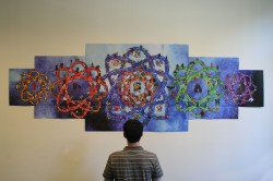
Rizzoli USA, the folks who published Louise Simonson’s DC Comics Covergirls (a book I’ve wanted to read forever but haven’t gotten my hands on) sent over something pretty interesting last week. Marvel: The Expanding Universe Wall Chart is pretty much the perfect thing for a new reader or an old reader looking to pick up some new tricks. First, check out the size of the thing:

MarvelWallChart_scale

That’s twelve feet long by three feet tall. It’s enormous. Essentially, the Marvel Wall Chart is an expanding poster book, accordian style. As you pull it open, and it keeps opening and opening, it reveals more and more Marvel characters, all of which are sorted into “families.” The design emulates an atom, the thing that is at the heart of so many Marvel origins, and each atom features one major character as its nucleus. The Torch anchors the Golden Age and pre-Marvel characters, Spider-Man is at the center of his family, the FF take care of many other heroes and cosmic Marvel, the X-Men revolve around Professor X, and Dr Strange takes care of the magical characters.

Now, that’s all well and good, but images only go so far, right? On the flipside of the chart is a continuity wonk’s dream: pages and pages of info on your favorite characters. They’re sorted by theme, rather than character, so you can see things about teams, kid heroes, origins, names, and so on. There’s even a bit on marriages. I uploaded a flickr set with a few G1 shots of them so that you can see what I mean.

It’s all pretty neat, to be honest. It’s a little tongue in cheek (Hellcat and Hellstorm’s marriage contains the blurb “presumably this ceremony was not held in a church”), and Patsy Walker gets a lot of love, surprisingly. I like it.

Now, here’s the thing that should interest you. I’ve got an extra one of these, new in box/mint condition/still in the wrapper, which means that it’s contest slash giveaway time. Here’s the details:

1. Share your favorite bit of Marvel or DC trivia or continuity porn down in the comments
2. Leave a valid email address in the email box
3. In the name box, put your real name. First name, last name, both names, whichever you prefer. Just no pseudonyms.
4. You have until midnight, this Friday, to enter. I’ll put a reminder post up on Thursday in case you forget to enter.
5. Also, this is open only to US residents. If you want to share trivia, and you’re from Uzbekistan or somewhere, you can, but please mark that down in your comment.
5. Wait until Monday, when I announce the winner and ship them a big fat chunk of Marvel history.

Sound good? Let’s get it in. Show me what you got.

Post to Twitter Post to Facebook Post to Reddit Post to StumbleUpon

h1

City of Dreams (New York, New York)

September 21st, 2009 Posted by david brothers

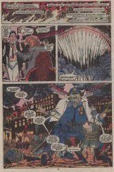
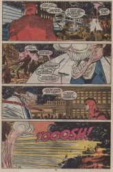
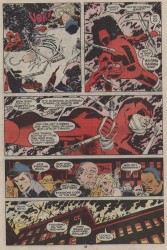
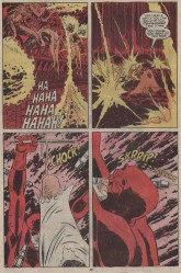
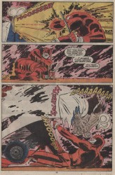
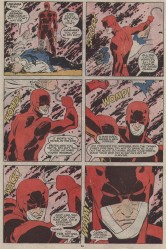
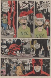
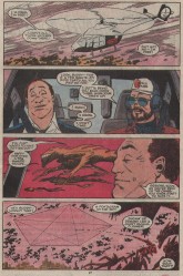
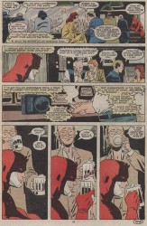
I’ve yakked about Ann Nocenti’s run on Daredevil before, but honestly, it was really great and underrated comics. The message that violence is not the answer, that heroes cannot use violence as the end-all/be-all problem solving tool, all of that stuff? It’s what Daredevil could use a little more of these days, instead of increasingly tortured melodrama and depression. I like my Daredevil to be a little more like Nocenti’s and a little less like Blankets, you know?

Anyway, context: Matt Murdock has forsaken the love of his life for Mary, the good half of Typhoid Mary. At the same time, Daredevil has fallen under the spell of Typhoid Mary, who betrays him, has him beaten, and then finishes him off by dropping him off a bridge. When DD wakes up, New York City has gone to Hell, literally. It’s infested with demons, the skies have gone red, and monsters roam the streets.

Daredevil, ashamed of himself and his actions, has gone quiet. He’s moving on auto-pilot, never speaking, just brutalizing demons. It isn’t even properly protecting people. The demons provide a convenient excuse for Daredevil to work out his frustrations. Not much of a hero, is he?

Best part’s the smile at the end.

Words by Ann Nocenti, art by John Romita, Jr.

nocentidd-001nocentidd-002nocentidd-003
nocentidd-004nocentidd-005nocentidd-006
nocentidd-007nocentidd-008nocentidd-009

Post to Twitter Post to Facebook Post to Reddit Post to StumbleUpon

h1

Fourcast! 17: Disney Presents Batgirl and Robin

September 21st, 2009 Posted by david brothers

What time is it? Time for another Bat-cast? You know it!

We open on me eating a rice krispie treat (thanks Esther!), move to the Disney/Marvel lawsuits, hop over to Batgirl, and then talk over Batman & Robin! Who’s trying to block the Disney and Marvel merger? What’s up with the possible love interest in Batgirl? Why did David drop Batman & Robin?

We ran a little over time (by half an hour, dang) so look for a Continuity Off-specific episode in a couple weeks!

Post to Twitter Post to Facebook Post to Reddit Post to StumbleUpon

h1

Reporting live from the scene…

September 19th, 2009 Posted by david brothers

Esther Inglis-Arkell is on the ground with io9.com with an article about unexplored rapes in comics. You should go give it a read and then digg it in when you’re done, I think!

Post to Twitter Post to Facebook Post to Reddit Post to StumbleUpon

h1

The Red Right Hand of Justice

September 18th, 2009 Posted by Esther Inglis-Arkell

What does that even mean?

I guess it just sounds cool.  And although Red Hood has a dippy catch phrase and is lobbying hard for the title of World’s Silliest Mask (Getting strong competition from the Purple Conehead in that issue.  Does anyone know who that is?) he’s shaping up to be a pretty good character.

I like that he’s obviously out to make a name for himself, for whatever reason, and approaches it with pragmatism and care.  It’s nice to see a hero/villain/anti-hero/whoever who is media-savvy.  I also like seeing the relationship between him and that girl who is his sidekick.  Funny that it seems about five times more tender and respectful than the relationships that most of the heroes have with their sidekicks.  The two seem to like each other and respect each other’s quirks.

Now, to the meat and potatoes.  Guesses on who Red Hood is?  I think the Jason thing is a red herring.

Post to Twitter Post to Facebook Post to Reddit Post to StumbleUpon

h1

Darwyn Cooke’s Richard Stark’s Parker: The Hunter

September 18th, 2009 Posted by david brothers

There are three books all comics readers should be forced to read this year, at gunpoint if necessary. One is David Mazzucchelli’s Asterios Polyp. It’s the kind of book you read a couple times, discuss with your friends, and dig into to figure out what it really means. The second is Naoki Urasawa’s Pluto. Pluto re-contextualizes a children’s character for an adult audience and creates a compelling work that inspires complicated emotional reactions and rewards careful reading. The third is Darwyn Cooke’s Parker: The Hunter, which presents a classic revenge tale in a new format and is just an all-around great read.

Richard Stark’s The Hunter is a classic novel and an almost archetypal revenge tale. Man is wronged by his partner and his woman, has his money stolen, and is on a quest to get it back, no matter the consequences. The titular hunter is Parker, no other name given, and he is, almost to a fault, a professional crook.

Cooke’s adaptation a word for word transplant of the novel into comic form, nor the rote adaptation of a work you’d see other companies hack out to secure a quick buck. Cooke took the book, examined what worked as a novel, figured out what would work as a comic, and, well, he did it and he succeeded.

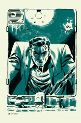
There are two two-page spreads in The Hunter, which are roughly 80 pages away from each other. The first of two two-page spreads opens the book with an overhead shot of a city, with “New York City 1962” stamped on top of it. The second spread is inevitable, something we all knew was coming and eager to see. Parker finally locates and gets a chance to get his hands on Mal, who has literally been caught sleeping.

thehunter_02That first spread is a starter’s pistol, as the next 80-some pages build up directly to the second spread. We see Parker’s long walk into the city and solvency, a largely wordless sequence save for a couple of muttered insults. While the wordlessness is nice, the real thing to pay attention to is Parker’s reaction to society.

He blends in very well. People, innocent people, offer him rides, give him blushing looks, and proposition him. He’s large and imposing, but he isn’t immediately identified as trouble. He’s enticing. Parker’s reaction to all this, though, is contempt at every turn. He tells the man who offers him a ride to “go to hell,” he walks down the middle of the bridge, he hops a subway turnstile, and he bums a smoke off a cute waitress before blowing the smoke in her face and leaving. Parker’s an outlaw. He’s got no place in proper society, and he doesn’t want one. He knows that he can take what he wants and, with proper planning, get away with it.

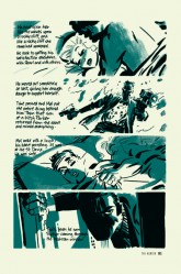
When the words come back, Parker’s reintroduction to the world is over and he’s all business from there on out. There’s little to no emotion to be found, and Cooke’s art reflects that. He doesn’t break from a strict grid for action shots or cool poses. It just hits, one after the other- bam-bam-bam.

When the grid finally breaks, it’s due to a change in the story. Parker’s flashback of his betrayal forces the words and the art into separate boxes, giving both room to breath and stretch their legs. They snap back to the grid soon after, though, and the story proceeds apace.

The first spread comes before books one and two. Book one is Parker’s reintroduction, while book two features the last days of the traitor, Mal. The second spread is the last image in book two, and it’s Parker coming through the window for Mal’s throat.

While the first two books were far from actionless, the second spread sets the stage for the rest of the book. Parker is within spitting distance of his target, and from here on out there is only going to be violence and death. Book three is the chase, and culminates in the end of Mal Resnick.

TheHunter_01Mal’s death, despite being a big deal, is treated as economically as the rest of the book. There’s no grand struggle, no promises, nothing. There is just a man and his big hands wrapped around the throat of the man who wronged him. Cooke is telling a story first and foremost, and everything is subject to that. Dialogue is to the point, the art enhances what’s going on. Characters act through facial expressions and body language. When Parker twists the filter off a cigarette, that’s character. When he slouches on a couch to sleep and awakes from his nightmare, you can see the malice in his pose.

Even the art style is economical. Black, white (though really an off-white/cream, due to the paper), and brushed green are the only colors you’ll find in Parker: The Hunter. Nothing stands in the way of the story that Cooke is telling. The limited palette gives the book a different feel than your normal black and white affair. It feels murky, not in a muddled art sense, but in the sense of a tale that’s nice and grimy. It’s dirty and thick, with some panels colored in completely and others decorated by splashes of green.

I think part of why I love The Hunter so much is because it doesn’t mess around at all. Each page is packed with info, whether there are words on it or not, and the grid is only broken for very specific reasons. The fact that it’s in a grid makes it very easy to read, but it also gives it an inevitable feel. The book moves along at a rapid pace, building up momentum toward Parker’s revenge like a snowball rolling down a hill, and you can’t escape from it any more than Mal can.

Parker: The Hunter is a page turner. You start it and you burn through it, and you’re left feeling satisfied and thirsty for more. The art and the story came together in a way that resulted in an excellent adaptation that’s extremely faithful, but still different enough to stand on its own. I read over a dozen of Stark’s Parker novels in the month or two leading up to Parker: The Hunter’s release, but this book still felt as fresh as a new Caddy. This is how you do an adaptation.

Three books: Asterios Polyp, Pluto, and Parker: The Hunter. As far as I’m concerned, Best of the Year is a three-way tie.

Post to Twitter Post to Facebook Post to Reddit Post to StumbleUpon

h1

“I Love You, Peter”

September 17th, 2009 Posted by david brothers

From Peter Parker Spider-Man Vol. 1: A Day in the Life, which is sadly out of print but available for cheap used, I present the Death of the Chameleon. Words by Paul Jenkins, art by Sean Phillips.

Webspinners 11-12Webspinners 11-13Webspinners 11-14Webspinners 11-15
Webspinners 11-16Webspinners 11-17Webspinners 11-18Webspinners 11-19
Webspinners 11-20Webspinners 11-21Webspinners 11-22

Post to Twitter Post to Facebook Post to Reddit Post to StumbleUpon