Reading Comics: “Don’t Curse”
May 14th, 2012 Posted by david brothersThere’s a Louis CK bit that I like a lot. It’s about how he hates “the n-word.” He goes on to say, “Not ‘nigger,’ by the way. I mean ‘the n-word,’ literally.” It’s a great bit because it’s funny, first of all, but it’s funny because it’s all about taking responsibility for the stupid things you want to say. A wise man once said “They wanna live in the house but don’t want no grass to grow.” People want to get the impact of having a curse word in their text, but they don’t want to take responsibility for the coarseness. They want all of the benefits and none of the downsides. And that’s weak.
Basically, know your outlet and your audience. I can’t curse on ComicsAlliance. Any expletives I might care to use would be turned into —- or f*** or ****** or whatever. I care a lot about how my writing flows and looks, and that looks stupid in text. ASCII’d out or asterisked to death curses in comics drive me crazy. Especially when they spell out the cusses in ascii characters like @$$ because… dude, who are you kidding? It’s having your cake and eating it, too. You’re a writer… figure out some way around it.
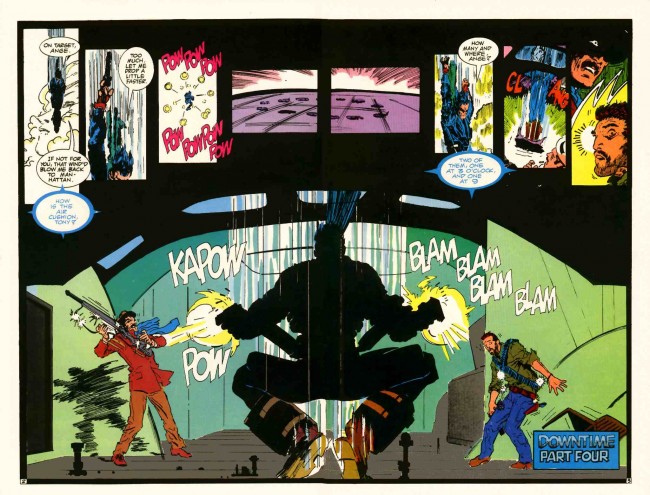
There are a couple of exceptions, of course. I’ve always liked the Milestone squiggle, because they used it for… I don’t know, high cuss words? The really bad ones? It can be seen here in Dwayne McDuffie, Ivan Velez Jr., and Trevor von Eeden’s Blood Syndicate #1:

and Adam Warren’s black bars in Empowered, this one taken from Empowered Volume 6 (Empowered Volume 7
is due out soon, get some):
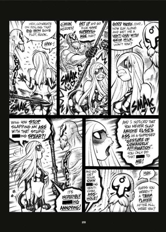
The squiggles and boxes feel more like bleeps than trying to have it both ways. Maybe it’s because the squiggle is art, rather than text standing in for other text, and I read that differently.
I started reading 2000 AD recently. There’s a strip in there called Grey Area that did something cool. Here’s a page from the chapter in prog 1767, pictures and words by Karl Richardson and Dan Abnett, that shows what I mean:

And I mean, I hate fake cuss words. Legion of Superheroes comics look stupid. Or silly. Maybe both. But this right here made me laugh. I like “grawlix” as a swear, because it’s both clever and explained in the story.
Grawlix is a bit of obscure comics terminology. It was coined by Mort Walker (the Beetle Bailey guy) in the ’60s, and he used it to refer to the faked up cusses you’d see in comics. Abnett here is using grawlix as a safe curse for men and women in uniform. When they step out of line and use real curses, they’re told to “Grawlix that.” It becomes about decorum in the text, which is much, much more interesting than being polite outside of the text.
Here’s another page, this time from prog 1770. Art by Lee Carter this time:

Anyway, cuss, don’t, or be clever about it. That’s all.

