I Got So Much Culture On My Mind 03: We Need to Review Comics Better
May 4th, 2012 Posted by david brothers-I’m thinking about quitting floppies for a month and then picking it up when they’re cheaper and keeping up that way. I think paying three and four dollars for digital comics is stupid, and if I skip a month, when I come back, all the comics will be two bucks, which is still stupid, but more tolerable. I mean, these people want three dollars for twenty-six pages of 20+ year old Tank Girls by Jamie Hewlett and Alan Martin. Really? In what world is that a deal, instead of a ripoff? And I say that as a huge Hewlett fan, from the Gorillaz to Tank Girl and back again. Bleah. I want to support, but I’m not going to be able to support if the prices are this absurd.
-My beloved friend and yours David Wolkin run an organization called Limmud NY. You can read about it here. Long story short, though, it’s about educating people with regard to their own Jewishness, and the broad spectrum of Jewish experience. It’s sorta fascinating, from the outside looking in, because it’s such a great idea. We all grow up in whatever culture or cultures we belong to and are expected to sorta keep up and mostly figure things out for ourselves. A concerted effort to educate people about their culture and how it applies to the modern day is… it’s beautiful, I think is the best word for it. I did those Black History x Comics posts for years for similar reasoning, and as a way to say that we’re here, we’ve always been here, and you don’t have to enjoy it, but please respect it. I did it because no one did it for me, so I’m glad to see Wolkin and Limmud NY doing their part. You can donate to Limmud NY here.
–Jason Latour’s giving away an art book. He’s got an ill style, and the sketchbook has life drawings and other things. I like how he draws buildings (page 7, 17) and the image on the bottom-right of page 5 is fantastic. He worked on BPRD Hell on Earth: The Pickens County Horror with Dave Stewart, and it was pretty good. Check it here and here. Mushrooms never looked so scary.
And yo, on his website, you see that header Pimp Trick Gangster Clicks? That’s how you know Latour is a real dude. Pimp Trick Gangster Click > Gnarls Barkley.

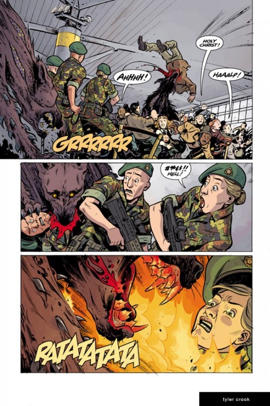
–I debuted the news that Tyler Crook is illustrating BPRD Hell on Earth: Return of the Master at ComicsAlliance. Crook is a pretty good artist, and it’s nice seeing his style evolve. I’ve got a copy of Petrograd somewhere around here. I need to sit down and read it. It’s high on my to-do list, but I keep getting distracted by old manga (this week it’s Katsuhiro Otomo’s Memories
, thanks to Jog.)
–Sean Witzke reviews 25 slashers, and kneecaps Cabin in the Woods in the process.
–Tucker’s Comics of the Weak @ TCJ are always worth reading. In fact, I think CotW and Jog’s column at TCJ are the only comics reviews I read at all these days.
–Giannis Milonogiannis, a dude whose vision of the future is right in line with mine (and Otomo’s and Shirow’s) is giving away comics. Go download OLD CITY BLUES: PROSTHETIC CORPUS PHASE ONE. I liked the original OCB (isn’t that title totally futuristic? Like OCP or something), which you can buy in digital or hardcover format. You can even read it online for free if you want.

-I liked Matthew Brady’s look at Hirohiko Araki’s Rohan at the Louvre. I’ve been meaning to pick it up, but (wait for it) I keep getting distracted. The preview is pretty tight.
-Eric Stephenson’s post about Bergen St Comics deciding not to carry Before Watchmen is a good one. “They’re leaving money on the table!” is a stupid thing to say. Every business makes decisions regarding what to carry and when. That’s their right. No one carries everything, and I think not carrying a book over ethical reasons is way better than not carrying a book because you don’t like Rob Liefeld’s art or something stupid like that.
–This quote from Joss Whedon is stupid. I can barely make sense of it.
–I like Chris Arrant talking about how we (fans, press, whoever) regularly and consistently devalue the artist in comics. I kinda sorta talked about this from another angle when I was talking about Marvel’s habit of ruining good books with rapid-fire art changes. It is an actual problem for these books and a problem for how we talk about comics. The best runs in comics have steady teams — look at the comics we got out of Claremont/Byrne/Austin, Claremont/Smith, Miller/Janson, Miller/Mazzucchelli, Brubaker/Phillips, Brubaker/Rucka/Lark, Bendis/Maleev, Ennis/Dillon, Ennis/Parlov, Nocenti/Romita, and more besides. If you give a team time to stick together and gel, you get better comics than you do when you reduce the artist to the level of an art robot. Having a steady team also changes how we talk about comics. We prioritize whoever is steadily present on a comic. These days, that means a writer. So it’s “Mark Waid’s Daredevil,” even though Paolo Rivera and Marcos Martin had tremendous input on what we all like about that comic. To call it Mark Waid’s Daredevil is disrespectful and inaccurate. It’s stupid. And yes, wah wah wah using multiple names is clunky, but suck it up. If you’re writing about comics, you should be able to do your job well enough to sidestep that issue. Otherwise you’re just a scrub.
-And actually, while I’m complaining about my peers — if you write a review that’s got one paragraph of art discussion toward the end… mannnnnnn. I looked at the eight most recent reviews on CBR and seven out of the eight have a few paragraphs about the writing, one paragraph about the art, and then an outro. Like they’re writing from a template. Boring.
Listen, here’s a challenge to everyone who writes reviews, especially if you do this lazy words-first thing. Find a comic you like. Write a review that’s predominately about the art, and leave one short paragraph toward the end for the writing. Talking about art isn’t hard. You look at it, you examine how it makes you feel and how it portrays the action on the page. Take a close look and find something you like, and then talk about why you like it.
This is simple, and if you’re writing about comics, you should be able to do this. You don’t have to be fluent at art. You just have to be conversational. Comics is a visual medium. There are words, yes, but when you open a page, the first thing you see is the pictures. So how about you pay attention and talk about the pictures in something more than a perfunctory manner?
-Anyway.

–Brandon Graham blog updates include sketches, snatches of new issues, and dope old manga and comics. Pay attention.
–I’m a fairly recent convert to Meredith Gran’s Octopus Pie. Maybe the middle of last year? I forget when my webcomics readin’ buddy Lauren Davis put me onto it. I haven’t made it through all the archives yet, but it’s good, good stuff.
-Comics comics comics! I’m working out how I feel about comics and comics discusso, if you can’t tell. It’s been a serious year so far. I’ve still got a lot to figure out, including what I write about and where. Pardon the dust and posts about things you don’t care about. I think the schedule I’m working with now, where Mondays have a Reading Comics bit, Wednesdays are variable, and Fridays have these posts, works well. We’ll see.
-Hawks over Celtics tonight! Josh Smith being out is no fun, but we’ll see how it goes.


