4 Elements: Heralds #1
June 8th, 2010 Posted by david brothersHeralds #1 was written by Kathryn Immonen, drawn by Tonci Zonjic, colored by Nathan Fairbain, and lettered by Clayton Cowles. Here are four reasons why it is worth your time.
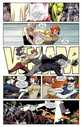
You know what I’m very fond of? Kathryn Immonen writing Patsy Walker. Immonen turned Patsy Walker (former model, ex-wife of the Son of Satan, ex-Avenger, former Queen of Boringtowne) into a fun and exciting character. She went from being a character you can slot into any story where you need a generic superhero into one that leans when she talks and swaggers when she walks. Patsy loves being a superhero. She devours life and is into what she does. Sure, blah blah power, blah blah responsibility, all of that stuff matters. Yeah, whatever. Who cares? Patsy does it because she likes doing it. And if she gets to punch some scientists? Shoot. That’s icing on a super-cake. Immonen and Patsy are killer together, like arsenic and old lace.
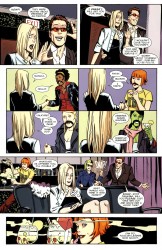
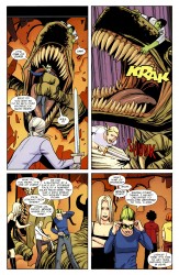
Variety in art is vital. Tonci Zonjic is ill. Pay attention to what everyone is wearing on this page. Emma’s in a dress and a cropped jacket. Patsy’s wearing a logo tee and red pants. Monica’s got a leather jacket and red button-up shirt. She-Hulk and Valkyrie both shop at the big & tall store, but they’re wearing different jackets. Five women, five different hairstyles. Four people in panel seven, four completely different acts and very descriptive body language.
You know the best part of this page? Patsy’s tongue and posture while she pours something that’s undoubtedly supremely alcoholic. The bitten tongue says a lot. Part of what it says is, “The rest of you artists need to step your game up and learn how to use acting in your work.”
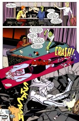
Layouts matter more than people realize. A lot of artists approach comics like movie storyboards. Scads of horizontal panels stacked on top of each other, only breaking the format for a two-page spread. Others stick to a nine-grid like their lives depended on it, which can result in a comic that feels staccato. Neil Edwards, the guy who does fill-ins on Fantastic Four right now, never met a panel he didn’t want to tilt at a 45 degree angle for no reason at all. Brian Bendis likes doing two-page spreads of talking heads.
What Zonjic gets is that the sweet spot is somewhere in-between all of these approaches. Your panel layout counts as storytelling. Zonjic draws these big, spacious panels, with tons of background work. He does several that are page-width, he does some head-on, some overhead, and then, when things start going bed, he throws in this panel that’s set at somewhere between thirty and forty-five degrees, diagonally skewed, and from a point of view that’s about two feet higher than eye-level. To increase the effect, Nathan Fairbain colors it a sickly red tone, a color that appeared in the book only one page previous and is decidedly unnatural. And the next panel–chaos. No gutters, just Emma hulking out while a phone rings. From 0 to FUBAR in four panels. Kapow.
Exposition hurts. Immonen gives you just enough to follow along. Why? Why not. Who cares exactly what happened? If it’s relevant to the story, you’ll find out when you need to find out. If it ain’t relevant… who cares? This is how exposition should work all the time.

