h1

The Prophet Exception: More On Artist Changes

February 26th, 2012 Posted by david brothers

I said that artist changes due to double-shipping mainstream comics devalues the artist. Not all art changes are evil, though. Sure, some of them are of the Final Crisis variety and result in terrible comics, but every once and a while, people get them right. Artist changes, guest artists, however you want to call them–they can be used tactically, as a way to showcase an artist or add a little extra punch to a storyline.

This may be weird, but follow along for a minute. One of the best examples of the way a guest artist can make something extra dope is a song. It relates to my point about unwanted art changes being like new actors showing up in old roles in a movie or a song changing direction mid-stream. It’s Big Boi’s “Fo Yo Sorrows,” off that Sir Lucious album:

It happens around 0:55. Too $hort, the legendary rapper out of Oakland, pops up to drop four bars and then bounce. That’s a quarter of a verse. It’s a cameo, but it goes deeper than that. At 0:47, Big Boi flips the word “bitch” just like $hort made famous, and then says that $hort was one of his favorite rappers. For Too $hort to pop up on this song for something that’s little more than a cameo is ill. It’s rappers playing around and having some fun. It’s not really a guest spot. It’s something you smile about, because you’re in on the joke.

That’s the feeling that art changes should give you. A little spike of glee, or a chance to explain to everyone you know exactly why what just happened is so good.

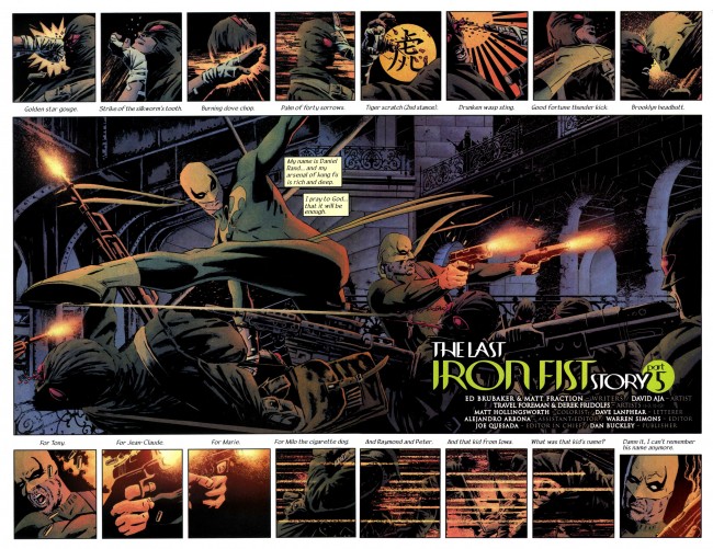
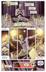
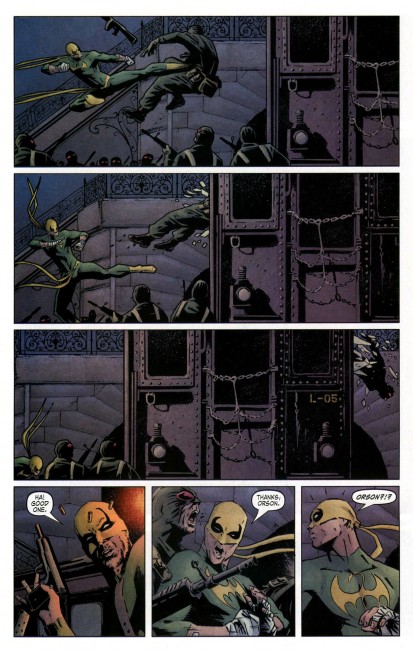
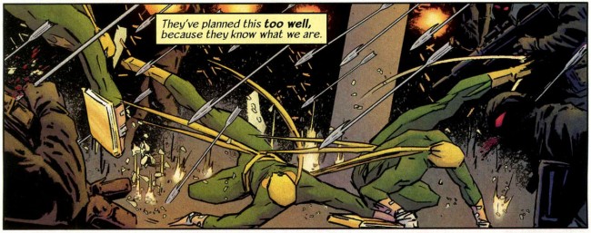
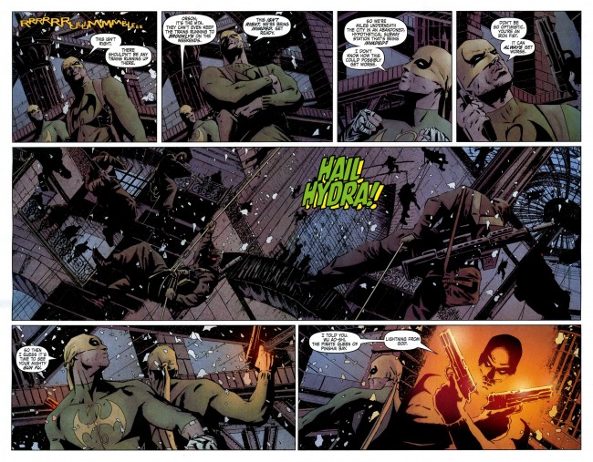
The Immortal Iron Fist did it well, for the most part. The flashbacks to adventures of other Iron Fists were drawn by a variety of dope artists, each one tackling a different Iron Fist. David Aja drew the modern pages, and his art served as connective tissue between the flashbacks. He set the tone and stage for the book, and then when the story required that the tone and stage change, Travel Foreman, John Severin, Russ Heath, and Sal Buscema tagged in to get it done. Aja is Big Boi, and John Severin is Too $hort. He brings with him a history and pedigree that people on the inside will get, while others will just go, “Yo, that looked pretty cool.”

Big Boi/Matt Fraction/Ed Brubaker had a good reason for their guests showing up, too. It’s not just a willy-nilly thing. There’s a point. It’s an enhancement, rather than someone just plugging another gear into the mix so that the machine goes faster. It turned Immortal Iron Fist into a jam comic. It provided variety.

There’s a really good example of what I’m talking about coming up later this year. Prophet started life as a Rob Liefeld/Dan Panosian joint. As part of the big Extreme relaunch, it’s currently in the hands of Brandon Graham, Simon Roy, Richard Ballermann, and Ed Brisson. It’s really good, actually, part of the continuously rising wave over at Image. Graham is writing, but working closely with Roy to make the story the best it can be. Sometimes that means layouts, other times it means Roy making sure that Graham’s on point or vice versa. It’s a collaboration. And there’s going to be guests popping in. From Graham’s blog:

So I’d written on here before that Prophet would come out 6 times a year but some cool shit has happened and now it’s going to be 12 issues a year monthly.

So here’s the schedule:

Starting Jan-

#21(number 1 in our hearts) -#23 art by Simon Roy (Jan’s Atomic heart), then #24 &25 are drawn by farel dalrymple (pop gun war) I’m drawing #26 and Giannis Milonogiannis (Old city blues)is doing # 27- 32. I think we’ve come up with a cool way to make this work storywize.

The situation isn’t too dissimilar from Marvel, and I’m sure a lot of people will say it isn’t different at all. There’s a comic, and the people making it want it to come out more frequently, so more artists are joining the team. The original draw of the series was the Graham/Roy/Ballermann/Brisson team, and that’s changing. I think that there’s a difference here, but a very, very fine one. I don’t think the difference is “I like these guys,” either. I like a lot of them dudes who are coming onto books I like, too.

Instead of just slipping new dudes into the rotation to boost the schedule, editor Eric Stephenson and writer Graham have found artists to work with and crafted the story around them. My understanding is that each artist will be working on a story tailored for them, rather than simply being used to keep the ship on track. All of the artists are doing covers, too, I suppose as a type of introduction. There’s a creative reason here, and I think that has more value than the purely economical reasons Marvel has to have artists playing musical chairs.

Here’s the covers for Prophet 22-24 and 26. The covers are by Simon Roy, Farel Dalrymple, Giannis Milonogiannis, and Brandon Graham, in that order.


They have absolutely distinct styles, right? Roy & Ballermann’s palette is dusty and soft, Dalrymple’s muted and night time-y, Milonogiannis’s is aged, and Graham’s is soft, but in a different way than Ballermann’s. Firmer, maybe. Roy & Ballermann’s art is rough and loose. Dalrymple is detailed and gloomy. Milonogiannis is… I don’t even know the right word for it right now. Majestic? Ominous? I get the feeling of mankind making contact with an entirely alien and apathetic intelligence, something that sees us as being beneath its notice. And Graham’s cover for 26 reminds me of nothing so much as the passage of a lot of time.

Things like this make art changes into events. It’s not just “Oh, we want to make people buy this book sixteen times a year instead of twelve.” It’s “We want this book to be the best it can be.”

I think it’ll work. I’m looking forward to finding out.

Post to Twitter Post to Facebook Post to Reddit Post to StumbleUpon

h1

7 Artists: David Aja

July 8th, 2010 Posted by david brothers

There’s this Grant Morrison quote I like a lot. It’s inflammatory, but I think there’s a lot of truth in it.

As for all this talk I keep hearing about how ‘ordinary people’ can’t handle the weird layouts in comics – well, time for another micro-rant, but that’s like your granddad saying he can’t handle all the scary, fast-moving information on Top of the Pops and there’s really only one answer. Fuck off, granddad. If you’re too stupid to read a comic page, you shouldn’t be trying to read comic books and probably don’t. As creative people, I feel we need to call time on the relentless watering down of comics design and storytelling possibilities in some misguided attempt to appeal to people who WILL NEVER BE INTERESTED in looking at or buying hand-drawn superhero comic books.

The emphasis is mine, and keep it in mind as you read.

How do you read a comics page?

Stupid question, right? But no, not really. The comics page is the most basic building block of a comic book. They haven’t changed too much since they were first invented. You can have words and pictures and you can have ink in CMYK or digital PSDs or AIs in RGB, but without a page to put it on, the tabula rasa of yore, you’re out of luck. It’s probably the one thing in comics that’s genuinely indispensable. (Well, that and ink.)

You could make cases for Jack Kirby, Steranko, and even the often-horrid art of the speculator boom of the ’90s for changing the way people read comics. This change has happened several times. The change came when people began treating the space between the panels, the passage of time that happens there, differently. Panels began to convey different kinds of action.

What’s nice about David Aja’s work is how he treats his layouts. Rather than simply being a tool to convey the story, which is generally how most artists treat their layouts, Aja often turns the layout into part of the story. It’s like if the television you use to watch movies ended up actually introducing new data into your viewing experience.

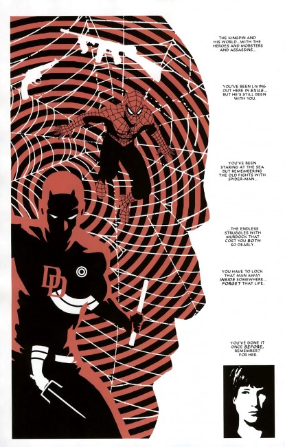
He’s done this in a variety of ways. David Uzumeri wrote a pretty fantastic appreciation of a single page from Daredevil 116 for Funnybook Babylon. It’s absolutely worth reading, if you have the time. The reason why this page is so crucial is simple. (Hopefully I can talk about it without plagiarizing David.) The Kingpin is a man defined by his relationships. The tommy gun and revolver represent his status in a very old-fashioned form of organized crime. Spider-Man was his introduction to the superhero community. Daredevil looms large in Kingpin’s mind, ready for violence, but bottled within Daredevil is a silhouette of Bullseye, Daredevil’s worst enemy and Kingpin’s former chief assassin. Separate from all of that is Vanessa, the Kingpin’s wife. He tried to keep her segregated from his less than savory pursuits, but those pursuits eventually destroyed her.

(When Ditko and Romita would draw Spider-Man with a half-Spidey mask over his face, it was meant to show how Spider-Man and Peter Parker coexisted, and how they cooperated and interfered with each other’s lives. They compete and battle each other, with Spider-Man taking the form of his responsibility and Peter Parker being his inner selfishness. The two halves need each other. They define each other by their existence, and sometimes even their absence. A simple technique–a face that is half Peter Parker and half Spider-Man–with fantastic depth. It’s storytelling quicksand, you don’t realize just how deep it goes til you’re knee deep in it. If that technique went off and had a baby with Steranko’s Agent of SHIELD, and that baby was raised by some of the more out there Frank Miller and David Mazzucchelli stuff on Daredevil, you’d end up with something like this, I think. This is also a technique that only works in comics. It’d look stupid in live action.)

This is a comics page. It’s the same kind of comics page you’ve grown up reading, but it isn’t. The grid is gone, replaced with the outline of a man’s head, and stacked high with meaning. It’s part of the story, not the hanger the story is draped upon.

Next.


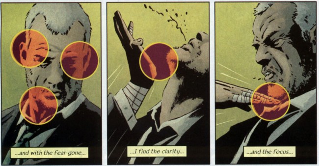
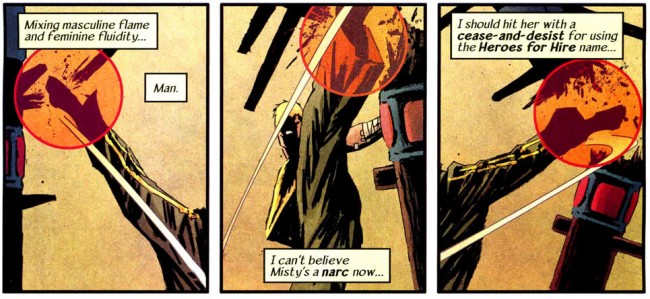
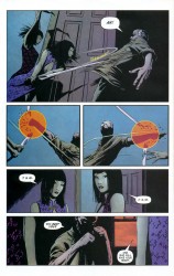
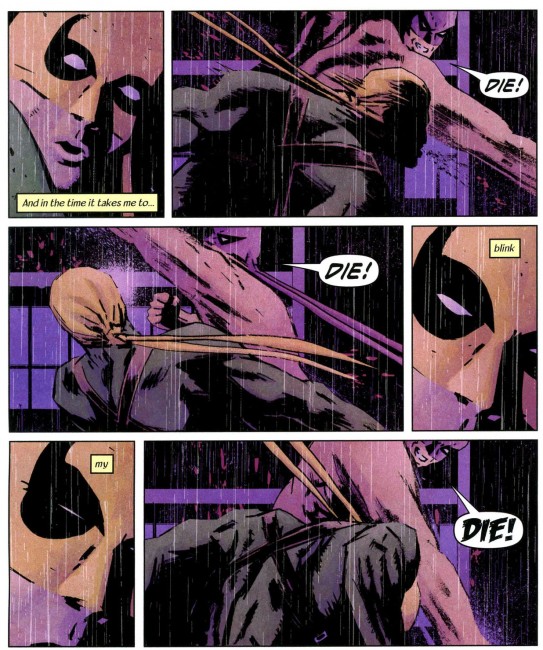
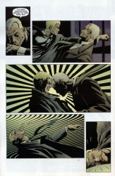
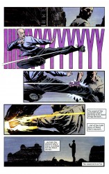
In Immortal Iron Fist, certain punches and strikes get a bit of extra oomph. Aja plays with your sense of time to accomplish this. Each panel on a page is a specific instant in time. When Spider-Man has several afterimages present on a page, doing a diverse array of actions (or just punching one guy 3-10 times), that is meant to take place in the same instant. It’s a show of speed. Aja, though, slams it into reverse and likes to pull your focus in to a specific point on the page you’re reading.

You see the punch in a panel of its own, but there’s a little more added into the mix. Small circles, like targeting reticles in video games, emphasize the point of impact, and by virtue of taking place at one specific moment in time, emphasize the impact itself. It changes the pace of your reading, so instead of going punch-kick-punch-uppercut, you’re seeing punch-jawbone-kick-kidney-punch-neck-uppercut-chin. Four beats become eight, and suddenly you’ve spent more time on the panels, more time focusing on the thing the layout wants you to focus on, than you normally would have. One breath becomes an infinite amount of time, captured like a slideshow.

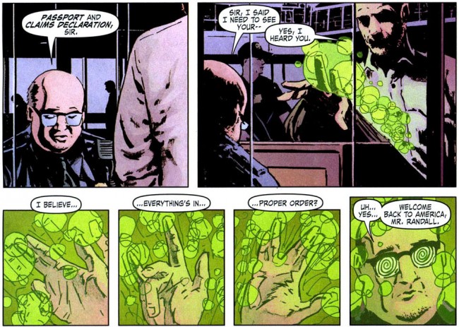
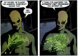
He does something else when Orson Randall arrives in the USA. He does a little jedi mind trick, something that would be a flick of the wrist and a blur of the fingers in real life, and each position of his hand gets a panel dedicated to it. This little bit of nothing, something that later in the book is a mere blur across two panels, gets a lot of page space.

This forces you to dwell on the trick itself, rather than the fact that a trick happened. Imagine if Spider-Man’s web-swinging was drawn differently. Spider-Man in mid-air-right arm curved in-right arm flung out-thwip position-web shooting out-hand pulling tight over the web-right arm pulling back and propelling Spider-Man forward. One action split into seven distinct segments. This is choreography at work.

These are all magic tricks that artists can use to control how you read comics. Aja does it better than most, particularly on Iron Fist. Two things made kung-fu movies exciting: speed and clarity. You want to see people moving quickly and doing impossible things, but you also want to be able to see exactly what Five Elements kung-fu is. If you can’t tell what it is, the action sucks (see also: The Dark Knight). Iron Fist is a kung-fu book, and while the cinematic stylings of kung-fu movies cannot be directly transplanted onto a comics page, Aja does the next best thing. He captures the look and the feel, if not the totality of the motion.

Do you get it?


A punch, for a particularly relevant example, is one smooth motion with a lot of moving parts. Your back muscles flex, your arm changes shape, and your body turns with the punch. Throwing repeated punches turns one motion into many, but since they’re taking place on the same body, they have to flow into each other. It’s not as easy as just drawing jab-jab-straight. Look at this Roy Jones Jr highlight reel. Jones is fantastically flashy, but watch how he moves. His legs move, his feet shift, his head bobs, and his body works. Have you ever seen Bruce Lee’s Green Hornet audition video? There’s a lot of similar things on display, and the theory holds true for all of it. Aja applies this sort of thing to comics very well, showing the myriad motions that people go through when they do simple or complex things and picking out the specific moments you need to show maximum action.

This is the opposite of the watering down that Morrison spoke out against. It’s aggressively pushing forward the standards of what to do with a comics page, how to tell a story, and expanding the language of comics.

And I haven’t even talked about his collaboration with Ann Nocenti, 3 Jacks. Tim O’Neil and Abhay already did that.

Pay attention to David Aja. Pay attention to how you read comic books. Everything matters. It’s all part of the story. And if you can’t handle it… maybe you should quit comics and start reading novels.

Post to Twitter Post to Facebook Post to Reddit Post to StumbleUpon