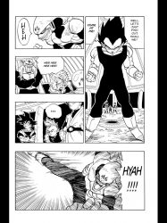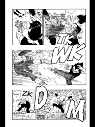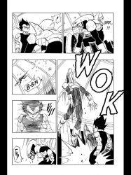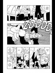
Work in Progress: Toriyama and Mignola Got My Mind In The Gutter
December 3rd, 2012 Posted by david brothersI’m trying to write about the panel layout in a comic that comes out this week and what it means. More specifically, I’m mulling over the best way to discuss the layouts, rather than being stumped or blocked. That sort of thing isn’t my strength, mainly because I don’t have the vocabulary for it. It’s a level of nitty-gritty that I only have a passing familiarity with. I can’t even fake it at a high enough level to convince people, you know?
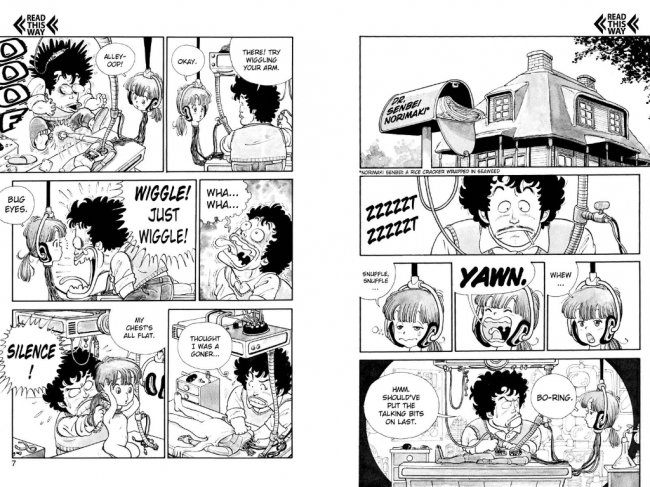
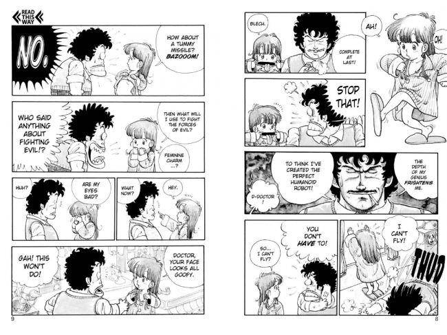
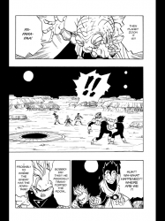
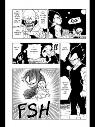
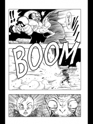
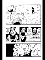
I read most of my comics on iPad at this point. It’s cool, because if you press power and the button at the same time, it’ll save a screenshot. I can then dropbox that screenshot to my laptop, where I forget about it for a few months. I’ll trip over it later, always in the middle of trying to hook up images for paying work, and wonder why I clipped it. Anyway, here’s a page from Akira Toriyama’s Dr Slump, specifically volume nine.
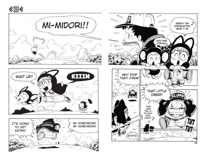
Toriyama gets chewed up a lot because of the excesses of Dragon Ball Z‘s tv series, but the guy is a pretty incredible cartoonist. He can do realistic, he can do cartoony, and he can do stuff like this, where he shatters the fourth wall in the pursuit of telling a story. Arale (glasses girl) and Gatchan (weird pre-verbal flying baby thing) are hanging onto the gutters and above some of the art.
Comics have been breaking panel borders for years. Probably one hundred of them, if my memories of George Herriman’s Krazy Kat comics are true. Spider-Man swings from one panel to another, Batman throws a Batarang through the gutters, and a Chris Ware protagonist… I dunno, cries and the tears land in the tier (“tear” ha ha) below him and collect in a puddle. You know what I’m talking about. Breaking panel borders isn’t that ground-breaking.
But this bit from Slump really caught my eye. It’s a cute joke in a dumb gag manga for children, yes, buuuuuuut… it’s also a great magic trick.
In the top panel, Arale and Gatchan are behind Senbei Norimaki. They’re facing us and speaking directly to us, right? So if that panel is panel 1, their kicking legs take up panel 2, then panels 3 and 4 are directly below that. Arale and Gatchan are facing away from us while Senbei runs directly at us. The camera’s POV has switched around.
Panels 5 and 6 to the left of those panels are where it gets really good, assuming you’re into this stuff. The camera swings back around as Senbei looks back at Arale & Gatchan & us. They’re on an angle now, instead of a flat bar, because the camera isn’t head-on any more.
I like how the dumb joke gives the spread a sense of place, too. We’re rotating around the same area, which I feel like does a better job of world-building than Toriyama’s generally randomized landscapes.
(also of note: the different ways Toriyama draws running. Speedo Sonic the Hedgehog spirals vs a pose… the spirals are rushing, right, while the pose is just “running normally”? I think.)
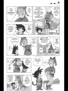
I also clipped this page from Dragon Ball. I think it’s from volume one.
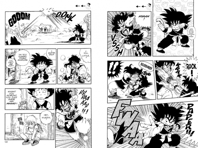
Toriyama’s panel-to-panel storytelling is immaculate as ever (the rock-scissors-paper sequence in particular, check out Goku’s arms and how his body turns), but the bit I want to point out is the bump at the top of page 131. It’s another irrelevant detail, but it’s cool, because now you realize Goku hit the guy SUPER hard, right? Toriyama doesn’t call a lot of attention to it. It’s just another cute joke. But it really, really works. It’s Looney Tunes-style comedy. It’s fun.
(This was definitely a jan-ken-pon-ken joke in the original Japanese, right?)
Here’s three pages from Mike Mignola’s Hellboy in Hell. It ships this week. You’ll have to visit CBR for the rest of the preview. Page 3 has a little of what I’m trying to figure out, that tall red panel transitioning to tall black to tiny grey. I realize what I’m talking about is kind of vague, but I’m really interested in how you’re supposed to read this comic. The effect Mignola is going for. I really want to figure this out, which is a pretty good place to start from when writing about comics, I think.


But even talking about Slump and looking at this preview again has sparked further thoughts. I’m right that Mignola uses gutters in interesting ways, but I was wrong in thinking of it in terms of gutters alone. It’s about the pacing he creates by placing his gutters. The inset panels, the bit where Hellboy crumbles into dust… Mignola is giving his comic a lot of room to breathe, isn’t he? What’s that all about? Is it about atmosphere? Pacing? Something else? All of the above?
I’m going to figure it out. How does “The Anatomy of a Hellboy Comic” sound? Does that sound like something you’d like to read, possibly later this week????
(Clem Robins’s lettering is super good in this, isn’t it? I don’t know what he’s doing different, but it really caught my eye, especially that “AHHHHHH”. Dave Stewart’s colors are as good as ever, too.)

