Archive for the 'reviews' Category

h1

Dan Dare: The Phantom Fleet

September 10th, 2009 Posted by david brothers

I don’t have much experience with British boys’ comics. I’ve read a little 2000AD, but that’s where it stops. Dan Dare began appearing 30 plus years before the oldest issue of 2000AD I’ve ever read, so it’s clearly something different entirely.

Titan Books sent over Dan Dare: The Phantom Fleet and I checked it out. It’s a weird kind of sci-fi tale. It’s got spaceships, spacesuits, aliens, ray guns, and all of that, but it feels like a sci-fi book that isn’t. Dare and crew wear uniforms that are just like normal military uniforms, medals and badges and all. They parachute onto planets, go scuba diving, and other things I don’t really associate with spaceships. It’s “grounded sci-fi,” for lack of a better phrase.

The stories themselves are interesting. They’re two-page affairs from a weekly magazine, so each page has either a “Next week!” box or a story recap box. Despite that, though, the stories just get right into it. They flow from week to week pretty well, and it’s kind of neat to see how they used to do comics back in the day. I’ve seen creators gripe about how eight pages (or 22) is too little space to tell a full story. I can’t imagine what they’d say if you gave them two pages, other than “I quit.”

Dan Dare: The Phantom Fleet feels exactly like what it is: a post-World War II comic for young boys. The military comes off very glamorous and awesome, there’s not a lot of nuance, and there’s even a kid sidekick and funny animal. The art, though, is pretty great. It’s a bit higher quality than I would’ve expected for the time period, and the coloring when things go weird is awesome. It looks good, even though it’s 55 years old.

The Phantom Fleet was interesting stuff, particularly as an introduction to Dan Dare. Though I’m pretty far removed from his original context, I can see why he’s so well-regarded. Titan’s got a pretty aggressive reprint program for these books, as this is volume eleven. Check out the site and see what catches your fancy.

Post to Twitter Post to Facebook Post to Reddit Post to StumbleUpon

h1

Dude, You’re Getting a Dell Dracula!

September 8th, 2009 Posted by Gavok

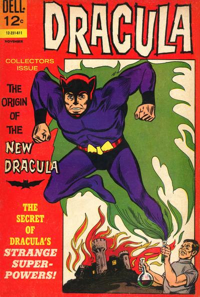
Back before DC and Marvel were the two big forces in the world of comics, Dell Comics appeared to be the #1 team. It’s no wonder, considering they got to sell comics with such properties as the Disney and Warner Brothers cartoons characters. Preexisting properties seemed to be their forte, as in the 60’s, they released comic one-shots that retold the films of famous movie monsters, such as Dracula, The Wolfman and Frankenstein.

What’s notable is that those came out during the early days of the Comics Code Authority, which proceeded to lay down ground rules on the comic companies to pussify every one of their titles. This meant the lack of horror aspects, including how vampires and their like were not allowed to see print. Dell decided that they wanted no part of the CCA, even though lots of sellers refused to carry comics that weren’t approved.

Dell didn’t want the CCA regulating them and insisted to the public that they could damn well regulate themselves, so don’t worry about it. I think the pressure on the CCA mentality is one of the things that pushed them towards today’s topic. That, along with their need for original content and how the superhero comics were really taking over the market.

The company decided to take their monster properties and turn them into superheroes. It doesn’t sound too crazy. Morbius the Living Vampire has been a Marvel staple for years and enjoyed some time as the hero in his own series. Similarly, Marvel released comics for heroes Werewolf by Night and Monster of Frankenstein. More recently, DC introduced the Hellboy-esque Frankenstein, who shows that even in the present there’s still much you can do with the old Mary Shelly creation.

That’s… not exactly what Dell was going for here.

There was a castle on fire and a man jumping out of a test tube and I killed a man with a trident.

I’ll admit that this entire article is thanks to Brian Cronin, whose article on the CCA and their opinion on vampires led me to first seeing that cover. From there I knew that I had to own this, read this and tell you all about it. Blame him!

I mean, look at that cover! The ridiculous outfit! The off-center belt! The fact that Dracula is jumping out of a test tube held by Dracula! Sorry to say, despite the cover’s claim, there’s no point where they tell us the secret to his power of appearing in two places at the same time.

Read the rest of this entry �

Post to Twitter Post to Facebook Post to Reddit Post to StumbleUpon

h1

Marian Churchland is Beasting

September 4th, 2009 Posted by david brothers

Marian Churchland is the real deal.

I hadn’t heard of her until Sean Witzke started talking her up and I began following Brandon Graham’s livejournal. I haven’t read anything else by Churchland, though she’s done some Conan and Elephantmen work this year.

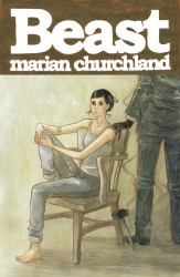
beast_ogn_coverHer original graphic novel “Beast,” which hits comic shops on September 23rd, is an amazing introduction to the woman and her work. It’s the tale of Colette, a young sculptor, who ends up being hired to sculpt a piece of flawless white marble for a client. In return, she’ll get enough money to pay her rent for a year, if not more. The issue is that she has to live in the house with the block until she’s done, and her client is something other than human.

As with any good story, that is just where it begins. Beast veers off into something else entirely very quickly. Within the first dozen pages is a very good horror turn, one of the best in recent memory. A slasher doesn’t jump out of the bushes while Colette runs away in her underwear, or anything even remotely as obvious, but the book takes a hard left where I was expecting something else.

It instantly made me re-assess what I thought the book was about. I wondered if the book was about the Apocalypse, and that the titular Beast was the Beast of Revelation. If she finished the sculpture, was the end of the world going to begin? Was she going to fight back somehow?

The idea floated around in my brain while Churchland slowly revealed the secrets of the marble and Beast and eventually debunked what was, in hindsight, a cockamamie theory. That vague sense of ambiguity about the story enhances the work, though, turning it into a tale that’s occasionally melancholy, always compelling, and, as a first work, simply amazing. It isn’t a horror comic, it isn’t a romance comic, it isn’t a weepy depresso comic. It’s just the kind of comic you should read. You don’t get to prejudge it and put it in a little box.

Churchland wrote and drew the story, and her art is full of those useless details that count for so much. The tag sticking up from Colette’s boxer shorts, the way her vest rides up a little, and her messy hair bun– all a lot of nothing, but very important in terms of building atmosphere and character. The art has a bit of Geof Darrow about it. Couches aren’t just the platonic ideal of a couch. They’re ripped, rumpled, and torn. Clothes shift and bunch, and faces turn from sleepily tired to worried and don’t need words to express it.

When the art goes from the soft tan tone and clean line work to the gritty and messy pencilwork that is the first appearance of Beast, you feel uncomfortable. When Colette wakes up, the world is different and she’s a little off. The art, too, is different- a different shade of color. That shade soon gives way to grey, as Colette finally meets Beast, and when she shivers and bursts into tears while an uncaring woman stands behind her, well– it works. It works really, really, really well.

beast_ogn_009beast_ogn_010beast_ogn_011beast_ogn_012

The details are what stuck with me the most, I think. The dried smudge of leftover tears on Colette’s face, the way Beast is defined (but not really), the disarray of the house, and the way the marble looks. All of it looks great. The colors change fairly often, but it always works within the story. It happens when a new day appears, or Colette’s perspective changes, or Beast reveals something new.

Beast is a mature and wonderfully paced work. It’s melancholy, wistful, maybe a little magical (for lack of a better term), and the character interaction is what makes it work. It can be a little rough around the edges, but never in a way that’s distracting. In fact, I never felt like the story was dragging, and I breezed through all 140-ish pages in one sitting. There are a few things I don’t quite buy, but that’s pretty much water under the bridge. I’m genuinely impressed, and I can’t wait to see what she’s doing next. If she can hit us with one of these a year, I’d be happy. Really, I think I’d be happy to read whatever she wants to work on.

Post to Twitter Post to Facebook Post to Reddit Post to StumbleUpon

h1

We Care a Lot Part 16: Toxology Report

September 1st, 2009 Posted by Gavok

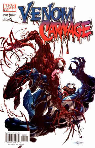
Venom was certainly making himself known in late 2004. Not only did he have his ongoing series and his role in Marvel Knights Spider-Man, but Marvel decided to give him top billing in yet another miniseries! This time, we got Venom/Carnage, or Venom vs. Carnage. At least, the latter is how it appeared in the solicits, but the former is how it shows up in the book. I mean, I guess the slashed one makes it easier to type, but adding “versus” makes anything sound cool. Would people be that interested in “Freddy/Jason” or “Aliens/Predator”? No. Not at all.

Venom/Carnage came out in September, 2004, only weeks before the Venomous storyline, which would seemingly kill off Eddie Brock and make Mac Gargan the new Venom. A couple months later, Carnage would be flown into space and torn in half by the Sentry in the pages of New Avengers. So why would they be making a miniseries about these two characters who are about to be changed so radically? Why, it would be for an introduction!

The series is written by Peter Milligan with the art by Clayton Crain. Crain’s style is very unique, looking like an ultra-glossy wax museum made of CGI. His human characters can look very off at times, but when someone’s face is covered and they’re in costume, they look pretty rocking. This goes double for the symbiote characters, such as Venom and Carnage on that above cover. The symbiotes get by on being made to look cool and this guy makes them look cooler, so give them a minseries, why not.

From writing up these articles and having to reread these stories, I think I’ve noticed a hiccup in the storytelling process. In the Spider-Man story The Hunger, it ends with the Venom symbiote saying that it’s pregnant. Daniel Way’s Venom series ends with Venom becoming a huge monster that’s meant to unleash some kind of world-ending output that can’t be described. My own educated guess would be that Toxin, the character this installment is about, was meant to be that offspring. Only, Peter Milligan was plotting Venom/Carnage and thought, “Eh… fuck it, we’ll make it Carnage’s kid.”

Read the rest of this entry �

Post to Twitter Post to Facebook Post to Reddit Post to StumbleUpon

h1

Batgirl #1: Play by Play

August 20th, 2009 Posted by Esther Inglis-Arkell

Before I open this comic and spoil it for anyone reading this review, let me begin with the prayer of the comics fan:

Oh Lord, who doth give a shit about comics,

Probably more so than most people realize,

Yeah, I’m looking at you, Schumacher,

But as I was saying,

Oh Master of Divine Sequential Art,

Give us this day a non-sucky comic,

And forgive me my continuity cherry-picking,

As I have forgiven – never mind that part.

Lead my very favorite character in the DCU not into comics ignominy,

But deliver her from cancellation.

And seriously, if she could have fun, kick some ass, and be a character I can sympathize with?

I would appreciate it for ever and ever.

Amen.

All right.  Let’s do this thing.

Read the rest of this entry �

Post to Twitter Post to Facebook Post to Reddit Post to StumbleUpon

h1

The Rocky Road to Publication: An Interview with the Creators of ‘Pray For Death’

August 4th, 2009 Posted by Esther Inglis-Arkell

I first met Nicholas Doan, the writer of Pray for Death, from Zuda, DC’s webcomic division at Wonder-Con.  When I ran into him in San Diego, with the comic’s artist Daniele Serra, they very kindly agreed to tell me about how their journey to publication.

Detective Abigail Jenkins is the inverse of the typical pop-culture cop; the one who is labelled a ‘loose canon’ by the press while the guys at the station indignantly talk about how he ‘gets things done’.  She’s lauded by the press after an early success, but condemned by her peers.  When she starts to investigate a serial killer with a religion fascination who thrills at the thought of getting caught, it seems everyone around her is setting her up to fail.

I ask Doan what inspired him.

“I think serial killers are society’s most complex, interesting and disturbed monsters,” he says.  The idea flowed from there.

How did he come to work with Serra?

At first, Doan was in contact with Septagon Studios about Pray for Death.  They put him in touch with Serra.

“I thank them every day for introducing us,” Doan tells me.  “I came up with the concept and he made it look pretty.”

‘Pretty’ isn’t the word I would use, either for the concept or the art.  The people in this comic aren’t glamourous.  They have weathered faces and preoccupied expressions.  The background is hazy.  The pages themselves look muddy and grim, with dark splatters of pigment splashed over them in places.  This style amplifies the noir tone of the book, as well as our sense of forboding as we look through it.  There is a feeling that the killer could very well jump from the shadowy panels.  And there’s the blood.

“The blood,” Doan says, “is perfectly used.”

He tells me that Serra used coffee to get the right pigment and texture.  When I ask Serra where he go the idea, he shrugs and says, “My breakfast.”

Septagon asked them for five pages and two covers, which they supplied.  Then they waited, for days, weeks, and finally months.  Two months in total, which as any creator can tell you, is grueling.

Finally, they went to Zuda.  I ask how their experience was there.

“They took care of us.  It was a good opportunity to be placed in a big company.”

And so, outside of Pray for Death, at least, there is a happy ending.  Inside?

Check it out.

Post to Twitter Post to Facebook Post to Reddit Post to StumbleUpon

h1

The Game Boy Comic: Now You’re Reading with Power! Portable Power!

July 28th, 2009 Posted by Gavok

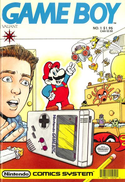
Back in the early 90’s, the comic company Valiant struck a deal with Nintendo. Over the next two years or so, Valiant would release a multitude of series based on Nintendo franchises. There were a couple that felt natural. Super Mario Brothers and Legend of Zelda each had their own cartoons at the time, so they would get picked up. Captain N: The Game Master would also get his own comic, though transformed due to the inability to use videogame characters outside of Nintendo. There was even a series called Nintendo Comics System that acted like an anthology of stories featuring those I mentioned and miscellaneous games like Dr. Mario and Punch Out.

Around that time, Nintendo’s Game Boy was still fresh on the scene and they wanted to do whatever they could to get the word out. Sure, advertising was easy for the Nintendo Entertainment System. Captain N was one big commercial for the console and all its games. Well, all the games that weren’t on that crappy knockoff cartoon Power Team (anyone else remember that? It had the monster truck Bigfoot, a basketball player and a talking tomato). Anyway, outside of commercials and magazine ads, how do you advertise what is essentially a lesser NES that you can carry around with you?

With the Captain N cartoon, they eventually introduced a Slimer-like character named Game Boy who was one, big, annoying Game Boy levitating around. With Valiant, they went in another direction. They gave it its own comic book.

I’m sure by now you’re already asking the million dollar question: “How exactly does a Game Boy comic work?” That’s a very good question and having found out the answer, I just had to get my hands on this 4-issue series.

Read the rest of this entry �

Post to Twitter Post to Facebook Post to Reddit Post to StumbleUpon

h1

We Care a Lot Part 15: Way Too Hard to Comprehend

July 20th, 2009 Posted by Gavok

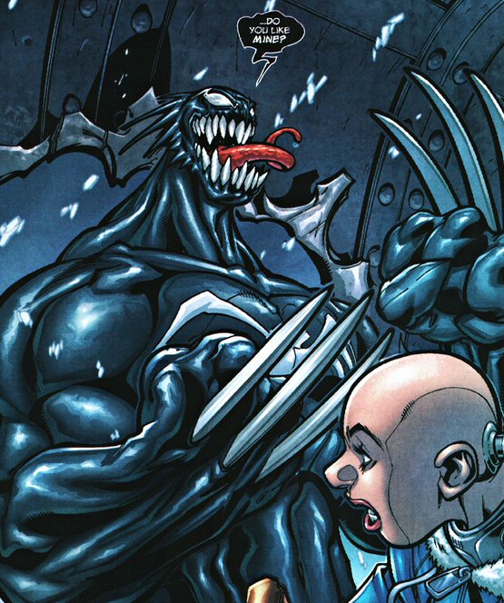
Last time on We Care a Lot, I discussed Eddie Brock’s cancer retcon. Before that, I was talking about Daniel Way’s Venom on-going series. To refresh your memory, the Venom symbiote is on the loose up in Canada. It killed off all of army girl Patricia Robertson’s friends and is on its way to a more populated area. Robertson is allied with an alien life form named the Suit, who fights with a cell phone gun. They are being antagonized by a pair of spy chicks who want Venom for themselves. Although they have already been killed, another couple of them have popped up. Venom has finally settled on a host that he can live off of forever.

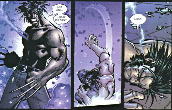
And that’s where we left off. Venom #10 begins with the Venom-controlled Wolverine attacking Vic and Frankie’s ship and forcing it to crash. The two suit up in their armor and reveal to the reader that they’re probably into each other sexually. Of course they are.

They don’t last a minute. Frankie is stabbed to death by Venom-Wolverine and Vic stumbles upon her doppelganger’s corpse from earlier. She realizes that she’s nothing more than a clone, puts her gun to her head and pulls the trigger.

The torso remains of the Suit give Patricia a new cell phone he has created. He says that he placed the original in a special place and that the new phone acts as a detonator. Venom-Wolverine busts in after her and she presses the button to activate the first phone. As we see, after Wolverine was knocked out by that nuke, the Suit tore open his chest and shoved his phone in there. Now the cell phone goes off, electrocuting Wolverine from the inside and forcing off the symbiote.

BOOOO!

Read the rest of this entry �

Post to Twitter Post to Facebook Post to Reddit Post to StumbleUpon

h1

Bloody Pulp: American Terror

July 15th, 2009 Posted by david brothers


Like most people, I’m pretty interested in side-effects. The US spends millions in Afghanistan fighting the Russians, and ends up giving a lot of people the skills needed to strike back. The CIA spends time and money aggressively pursuing American interests through less than honest means, and inadvertently help fund the destruction of the inner city and the black family. Millions of kids go to college for IT at the height of the dot-com boom, and then find themselves out of luck and with nowhere to go.

Jeff McComsey ‘s American Terror: Confession of a Human Smart Bomb is one of those books that deal with side-effects. Victor was trained to kill by the military, imprisoned for not following orders, and then bounced to civilian life. He was left aimless, basically drifting through life, and in the process of being headhunted by various “corporate security” firms. They want him to use his skills to wage war on their dime.

Instead, he ends up enlisting with a man who has no interest in self-serving violence or money-grubbing firms. Homer wants to start a school to work against these soldiers for hire. He’s interested in counterprogramming. Homer, Victor, and the varied crew that signs up for the gig all work for the greater good, but still manage to kick off the War of the Third World. Millions end up dying, but at the end of it all the world is a better place. Was it worth it?

Victor is stuck in a story that’s interested me for a while. We hear plenty about dictators and people who grasped power just so they can line their own pockets and tell other people what to do. If you vote, you’ve probably voted for one at least once. What about those who take by force, but for a good reason? “I’m going to make this a better world, whether you like it or not.”

I think that’s a fascinating line of thought, particularly in light of today. We live in a world where war is not about death or peace. It is about business. We have fighter jets cost 40-some thousand dollars to run for an hour, are produced with a glaring weakness to rain (of all things), and has an average failure rate of once every 1.7 hours. We push for the lowest bidder to maximize profits. You can be a professional soldier and make a ton of money. When’s someone going to say, “Hold, enough” and turn that around?

American Terror is a little rough around the edges, but a good read. I’m not entirely sold on the pacing, for example, but the art is top notch. McComsey sells the violence and talking heads bits with equal amounts of skill. The story of Victor, the people he comes across, and the people he kills while finding a direction for his life make for a pretty interesting tale, I think. Volume 1 and Volume 2 are available on Amazon for cheap.

Jeff McComsey, of course, is the artist of Bloody Pulp. You should go to the Zuda page for it, give it a read, and give it a vote and favorite it if you dig it. Judging by American Terror and the 8 pages of Bloody Pulp that are currently online, I like what I see.

Post to Twitter Post to Facebook Post to Reddit Post to StumbleUpon

h1

On Asterios Polyp

July 14th, 2009 Posted by david brothers

Asterios Polyp
David Mazzucchelli
Pantheon
344 pages
ISBN: 0307377326

David Mazzucchelli’s Asterios Polyp is looking like the latest capital A Art book, the kind of thing that people smarter than I (such as Jog or Douglas Wolk) are doubtless going to pore over, deconstruct, reconstruct, and analyze over the next few weeks. And, well, with good reason– Mazzucchelli does a lot of interesting things with the format and formula of comic books, and ends up creating amazing. More than anything, all ideas of what constitutes an “art” comic aside, Asterios Polyp is fascinating.

I read through this 344-page book pretty quickly, and barely noticed the time passing. Each chapter alternates time periods, telling us about Asterios’s history and his present, and are visually distinct. Every fistful of pages, the style switches from a standard comic format to something more influenced by graphic design and experimental. Mazzucchelli shows off a variety of styles in the book, even going so far as to have individual characters exist in their own styles.

There’s a visual metaphor introduced fairly early on, where Asterios and his wife are a combination of two different styles, with Asterios taking the form of the building blocks of a drawing of a human and Hana being the details and shading. When they meet, they merge to form a complete drawing. When strife hits their relationship, Hana violently pulls out of Asterios’s reality. It’s an amazingly effective move, and one which works on a gut level. You don’t need captions to tell you that they’re troubled, or growing apart, or anything– you simply have to look.

Asterios Polyp is so fascinating because it approaches storytelling in a way that only comics can. It takes advantage of the format to do something new and interesting, while coming at it from a new angle. Everything in life is about delivering information of one sort of another, be it via text, pictures, texture, or taste. Mazzucchelli doesn’t use the images in Asterios Polyp to show cool images or poses. Instead, each image has a point. We never (well, maybe twice, but he’s obscured) see Asterios’s face from the front. He’s always looking to the left or the right. It struck me in a few different ways while I was reading. It makes Asterios seem like he’s always doing something. There’s something just off-panel that we can’t see that’s he’s really interested in. However, it also makes him somewhat untrustworthy or uncomfortable. He’s never looking you in the eye. He never seems to be paying attention. There’s a level of distance there.

Most of all, though, it plays into the dualism that forms the foundation of his personal philosophy. Asterios Polyp can be accurately described as the story of a man learning to count to three. He embraces the idea of there being 1 and 2, yes and no, linear and plastic, and form and function. When his life falls apart, he learns to count in threes. (It’s interesting that twos vs threes is portrayed as a yin/yang of its own, inflexibility vs flexibility, but I’m not sure what that means just yet.)

Asterios is a book that’s fun to look at. The color palette is very focused. There are a lot of purples, yellows, pinks, blues, and blacks. Toward the end of the book, though, for a few pages, the palette opens up in an amazing scene. It’s a burst of color, and life, and a symbol of things to come. It’s a counterpoint to the beginning of the book, which was somber and fairly depressing.

Basically, Asterios Polyp is a must-read. It’s straightforward enough that anyone can enjoy it, but has layers that you can peel back and examine. I’m probably going to read it agin in a couple weeks, with the goal of just poring over the art. Mazzucchelli uses a lot of techniques in Asterios Polyp that all comics could benefit from. He got there first, though, and set the bar pretty high. The writing and art are excellent, and full of insights on how both comics and life work.

Asterios Polyp is objectively better than anything you’ve read this year thus far. There’s absolutely no question in my mind about that.

Post to Twitter Post to Facebook Post to Reddit Post to StumbleUpon