Archive for the 'before watchmen' Category

h1

before Watchmen: Conway & Kane’s Amazing Spider-Man 122

June 27th, 2012 Posted by david brothers

This is the last page of Amazing Spider-Man 122, the issue after Gwen Stacy dies. It’s right in the middle of one of my most favorite runs on any comic ever. Gerry Conway on words, Gil Kane on pencils, John Romita & Tony Mortellaro on inks, and Dave Hunt on colors.

The first 140 or so (I’ve never done a real count, but around there) issues of Amazing Spider-Man are my Lee/Kirby Fantastic Four, and this is one of my favorite single pages out of that entire run.

Steve Ditko gave Spider-Man a creepy outsider feel. When Ditko left and Jazzy Johnny Romita became the principal artist, the tone changed to something more influenced by romance comics and soap opera. Peter became a lot more handsome, the clothes were swinging, and the girls turned from pretty to supa dupa fly. The comic got a lot sexier, is what I’m saying, and Mary Jane Watson had a lot to do with that.

The usual line is that Mary Jane was the party girl, while Gwen was the wholesome girl next door. I don’t know if that’s actually true, but it’s a fair enough starting point if you want to branch out into a deeper understanding of the characters. MJ was definitely a popular girl, the type you’d describe as “hot” instead of “pretty.” Lesser writers took that to mean that she was an airhead or vapid, but that was never true. But she definitely represented a somewhat edgier kind of excitement than Gwen did.

Part of the mythos of Spider-Man is that Peter Parker is an extraordinarily selfish person. Or maybe just regular selfish — it’s hard to tell when everything in cape comics is so heightened. But he takes everything personally, and he tries to walk around with the weight of the world on his shoulders. He snaps and buckles under pressure before regaining his strength, but that snapping is the important part. Peter Parker needs support. He needs someone to tell him things are okay or to have his back in a pinch. Spider-Man is a role Peter Parker plays, not Peter Parker himself.

What I love about this page is how it shows the quiet strength and determination that Mary Jane always had underneath her party girl exterior. She’s been waiting at Peter and Harry’s pad for hours, praying for someone to talk to. The problem is that it’s dumb ol’ Petey, a guy who never met a problem that wasn’t his fault. He lashes out at her in his grief, ignoring her own grief, and instead of doing what anyone else would do, MJ turns to leave, pauses, and chooses to stay.

There’s something about the choice she makes between panels here that really, really sticks with me. MJ isn’t just a supporting character, a prop for someone else’s grief. Not when she’s written well, anyway. This choice feels significant, for both her and Peter. It’s one of my absolutely favorite scenes in Spider-Man comics, and I don’t know that I could tell you exactly why. There’s just tremendous emotional resonance there, and a certain finality and acceptance, that I really appreciate. She chooses to share her grief, whether Peter wants her to or not.

It’s like — does she recognize something in Peter? Is it something she also recognizes in herself? Why does she choose to forgive him for his anger? I think she recognizes how people run away from love and support, in part because she herself is also guilty of that.

There’s something deep lurking around here, right below the surface, and I love it. It’s like Spider-Man is shifting (or continuing its shift, really) from childhood to adulthood, transforming directly on the page, and making permanent decisions that other comics wouldn’t, and modern comics don’t. Part of the fun of the first 140 issues of Amazing Spider-Man grow from a 15 year old kid to a college-age adult, and this scene is a milestone moment.

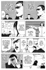
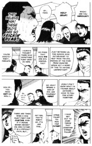
BACKUP STORY! CURSE OF THE CRIMSON CORSAIR, FEATURING EIJI NONAKA’S CROMARTIE HIGH SCHOOL! BUY IT USED!


Post to Twitter Post to Facebook Post to Reddit Post to StumbleUpon

h1

before Watchmen: Star*Reach Classics #1

June 20th, 2012 Posted by david brothers

I want there to be some kind of cute narrative behind my discovery of Star*Reach Classics 1 like there is for my introductions to Michelinie and McFarlane’s Amazing Spider-Man 316+317 (my first comics) and Miller’s Sin City: The Big Fat Kill 5 (my first adult comic), but there isn’t one. It was just a book I pulled out of a quarter bin six or seven years ago that I thought was really weird-looking and awkward and therefore must-reading.

I grabbed it for a couple of reasons. I knew and liked Jim Starlin’s work, especially his Adam Warlock-related stuff. I also knew of Neal Adams’s work, though I don’t think I’d had any direct experience with it beyond covers. I’m pretty sure I knew of Dave Sim, too, but I didn’t know that Cerebus was actually an important comic. It looked like a stupid talking animal parody book. So, hey, a quarter? For a book featuring art by one dude I knew I liked, one guy I figured I was supposed to like, and one guy whose name kept popping up? Why not? It turns out that Star*Reach Classics is a weird little time capsule of a comic, some of it great, some of it… strange.

Even though the vast majority of my experience with Starlin comes from reading Marvel comics, even today, I still have this really firm image of what I think his shtick is. There will be a battle between equal numbers, dialogue that’s as much a call-and-response speech as a conversation, amazing starscapes, ankhs, and at some point a close zoom on an eye. Sometimes the eye reveals the universe, sometimes the eye reveals a screaming skull. That’s Starlin in my head. It’s sort of funny how these things build up over the years and we place guys in these boxes. Sometimes it’s wrong. Sometimes it’s right.

“…The Birth of Death!” delivers, in terms of what I expect out of Starlin. “…The Birth of Death!” is a bedtime story delivered by a kid’s Uncle Mort (hey, something about that name…). Starlin remixes the Christian creation story, documenting the creation of angels, humans, immortals, and finally Death. As I was rereading this, I realized that it reminded me of nothing but “Night on Bald Mountain” from Fantasia. They both have that kinda dark and gloomy but still majestic and horrible feel.

I really like how Starlin draws the story. Instead of the bedtime story just being a framing sequence, with Uncle Mort’s words transitioning to captions instead of word balloons, Mort stays in the story every step of the way. His face, or parts of his face at least, is attached to every panel in the story. It’s a technique I don’t think I’ve ever seen before, but very cool. His expressions, from anger to awe, really sell the story, which is heightened in a space opera/high fantasy kind of way. Mort’s sneers and wrinkles elevate a basic story into something else.

I really like how Starlin renders God, too, as a pair of eyes (with ankhs, skulls, and the infinity symbol) floating in crowded space. It’s original and abstract enough to get across the idea of an ever present higher power. Some vague nudity in this one:

I think it’s notable that Starlin’s version of Death hangs out with two topless Conan the Barbarian looking chicks and holds some kind of weird squid-thing that he refers to as “the Dark Thing” in his hand. Starlin’s Death has the same kind of overwrought nobility that Dr Doom bears, but a physicality more fitting for a pulp hero. He’s the kind of villain that would drink wine out of a goblet, throw that goblet against the wall, and then casually bury an axe in a hero’s skull. He looks like he writes poetry about murders between murders, is what I’m saying.

In the end, of course, Uncle Mort is revealed to be Death, and the child he’s reading to is dead. A Longfellow poem and a pale child’s body close out the story.

There’s another story by Starlin in this one, “Death Building.” Was it Matt Fraction who said that the rise of Jim Starlin was the point when nerds discovered acid? Something to that effect, at least. Here’s the bottom two tiers from the first page of “Death Building”:

And here’s the last tier from the last page:

One thing that used to bug me about Starlin was that it seemed like he was always going back to the same well. I eventually got it. It’s not that he was out of ideas or whatever it was I used to think. It was more that he was interested in a specific thing, and working out his feelings about that on the page. Or maybe he was working out the various angles of that specific thing. I don’t want to assume anything about his feelings. Regardless, Starlin has spent a lot of time examining existence, from death to power to destiny and back again.

I like seeing people working out their thoughts in public. I’ve done a lot of it here, obviously. It’s like watching someone rub their chin and mull over a point in person. Starlin married his conundrum to his artwork, and the results are pretty great. It’s not going back to the well at all. It’s trying to solve a puzzle by recreating that puzzle in several different configurations.

There are a few stories in this issue. Starlin has another one-pager called “The Origin of God!” (I love that he uses punctuation in his titles so, so much) that’s just four panels long and pretty solid. Dave Sim supplies the four-page “Cosmix,” which is about suicide, criticism, and art, and still doesn’t manage to be interesting or particularly good. It has a last-minute stinger that isn’t really earned at all. (I just started watching Black Mirror, and the “Welcome To The Twilight Zone” moment in “Cosmix” is similar to a twist in the (pretty solid) second episode, but with a bit less brutal irony, maybe.)

The last story is “Flightmare,” with words by Neal Adams and art by Frank Cirocco, who I’m not familiar with at all, though he apparently drew an issue of Power Man and Iron Fist that I undoubtedly have kicking around somewhere.

“Flightmare” is pretty interesting. Its main thrust is about a man feeling frustrated with training women to fly commercial airliners, and yearning for days gone by. He travels through a series of dreamy sequences as he searches for peace. He sheds the woman, first of all, as he pilots a jet, because ladies these days, am I right fellas? But the jet moves “too fast to enjoy the ride,” so he transfers to a World War II-era P-51 Mustang, and then a biplane, and then… a giant naked blue woman? He’s naked, too, and he says that “This is the way flight was meant to be!” But look! Coming out of the sun! There’s that dastardly woman piloting… a giant naked blue man? So they have a big naked dogfight in their big naked airplanes, the lady shoots the male pilot down with hand lasers from her big naked dude, and then we flash back to reality and she gives him the finger guns, a wink, and a “Gotcha!” Sure. Okay.

It’s one of those stories where I can’t quite figure out if it has a certain point to make or if it’s just a fun lark. It’s pretty and fast-moving enough to get wrapped up in, but I don’t know if it’s about women’s lib or the futility of nostalgia or the cruelty of women or just some weird sex dream. But I liked reading it, even if I couldn’t tell you what Adams and Cirocco were trying to express. The craft and storytelling are really entertaining in a way that transcends the ambiguity. (Cirocco also draws nice airplanes.)

I like Star*Reach Classics 1 a lot. It’s the only one I’ve read, even after years of owning it, but it’s an interesting artifact. I say that I like ’70s comics the best, but that’s not really true. I like ’70s Marvels: Amazing Spider-Man, anything Heroes for Hire related, Doug Moench/Paul Gulacy, and Steve Gerber. There’s this whole other world of ’70s comics that I missed out on that — judging by Star*Reach Classics 1 — are probably pretty great.

BACKUP STORY! CURSE OF THE CRIMSON CORSAIR, FEATURING EIJI NONAKA’S CROMARTIE HIGH SCHOOL! BUY IT USED!

Post to Twitter Post to Facebook Post to Reddit Post to StumbleUpon

h1

before Watchmen: Shotaro Ishinomori’s Cyborg 009

June 13th, 2012 Posted by david brothers

Shotaro Ishinomori’s Cyborg 009 (ultra-cheap DVD, used book) has one of my favorite concepts for any story ever. Nine humans are kidnapped by the Black Ghost, a terror organization, and turned into combat robots. Each person gets a specific powerset — some can fly, others are telepathic — and a swanky new costume. Instead of being used to wreak havoc all over the world, though, the nine robots manage to escape from the Black Ghost, thanks to a helpful scientist, and decide to fight back against their masters. (The Skull Man is a pretty great look at the origins of the Black Ghost organization.)

It’s a simple concept, but a good one, nonetheless. The cyborgs go up against spies, terrorists, armies, other cyborgs, giant robots, and monsters. Cyborg 009 has a lot of super sentai appeal, but I like how easy it is to update the concept to the modern day. The series dates from the ’60s, of course, and features fears and anxiety that’s rooted in that time period. But the concept is just loose enough that as long as you have the Black Ghost eager to upset the status quo and nine humans who are upset at how they’ve been treated, you can apply it to almost any time period. Later this year, Kenji Kamiyama’s 009 RE:CYBORG drops, which brings the series fully into the modern day. There’s a trailer here, which I think does a great job of showing off how cool these cats are.

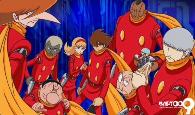
Part of the fun of the series is that each cyborg has a certain power. Joe Shimamura, Cyborg 009, is the hero (more or less) and can move at super-speed by activating a circuit. 001, Ivan Whisky, is telepathic, and also a baby. Jet Link is 002, an American that has been given the power of flight. Each of the nine cyborgs has a specialty, so they all have their chances to shine. They’re a team, and they have to figure out how to work together and battle the Black Ghost at the same time.

I love the costumes, too. The giant buttons that Ishinomori gave them are fantastic. They’re straight out of Walt Disney, and lend the whole affair a cartoony, child-like feel. The golden scarves are the perfect example of “too much” actually being “just enough.” The scarves are a great visual, especially when the characters are in motion, and are an iconic touch at this point. A certain class of hero needs a cape to project majesty, and the scarves do that while also being distinctive. The cyborgs look decidedly sci-fi, and actually pretty retro sci-fi. They’re from the future of 1966.

I like all the cyborgs, but 008 has a special place in my heart. He’s the black dude, called Pyunma, and the only actual soldier in the crew. His power is that he’s able to function extremely well underwater, both in terms of surviving indefinitely and deploying sea-based ordnance. Also, he’s drawn like this:


WHOA.

I hate this stuff. It’s racist and ugly, and stupid on top of that. Ebony White and that one Tintin story just make me angry, in part because that sort of racism is inexcusable but mostly because comics scholars are like “oh, listen, Will Eisner was a legend, how can he be racist? It was the ~times~!” Yes, the times when black people were demonized and dehumanized, ha ha, what a time! Mad Men!

But 008 is a little strange. For one, even though Ishinomori is using explicitly racist iconography, he isn’t bringing the same baggage to it that Eisner or others did. 008 isn’t a Stepin Fetchit type, and there’s not a hint of the “yassuh boss, we’s sick!” garbage that makes Ebony White such a Strong Black Character. He’s just a regular dude, and he acts like it. It’s like Ishinomori adopted the art style but missed out on the baggage that goes along with it.

I can’t help but wonder if part of the reason why 008 is more acceptable to me, and more normal than Ebony, is the subtext of Ishinomori’s story. The cyborg team is international, with members from China, France, the UK, the United States, Russia, Germany, and Japan. They vary racially among that mix, too. 009 is half-Japanese and half-American, which suggests that he’s the son of a military man and a Japanese woman to me, considering the time period. 005 is a Native American. Some of them are broad stereotypes, which varies depending on which incarnation of the series you’re reading, but they’re intentionally from all over the world.

Ishinomori’s exploring the idea of weapons run rampant and what it’ll take to put the world on the brink of war. It’s about money, and how chasing money can make people evil. He brings in an international cast, like Hideo Kojima did in Metal Gear Solid 4, because he wants to illustrate that war ruins everyone and everything. No one is safe, no matter whether you’re a rich ballerina in Paris or a poor farmer out in China.

Something about 008 and his attitude made me more willing to accept him than I would Ebony White or whatever that Tintin comic is. There’s a certain tension between 008’s looks, which have evolved over the years toward “actual human being” instead of stereotype, and the fact that Ishinomori is trying to show us how war affects all of us. I’m interested in that intersection. I don’t know how much contact Ishinomori had with black people, or where he first saw the racist iconography he employed. But I do think it is fair to assume that he employed that same iconography without the same cultural baggage as Eisner or Herge, who did it while reinforcing a very poisonous power structure. It looks like a duck but it quacks like a goose — what is it? It’s infuriating and interesting all at once, and if anything, makes me want to know more about the origins of the series and why Ishinomori made the choices he did. In a later series, produced after Ishinomori died, reinvented 008 as a guerilla soldier, instead of a refugee, which fits in even better with Ishinomori’s simultaneously global and personal focus.
I can see that Ishinomori was trying to tell a story that’s still progressive to this day, one that incorporates warmongering, weapons dealing, and the effects of war on a society. It’s about how war screws over all of us, from the people getting blown up on the front line to the people who don’t realize how often war is used in support of business interests. It’s about weapons possibly being used to prevent that outcome, and the importance of making humane decisions, rather than business-oriented ones, during the course of war. The cyborgs are weapons with free will and minds, and they make choices according to their own morality. That’s impossible with a nuclear bomb or drone. There’s a point there about where warfare and personal actions meet, but I can’t quite grasp it. Are the cyborgs us? Are they the leaders of the world? Just a cool superhero team? Something else?

It sorta bums me out to read a kids’ comic from the ’60s that gets that fact better than a lot of modern pop culture. The new Splinter Cell demo opens with Sam Fisher, American black-ops expert, torturing and murdering a terrorist on the Iraq/Iran border. Sam, if you aren’t familiar with the series, is a hero. The new Call of Duty features Oliver North as an advisor. Ollie North, the same man who funneled weapons to death squads and was involved in narcotics trafficking in order to fund his little hit squads and operations. You know where those drugs ended up? The inner city. He’s the guy consulting on a series that is increasingly less interested in showing the horrors of war, which it kinda sorta almost did at one point, and more interested in showing “AW YEAH!” moments. I mean, the news out of Iraq right now is that they’re pumping out enough oil to possibly make sanctioning Iran in the future easier without disrupting oil markets. I realize that holding up a children’s comic as a great example of social consciousness is stupid… but Ishinomori got it. It’s about money, and then men who control that money and want more of it, no matter what the cost.

It is what it is, I guess. Cyborg 009 is great, and I think Ishinomori has a strong message at the heart of the series. I hope the upcoming movie lives up to it, and I hope people keep reinventing it as time goes on. It’s a timeless idea, which is kind of sad, actually.

BACKUP STORY! CURSE OF THE CRIMSON CORSAIR, FEATURING EIJI NONAKA’S CROMARTIE HIGH SCHOOL! BUY IT USED!

Post to Twitter Post to Facebook Post to Reddit Post to StumbleUpon

h1

before Watchmen: Akira Toriyama’s Dr Slump

June 6th, 2012 Posted by david brothers

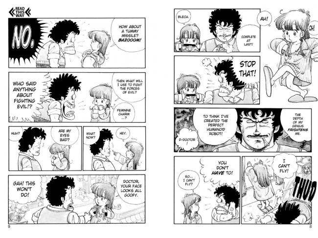
One problem I have with recommending Akira Toriyama’s Dr Slump (Vizmanga with free preview, Amazon) to other people is that I always end up wanting to explain the jokes. I think it’s one of the most brutally funny comics ever made, so of course I want to focus on what I like: the jokes. But explaining jokes is for the birds. It never comes out right. I could talk about how funny it is that Arale, a little robot girl built by Dr Senbei Norimaki, wishes she had tummy missiles. It’s funny because girl robots tend to have breast missiles. Aphrodite A from Go Nagai’s Mazinger Z is the mother of mammary-based missiles systems (even though Diana A has a better design), and it’s a joke about how girl robots have to have boob missiles because the genre demands it. But by the time I get to this point, you’re bored, I’m in over my head, and we’re both suddenly very conscious of the fact that the joke is receding into the distance and nobody’s laughing.

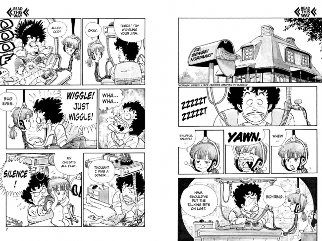
Here’s the first two pages of Dr Slump:

One of the things I like about Dr Slump is its density. It’s a gag manga, and it packs a ton of jokes into its short chapters. It’s not a buckshot style, either, where Toriyama just throws everything at the wall to see what sticks. No, Toriyama has a very specific tone for Dr Slump, one that’s heavy on absurdity and irony. The thing is that Toriyama isn’t afraid to meander around inside of that tone. He’ll dedicate page space to rolling off joke after joke within that absurd/ironic framework, and when he’s emptied out that vein, he moves on to the next scene.

As a result of Toriyama’s willingness to blow real estate setting up and knocking down jokes, Dr Slump is leisurely paced. Things just sorta happen, characters move from room to room, and the book never really becomes tense, despite the density of the jokes per square inch. The plot of each chapter has room to breathe, but the jokes never stop. Toriyama uses establishing shots to display jokes, too, like dinosaurs who live in trees or idiot aliens. You’re guaranteed at least one solid joke per page, and sometimes six or more.

Dr Slump hits much more often than it misses. It’s a smart dumb comic, in fact, because you don’t get to make funny dumb jokes without being smart enough to think of them. The tummy missiles joke I talked about earlier is funny on the face of it. It’s an absurd request to begin with, since there’s no good reason for a little girl need missiles. It’s funny that she just assumes she needs to fight the forces of evil, too, and her nervous thought of using her “feminine charm” to fight evil is a good’un. But if you know a little manga history, the joke get even better. It works on a couple of different levels.

Part of the reason that Dr Slump is a smart dumb comic is the body language. Characters wipe their brow, rub their eyes, cock their heads, scream, and fliptake, and it all looks exactly like it’s supposed to. It’s just real enough to draw you in, despite the giant eyes and tiny noses. Look at that first page. Look at Arale’s bored yawn and bleary-eyed sniffles. That’s beautiful, and then Toriyama gives Senbei the full Looney Tunes on the very next page. He knows when to amp it up and when to tamp it down.

Most people know Toriyama’s work via Dragon Ball Z, if anything, but Dr Slump predates that. His style here is much more cartoony. Normal people have Krillin-style builds, at best, and everyone else is squat and deformed. Dr Slump is much cuter than Dragon Ball Z, and it’s for the best. Jokes this dumb and absurd just wouldn’t work if his art was more realistic. Suppaman, Toriyama’s Superman parody (also known as Sourman), would look ridiculous if he had Goku’s proportions. Instead, in Dr Slump, he’s another squat, ugly, dumpy-looking guy, the perfect contrast to Superman and full of comedic potential on first sight.

Toriyama is clearly a guy who put a lot of thought into his jokes. He employs a lot of really dumb premises in order to facilitate jokes. In the first chapter alone, Arale goes to a restaurant and orders engine oil, Dr. Norimaki has to wear a schoolgirl outfit in order to avoid being seen as a pervert when buying panties for Arale, and Arale takes an eye exam and spells out N-U-T-S. The first chapter is 14 pages long, and while other strips would thoroughly explore a specific joke like “Arale has bad eyesight” for a chapter’s worth of related gags, Toriyama hits you with one good one (two good ones in this specific instance, actually) and moves on.

But all of this is beside the point. I can’t hit on the sublime thrills found in Dr Slump because they’re so specific to the setting. Toriyama built a world that was the perfect delivery system for his jokes and sense of humor, and then he populated it with circus freaks and idiots. Everyone’s a little bit dumb, even the theoretically smart people. You have to read the comic to get the full effect. The first chapter is free on Vizmanga.com.

I’m a big Dr Slump fan, and I’m glad that Viz is finally putting it up on VizManga, since half the series is OOP and too expensive to buy used. I hope you like it as much as I did. At five bucks a volume, you’re getting more laughs per dollar than basically anything ever.

BACKUP STORY! CURSE OF THE CRIMSON CORSAIR, FEATURING EIJI NONAKA’S CROMARTIE HIGH SCHOOL! BUY IT USED!

Post to Twitter Post to Facebook Post to Reddit Post to StumbleUpon

h1

Before Watchmen Is Comic Book Poison

June 5th, 2012 Posted by david brothers

One more time, since we’re about to suddenly become a post-Before Watchmen society. Buying Before Watchmen is a vote for:

-A comics industry that prizes properties over creators
-A comics industry that will effortlessly use its legal muscle to screw over creators
-A comics industry that strip-mines the past at the expense of the future

I don’t know how to put it any plainer than that. Before Watchmen is an attempt to recapture past glories with a crop of A-list talent, instead of creating new glories with that exact same talent. Azzarello? Cooke? Conner? These folks create classics, and instead of hiring them to do that, DC’s hired them to fulfill some top down publishing edict to wring all the money they can out of Moore & Gibbons Watchmen, no matter what. It’s stupid and short-sighted.

Here’s how DC thinks about comic books, from a recent USA Today piece:

“The strength of what comics are is building on other people’s legacies and enhancing them and making them even stronger properties in their own right,” says Dan DiDio, DC co-publisher.

The first half of this sentence is so wrong as to be laughable. The second half is so corporate it’s depressing. Properties: code word, meaning “something we can exploit in other media or in the future.” They aren’t characters. They definitely aren’t art. They’re properties. I wish there was a whiny baby font so I could really get across my disgust with Didio’s position.

The stuff about building on other people’s legacies… no. That’s not the strength of comics at all. The strength of comics is the creators, the men and women armed with pens and pencils who go in and make the stories go, who craft classics that are so good that it’s like they’re daring us not to like them. I don’t like Frank Miller’s Daredevil because of what Stan Lee and Bill Everett brought to the character. I like Frank Miller’s Daredevil because Frank Miller showed me things I’d never seen before. That’s the same reason I like Gene Colan’s version, or John Romita Jr’s version, or Alex Maleev’s version.

Dan Didio is objectively wrong about the strength of comics. He’s towing the company line, which is that the dissent against Before Watchmen is about Alan Moore being pissy over people using “his” characters. That, in turn, enables all the asinine remarks about how Lost Girls or League of Extraordinary Gentlemen is the same thing.

The thing is, it’s not about characters. It’s about ethics. It’s always been about ethics, no matter how often scumbags like Joseph Michael Stracynzski suggest otherwise. It’s about not taking advantage of the letter of the law to push forward with unethical projects. It’s about respecting the talent and the things they bring to the table.

But to DC, it’s about toys. “Why doesn’t Alan let us play with his toys, huh? Why’s he so stingy?” And I know that the comics press is going to enable these guys to get their way. Betting on whether or not a bunch of reviews open with some variant of “Despite the controversy, Before Watchmen is pretty good” or “While a vocal minority expressed a rabid dislike for these books, sight unseen, blah blah blah” is a sucker bet. Of course it’ll happen. Gotta protect those relationships to maintain access!

I dunno, man. Before Watchmen is loathsome. It’s going to come out and people are going to buy it, but my advice to you, my request, is that you think about the series and what it represents, and then decide if that’s the comics industry you want to build for yourself. If you just want to read Batman comics month in, month out, no matter who’s doing them, fine. That’s your thing. But if you want one where creators are respected, maybe give some thought to not buying the series, and telling DC what you think on Twitter, via email, during San Diego Comic-Con… get up in their face. Force them to talk about it in public.

A lot of creators, from indie megastars like Bryan Lee O’Malley to Big Two mainstays like Chris Roberson have expressed dissent, to put it nicely, about Before Watchmen. People care about this, and it’s not just because Watchmen was a really good comic however many years ago. It’s because creators’ rights matter, respect matters, and ethics matter. Alan Moore is one of the most respected and important people in comics. If they’ll put him to the wall, what do you think they’ll do to you? Pay attention to what these companies are saying behind the con announcements and press releases. Before Watchmen has a very clear message, and don’t be surprised when Before Watchmen II is announced next year.

I don’t want the industry that DC is trying to shore up. Not even remotely. There’s too many good comics out there to let Before Watchmen be what defines our industry and our habits as consumers.

Don’t buy Before Watchmen.

Here’s some further reading if you need convincing.
-Alan Moore and Dave Gibbons in conversation with Neil Gaiman (!) in The Comics Journal 116, July 1987, TCJ recently uploaded a transcript
-Tom Spurgeon’s “Sometimes They Make It Hard To Ignore Creators Issues” and “Twenty-One Not Exactly Original Notes On More Watchmen, Written At A Slight Remove”
-Ryan Dunlavey & Fred Van Lente’s Comic Book Comics #5 [preview]
-Image Comics publisher Eric Stephenson’s “NO FUN”
-Chris Mautner’s “We’ve come so far: On Before Watchmen and creators rights”
-Michael Dean’s “Kirby and Goliath: The Fight for Jack Kirby’s Marvel Artwork”
-Kurt Amacker interviews Alan Moore.
-Frank Miller’s “Keynote Speech By Frank Miller To Diamond Comic Distributors Retailers Seminar, June 12th, 1994” (from the pages of Sin City: The Big Fat Kill #5)
-The Comics Journal’s “The Four Page Agreement”
-Milo George & The Comics Journal’s The Comics Journal Library: Jack Kirby
-Michael Dean’s “Marvel/Disney’s Win Against Jack Kirby Heirs Not About Fairness” and Kirby and Goliath: The Fight for Jack Kirby’s Marvel Artwork”
-Gary Groth’s “Jack Kirby Interview”
-Steven R Bissette’s “Marvel/Disney v Kirby: Part 2” and “Marvel/Disney v Kirby: Do Avengers Avenge… Or Not?”
-This incredibly relevant Youtube clip from The Wire, if you need a pithy explanation on how depressing creators’ rights can be

Post to Twitter Post to Facebook Post to Reddit Post to StumbleUpon